From a technical perspective, Thomas Gainsborough appears to have approached the production of Peter Darnell Muilman, Charles Crokatt and William Keable in a Landscape (Tate T06746; figs.1a, 1b and 1c; hereafter Muilman, Crokatt and Keable in a Landscape) much as he did his other commissions for ‘conversation pieces’ in the 1740s and 1750s. Thin paint, applied with numerous deft brushstrokes, a grey ground, and complex mixtures of pigments with large particles; all of these fall in line with what previous research carried out at Tate and the National Gallery, especially by conservator Rica Jones, has taught us to recognise as typical of Gainsborough’s early technique.1 To an exceptional degree, the picture demonstrates the particular strengths of Gainsborough’s artistry at this stage – not least in the facility of the handling and the sophistication of the landscape elements. For all its finesse however, technical imaging also reveals that the figural balance of the piece, so crucial to conveying its impression of sociable ease, was in fact rather hard won through a considerable exertion of thought and effort.
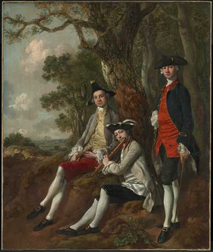
Fig.1a
Thomas Gainsborough
Peter Darnell Muilman, Charles Crokatt and William Keable in a Landscape c.1750
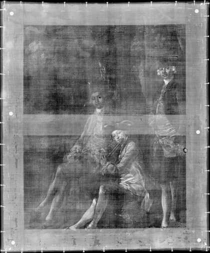
Fig.1b
Thomas Gainsborough
Muilman, Crokatt and Keable in a Landscape, X-ray
Photo © Tate
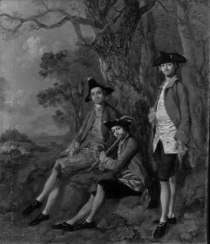
Fig.1c
Thomas Gainsborough
Muilman, Crokatt and Keable in a Landscape, infrared reflectogram
Photo © Tate
The work was commenced on a plain-weave linen canvas that had been prepared with a single, substantial layer of grey priming. On close examination, tiny faint horizontal striations are visible in the surface of this preparatory layer, which were created by the brush or other tool that was used for application.2 The pale grey colour of this ground layer is most common for Gainsborough at this time.3 He may have applied this himself, although commercially prepared canvases already stretched and primed in this colour were readily available by the middle of the eighteenth century.4 Oil paints were also easily purchased, pre-ground and wrapped in pieces of bladder, which Gainsborough tended to dilute before building up his compositions.5 In Muilman, Crokatt and Keable in a Landscape the translucent, glossy, liquid browns and blacks of the landscape suggest that the artist thinned his paint with additional oil medium rather than turpentine alone for these areas. The raised texture of the thick brown translucent paint on the central tree trunk may indicate the use of a modified or thickened oil.
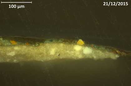
Fig.2
Thomas Gainsborough
Muilman, Crokatt and Keable in a Landscape, cross-section taken from foliage at the right-hand edge of the picture
Photo © Tate
Gainsborough’s palette was distinctive at this stage for the amount of light it permitted into the paint film. One way that he achieved this was by minimising the use of opaque pigments in favour of translucent equivalents. Another tactic was the use of transparent fillers, either in the form of ground glass or very pale smalt.6 Small paint samples analysed by Joyce Townsend, Tate’s Senior Conservation Scientist, confirmed that the range of pigments used for Muilman, Crokatt and Keable in a Landscape rest comfortably within Gainsborough’s standard techniques for this time.7 A sample from the foliage reveals a characteristically complex mixture of pigments, including green earth, iron oxides, vermilion, lead white and what appears to be Naples yellow (fig.2). Prussian blue is employed for the right-hand figure’s jacket and mixed with lead white in the sky, where it has faded considerably.8 In the red breeches of the left-hand figure, a sophisticated layering of opaque red has been adopted, followed by a translucent red glaze which gives the fabric a hint of a velvety finish.
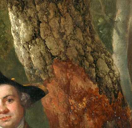
Fig.3
Thomas Gainsborough
Muilman, Crokatt and Keable in a Landscape, detail of the central oak tree
Photo © Tate
A comparison with other conversation pieces by Gainsborough from this period, such as Mr and Mrs Andrews c.1750 (National Gallery, London) and The Gravenor Family c.1754 (Yale Center for British Art, New Haven), shows that an unusual degree of attention has been paid to the achievement of the landscape element in Muilman, Crokatt and Keable in a Landscape. Indeed, the complexity and sophistication of these areas are more akin to his contemporary ‘standalone’ landscape works, for instance Cornard Wood, Near Sudbury, Suffolk 1748 (National Gallery, London); and Wooded Landscape with a Cottage and Shepherd 1748–50 and Landscape with Stream and Weir 1750–3 (both Yale Center for British Art, New Haven). The execution is confident and accomplished and there is little evidence of revision or hesitation, with the gnarled grey and brown trunk of the oak tree at the centre of the composition rendered with particular care (fig.3). The crevices and grooves between each plate of bark are described with calligraphic lines of thinned black paint; there are also textured creamy touches where the light catches the rough surface. In the upper left corner of the painting, the cloudy sky was painted only after the oak’s branches had been laid in, leaving the grey priming visible around their woody contours. Finally, the thin foliage of the old limbs was added with small dabs of green paint. The denser foliage of the trees behind was applied with the same small brush marks, while the leaves in the upper right corner were depicted with short strokes of paint mixed wet-in-wet that merge into zigzagged lines towards the upper edge.
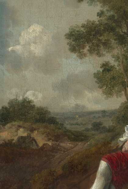
Fig.4
Thomas Gainsborough
Muilman, Crokatt and Keable in a Landscape, detail of the left side of the composition
Photo © Tate
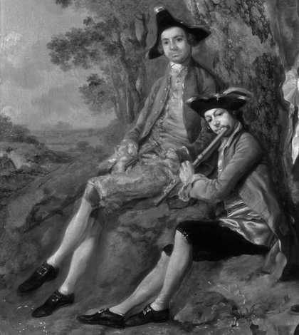
Fig.5
Thomas Gainsborough
Muilman, Crokatt and Keable in a Landscape, detail of the infrared reflectogram showing two sitters
Photo © Tate
The landscape is generally thinly painted, with the grey priming left visible at various points in the composition and serving as a mid-tone. However, different parts of the landscape were subject to contrasting treatments. The wooded area immediately behind the figures and the sandy bank on which they sit are rather loosely and thinly described, with fine details limited to tufts of grass and the single burdock specimen in the foreground. Much more attention was paid to the vista that opens out on the left-hand side of the composition (fig.4), with a greater variety of textures and light effects attempted than in the other parts of the landscape, aside from those seen in the oak tree. At the very edge of the hill and copse, in the middle distance, a tiny wet-in-wet fence is finely observed in pale shades of ochre paint. Such delicate mark-making can only be achieved by considerable dexterity with the aid of a very small brush, or the pointed tip of a good quality one.
Infrared reflectography and X-radiography has revealed the artist’s struggle with the seated figures and some consequent subtle variations in technique (fig.5).9 Gainsborough first marked out the figures with fluid lines of dark oil paint, which are visible in certain areas under magnification, and carried out some initial tonal underpainting, or ‘dead colouring’. At this stage the picture probably rather closely resembled Gainsborough’s unfinished Landscape with Gipsies of about 1753–4 (Tate N05845; fig.6). The right-hand figure (either Muilman or Crokatt) poses in a standard polite stance that seems to have been rather straightforward for Gainsborough to achieve, with only small changes in the costume perceptible. Infrared reflectography indicates diagonal, fast, sketchy strokes which are no longer visible to the naked eye, showing how this figure was first drawn in dark, thin oil paint.10 This outline created a ‘reserve’, or space, up to which surrounding areas could be painted until Gainsborough was ready to work up the figure more fully.
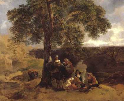
Fig.6
Thomas Gainsborough
Landscape with Gipsies c.1753–4
Tate N05845
Photo © Tate
The two seated figures seem to have caused Gainsborough much more trouble. They have both undergone multiple changes that are discernible on close examination of the surface and also with infrared reflectography and X-radiography. The left-hand seated figure has been compressed inwards at both sides. The foot of his crossed-over leg has been moved in towards the centre and up a little, and the leg has likewise been adjusted to accommodate this position.11 His head and torso, including hat, head and shoulder, have been moved away from the tree so that they no longer overlap it. (He may originally have been leaning back against the trunk.) An extra button, now painted out, is visible in the infrared image between the top two on his waistcoat, which, like the original position of his foot, suggests the figure was initially positioned further down the image. In addition, his hands have no ‘reserve’ and are painted on top of the red velvet trousers, which have begun to show through the aging paint of the flesh tones.12
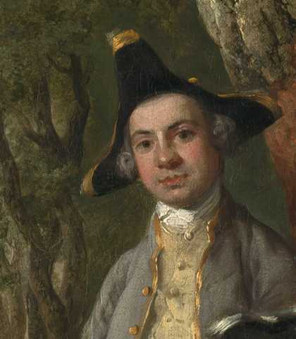
Fig.7
Thomas Gainsborough
Muilman, Crokatt and Keable in a Landscape, detail of the left-hand sitter
Photo © Tate
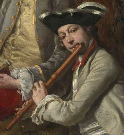
Fig.8
Thomas Gainsborough
Muilman, Crokatt and Keable in a Landscape, detail of William Keable
Photo © Tate
Once the central figure of William Keable playing the flute had been quite well established, it was moved slightly to the right, or perhaps twisted further away from the viewer. Adjustments can be seen around the hat, and the line of the jacket has been extended over the waistcoat. Microscopic examination of Keable’s face provides particularly strong indications that the figure was developed beyond basic ‘dead colouring’ before these adjustments. For the most part Gainsborough used the grey priming as a mid-tone when painting flesh; an economical technique involving the direct application of mixed paints in one or two layers and minimal use of glazing.13 Good examples of this technique are found in the face of the left-hand figure and the hand of the standing figure (fig.7). By contrast, Keable’s face has been reworked so that it appears more opaque than the other faces in the X-radiograph; indeed, the paint layer is visibly thicker to the naked eye and there are tiny shrinkage cracks. To compensate for the lack of the mid-tone provided by the priming, and to keep the colouring of Keable’s face consistent with his companions’, Gainsborough used an approximate colour over the pinker hues. An extremely subtle curved grey-green brush stroke has been added, for example, to create the edge of the outer nostril (fig.8). Less finessed, perhaps because less conspicuous, are the dense and relatively featureless halos of paint around the standing and left-hand figures, which were presumably added to reinforce the figures’ outlines after the changes were finally settled.
In conclusion, technical analysis of Muilman, Crokatt and Keable in a Landscape highlights the exceptional attention to detail that Gainsborough paid to both the landscape and the portrait figures in this conversation piece. The trees and foliage are skilfully painted to create areas of minute detail and the overall execution of the rural setting surpasses that of his other conversation pieces; in fact, the background as a whole more closely resembles Gainsborough’s ‘standalone’ landscapes from this period. But if this side of the commission was achieved with adeptness and confidence, the artist’s skill seems to have been put rather more considerably to the test by the complex arrangement of his sitters. Having made multiple adjustments and revisions in order to achieve the elegant ease of the left-hand figure and the exact poise of a flautist for Keable, it took a good deal of ingenuity on the artist’s part to restore harmony to this image of social and musical accord.
