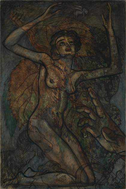
Fig.1
Francis Picabia
Otaïti 1930
Oil paint on canvas
194 x 130.3 cm
Tate T11982
© ADAGP, Paris and DACS, London 2017
Otaïti 1930 (fig.1) is one of Picabia’s ‘transparency’ paintings, which were created largely between 1927 and 1932. With these works Picabia moved away from making provocative dada gestures and started to experiment with a complex layering of images to achieve the aim of ‘transparency’. The transparencies vary dramatically in appearance; there are paintings on canvas as well as on plywood, and there are early watercolours on paper as well as gouache paintings using the transparent plastic sheeting Cellophane as the support.1 The images also vary in size and colour and in the complexity of layers, and it is generally very difficult to work out how these large complex paintings were made simply from looking at the surface.
Very little technical information exists about this enigmatic series of paintings and although art historical and vernacular sources have been found for many of the images, and as tempting as it is to try to tease some sort of narrative or meaning from them, it becomes clear that Picabia was not interested in creating a story board.2 The several sources for Otaïti will be discussed in this essay, while close examination, analysis and images made under high magnification reveal the materials and experimental techniques Picabia deployed. Time and subsequent conservation treatments have altered the appearance of the painting dramatically and these changes will also be discussed.
History and context
Picabia’s transparencies were achieved by laying down the outlines of several separate figures and shapes onto one support, allowing the jostling images to be seen simultaneously through diaphanous layers of coloured glazes and varnish. Picabia scholar Arnauld Pierre has described them as:
the result of a great assemblage of materials scattered through a long history of art, from the paintings of Pompeii to the Renaissance and the Italian seicento, from antique sculpture to Catalan Romanesque painting. The motifs clash between one work and another but also within individual works, where the most disparate and arbitrarily assembled periods and styles muddle along together. With Picabia … the eclecticism of the quotations never seems to become systematic, and the scaffolding of sources creates no conception of painting or what it should be. His painting is crafted from the heaped leftovers of a blurred and overloaded memory, offering no clear, steady aesthetic program. Reduced to the inconstancy of their contours, the Transparencies recycle no more than the now empty forms of the great works of the past, wearing out their primary meanings without breathing new ones into them.3
However, another Picabia scholar, William Camfield, has seen meaning in this series:
With little exaggeration it might be said that Picabia did not ‘create’ any of the images in the transparencies; instead his creation was comparable to that of a collagist who recognizes the material (images) which answers his needs and then combines it in a way which – if successful – transforms the material and becomes more than the mere sum of its parts.4
Picabia’s assemblages of images appear to imitate the translucency of film, with its ability to overlay multiple images and yet remain diaphanous. Picabia sought these effects using the traditional media of oil and resin, but his interest in photography is well documented, and being the grandson of early photography pioneer Alphonse Davanne, he was brought up with an understanding of its material properties and visual effects.5 According to his friend Gertrude Stein, this relationship was important to Picabia:
Picabia, when he was a young boy, was always with his grandfather. They used to travel a great deal and always visited museums and his grandfather, who was doing experiments with coloured photography at that time, being a well-known savant, was always given permission to photograph. So they photographed all day and developed all night, and this early experience, so Picabia believes, I am not sure he is right, has had a great deal to do with the development of modern painting. Picabia got from the constant contact with photography … something which did give him the idea of transparence and four dimensional painting, and this through him certainly has a great deal to do with everything. Even now in his later painting and his drawing he has achieved a transparence which is peculiarly a thing which has nothing to do with the surface seen.6
Depth, rather than surface, seems to be the preoccupation in Otaïti and this feature is common to many of the transparencies. The artist Marcel Duchamp later described them as creating ‘a third dimension without resorting to perspective’.7
It is known that Picabia often took inspiration from books, and indeed traced images from them, instead of working from original models. He seemed to choose his models in bursts or series, for example a Botticelli cycle, a Dürer cycle, or a Piero cycle. Art historian Sarah Wilson has written that Picabia used archetypes of the Catalan primitives after his visits to Barcelona, but that he never returned to Naples after his Port of Naples in 1912 and he is unlikely to have seen the masterpieces in its National Museum, which inspired so many of his works in the 1930s.8 Picabia’s son Lorenzo recalled that ‘My Father had a trunk full of art books in his studio’.9 Unfortunately, Picabia’s book collection did not survive. Towards the end of his life they were mostly stored in the cellar of his Paris studio, where they were destroyed by damp and vermin.10
The images selected for Otaïti are possibly from the pages of the books recalled by Lorenzo. Much less complex in its imagery than some of his most celebrated paintings, such as Sphinx from 1929, Otaïti is dominated by a female nude.11 The woman’s arms are raised as if to catch a small winged horse, which has alighted on a leaf like a butterfly. The huge leaves can be seen not only behind the figure, but through her and at the base of the painting. Also seen through her limbs are a belligerent ram, a tambourine, a viol and a mask of Janus, the two-headed god. Below the figure and to the right of the painting is a large, disembodied hand pointing upwards.
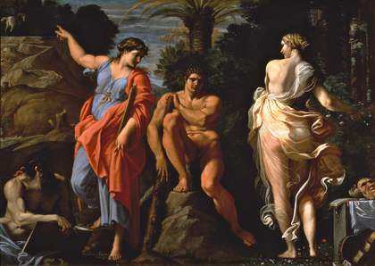
Fig.2
Annibale Carracci
The Choice of Heracles c.1596
Oil paint on canvas
167 x 273 cm
Museo Nazionale di Capodimonte, Naples
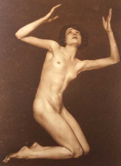
Fig.3
Trude Fleischmann
Nude Study of Claire Bauroff 1925
Reproduced in Peter Landow, Nature and Culture, Woman, English edn, London 1926, p.42
Image: Annette King
Location of original photograph unknown
The sources for some of the images around the figure have been identified as coming from Annibale Carracci’s The Choice of Heracles c.1596 (fig.2), then in the National Museum in Naples. Picabia lifted the winged horse from this painting and made it a light insubstantial presence in Otaïti. The instruments and mask of Janus are very similar to the ones featured in the Carracci painting, but are depicted as simple outlines in the lower-right corner of Picabia’s painting.
The nude has an altogether more modelled form and she is strikingly contemporary and sensual. She is possibly based on a photograph by the Viennese photographer Trude Fleischmann, who took a series of photographs of the nude, oiled body of the ballet dancer Claire Bauroff in 1925, set against a black studio backdrop (fig.3). Fleischmann took portrait photographs of many celebrities of the theatre, arts and intellectual circles and was among the first to photograph the new dance styles in Vienna. An exhibition of these photographs was confiscated by a Berlin district attorney for indecency.12 Picabia would no doubt have relished this sort of scandal. It is not known exactly where he came across these photographs, which achieved wide circulation in the 1920s, most prominently in the book Nature and Culture: Woman by Peter Landow, published in German, French and English.13 This contained art photographs of nude woman by international photographers to celebrate the beauty of the female form. But it is perhaps no coincidence that two paintings by Picabia exhibited in 1930 at the Galerie Alexandre III in Cannes seem to be based on two of the photographs which appear on consecutive pages of this book. Picabia’s transparency painting Salomé 1930 (fig.4) is also dominated by a nude female form, and the pose corresponds closely to another Fleischmann image in the Landow book (fig.5). These nude photographs also appeared in a special issue of a journal called Die Schönheit, which promoted German nudist culture.14
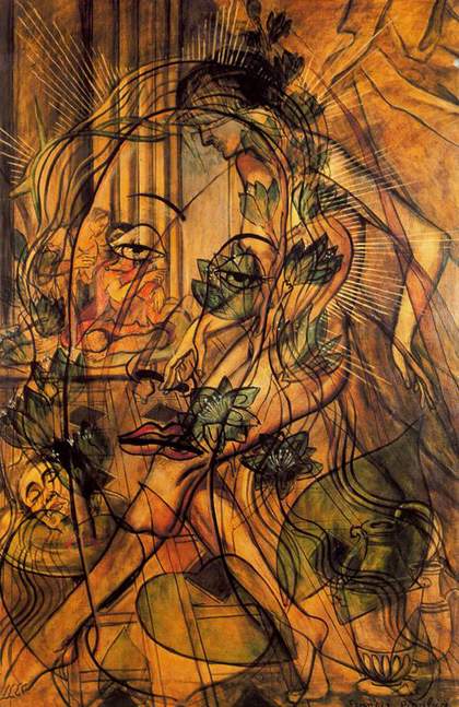
Fig.4
Francis Picabia
Salomé 1930
Oil paint on canvas
195 x 130 cm
Collection Broere Charitable Foundation
© ADAGP, Paris and DACS, London 2017
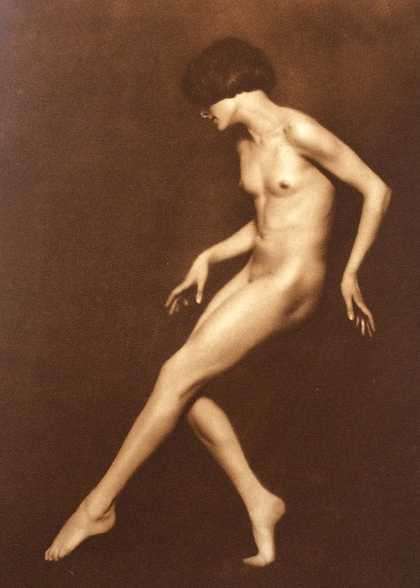
Fig.5
Trude Fleischmann
Nude Study of Claire Bauroff 1925
Reproduced in Peter Landow, Nature and Culture, Woman, English edn, London 1926, p.41
Image: Annette King
Location of original photograph unknown
1930 was a year of tremendous productivity for Picabia, as well as being a complicated year in his personal life. At the age of 51 he was going through a divorce from Gabriel Buffet-Picabia, and was ostensibly living with Germaine Everling in the Château de Mai, Mougins, in the south of France where his studio was located. However, he was in fact establishing his primary residence on a newly acquired motor yacht called L’Horizon I, moored opposite the Casino in Cannes, with Olga Mohler, the young Swiss nanny of his son Lorenzo and the companion of the last twenty-five years of his life. Picabia was a huge social success in Cannes as the creative director of gala evenings at the Château de Madrid and Club Ambassadeurs, and his own exhibitions became celebrated social occasions. In August 1930 Émile Fabre chose to open his new exhibition space, the Galerie Alexandre III, with an exhibition of Picabia’s recent works and ‘the opening was hailed as a social record of sorts, comparable to major events at the peak winter season’.15
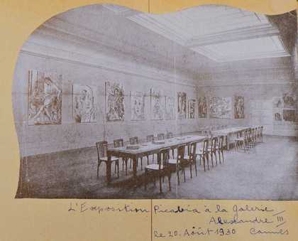
Fig.6
Installation photograph of Picabia’s exhibition at the Galerie Alexandre III, Cannes, August 1930
Reproduced in Olga Mohler Picabia, Album Picabia, ed. by Beverley Calté, Brussels 2016, p.35
Image: Suzanne Nagy
An installation photograph provides the only record of the show, and appears in Olga Picabia’s album accompanied by her caption, ‘The Picabia exhibition at Galerie Alexandre III, 20 August 1930, Cannes’ (fig.6).16 Otaïti is clearly visible, hung third from the left with Salomé one removed from it, on the far left. The hanging arrangement alternates between the larger format paintings like Otaïti and the slightly smaller canvases hung between them. It is interesting to note that the paintings appear not to be framed.
Throughout his career Picabia was interested in how he could achieve new effects using his painter’s palette, and in Otaïti he was extremely experimental and innovative, using paint media which would normally be considered incompatible to achieve new and possibly unforeseen consequences. Curator Anne Umland has remarked that:
Picabia’s paintings from this time [1930s] demonstrate a keen interest in process and experimental materials that belies his own statements about being indifferent to surface facture, and the statements of others who characterize him as a proto-Conceptual artist indifferent to the making of things or who attributes his turn to unusual materials simply as a function of the difficulties in finding paint supplies in the south of France.17
Gertrude Stein introduced Picabia to a young English artist called Sir Francis Rose, who wrote that Picabia ‘painted entirely in glazes of transparent colours which he mixed with a special varnish which, although permanent and non-cracking, turned a yellow colour and blued in the cold’.18
The word patina is often mentioned in connection with the transparencies, as well as the fact that Picabia was returning to traditional painting materials. Sarah Wilson described it as ‘deliberate “Old Master” facture and glazing … The effect of this “patina” was to render the paintings themselves timeless, emphasizing the suspended quality of dream’.19 The effect is indeed of more traditional glazed oil painting, certainly when contrasted with his earlier paintings in Ripolin commercial paint, or his collages, but in Otaïti Picabia continued his quest for the new, mixing ancient and contemporary, layering both images and materials to create something wholly original.
Technical examination and materials analysis of the painting
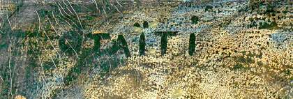
Fig.7
Detail of signature after image processing
Image: Annette King
Photo © Tate
Otaïti entered the Tate collection in 2005. It had been titled Taïti for some time before acquisition and there was some debate about whether the inscription at the top-left corner read ‘Taïti’ or ‘Otaïti’. When the painting was examined closely an ‘O’ was found, but the surrounding black paint and the dark register of the painting make it almost illegible. Photography renders the title slightly ambiguous, but with some image processing the ‘O’ appears more clearly (fig.7).
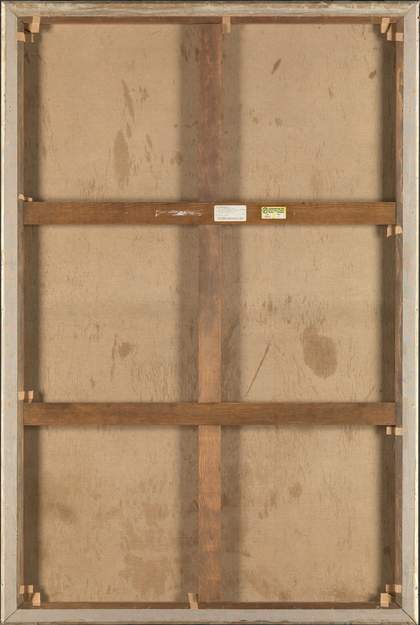
Fig.8
Reverse of Otaïti 1930
Photo © Tate

Fig.9
Details of top foldover and lower foldover edges from reverse
Photo © Tate
Otaïti is widely accepted as having been painted in 1930 at Picabia’s spacious studio in the Château de Mai. It is painted on one piece of plain weave linen canvas with twenty-six threads per centimetre in both directions, which makes the support fine in weave, with little texture. The warp direction is horizontal to the picture plane, and it was re-stretched onto a new stretcher (fig.8), having had the edges strip-lined before it came into the collection.20 Today the painting measures 194 cm x 130 cm, which is just one centimetre short of the standard ‘120 Figure’ format of 195 cm x 130 cm, making it possible that the centimetre of height was lost in the new stretcher.21 If the original format was a standard 120 Figure, then it would have had the same dimensions as Salomé. The original tacking margins were either very minimal along three sides or have been trimmed. The corners have been cut on the diagonal and adhered to the stretcher, rather than folded under and preserved, therefore there is very little original material left on the reverse (fig.9).
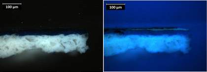
Fig.10
Cross-section of paint from the lower edge, below the feet, in visible light and ultraviolet light
Photo © Tate
Both the top and lower foldover edges have been roughly cut and the ground preparation does not reach the cut edge at either end, which suggests that that the ground was applied once the canvas had already been cut to size, rather than from a larger commercially prepared roll of canvas. The top edge in particular has traces of a scalloped edge, indicating it could have been loomed for preparation.22 The tool used to spread the ground has left a raised lip of material along the top edge. It is not known whether Picabia prepared his own ground for this canvas, but the ground proved to be unusual when examined in cross-section (fig.10). The base of the cross-section conforms to the profile of canvas threads, not included in the sample, and although it is thin, it covers the very modest texture provided by the fine weave of the canvas. Analysis of the ground indicated lead white and large angular particles of barium sulphate, with kaolin and traces of other extenders, in oil medium, which are typical materials at this date.23 However, these large colourless particles were not universal in grounds, and they act like glass fragments in that they make it reflect back more white light. It is possible that the priming type was selected by Picabia for its appearance. It would be interesting to compare other transparencies, particularly from 1930, but none have been investigated as yet. The ground is undoubtedly white and very smooth, which gives the transparent layers on top a luminous quality.
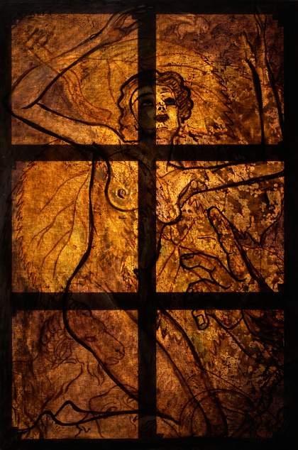
Fig.11
Otaïti 1930 under transmitted light
Photo © Tate
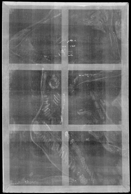
Fig.12
Digital X-radiograph of Otaïti 1930
Photo © Tate
It should be noted that although the paintings of this series are known as transparencies, they are in fact solid objects and are not completely see-through. However, the transmitted light image, taken with light behind the canvas, gives some idea of what Picabia may have meant by a transparent painting (fig.11). It shows the thinness of the paint and varnish layers, which make the canvas appear almost like a stained-glass window. Every transparent brushstroke is illuminated, but in contrast to the normal viewing conditions, the canvas texture is also clearly visible. The only lines that block the light are the thick unbroken black outlines of the figure and hand. There is no visible underdrawing, nor did examination with infrared reflectography reveal any evidence of drawing. However, the X-radiograph (fig.12) does reveal a sketchy outline and some modelling in lead white, rendered white in the image, which is presumed to be the initial outline of the figure, and less linear modelling for the large disembodied hand, later covered with black paint. The winged horse, the Janus mask and the other elements in the foreground were not initially outlined in lead white, nor the leaves behind or within the woman’s figure.
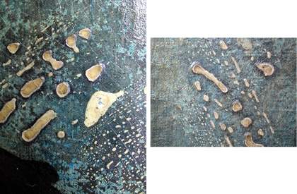
Fig.13
Details of reticulated white layer
Photo © Tate
The broken lines of the figure show a white layer which has reticulated and shrunk into islands (fig.13), applied in a medium incompatible with the oil of the priming beneath. The white spots consist of lead white in a plant gum, the thickness suggesting gouache.24 By using an incompatible medium, Picabia was looking to break up the dense line into tiny islands to maintain transparency, and make it ‘disappear’, which is very effective when viewed in normal light. Picabia then painted over the white lines with flesh paint in places.
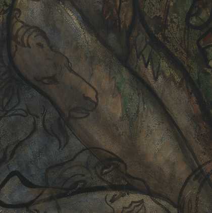
Fig.14a
Detail of thigh showing semi-opaque flesh paint covering white outlines
Photo © Tate
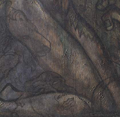
Fig.14b
Detail of thigh under raking light from left
Photo © Tate
The details in figs.14a and b show how these reticulated lines have been used to outline the figure and lay in some three-dimensional detail. These lines were then followed by ochre coloured brushy lines in the arm and a reddish flesh colour in the thigh. The white lines seem to float on top of a background made up of a patchwork of coloured areas. At the top-right corner and largely in areas around the figure this is a bright blue (figs.15a and b). In areas of the figure and leaves it is whitish underneath. Then glazes – which vary from bright green to a creamy ochre to a reddish brown – were applied on top.
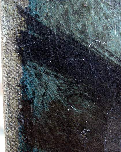
Fig.15a
Detail of left edge showing initial blue paint layer
Photo © Tate
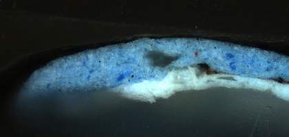
Fig.15b
Cross-section of paint showing layer structure in visible light
Photo © Tate
The first layer of colour on top of the ground in the upper left is a semi-opaque blue layer, applied with loose brushstrokes of cobalt blue in oil. On top of the loosely brushed areas of oil colour Picabia laid in the composition with the lead white outlines and allowed them to dry into reticulated islands. He added further details in semi-transparent black and brown lines and these have been augmented with washes of transparent glaze in pure colours.

Fig.16
Detail of the signature in the lower-right corner
Photo © Tate

Fig.17
Detail of foldover edge below the signature showing drips of blue glaze
Photo © Tate
The area of the signature in the lower-right corner has blue glaze layers applied over the first oil layers of the background (fig.16). There is a straight line at the base of the painting where a brush has run horizontally across the surface, finishing just short of the bottom edge, but then there are trails of blue glaze which have run over the foldover edge (fig.17). It is possible that the canvas was placed on an easel and the paint dripped onto the shelf where it transferred to the bottom edge. It is also possible that some of the glazes were applied when it was flat, and they dribbled over the edge. In either scenario there seem to be different intensities of blue and some of the areas are more dilute than others. These areas are unfortunately too thin to sample and analyse effectively.
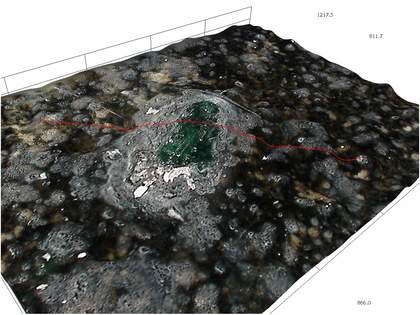
Fig.18
High-resolution 3D view of a deep green transparent pigment particle pushing through the black reticulated paint
Photo © Tate
The transparency of the glazes is muted today by the aged overlying layers, but one glimpse of their extraordinary colour can still be gained under high magnification where this deep green paint is pushing upwards through the black reticulated paint, pure in colour and jewel-like (fig.18). It is likely overlying a lead soap aggregate that has formed in the ground layer (a normal aging process in paint made from lead white and oil) and by now is large enough to deform the smooth surface of the paint, which was not an effect Picabia intended. The pockmarked surface in fig.18 is caused by the synthetic varnish, which is discussed later.
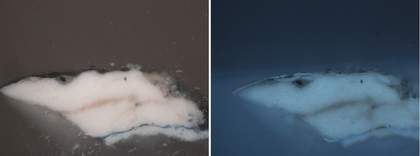
Fig.19
Cross-section of paint from the disembodied hand at the right foldover edge in visible light and ultraviolet light
Photo © Tate
The face and the disembodied hand to the right have been filled out with an opaque flesh colour. It is very thick in comparison to the deeply coloured cobalt blue layer on top of the white ground, present as the second layer up from the bottom in the cross-section (fig.19). The flesh colour could only be sampled in the hand at the very edge of the right of the painting and analysis suggested that the paint consisted of red iron oxide and lead white, painted wet-in-wet and showing as a vein of pink in the middle of the thick white over the cobalt blue.
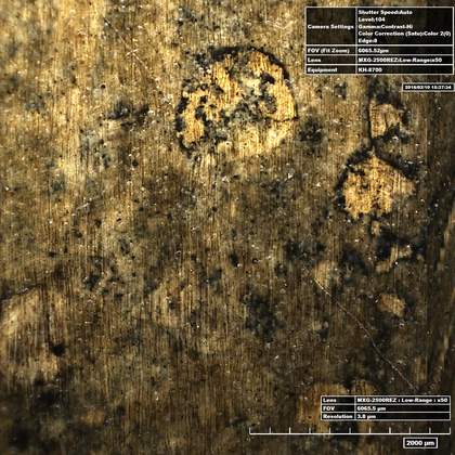
Fig.20a
High-resolution micrograph of the left breast
Photo © Tate
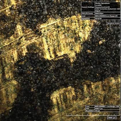
Fig.20b
High-resolution micrograph of the underarm area
Photo © Tate
Having applied very thin, bright and seemingly pure colour glazes, Picabia gave the painting texture by working across the surface with very smooth black paint. This seems to take two forms: an amorphous layer left to pool and form reticulated paint, presumably in a medium incompatible with oil (fig.20a), and a highly worked, thinly brushed surface, with brushstrokes in varying directions (fig.20b).
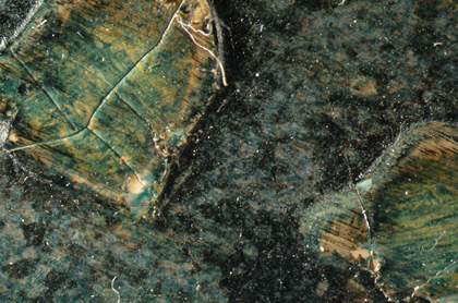
Fig.21
Detail of raised white spots in thigh coated with green/blue glaze
Photo © Tate
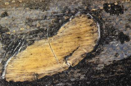
Fig.22
Detail of raised white spots in thigh coated with black paint
Photo © Tate
Both images show a very fine linear matrix of black lines over the surface of the paint, parallel in fig.20a, and crossing over one another at right angles to form a checked pattern in fig.20b. They are concentrated around some of the raised white reticulated lines of the design, and they would have been applied with a soft, long-haired brush as Picabia worked to create an appearance of transparency: green/blue glaze was brushed over the white in fig.21 and the black brushed layer runs over the green, whereas in fig.22 only the brushed black seems to have been applied over the white. The brushed black layer could be a very thin oil layer as it seems to adhere well to the underlayers. From the cross-sections, each layer of colour or black paint lies on top of a varnish (see fig.23).
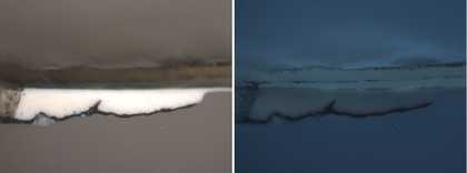
Fig.23
Cross-section of paint from inside proper left arm of figure in visible light and ultraviolet light (the ground is missing from this sample)
Photo © Tate
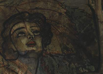
Fig.24
Detail of the face and background
Photo © Tate
There is another black layer applied subsequently, with what seems to be an incompatible medium. In ultraviolet light, the topmost layers of the cross-sections almost all show two layers of fluorescent varnish interspersed with an extremely thin black discontinuous layer. Having laid in the colour and detail of the painting, Picabia then applied a thick layer of varnish. Once it had dried, he experimented with a black coating in an incompatible medium, too thin to sample and analyse, but likely either aqueous or an oil medium very much diluted with thinners. The black has formed a discontinuous, amorphous coating of black which has partially covered the painting, but once again through reticulation it has retained transparency. The detail of the signature (fig.16) indicates this in places, and it can also be seen on the face where Picabia spread it out slightly more thinly, but in the background to the right he allowed this layer to pool into large areas (fig.24).
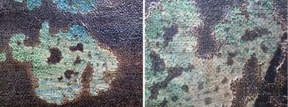
Fig.25
Details showing the reticulated black layer
Photo © Tate

Fig.26
Cross-section of paint taken from left edge in visible light and ultraviolet light
Photo © Tate
The black layer has dried unevenly, and in places it pooled into amorphous shapes, drying into broken islands with thick borders, the medium forming a brownish halo (fig.25). The black layer was left to dry and then a thinner layer of varnish was applied on top, sealing it in between varnishes. It is not obvious how this layer might have been applied; there are some broad-looking sweeps of what might be a brush in the left side of the painting, but it is possible that the painting was laid flat at this stage and that the black was poured or dripped onto the surface, since there are no indications that it dripped down if the painting had been vertical. It seems to have made contact with the surface and then been allowed to dry in its own fashion, perhaps being manipulated in places to thin it out, as the left side (fig.26) and the body and face of the figure have a much thicker application than at the right side.
The application of paint is not uniform, but has touches here and there, meaning each area of the painting has a slightly different stratigraphy. However, the varnish and black reticulated layers do seem to be across the whole surface and the varnish/black/varnish layers are consistent in all areas sampled. The varnish layers, made of natural resins, are all more yellow than when they were applied. However, they are not necessarily the uppermost layers.
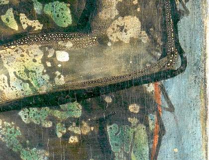
Fig.27
Detail of elbow at right-hand side after image processing
Image: Annette King
Photo © Tate
The colour in the detail of the elbow (fig.27) was adjusted to compensate for the yellowing of the thick varnish layers in order to show more clearly the order of painting. The arm is an example of the painting process continuing on top of the reticulated black layer. The dense, glossy black outline of the arm, which appears so confident and unbroken in transmitted light (fig.11), was applied after the pooled black paint, and overrides it. There is also a thin wash of flesh paint inside the contours of the arm, which renders the black layer a more diffuse grey. To the right of the arm a layer of semi-opaque blue and white was painted over the whole, to make the edges of the image recede, highlighting the figure and features.
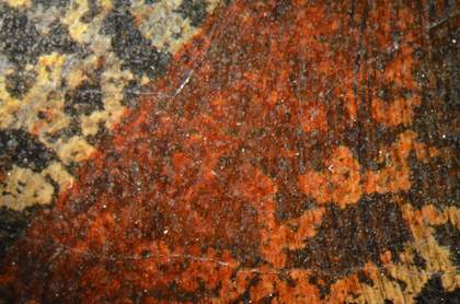
Fig.28
Detail of shoulder area
Photo © Tate
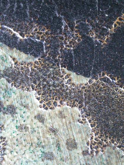
Fig.29
Detail of base of hand at right edge
Photo © Tate
The red layer in the shoulder area was applied over the varnish containing the black reticulated layer (fig.28). The thick, black line of the hand at the top (fig.29) also overlies the broken area of reticulated black. The pool of black beneath it has continued to separate from its medium and crack. This probably happened some time after the completion of the painting. This detail also shows the very thin wash of bright green and the aggregates of green pigment which form jewel-like clumps on the pale background. The striations are possibly the brushed black texturing layer discussed above.
The complexity of layering and covering of layers in this painting would most likely have involved periods of time between applications, to allow areas to dry before coating them again. Picabia was prolific at this period and the photograph taken in 1930 at the Galerie Alexandre III during his exhibition of recent work shows more than a dozen paintings. These might have been done over a longer period, but it is also possible that Picabia painted the series simultaneously in his studio, allowing one to dry while he worked on its neighbour. In this way, perhaps experiments that were less successful were not repeated in the other works. It would be interesting to know how many of the other paintings made around 1930 have a similar reticulated black layer. It is possible that Otaïti was one of the more experimental of the group, and that these effects were not repeated in other works.
Material changes over time
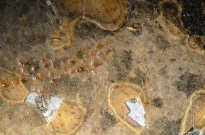
Fig.30
Micrograph of Janus mask showing losses to varnish and white spots
Photo © Tate
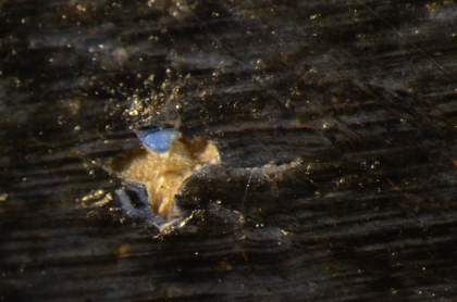
Fig.31
Micrograph revealing layer of bright blue paint
Photo © Tate
Changes to the various materials over time have compromised the appearance of Otaïti, which was much brighter in colour, and more glossy and transparent, when it was first painted and exhibited. The natural resin varnish used so copiously in this painting has yellowed to a near brown colour and in combination with the black striated textured layer and the pooled black reticulated layer, the painting is now much darker in hue. A lot of the luminosity conferred by the smooth white ground has been lost in consequence (fig.30). Another image shows the pale blue of the background paint under the Janus mask, which lies under both the white reticulated spots and the varnish layers (fig.31). The concentration of varnish layers in the upper area show how brown the varnishes have become, while the loss in the black paint shows how vibrant the cobalt blue layer of the background was.
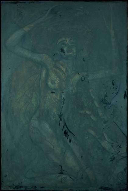
Fig.32
Otaïti 1930 under ultraviolet light
Photo © Tate
Varnish was used strategically to create the effect of transparency in this painting, but unfortunately a varnish applied probably to saturate an uneven surface and re-create ‘transparency’, has had the opposite effect. As noted earlier, this had been done prior to acquisition by Tate, probably in the 1980s. Viewed in ultraviolet light the paint surface has an almost uniform coating of synthetic resin varnish, apart from patches of retouching applied on top, which show up as dark areas (fig.32).
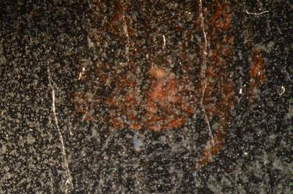
Fig.33a
Detail of the surface of the varnish
Photo © Tate
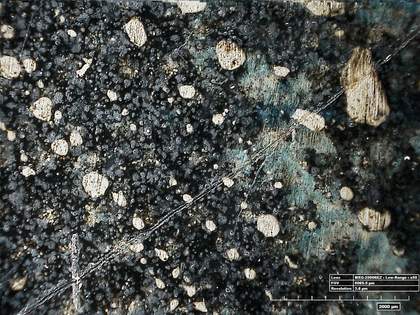
Fig.33b
High-resolution micrograph of the surface of the varnish
Photo © Tate
Both details in fig.33 show the spotted, opaque surface of the synthetic varnish, which seems to have been applied as a fine spray that dried before it was able to wet the surface.25 As a result, little pellets of varnish sit on the surface, scattering light and making it appear matte and grey. Analysis identified the varnish as the acrylic resin Paraloid B–67, the retouching having been done in the same material with some wax added.26 This material, invented after the Second World War and used by conservators in the mid-to-later twentieth century, strictly after Picabia’s lifetime, grows yellow and eventually brown with time, in contrast to the more stable acrylic varnishes used today. It also becomes more difficult to dissolve and remove. Today the painting appears darkened from the extremely yellowed original varnish and matte from the synthetic varnish on the surface, losing much of its depth and transparency.
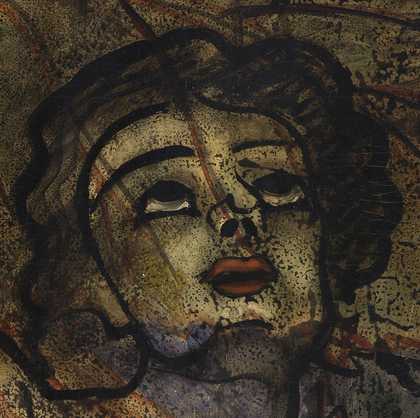
Fig.34a
Detail of face showing retouching to the proper right cheek
Photo © Tate
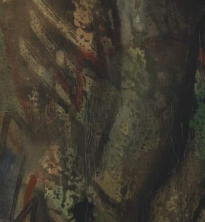
Fig.34b
Detail of torso showing rextensive retouching (in the centre of the image)
Photo © Tate
The retouchings are by now dense, opaque and muddy, and they jar slightly against the transparent layers of the painting (fig.34). Both the varnish and the retouchings are disfiguring and the painting would require a major treatment, begun by devising a sensitive method for separating the varnish and retouchings from Picabia’s varnish and glaze-like layers beneath. In contrast to most treatments involving varnish removal, the goal would be to leave all the original varnish layers present at their full (and variable) thickness, since they form the image, and it would be a challenging and lengthy treatment.
Conclusion
With Otaïti Picabia succeeded in creating a surface of such complexity that there are many questions about its facture that are still to be answered. The extreme thinness of some of the layers and the constant repainting make it a very difficult work to unravel technically, because no two areas of the painting are the same. Yet, despite having up to seven layers of material in places, the transmitted light image demonstrates the level of transparency achieved, before time began to conceal Picabia’s innovative techniques. He seems to have been at his most experimental during the creation of this work, not least with his careful choice of ground. He drew the figure in a material that resisted the initial oil-based layers by using dense lead white in an aqueous medium, and allowed the paint to break up into small islands to create a see-through line. Details were added with coloured glazes and black outlines and then a black veil was drawn over the bright colours, applied between upper varnishes. He went on to manipulate the appearance of the upper surface over this double varnish and black layer, playing with transparency and opacity to make certain features of the painting stand out or recede.
The many layers of the painting make it extremely fragile and there have been several losses to paint and varnish in the past. The fact that the painting received a new stretcher probably means that the original stretcher was unstable. That the painting has extensive cracking supports this idea. The surface has been re-varnished and retouched with little sensitivity to the technique and both these measures have compromised its transparency, but the canvas remains unlined, and the paint surface is still in plane with very few losses, which is a major achievement given its unorthodox sequence of paint application.
Despite the painting being darkened and matte, much of the transparency and complexity can still be appreciated. Picabia combined a contemporary ‘scandalous’ photograph with motifs from a Carracci painting and added a mysterious hand. The painting has survived intact and was not ‘destroyed’ by painting a new composition over the top, which seems to have been the fate of many of Picabia’s ‘transparency’ paintings. Although he did not make it as complex in its imagery as some such paintings, he seems to have revelled in the complexity of its materials and their unconventional use.
