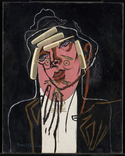
Fig.1
Francis Picabia
The Handsome Pork-Butcher
Oil paint, plastic combs and bone comb on canvas
92.4 x 73.7 cm
Tate T07108
© ADAGP, Paris and DACS, London 2017
The painting now known as The Handsome Pork-Butcher (fig.1) was begun by Francis Picabia as a collage in c.1924–6 featuring a portrait of a man identified as Raymond Poincaré, President and Prime Minister of France and a representative of the patriotic conservatism Picabia so despised. Around a decade later Picabia literally ripped off nearly all the collage elements and painted the outline of an elegant femme fatale over the ruins of the collaged face.
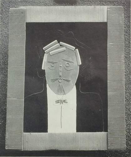
Fig.2
Photograph of Portrait c.1924–6 with original frame by Pierre Legrain as reproduced in Artwork: The International Quarterly of Arts and Crafts, vol.3, no.12, January–March 1928, p.249
Photo: Annette King
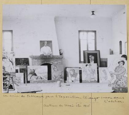
Fig.3
Photograph of Picabia’s studio in summer 1935 showing The Handsome Pork-Butcher leaning against the window in its original frame
Reproduced in Olga Mohler Picabia, Album Picabia, ed. by Beverley Calté, Brussels 2016, p.79
Photo: Suzanne Nagy
The materials and techniques of this painting are commonplace, but their deployment into a satirical portrait is unique, mimicking the distinctive figure of Poincaré which would likely have been unmistakable to the contemporary French public and therefore all the more scandalous. Initially known as Portrait or Portrait of Raymond Poincaré, the earlier painting was shown in an exhibition held at the Galerie Van Leer in Paris in 1927 in a frame designed by Pierre Legrain. It is only known from black and white photographs (fig.2). The painting’s later transformed state was first documented in a photograph of Picabia’s studio in the Chateau de Mai taken in the summer of 1935 (fig.3), which was discovered by Picabia scholar William Camfield in the album of cuttings and photographs made by the artist’s second wife Olga Mohler Picabia.1 This evidence gives the transformation of Portrait into The Handsome Pork-Butcher a latest possible date.
The early portrait: history and subject
Portrait began life as a collage of a pink-faced, portly man in white-tie formal dress. It is generally described as having been painted in Ripolin house paint, without supporting analytical evidence, and it included various commonly found materials such as combs and string for the hair, darning needles for eyebrows, toothpicks for the moustache and beard, curtain rings for the eyes and mouth, an eleven centimetre piece from a tape measure for the nose, pencil erasers as a wing collar and pen-nibs for the creases in the bow-tie. The stretcher has a handwritten date of 1921 written on it, the ‘1’ marked up over what looks like an earlier ‘3’.
Despite this date, this painting is not thought to belong to the earlier dada period collages, such as the famous Natures Mortes; Portrait de Cézanne, Portrait de Renoir, Portrait de Rembrandt 1920, but rather to a later group of paintings with collaged elements made between 1924 and 1926. These collages tended to be simpler in style and more figurative than the dada works of the late 1910s, and include portraits, landscapes and still lives in a gentler humorous style. One of the first such collages, Straws and Toothpicks 1923–4 (Kunsthaus Zürich), is an image of flowers constructed out of wooden straws, cord and quill toothpicks on what is thought to be a Ripolin ground. This also has a Pierre Legrain wooden frame, painted aluminium and studded with buttons. These collages, in Camfield’s words, were ‘Not very Dada, not witty, mocking or antiart; instead it has direct appeal, sensuous and very effective’.2
These works, which used collage in inventive ways, were usually completed by framing them with a creation every bit as unique. Picabia collaborated with Pierre Legrain and Rose Adler, both of whom made highly original, beautiful and often witty one-off frames, which included features such as snakeskin, transparent plastic tubes made from the new material Perspex, coloured mirrors and simple materials such as buttons, corrugated cardboard and emery paper. The frame made for Portrait is now lost; the painting arrived at Tate without it. Indeed, most Legrain creations are now lost, and where these frames do still exist they are particularly highly prized. As art historian Maria Lluisa Borras has pointed out, ‘Using a signed piece to frame an imitation of painting is once again a Dada action and at the same time in line with the spirit of Picabia’s writing during this period which denounced the inconsistency of the scale of values employed in the art market’.3
The photograph of Portrait in its Legrain frame taken at the Galerie Van Leer in Paris in 1927 was reproduced in the British periodical Artwork the following year (see fig.2). An accompanying article commented on the work:
Picabia’s use of materials other than oil-paint, as in the portrait reproduced, with its combs, pins etc., surely needs no defence. It is a trick of course, as the application of gold and jewels to mediaeval pictures is a trick, as oil-painting itself was a trick when first used. Constant renewal of technique is one of the principal means by which an artist escapes the prison of his own style, as much a necessity as escape from the prison of another’s style.4
The Galerie Van Leer exhibition was Picabia’s first one-man show. He showed only nineteen works, undoubtedly chosen with great care from among his most surrealist creations, including collages such as Combs, Needles, Rubbers and Feathers, Boats Coming Home and Portrait.5 While the painting was known simply as Portrait, it was widely identified as Portrait of Raymond Poincaré. It was described as such in a letter from 1926 by artist El Lissitzky, who with his future wife Sophie Kueppers suggested that the work may have been among those that Kueppers solicited from Paris artists in mid-1925 to show in her exhibitions of contemporary art in Dresden in 1926. Unfortunately, the exhibition had no catalogue, although a photograph was taken of the installation in Dresden.6 It was Kueppers who called the work Portrait of Poincaré and described the need to hide it at the inauguration of the exhibition, for fear of the scandal it would provoke.
This painted satire of Poincaré appears to chime with what the surrealist André Breton wrote about the French Prime Minister in his 1926 essay Légitime défense: ‘We consider the presence of M. Poincaré at the head of the French government to be a serious obstacle to all serious thought, an almost gratuitous insult to the spirit and a ferocious joke which should not be allowed to pass’.7 Raymond Poincaré was a French statesman who served three times as Prime Minister (1912−13, 1922−24 and 1926−29), and for seven years as President (1913−20). Trained as a lawyer, he was a formidable intellectual and between 1913 and 1934 he published ten volumes of memoirs titled Au service de la France. He was born in Lorraine where he witnessed first-hand the Prussian occupation and, in the words of British Prime Minister David Lloyd George, was ‘brought up in sight of the German eagle waving over the ravished provinces of France, [which] bred in him an implacable enmity of Germany and all Germans’.8 Opinions on his effectiveness as a leader are divided, but there is no doubt he was a powerful figure during the crucial years after the First World War. He had an implacable attitude towards Germany and refused to show any clemency after the war, demanding with military force − a full-scale French invasion of the Ruhr − that all reparations were paid in full. For this he is viewed by some as the catalyst for the utter collapse of Germany, the rise of National Socialism and the disaster of the Second World War. He was a patriot and believed in the supremacy of France. It is possibly everything that Poincaré represented – conservative, nationalistic and hard-nosed – that provoked the comments from Breton and this lampooning portrait by Picabia.
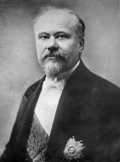
Fig.4
Photograph of Raymond Poincaré as President of the Republic of France, 1914
Photo courtesy Encyclopædia Britannica, Inc.
Source: https://www.britannica.com/biography/Raymond-Poincare
However, an alternative interpretation of the painting’s subject has been offered by curator Gérard Audinet:
At these dates Raymond Poincaré is in Business. Nothing surprising to see this portrait baptised with the name of the man who stabilised the franc by indexing it to gold, and the rentier Picabia, whose fortune had been decimated by the devaluations of the war and then the construction of the Chateau de Mai, in his own way paying casual and mocking homage.9
Poincaré is also known to have bought one of Picabia’s ‘impressionist’ works earlier in the artist’s career. Audinet notes that Poincaré died in October 1934 and that Picabia had transformed the portrait by summer 1935 ‘as if the portrait should not outlive its model, but metamorphose. Accompanying its model in its destiny, the painting is also mortal, ephemeral, denying all redemption in the immortality of art to the profit of a vitality of the instant’.10
Despite the low-art materials used in this portrait, there is a remarkable likeness between the collage portrait (see fig.2) and an official photograph of Poincaré from 1914 (fig.4). The statesman’s image was ever-present in contemporary France and internationally, his face appearing on coins, postage stamps and postcards. There are numerous photographs of him with world leaders, particularly British and Russian, and he even appeared on the cover of Time magazine in 1924.11 A year earlier he was depicted in a cartoon in Le Journal in which an emaciated child is brought in on a platter for his consumption, accompanied by the caption ‘Poincaré eats the children of the Ruhr’.12 In short, his image was a recognisable trope and therefore perfect fodder for a satirical portrait designed to provoke and antagonise the highest echelons of conservative society.
Technical analysis of the earlier painting
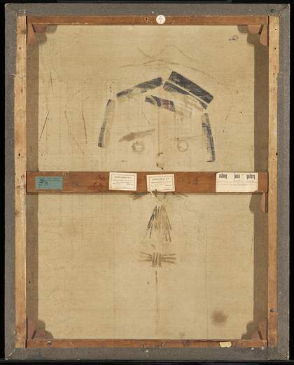
Fig.5
Reverse of The Handsome Pork-Butcher c.1924–6, c.1929–35 showing the stretcher
Photo © Tate

Fig.6
Detail of the emery fabric around the edge of the painting with rust coming through from tacks beneath
Photo © Tate
The canvas support for this painting (fig.5) is a standard French stretcher size, 30 Figure (92 x 73 cm), as evidenced by the upside-down colourmaker’s stamp ‘30 F’ in the centre of the lower stretcher member. The corners have been expanded slightly over time, which accounts for the current measurements of 924 mm x 737 mm. The canvas is exceptionally fine (29 warp threads per centimetre and 26 for the weft) and it appears to have retained its original attachment to the stretcher. There are multiple pin holes in the corners of the canvas which suggest it was stacked with drawing pin-type separators when in progress. The tacking margins are covered with an emery-coated canvas fabric which goes over the tacks (fig.6). These tacks are now rusty and stain the material from beneath. On the front of the work, black paint from the painting goes over the edges of the emery fabric (fig.7), which suggests that it was in place when the black paint was applied. It is interesting to note in the black and white photograph of the framed painting (fig.2) that the edges of the painting are not visible within the frame, so the emery fabric was not applied for visual effect when on display.
It is not clear whether Picabia ordered a commercial stretcher and requested this addition of emery fabric from the colourmaker, or whether he applied it himself. The tacks which attach the canvas to the stretcher lie under the emery fabric. It is probable that the emery fabric inspired the lost frame attributed to Pierre Legrain, which also featured emery paper or fabric along with corrugated cardboard, but it is not recorded whether they were conceived simultaneously or if it was an afterthought. The black paint which just spills over onto the emery fabric is very similar in hue to the original paint, which suggests that the fabric was already in place when the black paint was applied.
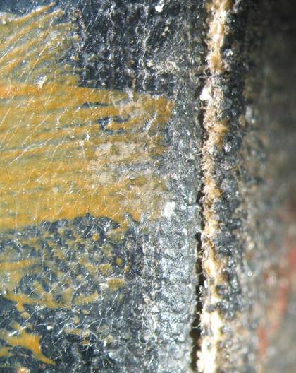
Fig.7
Detail of front edge of emery fabric with remnants of black paint
Photo © Tate
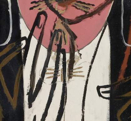
Fig.8
Detail showing the outline of the face and torso with exposed ground and black underpainting
Photo © Tate
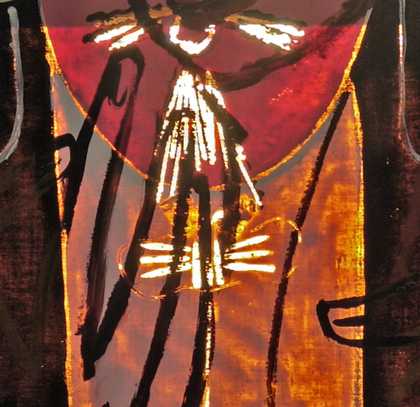
Fig.9
Detail of gap left between the face, shirt and jacket shown under transmitted light
Photo © Tate
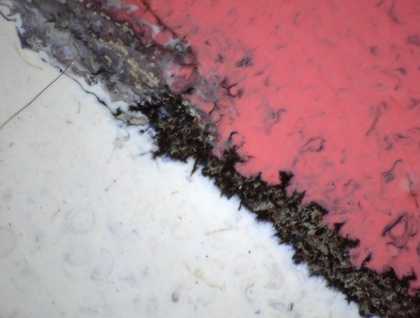
Fig.10
Detail of fluid black underpainting bleeding into wet pink and wet white paints between the face and the shirt
Photo © Tate
The painting has a white ground, thinly applied and most probably prepared commercially by the colourman. It was applied in a single layer, and analysis of the top side of the ground suggests that it consists of lead white, some chalk and small amounts of kaolin.13 From close examination of the surface it seems that Picabia began by outlining the face and torso of the man with a dilute line of black paint, presumed to be oil-based (fig.8). Glimpses of this were left visible around the contour of the face and shirt (fig.9). The ground remains visible between the shirt and the black background. Picabia then applied the pink, white and black paints in flat planes of colour, abutting one another, but not overlapping. The black outline was still wet when the pink and white paints were added, as these have mingled with the black causing the characteristic wet-in-wet marbling that is seen in other works by Picabia, where it also looks intentional (fig.10). This technique of laying in adjacent areas of colour is familiar from other paintings by Picabia, notably The Fig Leaf 1922 (Tate T03845). It is likely that Picabia started with the painting lying flat to paint these areas as there are no vertical drips and the areas of paint remain quite separate and do not run into one another. The white of the shirt ends neatly just before the base of the canvas and does not encroach on the edges. The black at all other edges does appear to go over them in places and it can be seen on top of the emery fabric. As the edges are covered by the emery fabric and the foldover edges are not visible, it is impossible to see whether any drips might have run over the edges. However, this is the technique deployed in other collages of similar date; Midi (Promenade des Anglais) 1924–5 (Yale University Art Gallery, New Haven), for example, has runs of colour on the foldover edges where the paint was applied while the painting was laid flat, creating drips.14
It was into these thickly applied layers of paint that Picabia laid in the collage elements and allowed the drying paint to act as the adhesive, rather than adding glue. The varnish that was applied to still-wet paint might have assisted in retaining them in place.
Figs.11a–c
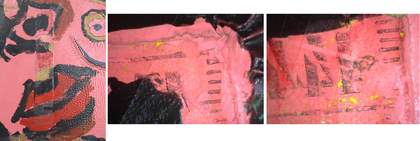
Details of imprint of the original tape measure including micrographs of ink and paint left on the surface
Photo © Tate
As noted earlier, Picabia used curtain rings for the eyes and mouth, darning needles for the eyebrows, toothpicks for the moustache and goatee beard and an eleven centimetre fragment of a tape measure for the nose. The tape measure fragment can still be seen in negative, since when it was ripped off it left an ink imprint of the centimetre markings, and some fragments of yellow paint embedded in the pink paint surface can be seen (figs.11a–c).
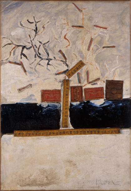
Fig.12
Francis Picabia
The Tape Measures 1923–5
Oil and collage on canvas
56 x 39 cm
Israel Museum, Jerusalem
© ADAGP, Paris and DACS, London 2017
Photo courtesy Israel Museum, Jerusalem

Fig.13
Detail of The Tape Measures 1923–5 showing central tape measure fragment
© ADAGP, Paris and DACS, London 2017
Photo courtesy Israel Museum, Jerusalem
Camfield has linked this section of tape measure to a work called The Tape Measures 1923–5 (Israel Museum, Jerusalem), which incorporates the rest of the tape measure, cut into several pieces (fig.12).15 The central tape measure fragment in The Tape Measures begins with the number twelve, suggesting that an eleven centimetre piece was cut off (fig.13). The only legible number on The Handsome Pork-Butcher is 144 reversed. Tape measures commonly have two sets of numbers running in reverse order on each side, starting at number one on one side and number 150 on the other. The tape measure fragments in The Tape Measures only go up to number sixty-two, which implies the last length of the tape is also missing. The black and white photograph printed in 1928 (fig.2) is just clear enough to see the numbers, and the imprint of 144 would suggest that the tape measure was stuck on with the right-side numbers upside down, running from one at the base to eleven at the top. The fragments of yellow paint on the surface of The Handsome Pork-Butcher also match with the yellow tape on The Tape Measures. The shapes of the numbers in 144 also look very similar to the digits in The Tape Measures, which suggests that these two paintings shared the same tape measure.
Camfield speculated on the reason behind Picabia’s use of tape measures:
Rich colours and varied forms and textures strike an immediate sensuous appeal that may be savoured with or without the intellectual possibilities suggested first of all by the broken meter tape – a symbol of rationality and order which brings to mind Duchamp’s Three Standard Stoppages. The tape is arranged so that, in conjunction with the loosely brushed paint and matches (sticks which make fire) it suggests a ‘tree’ or ‘fiery eruption’. But any simple perception of ground plane and sky is confounded by small, radiating ‘suns’ etched into the field of white paint at the ‘bottom’ of the composition.16
Perhaps the use of a tape measure can be related to Poincaré’s monetary policies, or maybe it was just to hand and fitted the bill for a nose. That it was attached upside down might be another way of turning order on its head. It would have provided a bright yellow line of colour in the middle of a pink face, which would have been striking if not jarring.
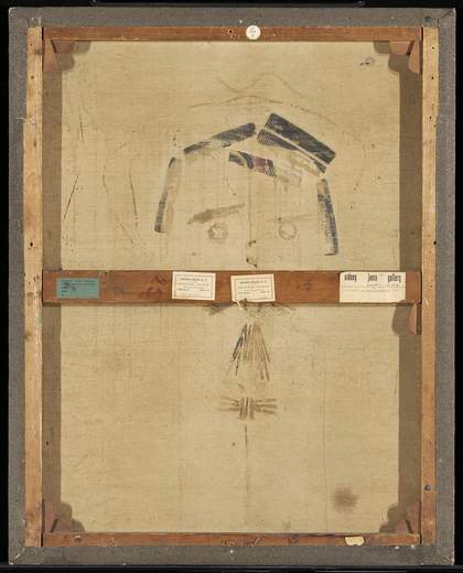
Fig.14
Reverse of The Handsome Pork-Butcher c.1924–6, c.1929–35 showing original position of combs
Photo © Tate
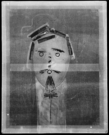
Fig.15
X-radiograph of The Handsome Pork-Butcher c.1924–6, c.1929–35 showing the original position of combs relative to the newer combs
Photo © Tate
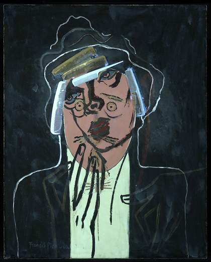
Fig.16
The Handsome Pork-Butcher c.1924–6, c.1929–35 under ultraviolet (UV) light
Photo © Tate
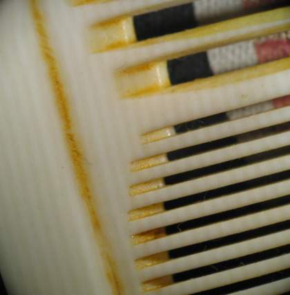
Fig.17
Detail of bone comb showing striations
Photo © Tate
Picabia used combs to create the hair of the first portrait. Initially there were six combs which show as black stains on the reverse of the canvas (fig.14) and are dark in the X-radiograph (fig.15) because the flattened paint beneath them is very thin. It is notable that the combs were attached to wet black paint, which was slower to dry and weaker than the pigment-rich white or pink areas. The combs pushed black paint through to the back of the work, and the subsequent colours applied for the woman’s outline have also come through to the back. In the X-radiograph the original six combs show as black outlines, which have the ghostly white shapes of the current combs behind them. It is possible that the weak bond with the black paint (and its varnish) caused the combs to come loose at some point and prompted the canvas to be revisited by Picabia. The combs are made of various different materials, as becomes obvious when the surface is examined in ultraviolet light (fig.16). One comb on the right-hand side of the painting appears to be made of bone, with characteristic striations when magnified (fig.17).
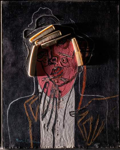
Fig.18
The Handsome Pork-Butcher c.1924–6, c.1929–35 under raking light from left
Photo © Tate
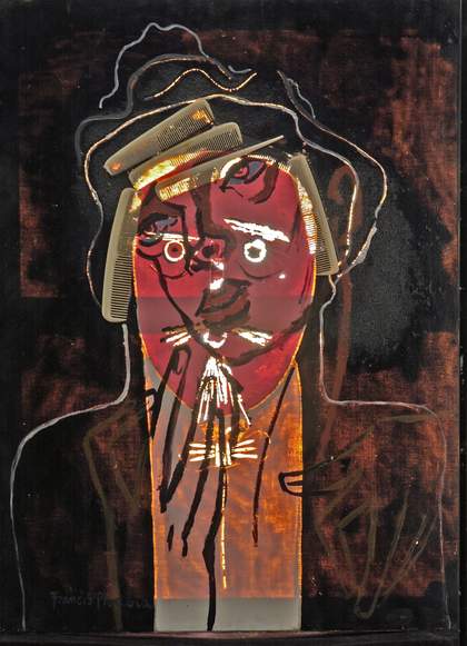
Fig.19
The Handsome Pork-Butcher c.1924–6, c.1929–35 under transmitted light
Photo © Tate
Another interesting feature of the hair for the first figure is that the black paint is thick and wrinkled, while the black of the background is thin and may have been rubbed away in places. The thicker black paint around the head has wrinkled considerably, as can be seen both in raking light (fig.18) and in transmitted light (fig.19). It has a distinctive appearance in ultraviolet light too (see fig.16). It is not known whether Picabia intended to create the wrinkled effect, but it is very specific to the area confined by the string outlines. The black and white photograph of Poincaré from 1914 (fig.4) shows that he had a curly beard and presumably curly or wiry hair too, although it is less visible in that image. The effect of the wrinkles is that of a textured area for the hair, which fits very well with the design.
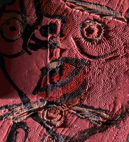
Fig.20
Detail of face under raking light from left showing wrinkled paint
Photo © Tate
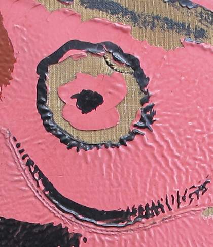
Fig.21
Detail of right eye showing wrinkled paint and tear in the canvas
Photo © Tate
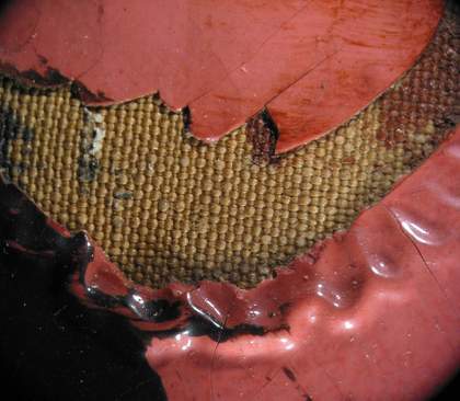
Fig.22
Detail of area around the mouth of the male head showing wrinkled paint
Photo © Tate
There is also dramatic wrinkling in the pink face (fig.20), but this seems to be the effect of a thick pool of pink paint which has been left to settle and dry, the surface again drying more rapidly than the body of the paint. The paint has been pushed up by the pressure exerted on the collage rings of eyes and mouth, and even more dramatic wrinkles delineate the circles of the eye on the right (fig.21) and the mouth of the first figure (fig.22).
Picabia’s choice of paints
According to anecdotes, Picabia used Ripolin in this painting. The glossy appearance of the paint, with dense colouration, wrinkling and almost complete absence of brittle cracking, would support this idea. These features were designed into commercial paints. However, the analysis of the paints offers a slightly confusing picture: the glossy black paint around the head is made from heat-bodied linseed oil with varying proportions of rosin (also known as colophony).17 Some of the areas examined from the black background were almost transparent: they consist of a varnish applied to the first image, not absorbed into the paint. Other areas absorbed the varnish, and they are the most wrinkled ones, and include the largest amount of rosin. The rosin (a natural resin, and one of the cheaper types, making it more likely to be found in a commercial product than a varnish sold for fine art use) must therefore constitute the varnish of the earlier image. The patchy absorption suggests early varnishing of paint not yet dried.
The black pigment is likely to be a carbon black such as lamp black.18 Lead white is included, and several extenders are present including chalk, gypsum and silica, possibly with Prussian blue as well, which would have been added by the paint maker to give a cooler and less brown black than pure lamp black. Zinc soaps are present, both amorphous and crystalline, in all the paint samples, but zinc white is never the only white pigment in these paints. The pink paint includes red organic pigment(s) that could not be identified with confidence using the techniques available, zinc white with barium sulphate (or lithopone, the combination of these), and chalk/gypsum extenders and zinc stearates (these could be from naturally aged zinc white, but could also be added to commercial paints). These constituents are very well-dispersed, and the pink paint must therefore be a commercial product. The pink paint also includes faded yellow pigment in its uppermost portion, which would have given it a more orange tone when new, and therefore it appears redder today than it should, and even less realistic as flesh paint. Such paints are not artists’ tube paints, but neither do they match well-analysed commercial paints such as the Ripolin range, which at this date included zinc white as the only white pigment, and had a markedly small proportion of extenders. Tube paints can include heat-bodied oils, which were more common in commercial paints at this period, but such oils could also be purchased by artists and added to tube paint to increase gloss.
These results do not rule out a Ripolin paint mixed with an artists’ paint or other paint containing lead white, heat-bodied oil and/or a reasonable amount of extenders, or even a commercial paint of a brand not yet studied by analysing historic samples. However, they do match the findings of a broader study into Picabia’s paints with a ‘Ripolin look’, which concluded that the use of Ripolin alone was evidenced by analysis only in a minority of cases, and that more likely Picabia added resins and/or heat-bodied oils to his own (artists’ tube) paint to achieve the gloss, smooth surface and capability for forming thick layers that he required.19
Wrinkling, to a commercial manufacturer, is the sign of a non-optimised paint formulation. To Picabia it might initially have been an unpredictable consequence of using paint with the desired handling and flow. But it could have become a feature he chose to incorporate into the image, for the hair in this instance. The analytical finding of more rosin in the wrinkled black paint for the hair, compared to the black paint in the background, could be interpreted as a controlled manipulation of the paint formulation with additions of rosin-based varnish to ensure a desired surface effect, rather than uneven absorption of the varnish. By using a single resin for varnish and putative paint modifier, Picabia has left us with a question that paint analysis cannot resolve. That he set out to create wrinkled paint for the hair by manipulating the paint formulation would be within his experience and capabilities, and it remains a reasonable interpretation.
However, there is another possibility. Paint designed to wrinkle was available in the early part of the twentieth century, and published illustrations of its appearance show a similar appearance to Picabia’s paint.20 Did he select such a commercial paint? These paints were generally formulated with comparable materials to his own (modified oils including some never found in artists’ tube paints, and added resins that could include rosin), so the analytical results could be interpreted as a wrinkle paint.21 But the black paint of the background is not wrinkled, yet has the same constituents to the black paint of the hair, differing only in proportions. It seems more likely that one type of black paint was manipulated by Picabia, to create a wrinkled texture in specific areas.
Technical analysis of the later painting
At an unknown date before summer 1935 (see fig.3), Picabia ripped off the collage elements taking with them both paint and ground, leaving areas of bare canvas, and even causing tears in the canvas where the removal was particularly violent (see fig.21). Picabia tore off some but not quite all of the string around the hair and he removed all the original combs, if they had not already slid downwards and at last fallen off one by one, as discussed earlier. On top of the ruins of the collage portrait, Picabia painted the outline, heavy-lidded eyes and vampish red lips of a femme fatale, her long-fingered hands draped provocatively over the shoulders of the rather surprised-looking male face underneath. The female figure is dominant and the male one looks emasculated and powerless.
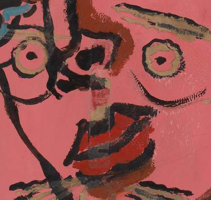
Fig.23
Detail showing rust brown contours of the female face
Photo © Tate
The outline of the woman was painted directly over the resulting losses in the face and body of the first portrait, the paint penetrating the bare canvas and staining the reverse. The eyes of the woman were outlined in black, and then blue was added to what would normally be the whites of her eyes. The features of her face are shadowed with a rust brown contour (fig.23), but the shadows do not follow any particularly directional light and seem rather random. The ear and neck contour are painted in a similar rust colour and overlie the wrinkles in the black paint, suggesting that the wrinkles belonged to the first portrait rather than being additions to the second. On top of the outlines of her face and eyes, Picabia added five combs and adhered them with animal skin glue. It seems the glue was applied liberally to the surface of the paint rather than the combs. The combs have slipped down the surface of the painting slightly, leaving areas of adhesive exposed. The bond between the combs and the painting is very weak and fragile. The new combs lie on top of the latest layers of paint and were added with adhesive once the woman’s profile was complete. The light-coloured combs give the impression of blonde hair, while they also conform to the outline of the previous male head, which was formed by string pressed into the paint. These outlines have been emphasised with white paint, which lies in the gap where the string was removed. The line of string which was left in the paint has received a grey border. The white lines around the hair have been augmented and painted over the exposed canvas where the string was removed. A new higher contour line has been added at the summit of the hair. The white lines which formed the shoulders of the earlier Portrait have been delineated with new white paint and the line goes over the paint of the hands on the right side. This white line seems to have been applied last as it also goes over the rust-brown of the ear and neck. The contour of the shoulders and neck still follow the original lines of the male figure and are not feminine in shape. Picabia also added a signature in the lower left corner over the brown outline of the woman’s hand (see fig.1).
Interestingly, at the same time as painting the woman, Picabia emphasised the remains of the first face. He painted black outlines around the eyes and in the eyebrows. He similarly created sagging bags underneath the eyes and emphasised the whiskers of the initial portrait. This was done after the collage elements were removed, because it is obvious that the black is lying directly on the exposed canvas, laid bare only after their demise. This creates the bizarre impression of blemishes on the woman’s cheeks and whiskers on her chin, whether intended or not. This also recalls the existence of the previous image, while at the same time overwhelming it with this feminine contour. Picabia seems to have been at pains to create a double portrait, with both forms existing in their own planes but also interlocking and seemingly inseparable. This is an interesting ‘destruction’ of his work, using the first portrait as a ready-made image that has then been altered, overpowered and then partially augmented rather than hidden.
Conclusion
The earlier Portrait was painted at a time of great experimentation for Picabia, when he was moving away from the dada movement, yet some of the dada scurrility remains in his portrayal of the President of the French Republic. The use of collage is significant; it is not just a convenient source of materials but reflects an active attempt to move away from the materials and techniques traditionally used by artists. The fact that he captured a caricature in curtain rings, needles, a tape measure and string among other items is remarkable, and a tribute to his skill as an artist.
Poincaré’s death in 1934 may have been the cause for revisiting this painting and changing it so dramatically. Or it may have been something as mundane as the combs becoming detached. Or both. Either way, it was extreme in its effect, leading Picabia to literally break the surface of the paint by ripping off the collage elements, destroying the past for a new and current image. The face and hands of the woman are painted in outline, reminiscent of his ‘transparencies’ from 1928–32, where overlapping contours of recognisable images are layered within transparent layers of varnish and oil glazes. Here the outlines are opaque, thick oil paint, applied liberally enough to seep through to the reverse and fill the areas left empty by the collage elements. At the same time Picabia picked out certain features of the male portrait below. The title The Handsome Pork-Butcher remains unexplained. Anecdotally, the Germans are fond of their sausages and such stereotypes would have been revisited in the post-First World War period. It has been mentioned already that Poincaré was considered a butcher for invading Germany in 1923 to force the payment of war damages. Perhaps, then, the title makes an insulting reference to Poincaré’s hostility towards Germany.
Tate paid tribute to the original Legrain frame by creating a new frame covered in emery paper, and the emery-covered edges of the painting are now visible within the frame. However, the whole frame is today protected with glazing, and the fragility of the remaining collage elements mean that it cannot travel. From lowly beginnings it is now a highly prized and valuable museum piece. Its innovation and creative power is undiminished, and it remains one of Picabia’s most striking and intriguing works.
