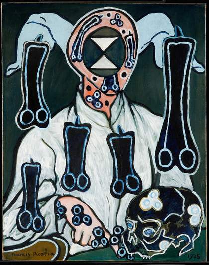
Fig.1
Francis Picabia
Portrait of a Doctor c.1935–1947
92 cm x 72.8 cm
Tate T05804
© ADAGP, Paris and DACS, London 2017
Portrait of a Doctor (fig.1) is thought to have been begun around 1935 and was painted in two distinct campaigns separated by a number of years. Photographs of the painting exist in the album of the artist’s second wife, Olga Mohler Picabia, and show a disarmingly simple portrait of a pensive figure pointing to a table bearing a skull in the manner of a memento mori. It was exhibited in Chicago in 1936 but without critical and commercial success, which led Picabia to ‘destroy’ it by painting over it in a radical way. He painted unexplained phallic shapes over the body of the figure, added other shapes described as splayed ‘legs’ or even cuckold horns around the head, repainted the shirt, blocked out the face and altered the skull. Opinion is divided as to whether this took place in 1938 or later, as will be discussed in this paper, but it was certainly during this second campaign of painting that Picabia added the fictitious date of 1925. The symbolism of the changes is obscure and it is not known why Picabia chose to obliterate some parts of the painting yet leave so much of the original composition visible. The final painting is a unique work of unusual complexity, which defies easy understanding both visually and technically.
Portrait of a Doctor c.1935
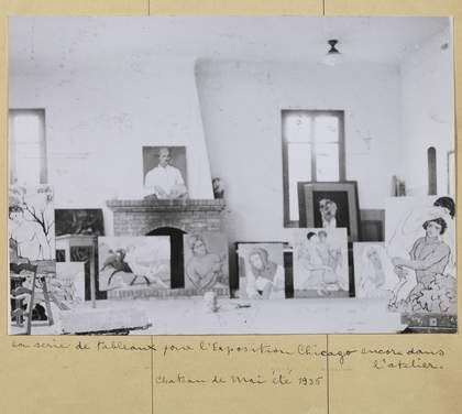
Fig.2
Photograph of Picabia’s studio in summer 1935 showing Portrait of a Doctor on top of the mantelpiece
Photo: Suzanne Nagy
Reproduced in Olga Mohler Picabia, Album Picabia, ed. by Beverley Calté, Brussels 2016
The first iteration of Portrait of a Doctor appears in a photograph of Picabia’s studio at the Château de Mai, Mougins, leaning on top of the mantelpiece unframed (fig.2), which indicates that it was complete before August 1935, when the house was sold following the collapse of Picabia’s relationship with Germaine Everling.1 Below the photograph Olga Mohler Picabia wrote: ‘The series of paintings for the Chicago Exhibition, still in the studio. Chateau de Mai summer 1935’. Picabia had started a new life in 1935, residing on a yacht with the young Olga Mohler, who had first entered the household as a nanny for the artist’s son.
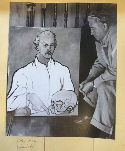
Fig.3
Photograph of Picabia with Portrait of a Doctor c.1935
Photo: Suzanne Nagy
Reproduced in Olga Mohler Picabia, Album Picabia, ed. by Beverley Calté, Brussels 2016
Another photograph from the same album offers a much closer view of Portrait of a Doctor (fig.3). It shows a relatively conventional portrait of a man in a white shirt, seated with his forearm resting on the arm of a chair, pointing down to a desk upon which sits a skull. The shirt appears startlingly white and the figure and details are starkly outlined with black, but the rest of the portrait in this black and white photograph has a brushy background, while the starkness is broken up by shadows beneath the skull, the arm and in the creases of the shirt.
Like the photograph of the studio, Olga Mohler dated this image ‘summer 1935’ in her album, and added the word ‘detruit’ (destroyed) in brackets. These early photographs confirm that the date of 1925 must have been painted onto the canvas later. It is not known why Picabia chose to add this fictitious date, but it is characteristic of his subversive tendency to play with dates in the tradition of dada. Art historian Arnauld Pierre has remarked: ‘Picabia indulges himself in such methods of mystification by using fantasy dates or parodies of signatures. This gives him the opportunity to attack the symbolic marks of authenticity and originality of a work’.2 It is a recurring theme throughout his career and it is wise not to take inscriptions or dates at face value.
Portrait of a Doctor is widely thought to be a portrait of a close friend of Picabia and Olga Mohler, Dr Gaston Raulot-Lapointe. He and his wife, nicknamed ‘Celli’ owing to her facial resemblance to a Botticelli painting, hosted the Picabias on numerous occasions and the two couples moored their yachts together at Cannes. Raulot-Lapointe was one of the early researchers into radiology. His research interests included radiography of the malpighian epithelioma, the thyroid and asthma. He also researched the development of malignant tumours on Roentgen ulcers, radio-diagnostics to investigate bone alteration or myopathies, and the way radiation affected the heart and aorta, stomach and large intestine.3 A publication about cholecystography (the X-ray examination of the gall bladder, particularly to detect gallstones) in 1932 apparently marked the end of his scientific career due to ill health. As well as being a prominent medical researcher, he had a distinguished military career as an army doctor, earned the Order of Stanislas after the First World War and was named Chevalier of the Legion of Honour in 1921 and Officer in 1935.4
After his stellar career he suffered ‘a long and cruel illness, which could not be beaten by the devoted care of his companion or the talent of his medical friends’, and died on Christmas day 1946.5 Perhaps his early work with X-rays had caused him irreparable or even fatal damage. If Raulot-Lapointe had been forced to give up his career for medical reasons, he may well have been confronting his own mortality. This could explain the presence of the skull in Picabia’s painting, while also perhaps pointing to Raulot-Lapointe’s profession.
The works pictured in the studio at the Château de Mai were noted by Olga to be part of a group of paintings sent to Chicago for the exhibition Paintings by Francis Picabia, organised by the writer and critic Gertrude Stein and held at the Arts Club of Chicago in January 1936. Picabia worked tirelessly on this series of paintings and was deeply disappointed when they were returned to him after the exhibition, only two of them having been sold. According to Picabia scholar William Camfield, the artist considered them ‘significant paintings, not jokes or burlesques of contemporary naturalistic art’, which is how they were misunderstood by some critics.6 Camfield also described this series of works as being ‘characterized by deliberately simplified, heavily outlined and solid images in which transparency is wholly eliminated. In some instances the forms are summarily modeled in light and dark, but for the most part those boldly contoured figures are filled in with bright, flat colours or washed over with a dark, monochromatic blue-green tone’.7
This description would appear to apply to Portrait of a Doctor as seen in the black and white photographs from Olga Mohler’s album. However, close study of the paint surface produced some surprising results. The simplicity of its appearance disguises a complex technique. The highly brushed background in the black and white photographs is in fact a transparent blue layer sandwiched between varnishes, which still forms the background today. This technique appears to have evolved from Picabia’s earlier series of ‘transparencies’ (1928–32), consisting of delicate, dream-like images superimposed on top of each other. By 1933 Picabia had moved on from creating paintings with complex layers of images and had developed a more naturalistic style that, in his words, was ‘more powerful, more simple, more human’.8 Camfield has noted that the Portrait of Gertrude Stein 1933 was one of the first to be depicted in this manner, although this painting was ‘neither conceived nor executed as merely naturalistic’.9 Picabia painted Stein in a direct manner, heavily outlined, loosely brushed in muted colours, but the simplicity of the final portrait is deceptive although the concerns that Stein identified in her account below are not readily obvious:
Picabia has conceived and is struggling with the problem that a line should have the vibration of a musical sound and that this vibration should be the result of conceiving the human form and the human face in so tenuous a fashion that it would induce such a vibration in the line forming it. It is his way of achieving the disembodied. It was this idea that conceived mathematically influenced Marcel Duchamp and produced his The Nude Descending the Staircase.
All his life Picabia has struggled to dominate and achieve this conception. Gertrude Stein thinks that perhaps he is now approaching the solution of his problem … He who is going to be the creator of the vibrant line knows that it is not yet created and if it were it would not exist by itself, it would be dependent upon the emotion of the object which compels the vibration. So much for the creator and his followers.10
1933 was also a year in which Picabia had to seek medical advice when emotional and psychological pressures combined to make him physically ill. In July 1934, however, he wrote to Stein saying: ‘I am working a great deal … it does not go badly, you will see, it seems to me that that my painting is stronger, simpler, more harmonious; those several months when I was obliged to do nothing may have been a good thing.’11
It seems that Picabia was in search of a painting technique which could convey a new realism in simple terms, but at the same time he wanted to achieve a vibration of line, similar to the effect of music. His discussions with Stein bear out the sincerity and the serious intention with which he embarked on this new body of work in the early 1930s, so his bitter disappointment at the lack of success of the Chicago exhibition is understandable. This may also form part of the reasoning behind the ultimate ‘destruction’ of this work in the second campaign of painting.
Technical analysis of the earlier painting
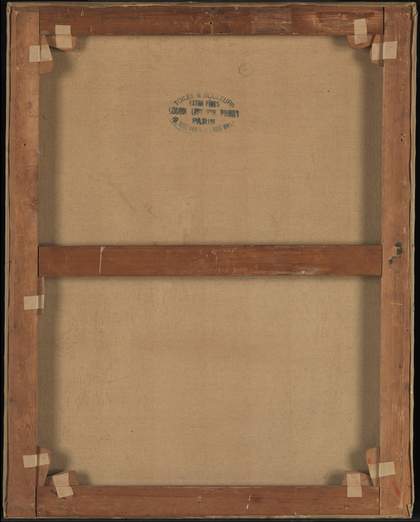
Fig.4
Reverse of Portrait of a Doctor showing the original stretcher
Photo © Tate
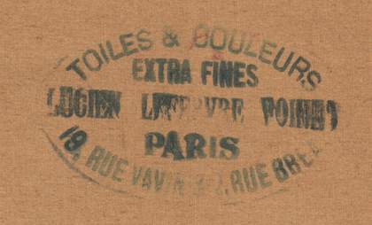
Fig.5
Detail of canvas stamp on reverse of Portrait of a Doctor
Photo © Tate
The stretcher is made of softwood and is a standard French size ‘30F’ or ‘Figure’ (92 x 73 cm).12 This is the original stretcher, with the canvas fixed to the sides with the original ferrous tacks, and very closely cropped in line with the back edge of the stretcher to leave little spare fabric (fig.4). These seem to be the original fixing holes in the canvas, but there are other holes where the canvas is slightly torn that might have been part of the original attachment. The fine canvas is plainly woven with twenty-seven threads per centimetre for both warp and weft, the warp direction being horizontal to the picture plane. It was prepared with glue size and it has a commercially applied white ground, as was typical for such ready-stretched supports. On its reverse is a clearly legible canvas stamp for the artists’ colourmaker Lucien Lefebvre-Foinet (fig.5).13
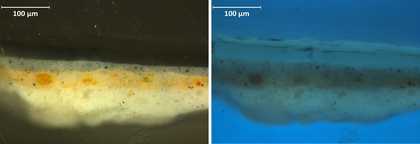
Fig.6
Cross-section of paint from left of canvas (shirt sleeve) in visible light and ultraviolet light
Photo © Tate
The ground is made with lead white pigment in oil. On top of the white ground there is a yellow priming, also oil-based, with lead white, yellow ochre and traces of red ochre and fine bone black (fig.6).14 The pigments seem too poorly dispersed to have been commercially prepared by thorough hand grinding or machine grinding, so it is likely that it was applied by Picabia himself. Both layers of priming are made from coarse-grained lead white produced by a traditional process, and both have developed large aggregates of lead soaps through a chemical reaction between the lead white and the oil medium, which are beginning to deform the priming layer upwards. Above the yellow layer, in the area sampled, there is a thin blue/grey opaque paint layer. This cool grey layer is made up of lead white, fine bone black and traces of red earth and cobalt blue, in an oil-based medium. These layers are all made from conventional artists’ oil paints.
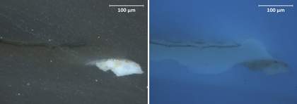
Fig.7
Cross-section of only the top-most layers of varnish in visible light and ultraviolet light
Photo © Tate
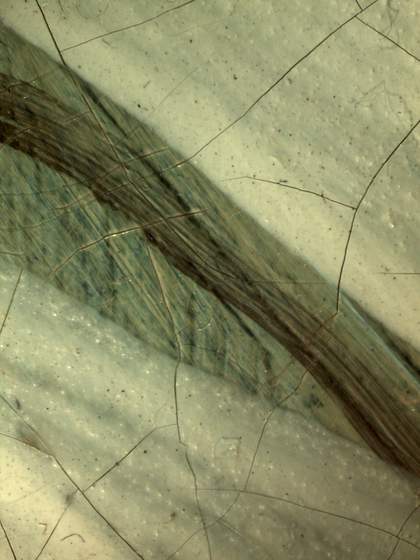
Fig.8
Detail of the base of the collar
Photo © Tate
Picabia laid in the portrait and figure, the shirt, and the skull in combinations of white, flesh colour and black outlines. He covered the painting with a thick layer of natural resin varnish. On top, he applied an extremely thin layer of what appears to be pure Prussian blue, applied in a brushy technique which rather than forming a solid sheet of colour, has the effect of translucency, but at the same time creating a textured surface appearance.15 He then finally added another thick application of the same type of varnish (fig.7). This layer of blue between varnishes seems to have been used to form the light and shade in the painting and to create a vibrant texture. An example is seen in the detail taken from the area of the shirt collar (fig.8). Between the opaque white lines there is a yellower background with blue stripes and a black line, which also appears transparent owing to the brushy application. This layer is representative of the original appearance of the shirt, but is more yellow/green in tone because the varnish has aged.
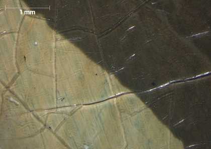
Fig.9
Micrograph of shirt and solid black outline showing blue layer between two layers of varnish
Photo © Tate
Picabia produced the shadows in the shirt by applying the Prussian blue layer more thickly, whereas the highlights have a very light application of this brushy layer. The second application of varnish sandwiched the blue, brushy layer between two transparent layers of varnish, giving it the appearance of floating just beneath the surface of a pool (see fig.9) – the effect Picabia first developed with his ‘transparencies’ series.
As can be seen, the bright white of the shirt is in fact a very pale blue, with minimal brushy blue strokes between the varnishes to create a brighter effect. The yellowing of the varnish has diminished the bright white effect to a much yellower hue. Both the white and black are beneath the varnishes but the blue striations are in between varnishes.
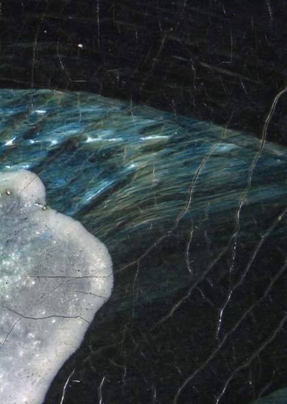
Fig.10
Detail of darkest area of the underarm
Photo © Tate
In contrast, in the shadow of the underarm area of the shirt the blue brushstrokes are densely painted to create a dark recess between the solid black outlines (fig.10). The raised impasto of the white of the shirt is breaking through to the surface in areas where the varnish appears to have been worn away, and the contrast with the yellowed varnish is stark.
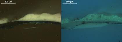
Fig.11
Cross-section of paint from left edge of sleeve in visible light and ultraviolet light
Photo © Tate
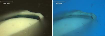
Fig.12
Cross-section of paint from left edge of sleeve in visible light and ultraviolet light
Photo © Tate
Cross-sections taken from the left edge of the shirt show darkened varnish layers sandwiching the blue glaze between them (figs.11 and 12). The relatively thick layer of white beneath, as seen in visible light, is the lead white of the shirt, with poorly dispersed particles of bone black, added by Picabia. Above the varnish layers there is zinc white of the more recent shirt, which fluoresces bright green under ultraviolet (UV) light (fig.12). In the two ultraviolet images the two layers of varnish fluoresce with a thin layer of Prussian blue between them.
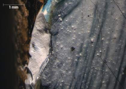
Fig.13
Micrograph showing damage at left edge at site of cross-sections
Photo © Tate
A micrograph of the sample site for the cross-sections above shows the bright white underlayer of the first shirt (fig.13). At the top of the image there is a glimpse of the bright blue glaze, where it did not get covered with the yellowed varnish just visible at the border of the textured, lumpy upper grey layer, which corresponds to the zinc white layer that forms the upper shirt.
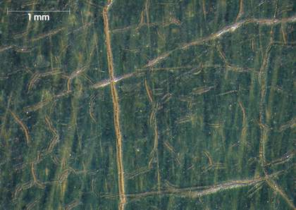
Fig.14
Micrograph showing background blue with distinctive craquelure
Photo © Tate
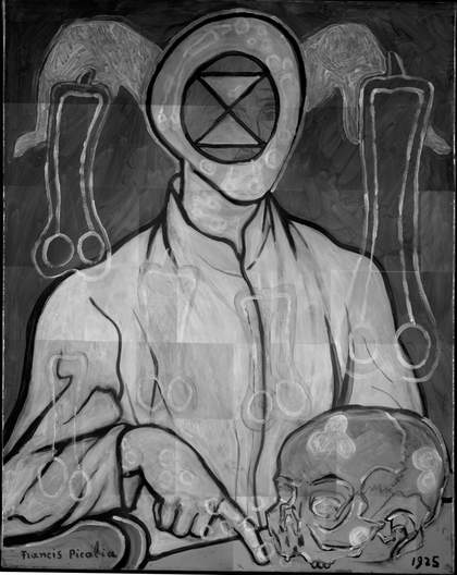
Fig.15
Short-wave infrared (SWIR) image of Portrait of a Doctor
Image: John Delaney and Kate Dooley, National Gallery of Art, Washington, D.C.
The background of the painting – then as now – is intense blue/green (fig.14). It consists of a Prussian blue glaze between two layers of varnish, applied with swirling brushstrokes as is revealed more clearly in the short-wave infrared (SWIR) image (fig.15), and was also rendered clearly in the photograph of the painting taken in c.1935 (fig.3).16 What appears to be a fairly uniform backdrop to today’s viewer becomes a lively, painterly feast of texture. The detailing of the skull is clearly visible beneath the upper layers. The loose and multi-directional brushwork in the background might be giving the impression of a little more texture here than the viewer could readily have seen in 1935, except perhaps in sunny early evenings, because the photographic film used then was rather sensitive to infrared radiation, while Prussian blue is a material that is notably transparent at this wavelength range. The short-wave infrared image also suggests that the phallic shapes and the background consist of the same pigment, which was confirmed by analysis.
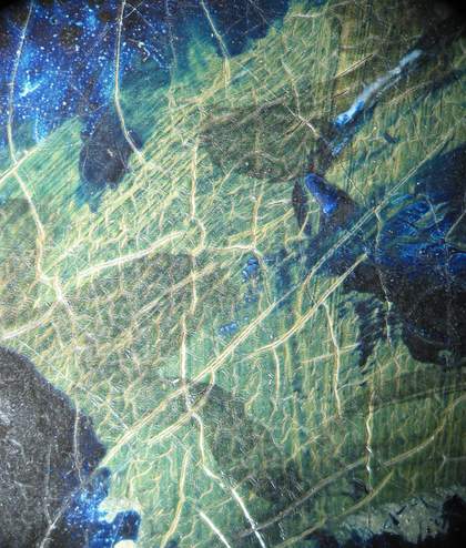
Fig.16
Micrograph showing the first paint layers of the skull, glimpsed between later additions
Photo © Tate
The SWIR image shows the features of the face beneath the upper paint layers as well as those of the skull and the creases in the shirt of the first painting. Clearly Picabia reworked the image by applying more paint but not by rubbing or scraping away any of the first image. The varnish and glaze layers overlying the first skull have formed a distinctive craquelure, revealing the pale yellow underpaint beneath (fig.16). The skull was painted in a similar way to the background and shirt originally, with black thinly painted brushstrokes delineating it on a pale yellow ground, followed by tints of Prussian blue glaze sandwiched within varnish layers. This too has developed the distinctive and complex craquelure seen already in the background. It is a combination of drying cracks, wide, open and amorphous, and brittle fracture cracks which appear as thin linear cracks.

Fig.17
Detail of signature in visible light and ultraviolet light
Photo © Tate
Analysis of paint from the yellowish arm of the chair at the lower-left corner suggests that it consists of yellow ochre paint, with the signature painted over it in bone black, both layers in drying oil. The signature, visible in the photograph of the first version of the painting (fig.3), sits beneath the varnish and blue glazing layer on the yellow oil paint (fig.17). The darker shadows in this area are (again) made up of brushy strokes of the blue glaze between varnish layers. The dark line at the base of the painting is where the blue glaze has been painted up to and not beyond an unknown barrier (maybe the shelf of an easel), and below this line the yellow is bare, giving an idea of its colour when applied. The white outline belongs to the second campaign of painting.
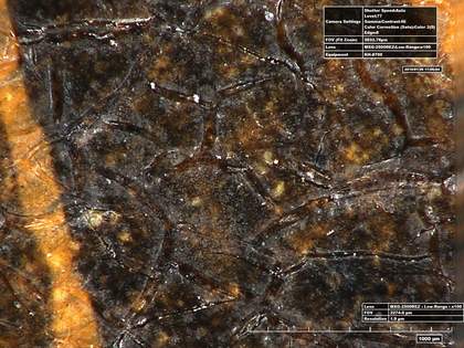
Fig.18
High-resolution micrograph of ‘b’ in signature
Photo © Tate
A close-up of part of the ‘b’ in the signature shows that the surface of the varnish has shrunk into islands with deep splits between them, revealing that the black of the signature lies on top of the yellow ochre layer but beneath the varnish layers (fig.18).
The second campaign of painting
This ‘more simple, more human’ style, as described by Picabia himself, did not meet with success. After an earlier exhibition at the Galerie Vignon in October 1934, an excoriating review described such works as ‘varnished, almost lacquered paintings’ and questioned whether they had ‘any aim other than to be decorative’.17 This new technique developed by Picabia was described as ‘brutalist’, as opposed to the refinement and sophistication of the transparencies.18 Portrait of a Doctor was one of thirty-three new works in the 1936 exhibition in Chicago, which showcased Picabia’s desire for simplification. The critical and commercial failure of this exhibition is thought to be the reason behind Picabia’s decision to paint over the work. However, it is not known why or exactly when Picabia decided to revisit this canvas and transform it so completely, and the materials analysis gave no clues to the dating of the second image. Anecdotally, Picabia’s daughter, Jeannine Bailly-Cowell, recalled the date of its transformation as 1947.19 Camfield wrote an account of Picabia offering the painting to his daughter, which she declined because she said she did not like it. Picabia asked her to return in a couple of days, by which time the painting had been transformed into its current state.20 If this anecdote is to be believed then one must assume that the second painting was executed rapidly.
It may also be significant to the date of repainting that the subject of the original portrait, his friend Dr Raulot-Lapointe, died in 1946. Just as was the case with Picabia’s The Handsome Pork-Butcher (Tate T07108), a painting can die with its subject.21 As curator Gérard Audinet has remarked: ‘The desecration of art makes a painting mortal like ourselves. The painting becomes the receptacle of our torments in the face of death. This embodies the anxieties of the aging painter’.22
Art historian Arnauld Pierre has speculated that the second painting of Portrait of a Doctor might be connected with Picabia’s ill health after the war. Picabia had suffered a cerebral haemorrhage in 1944 and death became a preoccupation for him, along with ‘decline, old age, solitude, feelings of bitterness and pessimism. By contrast the presence of death increases his natural inclination towards Nietzschean veneration of life and primordial forces. Desire, eroticism are associated with artistic fecundity and burgeoning creation’.23 Pierre sees the phallic symbols, which appear often in Picabia’s work at this time, as apotropaic, warding off the evils of impotency and old age.
Arguments proposing that the painting was repainted after the Second World War have also been made on stylistic grounds. Curator Gérard Audinet has remarked: ‘Both these phallic forms and also the fact that repainting is quite systematic in these last years (but not quite in 1938) lead us [Musée d’Art Moderne de la Ville de Paris] to propose 1946 for the second state’.24 Audinet has compared Portrait of a Doctor with stylistic changes made to other works, including Suzanne’s Dream 1949, which has similar flowing, scarf-like shapes emanating from the figure’s head, and The Breasts c.1924–7 and c.1946–7, which has a similar motif to that found in the head of Portrait of a Doctor, the point-to-point triangles within a circle.25 It is perhaps fitting that this symbol has been adopted by eco-warriors as the symbol for extinction in recent times.26
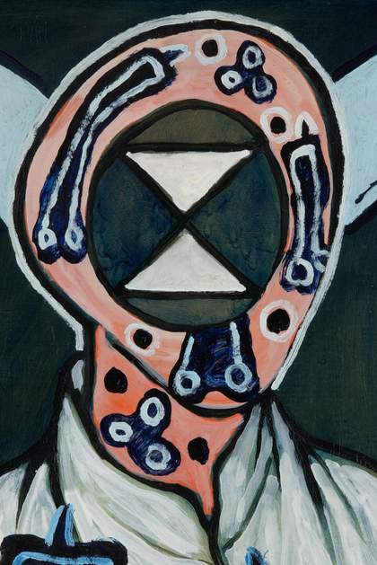
Fig.19
Detail of present-day face of Portrait of a Doctor
Photo © Tate
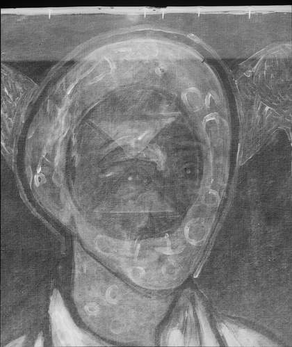
Fig.20
Detail of X-radiograph showing the face
Photo © Tate
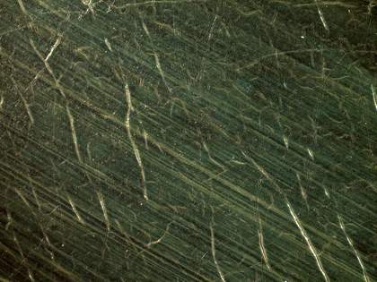
Fig.21
Detail of the original background of the first portrait
Photo © Tate
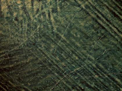
Fig.22
Detail of the blue background within the repainted area of the face
Photo © Tate
The painting in its second state was first exhibited at the Galerie René Drouin, Paris, in March 1949.27 The extent of repainting, even for Picabia, was extensive. He used the form of the head, the body and the skull as the basis of the new painting, but altered all of them in extreme ways. He obliterated the face of the doctor with the double triangle form (fig.19) and filled the area where the face had been with opaque colour and varnish to mimic the paint of the background, as if the face had never existed. Comparing the painting today with the X-radiograph (fig.20), the SWIR image (see fig.15), and the detail of the photograph of the first painting (see fig.3), it becomes apparent how closely Picabia followed the contours of the face. He was strategic in the placement of the motifs. Not only that, but he seems to have attempted to recreate the effect of the original background in the spaces around the triangles by varnishing it locally to augment the deception that they had always been there (figs.21 and 22). In ultraviolet light the newer varnish has a slightly bluer fluorescence than the original varnish (fig.23). Picabia effectively obliterated all traces of the man’s features. In the first painting, the creamy yellow underpaint had textured brushstrokes and the blue glaze became concentrated in the valleys of the paint to create darker lines. The actual brushstrokes of the glaze for the second painting run diagonally in the opposite direction. The glaze in the blue background of the first painting sits between the two varnishes and therefore does not follow the contours of the paint at all, but sits on a smooth base. The lines are parallel and straight. The surface of this layer shows the characteristic leathery craquelure described above, with small splits revealing the lighter layers beneath.
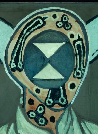
Fig.23
Detail of face under ultraviolet light
Photo © Tate
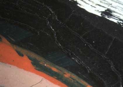
Fig.24
Micrograph showing the lower-left border of the face
Photo © Tate
The contours of the head were completely changed in the second campaign. To make it appear as though the face had never existed Picabia seems to have taken pains to cover the original outlines of the face with a false blue ‘background’. The original varnished background is just discernible between the black outline and a brighter blue border with orange beneath it (fig.24). This layer is newer and looks like an opaque flesh colour with a blue striated surface. This border is much more opaque and grainy than the original background and follows the contours of the new face’s outline. Around the face and over the neck there is a transparent white layer, over which lies a bright orange border. On top of the bright orange Picabia painted with a paler orange mixed with white and applied it wet-in-wet, picking up the brighter orange beneath. The black border lies on top of the orange and was therefore applied afterwards. It appears that orange layers were largely dry when the lean white brushstrokes and the blue circular and tubular shapes were added.
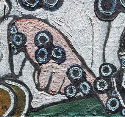
Fig.25
Detail of hand under raking light from top
Photo © Tate
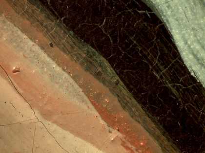
Fig.26
Detail of the hand showing original paint layer
Photo © Tate
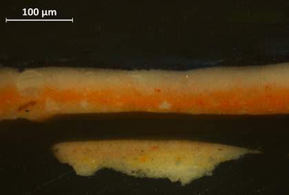
Fig.27
Cross-section of paint from loss in the hand
Photo © Tate
The layer structure in the hand pointing to the skull appears to have a similar layer structure to the flesh for the face (fig.25). Here Picabia left a sliver of the original background visible, adding a darker orange colour, then painted wet-in-wet with orange and white (fig.26). The whole was then outlined with black. A cross-section taken from a small loss at a junction of cracks, where the blue shape is painted over the hand, shows the complex layer structure clearly (fig.27). From the bottom up there is: white ground; flesh colour for the original hand; mixed from vermilion and lead white in oil medium; a thick layer of natural resin varnish, a thin line of Prussian blue; and another thin layer of natural resin (these appear dark in the cross-section). Over these layers for the first painting is the strong orange colour, made from cadmium orange in lead white, with zinc white added in the later orange paint, making it today richer in zinc soaps than the lower layers are. These two orange and white layers are painted wet-in-wet, as shown by blurred boundaries in the cross-section. Above the orange flesh colour Picabia painted the blue circular shapes in pure Prussian blue, while the orange was still quite soft, then worked in zinc white wet-in-wet, forming a lighter blue which is marbled in appearance where the colours have mixed, and may include a natural resin. Although the orange paint shares surface features with commercial house paint, it seems more likely from its composition to be an artist’s quality tube paint, with some additions of resin by the artist, to confer a smooth and glossy appearance.28
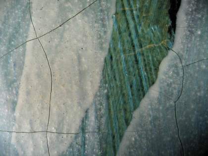
Fig.28
Detail of white shirt
Photo © Tate
In the second campaign the shirt was repainted with paint made from both zinc and lead white, following the original black outlines, which lie beneath the first varnish layer (fig.28). The speckled appearance of the overlying paint (obvious in fig.28) is caused by the formation of lead soap aggregates, and its transparent appearance is probably due to zinc soaps, which also form aggregates, but on a smaller scale here.
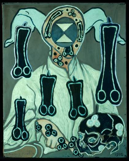
Fig.29
Portrait of a Doctor under ultraviolet light
Photo © Tate
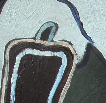
Fig.30
Detail of the ‘legs’ painted around the pendant shape in top-left corner
Photo © Tate
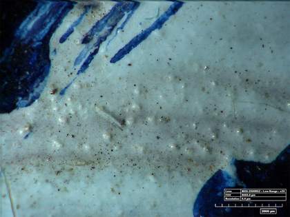
Fig.31
High-resolution micrograph of the ‘legs’
Photo © Tate
The lively brushstrokes of the new zinc white layer of the shirt are clearly perceptible in ultraviolet light (fig.29) and in details (fig.30). In fig.26 the white of the brushstrokes clearly lies over the original varnish and seems to have been painted into spaces divided up by the original black lines of the shirt. The varnish over the first shirt might have yellowed considerably by then (which would more likely suggest a repainting date in the 1940s rather than 1930s) and perhaps Picabia felt the need for a brighter white surface. The lead soap aggregates that are present everywhere in the shirt appear in even more abundance in the stocking-like ‘legs’ around the head of the figure (fig.31). The leg shapes were a late addition, since they are painted around the pendant shapes on both sides, leaving a gap of original varnished background between the leg shapes and the dark blue pendant shapes. It is not known what Picabia intended to convey with these shapes. One suggestion is that they are cuckold’s horns while another suggestion is that the shape is a direct quotation from Max Ernst’s surrealist painting, Men Shall Know Nothing of This 1923 (Tate T00336), where the legs of a copulating couple float in the sky.29 There seems to be a strong sexual reference in this addition.
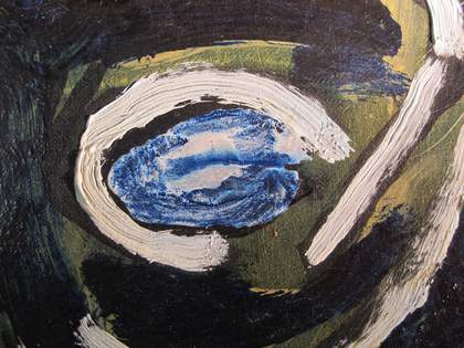
Fig.32
Micrograph of the proper left eye of the skull
Photo © Tate
One of the areas to receive the most attention in the repainting of this work was the skull. The first version (see fig.3) was almost featureless with empty eye sockets, simply delineated with black outlines and toned with a Prussian blue glaze within thick layers of natural resin varnish. This varnish has the characteristic craquelure seen elsewhere, as is still visible between the features of the reworked skull. For the repainting, Picabia applied thick white borders to the black outlines, laid in a similar yellow ochre colour to his own priming for the first painting and then applied pure Prussian blue to the planes of the skull. The eyes were filled with an extraordinary marbled mixture of the blue and white, achieved by the mixing of liquid blue into wet white paint (fig.32). In Otaïti, one of Picabia’s ‘transparencies’ from 1930, he had experimented with incompatible media to create reticulated layers within the layer structure of the painting, and these eyes would appear to be a legacy of such experiments.30
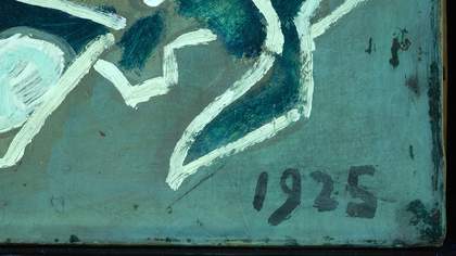
Fig.33
Detail of date in lower-right corner under ultraviolet light
Photo © Tate
Varnish is a key element of this painting, as illustrated by examination under ultraviolet light. Picabia used varnish as one the materials at his disposal, like an extension of his palette. He created the glassy depth of the first painting by using a blue glaze between two layers of natural resin-type varnish. The more recent elements of the painting – the second ‘face’, the shirt and skull and all the pendant shapes and ‘legs’ – do not fluoresce like the earlier layers that still form the background of the later image, because they are not varnished in a comparable way (see fig.29). They have therefore retained their bright and radiant colours. As noted earlier, the signature at the bottom-left corner of the canvas lies within the structure of the first portrait. However, the date 1925 at the bottom-right (fig.33) was painted when the portrait was reworked. It has a cloudy, bluish appearance in ultraviolet light and the borders of this blue fluorescence are confined to the table top and stop short of the skull, where a small gap of greenish fluorescence denotes the first varnish: hence it has a coat of varnish applied locally at the time of reworking the face, which received a similar varnish. It seems that Picabia went to some pains to make the false date appear to lie beneath a varnish just like the signature, further reinforcing the deception he had begun with the reworking of the image.
Material changes over time
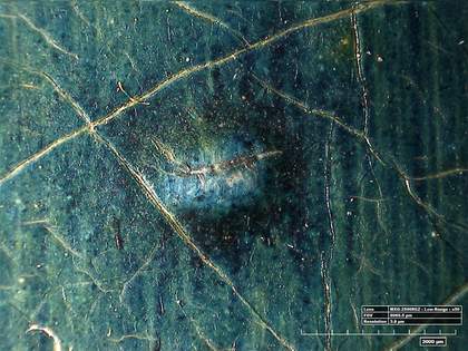
Fig.34
High-resolution micrograph showing a lead soap aggregate pushing through the varnished surface of the background
Photo © Tate
The appearance of Portrait of a Doctor has clearly changed significantly, through reworking most obviously, but also through the degradation of materials. The pure Prussian blue glaze would probably have appeared as a much clearer, brighter blue when the painting was new because the two varnish layers would have been transparent and glossy, not yellowed almost to a mid-brown as they are now, as well as having become slightly crazed on the surface. This would have given the impression of the lively blue layer hovering just above the surface of the paint, and perhaps this represented Picabia’s visual search for the ‘disembodiment’ of the line, as explained by Gertrude Stein.31 There is an opposing visual effect developing now, because as noted earlier, lead white in the priming layers has formed lead soap protrusions. The aggregates form outcrops at the surface of the background paint, like small pimples of blue or white against the green, deforming the formerly glass-like surface of the first painting (fig.34). These lumpy protrusions give the painting a mottled appearance, with white spots contrasting with the dark background.
The visual contrast of the intense blue of the pendant shapes and the bright white of the new shirt, and the orange of the face and hands of the later additions, would have been stark against the blue background that looks greener today due to the yellowing of the varnish. The pendant shapes have become more transparent together with the white of the shirt (see fig.28), and darker due to the effect of superficial yellowed varnish. The composition remains just as startling, but has subtly less impact in terms of colour contrast.
Zinc soaps can cause severe disruption to paint films, leading to cracking, delamination and losses in the paint surface.32 These issues would be catastrophic for the effects Picabia sought. The visual changes are quite subtle, and even as they intensify over time they are never likely to silence Picabia’s message completely.
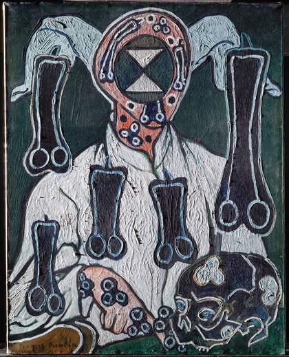
Fig.35
Portrait of a Doctor under raking light from left
Photo © Tate
Different forms of cracking have occurred, and the complex layer structure of Portrait of a Doctor has shrunk and fractured in interesting ways. The leathery appearance of the drying cracks in the background glaze and varnish has been discussed earlier, but there is also a brittle fracture associated with this layer. The paint layers have also become brittle and cracked, as emphasised in the raking light image (fig.35). The resinous layers here have developed linear cracking whereas the brittle zinc white paint used for the shirt has fractured into circular whorls which look as though they were caused by impacts from the reverse. Despite their rather alarming appearance in such lighting, the painting is in good condition for its age, if rather fragile.
Conclusion
Portrait of a Doctor has a very different appearance to when it was first completed around 1935. The complex techniques used for this earlier iteration were experimental, and have been discovered to be the offspring of the ‘transparency’ paintings.
It remains a matter of speculation as to why, and when, Picabia changed the painting in the way he did. The analytical study has offered no unequivocal evidence as to the date of these changes, since all the materials used to create the later portrait were equally easy to obtain in the 1930s and the 1940s. If the yellowing and slight crazing of the varnish that forms the first image offended Picabia enough to justify reworking much of the surface, this would suggest the later decade. If reworked in 1946 or 1947, perhaps the painting can be seen as a tragic expression of an artist traumatised by the Second World War, who had lost his virility and physical health and was suffering from grief following the loss of a close friend. Dr Raulot-Lapointe had specialised in the study of Roentgen ulcers and Picabia himself had suffered from furonculosis.33 Perhaps the circular trilobe shapes are symbolic of these conditions. The obliteration of the face seems poignant if the painting was made to die with Raulot-Lapointe, but as ever with Picabia, there seems to be an unexplained twist of farce with the addition of the stocking-like legs.
If repainted in 1938, perhaps the changes are more in keeping with Picabia’s well-known sardonic mockery of fine art, adding cuckold’s horns and phallic symbols to a painting which had been rejected by critics and the public alike. It has been said that the pragmatic Picabia repainted works to increase their market value and to make money in times of extreme hardship, and yet this painting was given by him to his daughter, and kept in the family until the late 1970s. Although the reworking was of relatively rapid execution, it is nonetheless a testimony to Picabia’s expertise and skill as a painter and his facility with his materials. His build-up of layers in the flesh paint, the lively, yet precisely placed brushwork of the shirt and the ‘legs’, and the careful recreation of the skull with its marbled, experimental paint effects in the eyes do not smack of a hasty, unreflective attack of pique.
Whichever argument prevails, the date ‘1925’ created during the re-working remains mysteriously false and indeed mystifying, although Picabia took care with the additions of varnish on top to make it look authentic. Knowing the complexity of the technique perhaps strengthens the view that Picabia was serious in his intentions with this painting, not frivolous and mocking as has often been suggested.
The change in appearance over the years creates a strange role reversal in tonal values, the transparent layers growing darker, while the more opaque, thicker, more brightly pigmented additions to the second version are becoming gradually more transparent. It is undoubtedly a very different painting today to the one given to the artist’s daughter in the late 1940s, but as is common with many paintings of the early twentieth century, nothing can be done to reverse these changes. The varnish is integral to the painting technique and could not be removed without totally destroying the painting: there are fewer options available to the conservator than in more conventionally constructed works where a varnish can be removed and replaced. Despite the change in appearance, however, it retains something of its luminosity, and its original state is in itself a precious record of the artist’s technique. It is brittle, cracked and fragile and needs to be presented in a frame with glazing and support from behind for better preservation of the fragile canvas, but in this form it will remain a testament to the master of materials who created it.
