Barkley L. Hendricks’s work has been compared to the realism of artists like Philip Pearlstein and William Bailey, both of whom were included in an exhibition entitled Seven Realists held at the Yale University Art Gallery, New Haven, in 1974, the same year that Family Jules (No Naked Niggahs) 1974 (Tate L02979) was painted.1 Hendricks’s art has also been discussed in relation to the photorealist work of artists like Chuck Close, whose portrait paintings – based on photographs – present close, geometrical studies of his subjects. The connection is not wholly surprising. Like Hendricks, Close studied at Yale (Close in 1962–4, Hendricks in 1970–2), and both artists were greatly influenced by Bernard Chaet’s classes, with their focus on direct observation. Also like Hendricks, Close integrates an attention to detail with modulations of paint to create a dramatic portrayal of physiognomy and subjectivity. Comparisons between Hendricks’s and Close’s paintings can therefore be made on the basis of their combined interests in realism and portraiture, while another connection could also be drawn in their translation of photography into paint. However, what these comparisons do not capture is the very different effect of their realism.
Varieties of realism
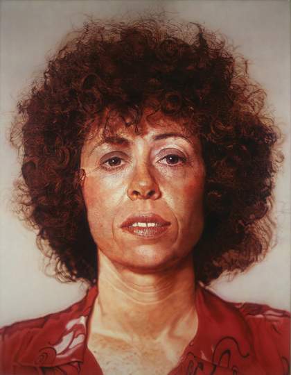
Fig.1
Chuck Close
Linda 1975–6
Akron Art Museum, Akron
© Chuck Close
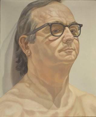
Fig.2
Philip Pearlstein
Portrait of George Klauber 1976
Brooklyn Museum, New York
© Philip Pearlstein
Close’s portraits portray a certain naturalism, while also highlighting their illusory detail: it is this relationship that is foregrounded in the translation he stages from the documentary detail of the photograph into his textured portraits (see, for example, Close’s Linda 1975–6; fig.1). Close’s canvases are highly structured and careful studies in gradation. Their various modulations – effected by his cropping and recomposing of the original in paint – give the effect of a gridded surface. This gridded arrangement deploys a close adherence to the structure of the canvas, enhanced by the contours of tone and variations of colour he uses. The result is a flattening effect that both conforms to the geometry of the painting’s support while also amplifying – through its gradated surface – the sitter’s subjectivity. In staging this translation, Close’s portraits dramatically rework the documentary function of the photograph, not mimetically, but as a means of interrogating the meaning of realism itself. A similar project might be said to underscore the academic realism of an artist like Pearlstein (see, for instance, his Portrait of George Klauber 1976; fig.2). Both artists grapple with the possibilities and limitations of capturing the human figure as painterly subject. Yet while Pearlstein’s paintings look back to a neoclassical style of painting, albeit reformulated by a clinical precision that borders on detachment, Close’s exaggerated portraits create something hyper-real, also evoking the vivid detail of commercial advertising.
In the case of Hendricks, realism functions somewhat differently. As he recalled of his early experiences with the medium of photography:
When I came to Yale, my first camera was a range-finder. Someone had said once I had gotten the travelling scholarship … ‘Man, are you going to take a camera?’ So at the time, my knowledge of cameras was quite slight. My mother had a Brownie and the man next door to me had a high-end Polaroid. And neither one of those were portable. So I went out and bought a range-finder – I think it was a hundred bucks – and I learned after three months with that, that I wanted to have a through-the-lens camera, rather than a range-finder. And that sort of opened the door for other cameras, such as the two-and-a-quarter by two-and-a-quarter and a few others I had gotten … So after that experience, a variety of different cameras were brought into my sphere of knowledge. And it started to serve a number of different purposes. So that was the experience that I had, that I brought to Tom Brown, whose was the first class that I took in terms of photography. And then the work that I did there, I used to get into Walker Evans’s class.2
It was Evans’s interest in street photography that most attracted Hendricks: ‘Walker was certainly a devotee of photographing on the street. And certain sort of situations, his images that he did in terms of travel – the Farm Securities work and Cuba, and subway system, stuff like that – he got out into the world.’3 In classes with Evans, Hendricks first started working with photographs he took that addressed his military experience with the New Jersey National Guard. Travelling to New Jersey on the weekends, he would return to Yale via the New York Port Authority, and the first set of images he made for Evans’s class were based on Port Authority subject matter. These experiences taught him ‘about the technical areas of black and white photography … I spent many hours down with the photographers … learning the zone system in terms of certain areas of the black and white experience, what papers do you use, how to print’.4 These early experiments with the camera continued to be part of Hendricks’s practice until his death: although known primarily as a painter, his oeuvre encompasses the photographic format. While he chose to use the camera as ‘my mechanical sketchbook’,5 his developing interests in the medium also stemmed from its precision in relation to the illusionistic effect of representation.
In connecting Hendricks’s compositional arrangements with the photographic techniques he learnt, I do not mean to only suggest that there is a photographic quality to Hendricks’s portraits that is connected to their striking realistic detail. This would lessen the impact of his paintings and limit their broader significance. What will be emphasised here is the relationship between Hendricks’s interest in photography and his attention to surface arrangement, and the surface arrangements of his subjects.
Materiality and ‘surfacism’
Learning the zone system of modulation appears to have helped Hendricks translate his observations of the real into a painterly style. There seems to be a remarkable relationship between the zone system, so central to the arrangement of a photograph, and Hendricks’s own emphasis on surface arrangement through the gradation and modulation of colour and pattern in Family Jules, one that directs our focus on the various components of the painting. Thinking of the slightly later example of Misc Tyrone (Tyrone Smith) 1976 (private collection), which was based on photographs Hendricks took of Tyrone walking and posing on Broad Street in Philadelphia, sheds some light on what I am trying to say here.6 Just as sharply dressed urban figures use their bodies and accessories to direct the gaze of passers-by, Hendricks’s paintings draw on precise techniques of composition not simply to mimic reality, but to recreate this relationship between subject and viewer. In Family Jules the sometimes jarring juxtaposition of various bright colours, geometric patterns and textured materials obstruct our search for what anthropologist and art historian Christopher Pinney has more generally referred to as a ‘spatial-temporal certainty receding within the image’.7 In other words, there is no backdrop or sense of support beyond what we see: instead our gaze becomes a form of description that moves through and across the materiality of the surface. In turn this materiality works to project everything out of the picture plane, for anchoring our gaze to the surface in this way essentially means we are anchored to the painting by Jules himself. Rather than the viewer receding into the painting, then, Jules advances outwards, into the space of the viewer.
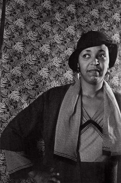
Fig.3
Carl Van Vechten
Ethel Waters 1932
© Carl Van Vechten Trust/Eakins Press Foundation
Jules’s movement forward out of a densely patterned surface recalls the portrait photographs of Harlem Renaissance artists and intellectuals made by artist and patron Carl Van Vechten during the 1930s and 1940s. In these photographs, which provide a rich collective portrait of a generation of African American intellectuals and artists, he frequently juxtaposed figure and pattern to create a dynamic projection of personality. Van Vechten incorporated a wide array of patterned backgrounds – as can be seen in his photographs of Ethel Waters from 1932 (fig.3) and Zora Neale Hurston from 1938 (Beinecke Library, Yale University, New Haven) – that created a sense of theatricality and through which his sitters’ cultural personas could be probed. An attention to surface aesthetics is also played out in Van Vechten’s photographs in his dramatic use of light, figure and pattern to project a psychological portrait of his sitters. However, his control of his subjects’ representation, from composition to the choosing of the background, has also been critiqued for its exoticising tendencies that subtly reinforce perceptions of black culture – its sensuality and naturalness – that attracted many whites during the 1920s and 1930s.8 Indeed, Van Vechten’s photographs need to be read in relation to a deeper and more complex history of the Harlem Renaissance movement, black avant-garde aesthetics and the complicated relationships that shaped interactions between black communities and their white supporters, patrons and followers during this time.
While Van Vechten’s photographic portraits provide a historical context for Hendricks’s surface aesthetics, I want to also highlight another related network of imagery and image production. Hendricks’s emphasis on the materiality of the surface – what Pinney has called ‘surfacism’9 – presents a form of looking that makes us aware of vision itself as a process negotiated between seeing and being seen. Hendricks and Jules display a concern with the way the canvas becomes a foundation or ground on which, as Pinney notes, ‘presences that look out toward the viewer can be built’.10 Pinney’s description, drawn from artist and art historian Olu Oguibe’s discussion of African photography, foregrounds a different kind of connection between subject, viewer and medium that replaces traditional relationships of surface and depth with an emphasis on the sitter and their surroundings. Rather than creating a detached viewing position, our relationship to the photographs Pinney discusses – popular imagery taken in India and West Africa – is indeterminate, directed by the sitter and their self-exploration. His emphasis on surfacism highlights not the indexicality of a photograph, but the ‘space between the images’ surface and their beholders’.11 Allowing this sense of projection to emerge from the compositional arrangement of the painting, as well as its detailed realism, Hendricks stages a relationship between surface and selfhood, similar to the photographs that Pinney describes, in which a viewer’s relationship to the painting itself seems wholly defined by the sitter.
Studio and street
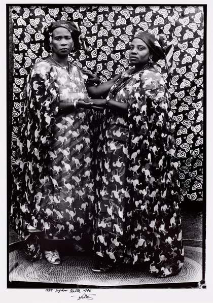
Fig.4
Seydou Keïta
Untitled (Two Women) 1958, printed 1997
Museum of Fine Arts, Boston
While Hendricks’s portraits foreground their surface appeal to highlight their flatness, their compositional arrangement asserts a sense of depth that references the sitters’ own interest in surface aesthetics. This sense of projection that Hendricks evokes in his portraits – one that mirrors the sitters’ own projection of self – resonates with the compositional elements and stylistic assemblages of other photographers located outside the United States at this time. Family Jules, with its charged surface resulting from the juxtaposition of pattern and texture, arguably evokes the elegant portraits of the photographer Seydou Keïta. Keïta’s studio photographs, created in the post-war period in colonial Mali, reveal the sophisticated visual language of his subjects (see, for instance, Untitled (Two Women) 1958, printed 1997; fig.4). As the curators and art historians Chika Okeke-Agulu and Okwui Enwezor have written, his photographs came to stand for ‘the attempt to encapsulate an entire era of a culture through the ordinariness of the people portrayed across class, social and political structures’.12 Keïta’s photographs often incorporated a patterned backdrop combined with his client’s clothing to ‘form a single visual plane, one that results in an image that seems simultaneously flattened and bursting forth through the surface of the photograph’, notes art historian Krista Thompson.13 They are a form of memory work and archive: they document what Okeke-Agulu and Enwezor describe as the ‘private aspirations and identities of modern urban, Malian women and men rarely seen in public representations of Africa’.14
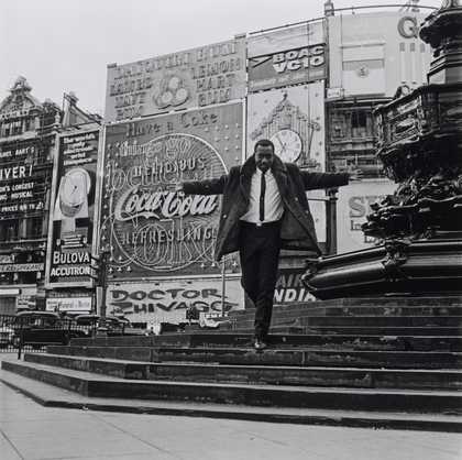
Fig.5
James Barnor
Mike Eghan at Piccadilly Circus, London 1967, printed 2010
Tate P13420
Photo © Tate
What Keïta’s photographs also show is the way the studio became a performative space, a place where individuals staged their identity in a variety of guises and poses. Keïta’s studio portraits laid the groundwork for a range of photographers who came to prominence in the 1960s and 1970s, including Malick Sidibe, Samuel Fosso and James Barnor. Both Sidibe (who worked in Mali) and Barnor (who worked in Ghana and Britain) took these studio performances out onto the street. In Barnor’s photographs in particular – many of which he created for Drum, a radical magazine that first began circulation in South Africa in the 1950s – we see remarkable portraits of young urban black women and men that emphasise their cosmopolitan self-fashioning against the backdrop of an urban metropolis. In Barnor’s now-iconic 1967 photograph of the BBC World Service presenter Mike Eghan at Piccadilly Circus in London (fig.5), Eghan seems to float down the steps towards us. His arms are stretched out such that his body forms a cross, and his woollen jacket swings out behind him like a cape. Advertising billboards and signs flare out across the background as if at Eghan’s beckoning. The emphasis on surface in this photograph is encoded everywhere – from the repetition of advertising to the theatricality of Eghan’s stance. Eghan himself seems to be touching the billboards behind him, his body grounded through this relationship, as if he is embedded in and being projected out of this flattened background simultaneously.
To look at this photograph requires anchoring our vision in the materiality of the surface, a materiality that focuses our attention on the careful arrangement of the self being displayed and the agency created by the ‘construction of self through the assemblage of garments, accessories, and beauty regimes, that may or may not be in fashion at the time of use’, in the words of writer and curator Carol Tulloch.15 In a similar sense, Family Jules might be said to illuminate a distinctive diasporic and cultural moment of urban representation that emphasised the self-styling and performativity of identity as a process of assemblage. This broader visual phenomenon, with its foregrounding of the mobile, interactive aspect of surface, offers another way of seeing and describing that provides an alternative to the relationship of surface and depth embedded in the scopic regime of Cartesian perspectivalism and in the photographic medium.16
