A ‘great deal of excitement about colour’: this was Vanessa Bell’s defining memory of an intense period of artistic experiment in the early 1910s.1 ‘I suppose it was the result of trying first to change everything into colour’, she continued. ‘It certainly made me inclined also to destroy the solidity of objects.’ She produced Abstract Painting (Tate T01935; fig.1) in c.1914, during this time of extraordinary innovation in the use of colour in art. Her observations about the metamorphosis of objects into colour call attention to the central theme that will be pursued in this essay. What do Bell’s experiments with colour combinations in her abstract work reveal about the impact of her discovery of colour? What significance has this had for her critical reception? Situating Abstract Painting within the context of debates concerning colour and form, sensation and synaesthesia, which preoccupied her Bloomsbury group circle and European painters more widely in the early twentieth century, this essay will examine the transformative properties of colour in Bell’s practice and its capacity to conjure an expressivity equivalent to speech.
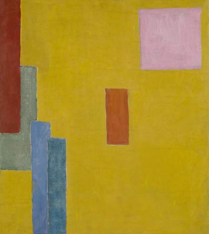
Fig.1
Vanessa Bell
Abstract Painting c.1914
Tate T01935
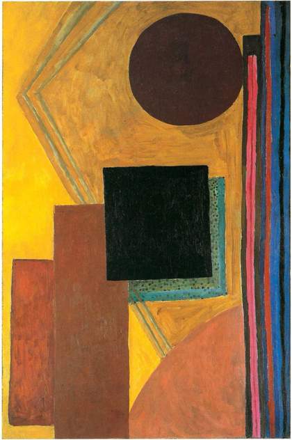
Fig.2
Vanessa Bell
Abstract Composition 1914
Oil on canvas
Private collection
Bell’s elimination of representational content in Abstract Painting invites us to consider the subtle modulation of affective and emotional qualities through nuances of tone and texture. While dark-hued red rectangles dominate the visual field, the textured pink square surprises the eye and competes for attention in what art historian Matthew Affron defines as an ‘unusual contrast of the sweet and the earthy’.2 Bell’s deployment of strong complementary colours across a chrome yellow ground conveys a monumentality that exceeds the relatively small scale of the canvas: the triad of blue tones sets off the radiating warmth of the yellow field, and the thick blue-green oblong on the left-hand edge contrasts with the elongated plum-red one that overlays it. The ‘emotional charge’ of Bell’s work, as art historian Grace Brockington describes it, is arguably orientated in the central red oblong, which registers as an arresting, even threatening signal, partly due to the colour’s long association with danger and passion and its widespread use in warning or ‘stop’ signs.3 In her abstract works Bell investigated the way in which colour changes our experience of different forms. She achieved a subtly different emotional impression, for instance, in the similar positioning of a black square over a warm-toned ground and red oblongs at the centre of Abstract Composition 1914 (fig.2).
Bell’s retrospective addition of ‘(Test for chrome yellow)’ to the title of Abstract Painting in an inventory of 1951 situates the work in a moment of modernist chromatic experiment.4 Chrome yellow pigment, or lead chromate, became available from the end of the first decade of the nineteenth century, and painters were quickly attracted to its brilliance. Vincent van Gogh deployed it to luminescent effect in A Wheatfield, with Cypresses 1889 (National Gallery, London).5 In the 1890s – the ‘yellow nineties’ – yellow became the colour of transgression through its association with the literary and artistic periodical the Yellow Book. It was ‘the colour of the hour … associated with all that was bizarre and queer in art and life, with all that was outrageously modern’, the critic Holbrook Jackson wrote in 1913.6 Eventually, it became the colour of Bloomsbury, when Aldous Huxley’s novel Chrome Yellow (1921) satirised the Bloomsbury patron Lady Ottoline Morrell and her circle. Morrell was later to paint her front door chrome yellow, a gesture which, it was noted, ‘distinguishes it from all the other dark brick Georgian houses in the street’.7

Fig.3
Duncan Grant
Abstract Kinetic Collage Painting with Sound 1914
Gouache and watercolour on paper on canvas
Tate T01744
© The estate of Duncan Grant
Photo © Tate
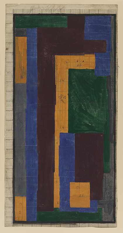
Fig.4
Attributed to Vanessa Bell or Duncan Grant
Third in a series of rug designs 1913–15
Gouache and pencil on squared paper
Courtauld Gallery, London
Photo © The Samuel Courtauld Trust, The Courtauld Gallery, London
Abstract Kinetic Collage Painting with Sound (fig.3), made in 1914 by the Bloomsbury artist Duncan Grant, was an important marker in the matrix of ideas about colour, music and abstraction, at a time when he and Bell were engaged in close collaboration. She admired Grant’s chromatic inventiveness, expressing concern that her designs might appear rather ‘dull’ in comparison.8 The art historian Richard Shone has attributed the ‘rapid lightening’ of her palette the following year to Grant’s influence.9 However, while the vertical colour blocks with yellow and orange tones in Abstract Kinetic Collage are reminiscent of Abstract Painting, Grant’s composition is a self-declared investigation of movement, whereas Bell’s rectilinear forms are static in space and her colour contrasts are more intense.10 Furthermore, the spaciousness of the yellow colour field in her composition finds no equivalent in Grant’s more crowded abstract collages with their variegated colours, such as Interior at 46 Gordon Square c.1915. Nevertheless, Bell’s abstract work coincided with collaborations with Grant at the interior design company Omega Workshops Ltd, where painted and pasted colour played an important role in transforming everyday objects and often included chrome yellow in the colour scheme. Chromatic links to Abstract Painting would have been apparent in Bell’s popular lampshade design of 1913–19 (examples held in the Victoria and Albert Museum, London), which the artist Winifred Gill described as consisting of ‘three shades of chrome yellow, with a background of deep blue and purple’, and in an Omega rug design of 1913–15 (fig.4), attributed to Bell or Grant, with its brilliant segments of chrome yellow set amid interlocking rectilinear motifs.11
When Bloomsbury artist and critic Roger Fry curated the exhibition Manet and the Post-Impressionists (Grafton Galleries, London) in 1910, he introduced the audacious chromatics of painters working in France such as Paul Cézanne, Henri Matisse and van Gogh to a London audience. As Bell remembered it, the show was revolutionary for her generation, signalling ‘a possible path, a sudden liberation and encouragement to feel for oneself’.12 Fry’s attitude to colour shifted, from his statement in 1909 that colour is ‘the only one of our elements [of design] which is not of critical or universal importance to life’, to his declaration in 1911 that Cézanne had ‘recovered for modern art a whole lost language of form and colour’.13 Here he differed from the Bloomsbury critic Clive Bell (Vanessa’s husband), who claimed in 1914 that colour ‘becomes significant only when it is used as an attribute to form’.14
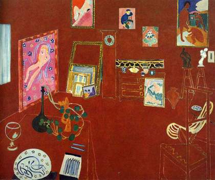
Fig.5
Henri Matisse
The Red Studio 1911
Museum of Modern Art, New York
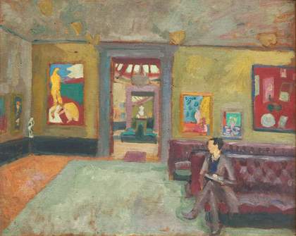
Fig.6
Vanessa Bell (also attributed to Roger Fry)
A Room in the Second Post-Impressionist Exhibition (The Matisse Room) 1912
Musée D’Orsay, Paris
According to Bloomsbury scholar Simon Watney, colour was a definitive feature of English post-impressionism, and this was demonstrated when Bell’s work was included in the Second Post-Impressionist Exhibition of 1912.15 She assisted Fry in hanging the Matisse rooms, which were the centrepiece of the exhibition and included thirty-four drawings and paintings and six sculptures. Demonstrating what Fry called an ‘entirely new use of colour’, the painter’s rough, expressive, fauvist approach had a profound impact on Bell.16 Her impression of ‘changing everything into colour’ during this period effectively describes Matisse’s transmutation of objects in The Red Studio (L’Atelier Rouge) 1911 (fig.5), displayed at the exhibition, in which the space of the room dissolves and the objects float in a rich, suffusing red. Bell’s 1912 homage, A Room in the Second Post-Impressionist Exhibition (The Matisse Room) (fig.6), features a copy of the painting.17
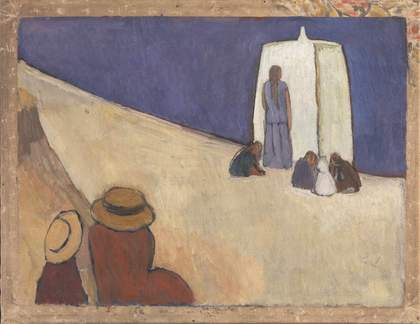
Fig.7
Vanessa Bell
Studland Beach c.1912
Tate T02080
© Estate of Vanessa Bell, courtesy Henrietta Garnett
Photo © Tate
However, as Brockington observes, Bell’s relationship to Matisse was ‘never a straightforward case of imitation’.18 The pink square in Abstract Painting reads almost as a chromatic quotation from Matisse’s The Pink Studio (L’Atelier Rose) 1911 (Pushkin Museum, Moscow), in which modulations of pink describe the floor and walls, but the radical simplification of Bell’s abstract painting has closer affinity with his works in process in spring 1914, including View of Notre Dame (Vue de Notre Dame) 1914 (Museum of Modern Art, New York), where architectural features are reduced to a series of descriptive black lines in a field of blue. Matisse’s work would have been fresh in Bell’s mind when she began Abstract Painting, following a visit to his Paris studio in the spring of 1914 where she saw two unfinished paintings. She also admired ‘several early things and one very large later one which was most beautiful’ in the collection of Michael Stein.19 Nevertheless, her Abstract Painting travels further into the realm of pure colour untethered from descriptive function. It represents an extension of the aesthetics of reduction already evident in Studland Beach c.1912 (fig.7), where pared-down forms and flat bands of an intense blue convey an emotional resonance. The art historian Lisa Tickner finds in this colour compound psychological and cultural meanings: ‘the blue of St Ives, of the void and divine light, of the Virgin’s robe’, with echoes of Piero della Francesca (1415–1492) and Giotto (1266/7–1337), and the theme of motherhood as the site of ‘ambivalence and loss’.20
Bell’s participation in the broader conversation about emotional expression in abstraction comes further into focus alongside the work of European painters, notably Wassily Kandinsky, whose ‘pure visual music’ Fry praised in 1913.21 In her biography of Bell the art historian Frances Spalding suggests that discussion of Kandinsky’s works, which were shown at the Allied Artists’ Association exhibition in London in 1913 and at the exhibition of the Grafton Group the same year, along with those of František Kupka, may have encouraged Bell’s experiments in abstraction.22 Kandinsky developed one of the most influential colour theories in Concerning the Spiritual in Art (Über das Geistige in der Kunst) (1911), which was translated into English by Michael T.H. Sadler in 1914, with extracts from the translation printed in the vorticist magazine Blast the same year. Influenced by Goethe’s colour theory and by theosophical ideas, Kandinsky explored emotional and spiritual responses to colour, as well as its association with sound.23 Looking at colours could produce a ‘psychic effect’, he argued: ‘a corresponding spiritual vibration’.24 According to his theory, yellow and blue represent a series of antitheses: between warm and cold, eccentric and concentric movement, and the ‘earthly’ and ‘heavenly’.25 Whether or not we experience these sensory effects in Bell’s colour combinations, Kandinsky’s vibrational model of aesthetic experience offers a way of reading her work’s emotional expressivity.
If, following the modernist paradigm, colour is evocative of sound, then Bell’s bold use of colour resists the implicitly gendered narratives that characterise her work as taciturn or silent. Traditionally, colour has been seen as ‘secondary’ in art theory and history, where it is often presented as ‘feminine’, unstable and sensuous in contrast to the ‘masculine’ properties of form and line.26 Critic Keith Roberts deployed the quality as a negative term in his assessment of Bell as ‘an essentially lavender talent’, reticent and lacking in rigour.27 However, a closer examination of Bell’s colour palette bolsters Brockington’s counter-argument for the painter’s ‘distinctive, expressive power which complicates the dichotomy between speech and silence, critic and artist’.28 Bell’s sister, the writer Virginia Woolf, was alert to these subtleties in Bell’s work, declaring her ‘a poet in colour’, even as she contributed to the legend that she and her paintings were ‘as silent as the grave’.29
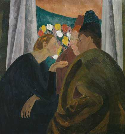
Fig.8
Vanessa Bell
A Conversation 1913–16
Courtauld Gallery, London
© 1961 Estate of Vanessa Bell, courtesy Henrietta Garnett
Photo © Courtauld Gallery, London
Bell hints obliquely at the analogy between colour and speech in A Conversation 1913–16 (fig.8), through the chromatic relationship between the conversing women and the flowerbed outside the window, which is rendered as flat blobs of colour, almost like speech bubbles. For Woolf, this painting suggested Bell’s ability as ‘a short story writer’, and she wondered whether she could ‘write the Three Women [an earlier title] in prose’.30 There are implications here for what the literary critic Jane Goldman calls the ‘non-verbal, political significance of feminist colourism’.31 She situates Bell in the context of the Women’s Suffrage Movement, which was making an impact at the time of Fry’s post-impressionist exhibitions, and which deployed bold colours to promote the cause. Yet Bell’s nuanced colour tones are difficult to render in precise language. ‘I don’t see how you use colours in writing, but probably you can do it with art’, she wrote to Woolf in 1909. ‘The mere words gold or yellow or grey mean nothing to me unless I can see the exact quality of the colours.’32
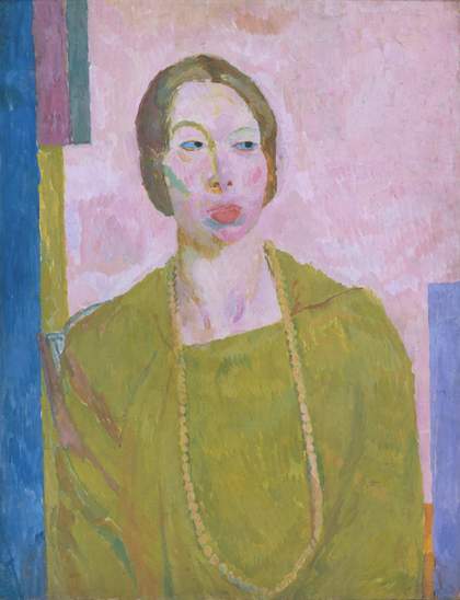
Fig.9
Vanessa Bell
Mrs St John Hutchinson 1915
Tate T01768
© Estate of Vanessa Bell, courtesy Henrietta Garnett
Photo © Tate
The role of abstract coloured shapes in expressing mute yet emotionally powerful subjects is important in the portraits that Bell made leading up to Abstract Painting, exemplified in her practice of blanking out the faces of her subjects, as in her painting Virginia Woolf 1912 (National Portrait Gallery, London). She went on to employ rectilinear patterns reminiscent of her abstract compositions in the backgrounds of a number of portraits of women produced between 1914 and 1916, where, as Reed observes, the female figure is ‘visually unified’ with her ‘modernist environment’.33 In Mrs St John Hutchinson (fig.9) we observe accents of yellow-green which activate chromatic links between sitter and background. With the compositional structure of these portraits in mind, we can re-read the central red-orange rectangle in Abstract Painting. Endowed with presence and intensity through its suspension in the expanse of yellow, the rectangle can be understood as an abbreviation, even a denial, of the faces that occupied the focal point of her portraits.
Bell continued to experiment with the transformative possibilities of colour even as she returned to representational subject matter during the First World War. As Fry’s review of her 1922 exhibition with the fauve painter Othon Friesz testifies, ‘it is as a colourist’ that she ‘stands out so markedly among contemporary artists’.34 The following year, Bell could have been describing Abstract Painting when she recollected the ‘intensity of colour’ in the previous decade, and speculated on whether this could still be achieved ‘without losing solidity of objects and space’.35 The painting therefore marks a frontier in the chromatic freedom and eloquence that would continue to invigorate her practice even as she moved beyond her experimental phase.
