An introduction to abstraction

Fig.1
Duncan Grant
Abstract Kinetic Collage Painting with Sound 1914
Gouache and watercolour on paper on canvas
279 x 4502 mm
Tate
© The estate of Duncan Grant
Bloomsbury’s foray into abstract painting was a brief one: the small body of work produced by the group’s principal painters, Duncan Grant and Vanessa Bell, between 1913 and 1915 received little of the attention bestowed upon their European counterparts. After Grant made In Memoriam Rupert Brooke (Yale Center for British Art, New Haven) in the middle of 1915 these experiments were largely abandoned, and the pair returned to figurative painting. Despite its brevity, however, this period saw them make a number of profoundly challenging exercises in visual abstraction: Grant’s Abstract Kinetic Collage Painting with Sound 1914 (fig.1), hereafter referred to as the Scroll, is the most radical of these works.
The Scroll adopted the principles of formal abstraction, being composed exclusively of rectangles of variegated colour placed upon a mottled background. As we have outlined in our introduction, there is a system to the placement of these rectangles, and their displacement.1 However, as I will show here, the abstraction is complicated by Grant’s use of collage, which to this point had been deployed principally by cubist painters to disrupt the conventions of pictorial representation. Since the later decades of the nineteenth century, modernist artists had become increasingly suspicious of naturalistic representation, believing that it falsely presented a constructed reality as a true one, and created an experience based on illusion, deception and manipulation.2 For both ‘pure’ abstract painters, such as Wassily Kandinsky, and figurative painters bent on exposing the conventions of western representation that had persisted since the fifteenth century, the illusion of naturalistic representation – and in particular monocular perspective and depth of field – needed to be abandoned in order to achieve a greater truth to the sensed experience of contemporary life. Accordingly, visual styles developed which emphasised that the act of painting was an interpretation of the world rather than its realistic representation, affirming an image’s independence from any real life equivalent. Thus, the subject of a modernist painting might be as much its own status as painting, and the artist’s unique act of perception, as anything that was depicted on the canvas. In doing this, however, modernist artists happily continued in the visual traditions of western art: neither bowls of fruit, nor glasses and lemons, have ever been that fascinating in themselves, whether in the seventeenth century or the twentieth. What changed was the supporting theoretical armature for the artists’ practice. As the post-impressionist art critic Maurice Denis wrote: ‘a painting – before it is a war-horse, a nude woman, or some anecdote – is essentially a flat surface covered with colours assembled in a certain order’.3
Cubism, first in paint and then through the introduction of collage in particular, challenged that notion of order in its compression of depth and field and the confusion of figure and ground. This new practice eventually led in some cases to highly stylised imagery, with non-naturalistic colours and the exaggeration of form (for instance in the post-impressionist styles of Henri Matisse or André Derain). For others it meant a complete rejection of naturalistic representation and a turn to compositions without obvious relation to any specific referent in the natural world. The art historian Pepe Karmel summarises cubism’s radical contribution thus: ‘Other avant-garde artists had approached abstraction by simplifying an originally realistic image. The Cubists began with an abstract image and modified it just enough to suggest reality.’4 This is one reason why we sometimes have difficulty understanding the subjects of early cubism in particular as ‘figurative’, even though they are real subjects in the world. Later modernist critics such as Clement Greenberg argued that these paintings were conceived as ‘autonomous’ entities undisturbed by history, politics or society’s changeable truths and simply attended to the fundamentals of painting.
In rejecting illusionistic representation, many modernist artists also conceived of a more direct experience between the viewer and the artwork in front of them – an experience that relied less on culturally specific or empirical knowledge than an ‘intuitive’ reality that could transcend human-made societies. This was certainly the case with some abstract painters in the 1900s, for example Kandinsky, and reached its apogee with the mid-century North American abstract expressionist painters whom Greenberg so zealously promoted, such as Jackson Pollock and Mark Rothko. However, the introduction of collage by Georges Braque and Pablo Picasso introduced a level of complexity to the signs in a cubist artwork – what the art historian Yve-Alain Bois has termed ‘polysemy’.5 This reintroduced specific histories and politics within the artwork even as the dislocation of the culturally specific form (the newspaper, the restaurant menu, the label from the lunchtime bottle of vin ordinaire) into the painting loosened its relation to ‘the real world’.6 As I will show, Grant’s use of what appears to be purely decorative, abstract collage in the Scroll represents an important intervention in modernism’s exploration of signification in the artwork through found, non-painterly materials.
However, regardless of the Scroll’s use of geometric form, I would agree with Simon Watney’s assertion that Grant’s abstraction is never fully divorced from the concerns of figurative painting.7 In this sense Grant is one of those avant-garde painters who generally simplifies bodily form towards abstraction. I would also highlight the argument proposed by Christopher Townsend in 2014, that although there are no bodies depicted in the work, a body seems to be needed to turn the piece through its mechanism, performing a repetitive action that mirrors the rhythm of the Scroll’s design.8 Certainly, in the acknowledged influence of Chinese handscrolls on the work, there is an immediate evocation of corporeal materiality – however much Grant might have wanted to engineer mechanical propulsion for some form of the Scroll, the fact remains that on the only occasion we know that it was exhibited during the time of its making, it was unwound by hand, by Grant and David Garnett, to an audience of at most three people.9 For Grant, abstraction was not about the complete autonomy of art and never entirely divorced from the material world: his works remain closer to abstraction as a simplification of natural form, rather than a separation from it. Even when not directly representing recognisable natural forms, Grant’s work presents an interrogation of materialism and physical interaction with materials, particularly in the domestic space. With this in mind, in this essay I show that the Scroll can be better understood than in relation to the geometric abstraction that it superficially resembles – where it might be said to anticipate post-war constructivism. Indeed, in mistakenly comparing the Scroll to the abstract films made by the German artist Hans Richter in 1923–4, Ian Christie and Laura Marcus imply that Grant anticipates constructivism. These ahistorical comparisons are corrected by Erik Born in his detailed analysis of the conception and making of Richter’s first abstract film.10 Rather, I want to examine the Scroll in light of Picasso’s nominally figurative, cubist collages, suggesting that both rely on the two artists’ shared interest in materiality as a basis for different modes of representation.
Grant, Picasso and materiality
In January 1914 Duncan Grant travelled to Paris to complete his costume designs for the director Jacques Copeau’s play La nuit des rois, an interpretation of Shakespeare’s Twelfth Night that was praised on both sides of the Atlantic and became a mainstay at the Théâtre Vieux Colombier in Paris for more than a decade.11 Grant’s designs for the theatre eschewed historical specificity and, like the Scroll, concentrated on ideas of form and flow that he had recently admired in Clive Bell’s writings on art.12 During these months in Paris an encounter with Picasso, in company with the writer and art collector Gertrude Stein, had an important effect on Grant. On a visit to Picasso’s studio at 5 bis rue Schoelcher, which Grant described in a letter to Clive Bell, Grant took with him a roll of old wallpapers found in a cupboard at the Hôtel de l’Univers et du Portugal, where he was staying.13 Since Grant combines a singular noun, ‘roll’, with a multiple one, ‘wallpapers’ – rather than using ‘wallpaper’ – it is likely that this single roll was composed of unused end pieces from several different original rolls. This was a spontaneous gift from Grant to an artist five years his senior whom he admired greatly, and was a symbol of their shared interest in domestic materials. Working in collaboration with Vanessa Bell, Grant had designed wallpapers to be sold in the Omega Workshops since it was founded by Roger Fry in 1913; Picasso had been using Victorian wallpapers – mostly poor-quality prints made for the mass market between 1850 and 1890 – in collage works (papiers collées) since November 1912, following Braque, whose Fruit Dish and Glass 1912 (Metropolitan Museum of Art, New York) was the first such piece.14 Picasso, who apparently experienced such trouble finding antique wallpapers that he resorted to tearing scraps off walls, expressed his delight at the gift, and in the following months may have used it in the last of these works.
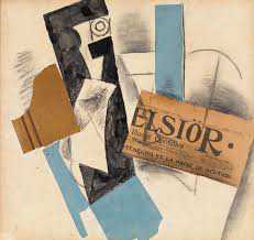
Fig.2
Pablo Picasso
Bottle and Newspaper 1913
Collage
450 x 480 mm
National Gallery of Ireland, Dublin
© Succession Picasso/DACS 2020
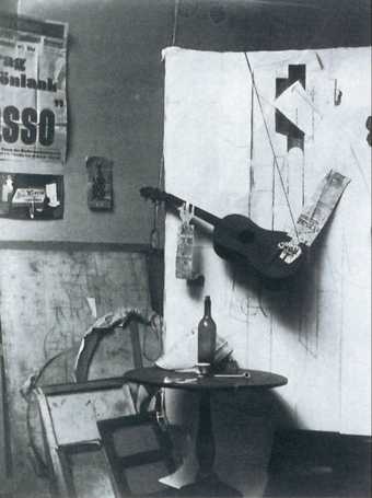
Fig.3
Photograph from Pablo Picasso’s studio at Céret, spring 1913
Picasso Archives, Musée Picasso, Paris
The art historian Elizabeth Cowling notes that Picasso’s creation of papiers collées tended to be in sustained bursts, perhaps linked to the acquisition of wallpapers. The works made at Céret in March and April 1913, for example, used nine different rolls, only one of which, Bottle and Newspaper 1913 (fig.2) employs contemporary material.15 It is also possible to identify particular papers incorporated across several works made in a brief period, presumably until they were used up.16 A photograph from Picasso’s studio at Céret in spring 1913 shows how he also experimented with combinations of large fragments of antique paper as background for sculptures made from ephemeral materials (fig.3). Picasso’s gallerist, Daniel-Henry Kahnweiler, commented on the artist’s ‘concentrated return to the medium of pasted paper’ after February 1914, and pondered on the catalyst for it.17 That catalyst was perhaps Grant’s gift. While there is no written account of Grant’s experience at Picasso’s studio beyond the letter to Clive Bell, Vanessa Bell wrote enthusiastically of her visit there during the same period. Welcomed with warmth and generosity by Picasso, she was shown an array of his works, from childhood drawings through to his latest endeavours. Bits of wood and fabric were spread around the studio, and Bell was captivated by the plethora of materials that were barely distinguishable from the finished works:
The whole studio seemed to be bristling with Picassos. All the bits of wood and frames had become like his pictures. Some of the newest ones are very lovely I thought. One hardly gets any idea of them from the photographs, which often don’t show what is picture and what isn’t. They are amazing arrangements of coloured papers and bits of wood which somehow do give me great satisfaction. He wants to carry them out in iron. Roger recommended aluminium, which rather took his fancy.18
At this time bits of wood were not merely ‘like’ Picasso’s pictures, as Bell wrote, they often were the pictures. The artist’s biographer John Richardson observed that ‘Picasso … cobbled his assemblages together out of the junk that littered his floor’.19 This was neither haphazard nor expedient, but advertent: found industrial and domestic materials often had a functional role in the work’s creation, arranged as three-dimensional models from which the artist composed his collages and independent sculptures. As with the wallpapers, detritus was gathered for its future or immediate potential within an imagined artwork. Guitars, glasses and wooden frames were hung from the ceiling, still-life compositions dangling in mid-air – these prosaic materials presented an obscured, gravity-defying interpretation of an everyday domestic reality.20 Such coalescence of art and domestic space, through objects that applied equally to both, would have affirmed Grant’s own interest in materiality, especially as it was applied in the domestic interior.
For Cowling, Picasso’s use of outdated Victorian wallpaper, like that Grant gave to Picasso, was in part a commentary on gender and class-structured designs in the private space. Cheap antique papers suggested working class interiors and rejected bourgeois fashions that were promoted in magazines and by interior designers.21 Floral designs indicated a feminine interior, whereas faux bois (‘fake wood’) was ‘conventionally gendered masculine’ and used in spaces of utility such as kitchens and offices, despite having none of the functional properties of wood.22 Picasso’s materials commented on the gendering and economic structuring of space and the role of mass-produced wallpapers in affirming societal norms. His art was in re-presenting them not as vacant remains of a general history of commerce, but of ‘particular environments [and] aspirations’.23 The art historian T.J. Clark makes a similar point to Cowling’s claim for the wallpaper’s ‘metonymic potential’, suggesting the scattered objects were the material relics of a specific moment of an individual life:
I cannot avoid the conviction that somewhere at the heart of Picasso’s understanding of life … lay an unshakable commitment to the space of a small or middle-sized room and the little possessions laid out on its table. His world was of property arranged in an interior: maybe erotic property … but always with bodies imagined in terms that equate with them.24
While newspapers, department store labels, cheap faux bois and Victorian patterned wallpaper perhaps signified a generalised consumer more than they did a unique human being, these fragments of mass culture were re-articulated by Picasso as remnants of a more personal existence eroded by modernity. Through the artist’s fumisterie (a humorous, often mischievous artistic gesture with a long tradition in French modernism, back to the early days of the Third Republic), these mundane objects were frequently turned into sexually explicit jokes – mocking the art market as well as the culture of commerce.25 The individual in Picasso’s works, however, emerges quietly victorious, having established a private space within the homogeneity established by capital that would have them comply to a standardised ideal. As the literary theorist Fredric Jameson observes, ‘modernity cannot be organised around categories of subjectivity’ because subjectivity is beyond representation, and indeed, as the philosopher Theodor Adorno repeatedly emphasised, subjectivity as it came to be understood in the west in the early modern and Enlightenment periods is annihilated within the regimented domain of industrial-administrative modernity.26 Modernist artists across all media repeatedly attempted the restitution of the subject, through translation into new forms and displacement into new sites, and often deploying those new technologies and commodities as phármakoi against the ethos in which they were formed.27 Picasso’s move here, as understood by Clark, is exemplary. However, such ideas are equally applicable to Grant and his fellow artists in Bloomsbury, for whom radical culture was in part a means of defying both the social conventions and gender-determined roles expected by British society and the trends in modern life and art that promoted standardisation over individualism.28 Art, furniture and interior designs were part of a person’s everyday physical reality and a means through which that reality could be subtly modified or quietly subverted. This subversive radicalism would come to the fore in Bloomsbury’s determined and principled cultural and political resistance to the demands of the British state during the First World War.29
Materiality and play
Although the evidence of the sketches on both the verso of the letter of 26 January 1914 from the London Joint Stock Bank, and on the cover of the March issue of Les Soirées de Paris, indicates that Grant was working on ideas for the project in the winter and spring of 1914, it was only in the August following his visit to France that Grant produced the Scroll.30 Staying with Vanessa Bell, Adrian Stephen and Karin Costelloe at Asheham House near the South Downs, for Grant the summer of 1914 was – despite the outbreak of war – filled with little other than painting and debate.31 While Grant, like Picasso at Céret, chose collage as his medium here, he did not employ the kinds of found materials that featured so heavily in cubist work. As art historian Christine Poggi shows, cubist collage is representational, and the collage elements may bear multiple meanings simultaneously – the form is the sign of itself and a sign that stands for other things.32 Yet Grant’s collage in the Scroll is non-representational, and there is a play between it and painting, based upon similarity, that would seem to challenge the differences established between the two media by cubism. In the Scroll only the first six sets are rendered exclusively in collage: in the seventh cluster, the lowest rectangle is painted directly onto the paper that is glued to the canvas. There is therefore a process of substitution, where painted rectangles replace paper ones, until by the thirteenth set no collage remains. This process obviates facile arguments about the utility of gluing cut shapes against painting them, since Grant clearly does both in approximately equal measure and there is a rough system of substitution.
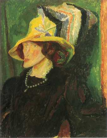
Fig.4
Duncan Grant
Portrait of Lady Ottoline Morrell 1913
Oil on panel
830 x 640 cm
Private collection
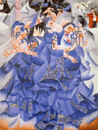
Fig.5
Gino Severini
Blue Dancer 1912
Oil on canvas with sequins
610 x 460 mm
Solomon R. Guggenheim Museum, New York
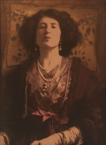
Fig.6
Baron Adolph de Meyer
Lady Ottoline Morrell c.1907
Half-plate autochrome
National Portrait Gallery, London
Grant was well aware of the purpose of modernist collage: he used found paper materials widely throughout 1914–15 after his visit to Picasso. But he had begun to experiment even before that meeting: the first version of his 1913 portrait of Lady Ottoline Morrell (fig.4) had included a string of pearls.33 By this time Grant would have seen, and almost certainly read about, futurism’s use of real materials as substitute for their sign. Gino Severini had included sequins on his painting Blue Dancer 1912 (fig.5), hung in his exhibition at the Marlborough Gallery in April 1913, and the Sketch had published an article about them.34 The pearls in the Morrell portrait, however, suggest a deeper consciousness of the play between reality and representation, as acute as that of Picasso, Juan Gris or Braque. A c.1907 autochrome of Lady Morrell (fig.6) by the celebrity photographer Baron Adolph de Meyer makes her double string of pearls its focal point. 35 Photography was, of course, grounded in an episteme that privileged reality over its representation and which depended for its imagery upon the material presence of its objects in a way that painting did not. Picasso both used photography as basis and aide-mémoire in his cubist painting, and made those paintings as a critical response.36 However, if a painted necklace was not, really, a necklace, a photographed one was proof of its reality, and the colour process of the autochrome further emphasised that truth. Given the closeness of his relationship with Morrell, and the novelty value of the autochrome – such photographs were rare and expensive – it is highly likely that Grant had seen de Meyer’s earlier portrait of his subject and used a genuine necklace (if not genuine pearls) to demonstrate the entry of the real into a system of pictorial representation. But, if that was the case in a portrait of a person, quite what was Grant doing in first establishing and then eliding the difference between collage and paint in non-objective, abstract painting?
Grant perhaps wanted the elision between painting and collage to demonstrate that, for all its invocation of a reality outside the artwork, collage remained representational: after all, as Poggi acknowledges, one of the virtues of collage is its ability to be both fixed object and mutable sign. There might also be some commentary on what Cowling terms the ‘blithely counterfeit nature’ of the nineteenth-century wallpapers that fascinated Picasso.37 That is, the ‘reality’ self-consciously introduced to cubist painting was itself also already a displaced sign, a mimesis of reality; so that what modernism’s use of these materials pointed to was not the object as object but the history of its representation. Given that the only difference between the rectangles is one of medium, it is impossible without close observation to tell which is the collage and which the painted representation. If Grant was playing that kind of game, it was one at least as clever as Picasso’s fumistique confusion of illusion and reality in his paintings of 1912–14, and a sophisticated critique of cubist ideas. However, I suggest that Grant’s elision of difference also gestures towards an abstraction from nature. That is, the rectangles in the Scroll are not as pure as they look. They are not necessarily abstract forms as they would be conceived within movements such as constructivism, but perhaps extreme derivations from nature. A clue here is that in late 1914 Grant actually reversed this process, merging abstracted, collaged paper back into figurative painting. In a study of Vanessa Bell wearing a red evening gown (Portrait of Vanessa Bell 1915, Charleston Trust, Lewes) Grant used cut paper to suggest texture and tonal values in the fabric, but its difference from the painted surface is minimal. The abstract form blends back into the painted, pictorial body. Given the rhythmic grouping of the six rectangles in each set of the Scroll, albeit that their movements are less than systematic, and given the aspiration to accompany their movement with music, might we not see these shapes as ‘bodies’? After all, we know that Grant was fascinated by the rhythms of bodily movement, having been inspired by a visit to Matisse’s studio in 1911. There he saw Matisse’s The Dance 1909–10 (State Hermitage Museum, St Petersburg), and made a version of it in his Dancers 1911 (Tate), before using repetition and displacement of the human form in his large-scale oil painting of swimmers in the Serpentine, Bathing 1911 (Tate).38
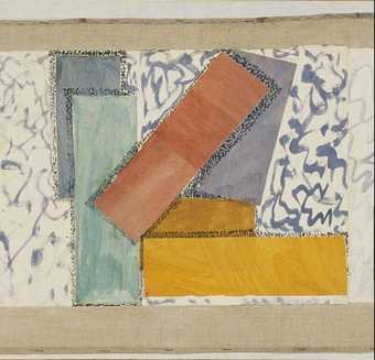
Fig.7
Duncan Grant
Abstract Kinetic Collage Painting with Sound, detail showing the eleventh group of rectangles, with stippled background and hatching around the edges of the light yellow, red, green and blue shapes
© The estate of Duncan Grant
Grant’s use of collage is notable, therefore, since the coloured rectangles that are so carefully arranged on the Scroll might all have been just as easily painted directly onto the canvas, or all made from collage. The purpose of collage here is at once aesthetic, functional and critical. It first provided room for play in the process of constructing the work, perhaps allowing the artist to test different arrangements more quickly and accurately in the early stages of the work’s development than could be achieved with sketches. Secondly, the painted marks on the rectangles expose these shapes as fragments of a larger whole, and emphasise the artist’s rapid touch. The rectangles, being cut and pasted from a larger surface, were unrestrained in their modelling by the narrow limits of the Scroll’s canvas. With the collage technique, Grant emphasised the Scroll’s materiality and revealed the process of its making. Movement and duration are also emphasised through the hatching around the edges of the rectangles and the painted ‘stippled’ dots and marbling of the background (fig.7). The poet and critic Josep Palau i Fabre suggested Grant borrowed from cubist collage, but he had used these marks since 1912.39 Although they have been described as ‘pointillist’ dots, they had a wider application than in neo-impressionist works and were used in cubist collage in the months before Grant’s visit.40
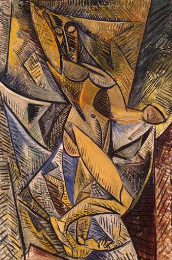
Fig.8
Pablo Picasso
Dance of the Veils 1907
Oil on canvas
1500 x 1000 mm
State Hermitage Museum, St Petersburg
© 2020 Estate of Pablo Picasso
Picasso’s use of hatching dates back to 1907 and the painting Dance of the Veils (fig.8). There, as Karmel observes, the dematerialisation and de-sexualisation of the body that accompanied the rejection of classical anatomical representation was compensated by reasserting ‘the power of sculptural form without giving up the pictorial coherence of his new decorative style’.41 I suggest that while Picasso quickly moved on from this use of what Karmel calls ‘rhythmic striations’, Grant persisted. For both artists, working between figuration and abstraction, it is a means of insisting on the subject’s material presence, even as it is dissolved into its milieu. For Grant, in making the Scroll, hatching and marbling gesture towards difference through the re-creation of depth relation. This is also the case in other domestic works by Grant, such as the carpet designs where such hatching defines the edge of the work. The technical strategy solicits from the material, human subject in space, a comparison of its own relationship, as body, to the space it occupies. Here I would point to Christopher Townsend’s comments in his first essay of this project, on the way in which Omega Workshops design in general both blurs the boundary of the subject and its milieu and in pointing to this reduced difference thus invites the subject to rethink its relation to the world.42 If we simply imagine the Scroll as a film, this hatching and marbling has no function – it is disembodied, mobilised projection. If we place it in a domestic setting, it works in the same way as the edge of the carpet, or the edge of a facet in Picasso’s painting. In the Scroll Grant uses this technique to create a shadow beneath his rectangles, creating the illusion of depth relation between them and accentuating the impression of their movement as they appear to tumble across the canvas. The Scroll thus did more than incorporate the lessons of cubist collage; it embraced the sculptural qualities of Picasso’s two-dimensional works and developed its techniques to also emphasise a sense of kinesis. This was further achieved by the dynamic blue lines of the ‘mottled’ background, intended as a loose imitation of marble and created by the artist’s vigorous painted scrawls.
Although in using geometric abstraction the Scroll took a path that cubist collage never followed, it was at this time that Picasso’s collages came closest to abstract form, even as he began to pursue more naturalistic figuration in other works. His use of geometric forms became harsher than it had been in previous years; and his painted imitations of materials, which replaced the use of found materials, might justly be described as fragments of abstract painting.43 Picasso’s own imitation marble paintings exemplify this – despite their close visual associations with the natural material, they are nonetheless creations of the artist’s imagination and as much expressions of warmth and energy as of representational forms.44 Produced in Avignon after mid-June 1914, such marbled fragments may just pre-date the production of Grant’s Scroll. Whether or not this is the case, what is significant is the way in which both artists drew a sense of dynamic relation out of the marbled patterns. Regardless of this dynamism being alien to the rigid, solid stone, Palau i Fabre suggests that this abstraction also retained for Picasso a concrete connection to ‘mother earth’.45 Grant, I argue, is similarly interested in confusing abstraction with reality and indeed in extending into the domestic space the play between types of materials and their representation that is established in the portraits of Lady Morrell and Vanessa Bell. While the Scroll’s blue mottled background loosely mimics a marbled surface, the style of the painted rectangles it carries bears close relation to Grant’s equally loose imitation of wood, such as that used a few years later at Charleston.46 After whitewashing the house, Grant then painted a wood pattern on top of the wooden doorframe, a gesture that resulted in a somewhat warped sense of domestic reality.
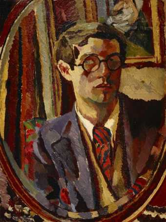
Fig.9
Duncan Grant
Self-Portrait c.1920
Oil on canvas
610 x 458 mm
National Galleries of Scotland, Edinburgh
© The estate of Duncan Grant. All rights reserved, DACS 2020
In eschewing a naturalistic representation of the imitated material, Grant’s paintings confidently embraced an experimental, modernist aesthetic while remaining inseparable from the material traces of ancient and established art forms (marble) and domestic life (wallpaper).47 If the Scroll’s imitation of material surfaces more solid and tangible than paint aligned this work with cubist collage, it simultaneously set it apart from other areas of modernist painting that influenced Grant’s work. Grant here is looking back to post-impressionist painting, where the physical details of texture and substance were derogated to the study of form itself. As form became simplified, surfaces were differentiated largely by colour and form, rather than by the physical qualities inherent to each object’s material. For Bloomsbury, post-impressionist painter Paul Cézanne was the master of ‘pure form’, which he constructed through intricately composed planes of colour that deny the textural details perceived by the eye or the hand.48 A significant element of Grant’s figurative work seems to conform to this same tendency. In his Self-Portrait c.1920 (fig.9), while the composition is brimming with an assortment of materials, all are depicted with a largely homogeneous texture, as studies of colour and form. Yet materials are nonetheless integral to such works: the soft textile of the curtain; the shine of the glass mirror; the solid carving of the wooden frame; and the two-dimensional paint of the artwork hung upon the wall are all invoked not by the details of the paintwork, but by the viewer’s memory of those materials.
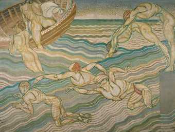
Fig.10
Duncan Grant
Bathing 1911
Oil on canvas
2286 x 3061 mm
Tate
© Tate
This memory of touch is equally integral to Grant’s more abstract and experimental body of work, which act as an interrogation of materials, and their relationship with the body through their application in society. Bathing 1911 (fig.10), is typical of this. Because of its dynamic subject and repetition of form, the painting has sometimes been linked to the Scroll, and widely accepted as one of Grant’s earlier examinations of motion. The seven distinct figures – inspired by Italian Renaissance painting, including Luca Signorelli’s frescoes in the San Brizio chapel of the Duomo in Orvieto (1499–1503) and Bastiano da Sangallo’s copy of Michelangelo’s Battle of Cascina (c.1542) – have been read as the study of a single body’s movement.49 A contemporary observer also praised the work for representing not merely the action, but the sensation of swimming: ‘If you will not demand any illusion, you will find that it gives you an extraordinary keen sense of the pleasure of swimming.’50 This is achieved in part through its depiction of a muscular body, first straining and contorted as it drives through the water and then as it clambers into the waiting rowing boat. Yet it might be seen as paradoxical that this sensation is achieved not with a naturalistic depiction of the Serpentine’s cold, fresh water, nor even an impressionistic image of its waves and spray, but with a painted imitation of mosaic tiles. While the paint makes only minimal effort to imitate a stone surface, that it is meant to invoke a tiled mosaic is unmistakeable: each ‘strand’ of wave has an entirely solid colour; no matter how closely one sits next to another, each remains separate. The paint behaves as a solid material and, just like stone, these individual strands of the waves never merge or blend. The white gaps and red lines cement this separation, emphasising their solidity. The effect, I suggest, would be markedly different if the waves imitated the warmth of a wooden surface or the softness of fabric, and either would seem decidedly misplaced compared to a blue stone tile that is frequently used in human-made swimming pools and bathrooms. By imitating tile, Grant recalls the atmosphere of the communal baths and the feeling of the smooth stone wet beneath the feet, relying on the viewer’s experience and memory of touch. That the tile is human-made is also significant in that it emphasises the domestication of the similarly human-made lake – the Serpentine as a controlled urban environment, confined by rigid boundaries and without either the freedom or uncertainty of the open sea.
Similarly, the Scroll should be regarded as a comment on the ability for individual and collective realities to be (re)constructed through the body’s connection with the material world in the domestic space. Despite the Scroll’s apparent rejection of illusionistic representation of the natural world, it remains distinct from the abstract notions of a metaphysical reality associated with the European geometric abstraction that it resembles – something emphasised in the first essay in this project.51 Instead, the Scroll confirms an experience of a reality as it is lived through physical interaction with the material world. Like Picasso’s collages, it interrogates that reality through the materials encountered by the individual. There is a space for play in this reality and the Scroll suggests a world in which a marble surface becomes kinetic, enacting the movement suggested by the patterns in a marble surface. As much as Grant’s emphasis of materiality provides the means to link his work with a physical, tangible reality, so too does it provide a means to destabilise that reality.
