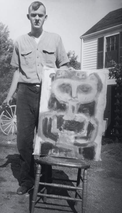
Cy Twombly with unidentified work 1940s
Courtesy Cy Twombly
In 1962 Cy Twombly (born 1928 in Lexington, Virginia) painted a work that illustrates many of the abiding engagements of his practice. Untitled is divided into two zones by a horizontal line about two thirds of the way up. Across the bottom edge of the canvas, Twombly has scribbled a textual fragment gleaned from the poet Sappho: ‘But their heart turned cold + they dropped their wings.’ The phrase, suggesting a hovering between higher and lower realms, conjures up a distant classical realm, even as the grappling, awkward hand renders the words materially present. In the upper third of the canvas, the artist provides a code for viewing: a white circle swirled with pink is labelled ‘blood’; an aggressive red ‘x’ reads ‘flesh’, a glutinous dollop of brown paint, ‘earth’ or possibly ‘youth’; a delicate disc of wispy white paint, ‘clouds’; and a shiny coin-shaped form in graphite pencil, ‘mirror’. Beneath this code, Twombly has rendered, within a drawn frame, an array of possibilities for mark-making per se, as though to set them apart from the more direct references of words. The elements of the code come from three distinct experiential fields: the elemental (earth and clouds), the somatic (flesh and blood) and the subjective (mirror). And they can be mapped on to three corresponding traditional genres of oil painting, respectively: landscape, figure and self-portraiture. In Untitled we see Twombly’s invocation of myth and poetry, his wavering between high and low and his sustained dwelling on the threshold where writing becomes drawing or painting. Perhaps most importantly, we see in this painting how marks and words – in collaboration and counter-distinction – construct meaning differently. As John Berger has written, Twombly ‘visualises with living colours the silent space that exists between and around words’.
Although his work resonates strongly with generations of younger artists, ranging from Brice Marden to Richard Prince to Tacita Dean to Patti Smith, it has a general propensity to polarise its audience between perplexity and unbridled admiration. (Remember the incident last summer of a woman planting a lipstick kiss on a Twombly canvas on show in Lyon?) Additionally, the critical and historical reception has seemed to describe two Twomblys – one about form, the other about content. Some writers have concentrated on the materiality of the artist’s mark as aggressive, often illegible graffiti; others have followed the classical allusions to ferret out the references. Two elements might serve as metaphors for the predominant interpretations: the floating disc of white paint labelled ‘clouds’standing for the poetic and mythological aspects, and the scatological heap of brown paint designating ‘earth’. However, Twombly’s painterly palimpsests trace the progressions through which form and content, text and image are inextricably linked.
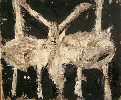
Cy Twombly, Min-Oe 1951
Paint on canvas 86.4 x 101 cm
Photo: Geoffrey Clements
Courtesy Robert Rauschenberg Foundation Collection © Cy Twombly
Earth ⁄ Youth
Cy Twombly arrived in Manhattan in 1950 while the New York School painting of Pollock and de Kooning was in full swing. Upon Robert Rauschenberg’s encouragement, Twombly joined him for the 1951–2 sessions at Black Mountain College near Asheville, North Carolina – a liberal refuge, a site of free experimentation and exchange in a nation growing increasingly conservative during the Cold War. Among the influential teachers present at this time were Charles Olson, Franz Kline, Robert Motherwell and John Cage. Building on the freedom afforded by the previous generation, the younger artists emphasised libidinal energy integrated through experience. They focused attention on calligraphic gesture and word/image relationships resulting in work that was more syncretic, less spontaneously automatist. Works such as Twombly’s Min-Oe 1951 bear evidence of the poet Olson’s interests in the roots of writing in ancient cultures and condensed glyphic forms.
For eight months spanning 1952–3 Twombly and Rauschenberg travelled through Europe and north Africa, joined for a while by the writer Paul Bowles. Upon returning to New York, Rauschenberg set up the Fulton Street studio that Twombly sometimes shared. Eleanor Ward invited the two artists to exhibit at her Stable Gallery. A series of Twombly’s works on light grounds dating to 1955 were given curious titles from a list collaboratively compiled by Twombly, Rauschenberg and Jasper Johns – Criticism, The Geeks, Academy. Here, pencil and crayon lines are inscribed into viscous light greyish brown paint. Among the anxious, discontinuous thickets, basic signs and letters begin to appear.
In 1957, having built a bridge of connections with Italian artists showing frequently at the Stable Gallery, Twombly left again for Italy, where he would remain for the most part, though making frequent trips, including many to the States. He established a studio in Rome overlooking the Colosseum and wrote a short statement for the Italian art journal L’Esperienza moderna, which was to remain the sole published reflection on his own work until 2000, when he was interviewed by David Sylvester. In the statement, Twombly describes his process: ‘Each line is now the actual experience with its own innate history. It does not illustrate – it is the sensation of its own realisation.’ Works from this era bear out the description. In Arcadia, for example, it is as though he taps into the nervous system, harnessing an alert state of tension, letting it come through in abrupt bursts at a level where it is generally inhibited by the body’s higher functions, registering its insistent throb in stuttering, jittery, whiplash lines. His move to Italy also afforded him ready access to the Mediterranean repository of classical ruin and reference. In works such as Olympia, words and names – ‘Roma’, ‘Amor’ – emerge out of a network of marks.
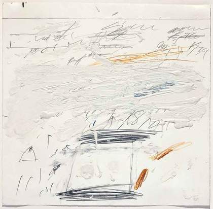
Cy Twombly, Poems to the Sea 1959
Oil, crayon, pastel and coloured pencil on paper
One of 24 sheets, each approximately 31 x 31cm
Photo: Douglas M. Parker
Collection Dia Art Foundation, New York © Cy Twombly
In 1959 Twombly executed some of the most spare works of his career, among them the 24 drawings that comprise Poems to the Sea, done on the coast of Italy at Sperlonga. What order of poems, punctuated with numerals and question marks, are these? The sea is reduced to horizon line and word, scribblings and veils of paint against the stark white of paper. A persistent compulsion is invoked in the viewer, the desire to read what is there, but not fully manifest in the artist’s scrawled script. Two words in these drawings emerge into legibility, “time”and “Sappho”, as if washed up on the beach alongside sudden, subtle gem-flashes of colour – blue, orange-yellow, pink – gleaming all the more because of their discretion. In these pages, meaning is endlessly frustrated and pursued. It settles only in the distance, figured perhaps by the horizon lines that move across the top of each of the drawings – in fact, simply grey or blue lines made with a straight edge, but suggesting seascapes at the vanishing point. The flat planes of sea and page have been collapsed. Writing comes in waves, rolling funnels of cursive script, crossed out, erased, enfoamed in satiny greyish-white paint. The signs are given as nascent forms, as gestural indications of ‘the hand’s becoming’, as Roland Barthes so aptly phrased it.
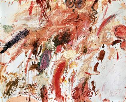
Cy Twombly, Ferragosto V 1961
Oil paint, wax crayon, lead pencil on canvas
164.5 x 200 cm
Private collection
Courtesy Thomas Ammann Fine Art, Zürich © Cy Twombly
Flesh and Blood
In the autumn of 1960 Twombly had his first solo show at the Leo Castelli Gallery in New York. Moving into the 1960s, thick and florid colour comes into his work, along with multiple classical references. During the prolific summer of 1961, he reached a fever pitch, a colouristic crescendo in the Ferragosto paintings. A thickly encrusted palette of brown, pink and red takes on a viscerality paired in the work with a body parcelled into pictograms: pendulous breasts, erupting penises, scatological posteriors. From 1961 to 1963 mythological motifs appear with increasing insistence: Leda and the Swan, Venus, Apollo, Achilles. This line of investigation culminated in 1963 with a series of works called Nine Discourses on Commodus, an obscure portrait of the megalomaniacal Roman emperor conceived while Twombly was reading the French novelist Alain Robbe-Grillet and looking at the paintings of Francis Bacon. These works were shown at Castelli in 1964, to a New York art world which had by then turned to Pop and Minimalism. Following this exhibition, Twombly’s American enthusiasm ebbed for a number of years. The situation was quite different in Europe, where his work remained a critical success. Nevertheless, the Commodus exhibition represents a crucial moment of rupture in the artist’s career, for, as he commented, it made him ‘the happiest painter around for a couple of years: no one gave a damn what I did’.
Approaching the end of the 1960s, Twombly employed a monochrome grey ground. In 1966 white writing in looped repetitive script appears on blackboard-like surfaces. The works, which continue into the early 1970s, resemble rudimentary handwriting tests, registering the muscular rhythms of the arm relaxing and tensing, and seem to eschew outside reference; but Leonardo da Vinci’s Deluge drawings and the Italian Futurists’ spatio-temporal explorations echo through them.
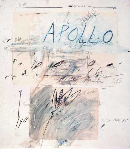
Cy Twombly, Apollo and the Artist 1975
Oil paint, wax crayon, pencil and collage on paper
142 x 128 cm
Image courtesy Works on Paper, Rome © Cy Twombly
Clouds
Beginning in 1975 and continuing into the present, Twombly has been working towards increasingly integrated combinations of text and image; of lines – both written and drawn – and colour. The repeated returns to the rich resources of classical mythology have remained the complications of his work. He employs myth as yet another form in conjunction with painting, drawing and writing. He sometimes suggests myth’s first seminal stirring, letting only hermetic fragments come to the surface as names from the past: Hero and Leander, Orpheus, Bacchus. At other times he offers a full-blown line or verse burdened with all of its cultural and poetic associations like a tree overripe with fruit. Roberto Calasso has written of the Greek myths: ‘All the powers of the cult of gods have migrated into a single, immobile and solitary act: that of reading.’ Twombly’s caveat, however, would be that the gods’ powers lie not in a single act, but in the mobilisation of the space between reading and seeing.
We see this in works such as Venus and Apollo (both 1975). In Venus the name of the goddess is written out in a palimpsest of red lines with a blossom drawn in crimson oil stick beneath. She is attended by a pencil-drawn list of her various names (Nadyomene, Aphrodite, Nymphaea…) and of her associations (myrtle, poppy, apple, sparrow…). ‘Venus’ is written out so as to emphasise the openness of the ‘V’, ‘N’ and ‘U’. In the pendant drawing, ‘Apollo’ is delineated in dark blue with a triangle, the Greek delta, serving as the first initial and doubling as a directional pointer upward. Like the delta, the two letters ‘o’ of the name are closed forms, as against the five open letters of Venus. Apollo, too, is accompanied by a list of his many names and attributes (laurel, palm, tree, hawk, grasshopper…). In these drawings, no direct definition is provided (no goddess of love or god of measure), but rather a network of allusions given both word and form.
The Whitney Museum of American Art mounted a retrospective exhibition in 1979 intended to rectify Twombly’s relative absence on the American scene. Roland Barthes, upon the artist’s suggestion, wrote the catalogue essay, ‘The Wisdom of Art’. In his tendency to promote a proliferating, reference-laden and intricate web of text, Barthes met his match with Twombly, whose work he described as ‘inimitable’: ‘It is in a smear that we find the truth of redness; it is in a wobbly line that we find the truth of a pencil.’ The exhibition made only a small splash, critiqued by some for being ‘too European’. Twombly was still in Rome and very much outside the dominant narratives of contemporary American art of the time.
The Green series, Untitled [A Painting in Nine Parts], is a sustained investigation of colour set in relation to Rainer Maria Rilke’s poetry and Monet’s art. Clearly gesturing toward landscape painting, this work seems to be the most mimetic of Twombly’s oeuvre, yet it is also the most rawly material – suggesting the two primary paths taken in the decades to follow. The green Untitled was executed in the spring of 1988 in Rome, the wood panels covered in quick-drying acrylic (for speed was of the essence in these shots of propulsive vernal energy). Part 1 functions like a title page: two lines from Rilke’s Moving Forward pencilled in Twombly’s cursive hand (‘… and in the ponds broken off from the sky, my feeling sinks as if standing on fishes’) flutter down the plane of white. ‘Fishes’, written in shimmery silver-grey oil stick near the bottom of the panel, spans from edge to edge, even moving on to the white frame. Words read as though seen through rippling water. Rhythmic spurts of graphic attention create a visual analogue to the assonance of the words. The hesitations around the letter ‘s’ swish like fish. In the other panels, words seem to be losing the battle with a superabundance of verdure. Groping finger streaks of deep emerald green have the look of sea grasses shimmying in shallow water. Monet’s Water Lilies enter the frame of reference. The effect of spatial disorientation and the congested surfaces of these pond-panels suggest something of metaphorical drowning. The myth of Narcissus, in which identity is swallowed up by mirror reflection, lurks somewhere beneath these works.
Mirror
In 1994 the Cy Twombly Gallery in Houston, Texas – designed by Renzo Piano from Twombly’s original conception – opened as a joint project between the Dia and Menil Foundations to house an extensive permanent collection of the painter’s work. That same year, the Museum of Modern Art in New York mounted a Twombly retrospective curated by Kirk Varnedoe. It met with success and marked a dramatic shift in his American reception. This was due largely to the curator’s mission of reinstating the artist’s grand themes into an individual poetics. Varnedoe essentially reads Twombly’s work as sublimation: ‘[Twombly] used the new art he created precisely to reforge, in a wholly different poetics of light and sexuality that was specific to his experience, the link between the heritage of the human past and the life of a personal psyche.’
Concurrent with the MoMA retrospective, Twombly exhibited his Untitled (Say Goodbye Catullus, to the Shores of Asia Minor) 1994 at the Gagosian Gallery in New York. The monumental piece measuring four by sixteen metres, a meditation on ageing and homecoming, offers an extraordinary array of types of mark, range of chromatic dynamics from the faintest stain of pale grey to outbursts of overripe wines and vibrant yellow-oranges, and a large body of associative references (to name only a few: Robert Burton’s Anatomy of Melancholy, Keats, Catullus, Archilochus, Turner). The painting is intended to be read from right to left, like a Chinese scroll, marking the direction of Twombly’s return over the Atlantic as it does the movement of soul boats crossing the Nile, the primary pictorial theme. The varied marks also weave a complex web of connections to myth, poetry, history, memory, conventions of painting and earlier moments in Twombly’s career.
Untitled was undertaken over a period of nearly 22 years, from 1972 to 1994. Just before it was about to be installed in the Cy Twombly Gallery in Houston, Twombly called Paul Winkler, then director of the Menil Collection; he had found a disused factory with enough wall space to hang the work in Lexington. The painting was rolled up and two Menil couriers were dispatched in an ice storm to deliver the work so that Twombly could rework it, yet again, before it was permanently hung. The anxiety around finishing this painting belies the artist’s thought expressed to Winkler, that it would be his last. It was not. He has been extremely prolific since 1994. The Bacchus series from 2005, for example, with its rush of roseate pigment and whorls of gestural energy, shows an extra-ordinary exuberance. In Simon Schama’s words: ‘The good ship Twombly sails on.’
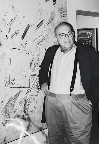
Cy Twombly with Untitled (Bolsena) 1969
Courtesy Cy Twombly
Signature
Beginning around the time of the move to Rome in 1957, Twombly’s signature became an increasingly integral element of his compositions, though often sullied, sometimes barely legible, sometimes scribbled over. The signature would seem an appropriate way to conclude a meditation on Twombly. His work is characterised by a shuttling among styles and by a certain detachment that do not enable easy extraction of a singular signature style. So what if we were to take some liberties with the proper name, ‘Twombly’? To pronounce its two syllables, the tongue performs an awkward wobble, the vocalised equivalent of a Twombly scrawl. The name holds within it the formidable parentheses that frame a life, ‘womb’ and ‘tomb’, the possibilities of proliferation and foreclosure. What of the ‘-ly’? As the suffix characterising the adverb, it could be read metaphorically alongside a verb unfurling in action (as in Action Painting), as a term turning back to modify the verb, to comment upon it.
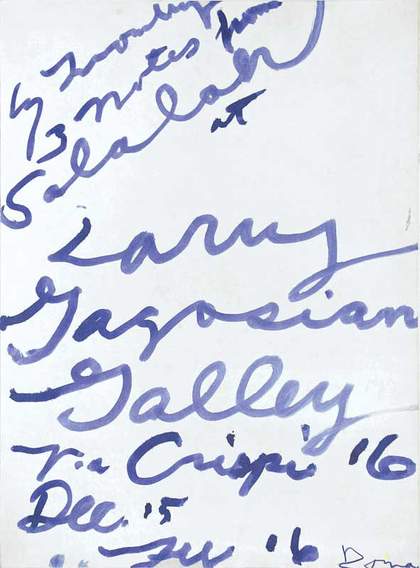
Poster for Cy Twombly’s exhibition Three notes from Salalah at Gagosian Gallery, Rome 2008
Courtesy Gagosian Gallery © Cy Twombly
Certainly, the fortuities of a name are being pushed too far here, but what does Twombly do but offer up words in all of their resonance: literal, metaphoric, corporeal, material? His citations often have the vanitas effect of graffiti: ‘Cy was here’. Lingering at the threshold between word and image, Twombly renders visible those things – experience, emotion, the body’s share – that lie beyond the reach of verbal articulation.

