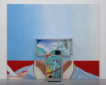
Fig.1
James Rosenquist
Silo 1963–4
Oil paint on canvas, wood and Perspex
2870 x 3531 x 562 mm
Tate T01829
© James Rosenquist/VAGA, New York and DACS, London 2017
At the centre of James Rosenquist’s Silo 1963–4 (Tate T01829; fig.1) is the T-zone. This three-dimensional structure is a wood-framed T-shape on a base comprised of two further planks of wood. This base raises the structure 4 cm off the gallery floor on which both T-shape and painting are designed to stand. The T-zone therefore demarcates a space that is above and separate from the ground yet which sits within the image-space of the painting. The T-shaped structure is glazed: its wooden frame supports sheets of Perspex, like window panes. Yet the frontal face and the innermost plane – the one that abuts the painting – are unglazed, and attached to this inner plane is a small, blank blackboard. In the work’s original incarnation as Candidate 1963, which featured the enormous smiling face of the woman whose neck and hand are still visible in Silo, the glazing included the front face of the T-zone. As such there was no point of entrance into it, even though this earlier version also contained the apparent invitation of an empty chair, a pan of water holding fake Day-Glo-coloured flowers and a working light bulb that hung from its ‘ceiling’. In both Candidate and Silo the T-zone is therefore an enclosure, and what is contained within this space is as much an object of vision as it might be the site of a subject who looks out.
The initial exhibition and reception of Candidate placed it firmly within the context of three-dimensional art. In a 1972 interview with the Whitney Museum of American Art, New York, Rosenquist made it clear that he considers the period around the beginning of 1964 as the moment when his career took off. In describing this time, he singled out two exhibitions of particular importance which both opened in New York in January 1964.1 The first is Four Environments by Four New Realists at Sidney Janis Gallery; the second, his own one-man exhibition at Green Gallery. In the Sidney Janis Gallery show, Rosenquist’s practice was associated with the three-dimensional, environment work of George Segal, Claes Oldenburg and Jim Dine. Green Gallery held breakthrough exhibitions for minimalist artists Dan Flavin and Robert Morris, as well as Rosenquist, in 1964. Linking the trajectories of these two galleries at this time, particularly through a shared attention to the work of Oldenburg and Flavin, was fellow minimalist Donald Judd’s 1965 essay ‘Specific Objects’, which focused on the shift away from the categories of painting and sculpture towards a concern for three-dimensional space.2 Rosenquist’s work fitted perfectly into Judd’s exposition and was received at the time in terms of these new ideas. In a 1966 article, for example, critic Lucy Lippard wrote of the ‘protruding forms’ of Rosenquist’s painting, of how ‘the images float uneasily’ and are spatially ambiguous. She also considered his ‘freestanding constructions’ not as conventional sculpture but as additions to this overall ambiguity.3 More than simply sculpture or painting, Rosenquist’s vision, expressed in Silo, complied with the contemporary enthusiasm for the three-dimensional and the environmental.
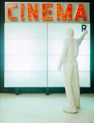
Fig.2
George Segal
Cinema 1963
Plaster, metal, acrylic sheet and fluorescent light
2997.2 x 2438.4 x 990.6 mm
Albright-Knox Art Gallery, New York
© The George and Helen Segal Foundation
Although Judd and Lippard were concerned with formal innovations, it is important to recognise that these changes acted as a means by which the social could be brought into the gallery. Like Andy Warhol’s installation of facsimile packaging boxes at the Stable Gallery in 1964 and George Segal’s Cinema from 1963 (fig.2), Silo suggests that the spectator has become both consumer-subject and worker at the same time. In contemporary reviews of Warhol’s Stable Gallery show it was noted how the artist had turned the gallery into a stock room, and critic Arthur C. Danto went further to conjure the image of a ‘stock boy’ lurking out of sight.4 Similarly, viewers are confronted by an already-present proxy of themselves in Segal’s Cinema, in the form of the figure installing the letter ‘R’ under the ‘CINEMA’ sign. Here, as at the Stable Gallery, mass production and consumption (the movies, the supermarket) have invaded the gallery, that site of distinction and rarefied looking. As for Silo, the title, referring to the massive industrial grain and feed stores with which Rosenquist would have been familiar from his time living in the American Midwest, suggests that this subject is being processed, compressed and contained, perhaps even as a kind of ‘fodder’. A similar sense is also given in Conveyor Belt 1964 (private collection), with its real conveyer belt element encouraging a direct association with factory production and supermarket check-outs. In both Silo and Conveyer Belt the sculptural appendage is the aspect that defines the role of the spectator in the work.
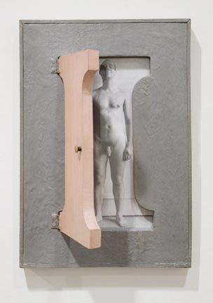
Fig.3
Robert Morris
I-Box 1962
Painted plywood cabinet, Sculp-metal and gelatin silver print
483 x 330 x 38 mm
Collection Barbara Bertozzi Castelli
© Robert Morris
Rosenquist’s association with pop art has often prevented consideration of his three-dimensional and environmental work within a wider sphere of aesthetic enquiry. In order to address this the present essay aims to complicate the narratives within art history that have tended to dichotomise pop, associated with two dimensions, and minimalism, associated with three. While the T-zone, in shape and scale, resembles Robert Morris’s minimalist ‘complex regular polyhedrons’ (such as Untitled (Corner Piece) 1964, Dia Art Foundation, New York), the more interesting comparison with Morris’s work might be with his I-Box 1962 (fig.3).5 Here, Morris’s ironic positioning of the work’s creator, literally embodied by the naked figure of the artist, inside the giant letter ‘I’ acts a critique of the idea, held by the abstract expressionists in the 1940s and 1950s, that the artist was the centre and subject of his own work and its world.
Comparing I-Box with the T-zone in Silo, in both cases box-shaped structures suggest an encasement of the subject and its formation by letters of the alphabet. To bring in Andy Warhol’s Brillo Box (Soap Pads) 1964 (Museum of Modern Art, New York), its white ‘swipe’-shaped logo design prefigures the scrubbing action of the consumer using the Brillo pad, therefore ‘packaging’ both the product and the consumer, as art historian Michael J. Golec has observed.6 As I have argued in more detail of the Brillo Boxes elsewhere, these as well as works such as Silo have important links to the genesis of what became minimalism in late 1964, and in all of them a theme of occupation – in the senses both of labour and of domesticity and its norms – becomes apparent.7 All three suggest the roles the modern subject comes to inhabit, and at issue in each is the politics of ‘fitting in’, which Silo underlines in its references to domestic work and the gendered division of housework: the dishes drying on the rack, for instance, and the woman’s hands cutting wax paper.
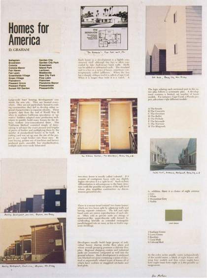
Fig.4
Dan Graham
Page from Homes for America 1966–7
© Dan Graham
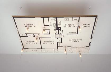
Fig.5
James Rosenquist
Doorstop 1963
Museum of Modern Art, New York
© James Rosenquist
Similar themes recur in Dan Graham’s magazine article piece Homes for America 1966–7 (fig.4), which was published in Arts Magazine two years after Silo was made. In this piece of mock anthropology Graham identifies the schematic, commercial and utterly fabricated underpinnings of American post-war domesticity. The article includes Graham’s photographs of stacked and serialised commodities which blur pop and minimalist aesthetics. Here, repeated industrial forms, including the suburban house, are returned to their place of origin in popular culture. Graham’s piece also includes an illustration of a floorplan almost identical to that seen in Rosenquist’s 1963 work Doorstop (fig.5), in which the floorplan of a typical Levittown-type prefabricated house hangs horizontally from the ceiling. Space for ‘two cars’ is stipulated in the driveway of this blueprint for the domestic American dream.
While Graham’s article takes on many of the concerns of the moment from which minimalism and American pop emerged, and shifts platforms from gallery space to media space, it will be argued here that Silo should be understood as blurring the still grounded, still ‘real’ space of the viewer and the media environment. Important to this understanding of Rosenquist’s work are two linked metaphors that reflect on this new idea of a three-dimensional space, and it is particularly through the sculptural elements like those in Silo, its precursor Candidate and other work of this time that this idea is developed. The first metaphor is the idea of media as infiltrating air-space, producing a toxic, dense atmosphere or environment filled with commercial images. The second is that of the screen onto and from which this atmosphere is projected.
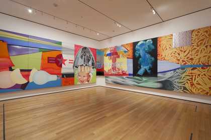
Fig.6
James Rosenquist
F-111 1964–5
Installation view
Oil on canvas with aluminium, twenty-three sections
Museum of Modern Art, New York
© James Rosenquist
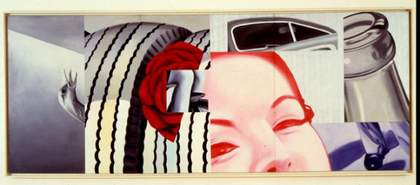
Fig.7
James Rosenquist
Silver Skies 1962
Chrysler Museum of Art, Norfolk, Virginia
© James Rosenquist
In developing an analysis of these metaphors we can begin with the flowers, floating in the pan in Candidate, whose meaning later became almost the entire subject of Silo when the canvas was repainted and renamed. The flowers in Candidate relate to a motif that was already well established in Rosenquist’s work by 1964, the signification of which is also at the very heart of Silo and, indeed, F-111 1964–5 (fig.6). This motif is that of the wallpaper pattern seen first in Silver Skies 1962 (fig.7). In his 1965 interview with curator Gene Swenson about F-111, Rosenquist stated:
I used those same wallpaper roller patterns in 1962 on a painting called Silver Skies. I saw the pattern in an elevator lobby and thought of a solid atmosphere; you walk outside of your apartment into what used to be open air and all of a sudden feel that it has become solid with radioactivity and other undesirable elements. So I used a wallpaper roller with hard artificial flowers to hang in the atmosphere like a veil.8
In Candidate this motif of artificial flowers, which in this case are luminous, is repeated; floating in a space within the image, enclosed by the T-zone and in front of the female subject’s ‘dazzling’ smile, with the light bulb hanging overhead. The elements go together to suggest an idea of radiation also signified by the ‘beaming’ and ‘glow’ of lightbulbs, which was related in Rosenquist’s thinking to the impact of speed on screens, or glass surfaces, particularly windshields. As Rosenquist described to Swenson:
ROSENQUIST: A man in an airplane approaching a beam at the airport … The ambience of the painting is involved with people who are all going toward a similar thing. All the ideas in the whole picture are very divergent, but I think they all seem to go toward some basic meaning … [O]range spaghetti, cake, light bulbs, flowers…
SWENSON: Going toward what?
ROSENQUIST: Some blinding light, like a bug hitting a light bulb. I think of the picture as being shovelled into a boiler. The picture is my personal reaction as an individual to the heavy ideas of mass media and communication and to other ideas that affect artists.9
This exchange might even serve to characterise the transition between Candidate and Silo – between commercial pleasure and a more intense sense of atmospheric bombardment and pressure as signified by the title, with the ‘silo’ being akin to the ‘boiler’ Rosenquist describes.
The wallpaper pattern in F-111 and Silver Skies is also a screen and, of course, the T-zone itself is a screen, operating as both media screen and window pane or windscreen. Both types of screen were commonly alluded to in Rosenquist’s work of this time. In 1964 the artist had planned to make a series of paintings on shaped Plexiglas screens, referred to by Rosenquist as ‘waves’,10 that retained some transparent parts and which included TV sets in their imagery.11 Another example is the painting Air Hammer 1962 (private collection), the title of which expresses precisely the sense of force Rosenquist described in this statement of 1963:
I’m amazed and excited and fascinated … about the way things are thrust at us, the way this invisible screen that’s a couple of feet in front of our mind and our senses is attacked by radio and television and visual communications, through things larger than life, the impact of things thrown at us, at such a speed and with such a force that painting and the attitudes toward painting and communication through doing a painting now seem very old-fashioned.12
Here we see an understanding that these modern conditions require forms of representation that go beyond two dimensions: an understanding allied to developments in sculpture in the environs in which Rosenquist’s art was being seen at the beginning of 1964. Lucy Lippard described the materials that appeared in Rosenquist’s sculptural-paintings, such as the Perspex used for the T-zone, as ‘abstract … extending sensuous experience’. ‘Light and clear plastics’, Lippard continued, ‘share with Rosenquist’s vocabulary a quiescent immateriality and an ability to destroy conventional space and define further levels or “vantage points”.’13
In a development of this idea, art historian Michael Lobel has argued that these vantage points are also historical – that Rosenquist’s work presents a moment of transition as TV took over from other forms of advertisement, including the painted billboard that was, in many ways, Rosenquist’s idiom. However, Lobel argues that Rosenquist used this idiom to replicate in paint the effects of TV, offering ‘a type of fragmentation, disjunction, and juxtaposition more consonant with the experience of television than with that of the billboard’.14 Thus in Silo cultural norms signified by images of domestic work are represented as fragments: the T-zone might be a television zone as much as a taste zone. As Rosenquist’s contemporary, the philosopher Marshall McLuhan, would suggest, the media is an environment (‘the images wrap around you’) and this further emphasises the theme of inhabitation in the sculptural T-zone of Silo.15

Fig.8
James Rosenquist
Tumbleweed 1963–6
Chromed barbed wire, neon and wood
Approximately 1372 x 1524 x 1524 mm
Collection of Virginia and Bagley Wright
© James Rosenquist
Following Lobel, and returning to the dual nature of Rosenquist’s screen as both window and TV screen, it might also be suggested that we stand, alongside Rosenquist, in an area ‘outside’ of TV’s media and domestic ‘inside’ space. The outside is, of course, the space that the billboard occupied, especially the vast horizontal empty spaces by the side of America’s new highways and the vertical visual landscape of New York. In this reading the ‘screen’ of the T-zone’s Perspex encasement could be the glazed façades of city shopfronts and offices or the windscreens of boxy, pre-airstream automobiles, which represented, perhaps for Rosenquist as much as for thinker Michel de Certeau, ‘a bubble of panoptic and classifying power’.16
The exhibition of Rosenquist’s freestanding sculpture work Tumbleweed 1963–6 (fig.8) alongside Silo’s precursor, Candidate, at Green Gallery in 1964 might offer some support for this theory. Tumbleweed is suggestive of the landscape at the side of the road on the great routes through the American West. In these works during this moment, and perhaps palpable only for a brief period in Rosenquist’s career, sculpture and painting seem to be held together through a single concern for the three-dimensional. In doing so, the sculptural element signifies a dynamic between the different spectator spaces of virtual media, domestic space and the ‘outside’ of the highway. Sculpture demarcates representations of the historical past, but also spaces where the spectator is allowed multiple perspectives on the ideology of the American way.17
