Fig.1
Norman Lewis
Cathedral 1950
Oil on canvas
1168 x 635 mm
Tate L03741
© Estate of Norman W. Lewis; courtesy of Michael Rosenfeld Gallery LLC, New York, NY
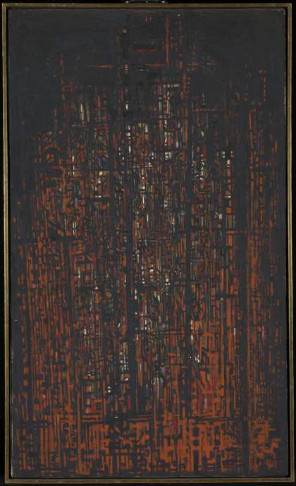
Painted by American abstract expressionist artist Norman Lewis in 1950, Cathedral (Tate L03741; fig.1) is an abstract painting featuring a complex arrangement of black lines and marks that are interspersed with various colours. The most prominent among these colours is a bold red-orange that appears in swathes and patches among the black. Multiple specks and blobs of chartreuse (yellow-green), blue, white, vermillion and viridian green are dispersed across the painting, and are particularly concentrated towards the centre. The black lines vary in thickness and move both vertically and horizontally, creating a gridded effect, with the vertical ones mimicking the orientation of the rectangular canvas and giving a feeling of upward movement. Running parallel to some of the thicker vertical lines are stacked columns of spiral-like black curls, while solid yet less clearly defined black circles and squares appear towards the edges of the painting. The composition is framed by a hazy margin of black paint, and the upper part is dominated by a large area of black with occasional lines and colours showing through. Parts of this area are glossy in texture, and this, as well as the glimpses of white and colour that appear across the central part of the painting, give an effect of shimmering and reflecting light. Towards the lower right, painted in red on a particularly thick black line that traverses the canvas horizontally, the artist has added the inscription ‘N. LEWIS 50’.
Lewis painted Cathedral on a pre-stretched, commercially primed canvas, using a variety of brushes that ranged from 2 mm to 10 mm in thickness. He blended the paints together on the canvas, rather than on the palette prior to application. The way in which the different tones of paint merge together also suggests that Lewis painted wet into wet (applying new layers before the previous ones had dried) and with some rapidity, and that he may have thinned the paint with a substance such as turpentine, allowing it to spread further on the canvas. Lewis may have returned to the work several times: it is evident that he applied the paint in distinct layers, although the order in which he painted these is unclear, and similar tones have been treated in different ways during this process. For instance, some of the patches of white may be the result of unpainted areas of primed canvas remaining exposed, while in other places white oil paint has clearly been added at a later stage, inserted into the small spaces created by the black gridded lines. The colours of the painting have been treated in a similar way, such that it is difficult to determine a foreground and background to the composition, adding to the intense effect of light filtering through, or emanating from, an architectural structure.1
Although most of Lewis’s paintings from around this time refer to the natural world – for instance, Autumn Garden 1949 (location unknown) and Winter Branches 1949 (private collection) – it is easy to see why, after painting Cathedral in his studio in New York’s Harlem, Lewis titled the work in this way. The clearly marked lines give it a structural appearance and a vertical emphasis reminiscent of Gothic architecture, and the vibration of colour in a dark space could be seen as akin to the experience of looking at a stained-glass window.
Cathedral is one of only four paintings Lewis finished in 1950 – a relatively slow year for the artist.2 Its international reputation would begin to build later in that decade due to curator Katharine Kuh’s inclusion of the work in the US pavilion at the 1956 Venice Biennale, in an exhibition titled American Artists Paint the City.3 Kuh’s display featured some of the more well-known abstract expressionists, including Jackson Pollock and Willem de Kooning, as well as a wide range of American artists who used the city as a subject for their work. Lewis’s inclusion (along with Jacob Lawrence) was the first time African Americans were represented in the US pavilion.
Lewis painted Cathedral four years after he had begun exhibiting at the Willard Gallery in New York. Although it is likely that he knew the kind of work made by the Willard’s stable of artists before this date, it is certain that he became familiar with their production afterwards, as is suggested by the numerous Willard Gallery exhibition brochures in the artist’s estate.4 Among these was the catalogue of abstract painter Lyonel Feininger’s memorial exhibition of 1959. Feininger was one of Willard’s best-known artists and his substantial overlap with Lewis at Willard, from 1946 to 1959, is notable for the formative influence that Feininger had on Lewis’s career, beginning in the late 1940s. In a 1974 interview Lewis described his relationship with Feininger as follows:
Lionel Feininger used to encourage me a lot … The impressive thing was to eventually be in a gallery and be admired by the very people whom you admire, like David Smith and Feininger. Feininger was a guy I had read about in the Bauhaus. He said, ‘I’ve looked at your work so much, and it’s so good to meet you.’ Every Christmas we used to have a party in the Willard Gallery and we would meet and talk. He used to say, ‘Don’t despair because a lot of bastards here are enjoying more material success than you. Keep on.’5
Also found in Lewis’s estate was a catalogue to a 1954–5 exhibition devoted to the Munich-based expressionist group Der Blaue Reiter (The Blue Rider), with whom Feininger was associated, and a cutting of a 1952 article in the New York Herald Tribune that noted that the form of Lewis’s work ‘is deliberately geometrical in pattern suggest[ing] a fairly close appreciation of Feininger’.6
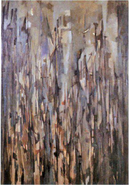
Fig.2
Norman Lewis
Harlem Courtyard 1954
Private collection
Several scholars have argued that Lewis’s title Cathedral and the oil painting’s subject matter derives from the architecture outside the artist’s studio in Harlem in New York City.7 This sort of interpretation asserts that Lewis is abstracting from specific buildings, which in many ways would place him alongside Feininger and other artists of his ilk rather than the younger abstract expressionist painters of his own generation. For instance, it is possible that Cathedral could be based on the Cathedral of Saint John the Divine in Harlem, given its location not far from Lewis’s studio; however, none of the structure’s windows feature the bold red, orange and green composition seen in Lewis’s painting. Furthermore, while there are many works made by Lewis between 1947 and 1960 whose titles mention architectural spaces and Harlem itself, such as Harlem Courtyard 1954 (fig.2) and Harlem Turns White 1955 (private collection), the spatial references in his paintings are often of a general nature – to metropolitan crowds, musical events or natural locations and phenomena such as islands, mists and storms. Lewis often referred to the felt reality of these spaces rather than any particular building or place. This was akin to the way that his fellow abstract expressionists approached the city, engaging with it as an expressive environment. Lewis seemed to confirm this when he stated:
When I’m at work, I usually remove my state of mind from the Negro environment I live in … I paint what is inside and like to think of it as a very personal, very individual environment. Being Negro, of course, is part of what I feel, but in expressing all of what I am artistically, I often find myself in a visionary world, to which 125 Street would prove limited and less universal by comparison.8
Although the distinction may appear minor, what is at stake is whether Lewis belonged to the abstract expressionism movement, in which the felt environment was key. Many of these artists, including Lewis, approached abstract composition as primary, rather than as a means to link abstraction to architecture, as we see in the work of the expressionists of earlier generations.9 This distinction will be explored later in this essay. In addition, so often we find that scholars focus on the hyper-visibility of African American identity so that the work of black modernists such as Lewis is often construed solely as a representation of their neighbourhoods, of social issues, or of phenomena such as light, fog and aerial landscapes.10 This limits the possible interpretations of work by black modernists.
This essay will analyse the influence of Feininger’s cathedral-themed paintings on Lewis alongside Feininger’s Factory Windows in Manhattan 1949, which was one of three Feininger works included in Kuh’s American Artists Paint the City (the others were New York, Architectural Composition 1940 and The Spell 1951, both in private collections). These comparisons will contextualise some of the narratives and divergences between the two artists and around pictorial space in painting in New York at mid-century. The other three sections of the In Focus emphasise the painting’s exhibition, ownership and its reception surrounding its display in Venice in 1956. Raffaele Bedarida’s contribution discusses the role that American Artists Paint the City had in the European reception of American abstract expressionism and the significance of Lewis’s participation. Claire Brandon’s essay considers the 1956 Venice Biennale, and Lewis’s inclusion within it, with regard to the rise of the large-scale global biennial as an exhibition platform in the 1950s, and assesses the role of abstract expressionism and the United States pavilion in the broader Euro-American context. Finally, an interview with Nigel Freeman of Swann Auction Galleries in New York reveals the process of researching and tracking down Cathedral for auction and the painting’s importance to the history of American art, modernism and African American culture.
Cathedrals and space
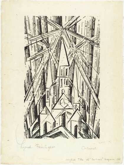
Fig.3
Lyonel Feininger
Cathedral (Kathedrale) for Programme of the State Bauhaus in Weimar 1919
Museum of Modern Art, New York
© 2018 Artists Rights Society (ARS), New York/VG Bild-Kunst, Bonn
The cathedral as title and subject has a long legacy in relation to the development of abstraction, a key example being Feininger’s woodcut Cathedral (Kathedrale) 1919 (fig.3). This was created for the cover of the Programme of the State Bauhaus in Weimar (Programm des Staatlichen Bauhauses in Weimar) (1919), the manifesto for the Bauhaus – an art school founded with a curriculum that merged architecture, painting and industrial design, among other practices.11 Feininger was hired to teach at the Weimar Bauhaus by its founder, Walter Gropius. Written by Gropius, the manifesto promulgated the artistic and educational aims of the institution. In it Gropius discusses how the arts should formally look to the Gothic past and should not solely illustrate a ‘cathedral of the future’ (Zukunftskathedrale). Rather, they could draw characteristics from the past (for instance medieval architecture), bringing them into the present in order to create an abstraction of the future.12
Although Feininger completed his woodcut in 1919, this was a later return to a favourite subject for the artist. As early as 1906 he drew the Gothic church in the German city of Gelmeroda, and he would paint thirteen monumental oil paintings of cathedrals. Whether visiting them in Gelmeroda or nearby Zirchow, he often returned to the subject of the cathedral over a span of four decades.13 As mentioned above, Feininger was also associated with the expressionist group Der Blaue Reiter, who had read art historian and theorist Wilhelm Worringer’s Abstraction and Empathy (1908). Worringer proposed a crossover in his interpretation of Christian medieval spaces with the very spiritually imbued language of German expressionism around transcendence, colour and light: ‘It is evident that transcendental notions in a religious respect, and the urge to abstraction in an artistic respect, are expressions of the same psychic disposition vis-à-vis the cosmos.’14 While there is no evidence that Feininger was looking at this specifically (and it would be simplistic to interpret Feininger’s paintings as religious in any overt way), his paintings are abstractions that could be seen to address the idea of transcending reality. If we follow Worringer’s interpretation of abstraction, Feininger’s paintings manifest in art what formerly occurred in the Gothic and Christian architecture from which he drew inspiration. As Worringer notes of abstraction and architecture, they share certain components, which are a ‘return to the plane surface, suppression of the organic, [and a] crystalline geometric composition’.15 It is not a leap to see how Feininger, painting cathedrals and familiar with Worringer’s text, would have imbued his paintings with these visual characteristics.16
In his woodcut Cathedral we see Feininger drawing from Gothic architecture in order to reconstruct space. Philosopher Michel Foucault’s analysis of medieval space, that it was hierarchical in structure and often defined through opposites – sacred or profane; urban or rural; celestial or terrestrial – is different from his understanding of modern space. For Foucault, medieval space (a world in which these oppositions intersected) was ‘the space of emplacement’.17 Whereas in the modern world we may note the primacy of extensive space, one that reaches outwards, emplacement implies a contained or confined environment, such as the cloister or enclosed garden. When Feininger drew from this architectonic language of medieval structures for his small print, he also drew upon this feeling of containment. In the print we even see the containment of light as it solidifies: featuring triangular articulations of rays of light emerging from a religious structure, light reifies as the glass facets into structure and volume. In the sky, bright stars glimmer and also emit light rays, forming a crystalline composition. In these ways, Feininger’s prismatic abstraction transforms light into space, and the hardening of light allows it to be contained within a depiction.
Akin to many of Feininger’s early compositions, such as Gelmeroda IV 1913 (Solomon R. Guggenheim Museum, New York), the cathedral building became not only a means of conveying luminosity but also a crystallisation of an atmospheric condition. Of course, in many ways light was an intrinsic consideration in the architecture of medieval cathedrals. It contributed to their very design; for example, the lighting in the apse and the placement of stained glass windows were of the highest consideration. Yet while it is tempting to read Feininger’s subject matter and Gropius’s three-page text in the Programme of the State Bauhaus as nostalgic for the Gothic past, in contradistinction it indicates how a cathedral could be, in Gropius’s words, a ‘crystal symbol of a coming faith’.18 In this way, the print Cathedral conveys a temporal link between the past, the present and the near future, but it also manages to convey the Bauhaus’s mission of connecting all the arts, including painting, sculpture, architecture and design.
This linkage of all the arts would once again become central to discussions around the new American abstraction emerging in the post-war period. By the time Lewis painted his own Cathedral in 1950, many artists such as Feininger had immigrated to the United States and became influential for the abstract expressionists in New York. Feininger and Lewis shared a mutual gallerist in Marian Willard, who was deeply invested in Feininger. She had first exhibited his work in 1936 and held further exhibitions over the next two decades. We know that Lewis encountered Feininger’s work over the years from the aforementioned gallery brochures that Lewis owned, but it is also likely that he met the artist at dinners thrown by Willard. In a 1973 interview, reflecting on his time at Willard, Lewis stated: ‘I belonged for eighteen years in the Willard Gallery. They handled Mark Tobey, Morris Graves, Richard Lippold, David Smith and Feininger, with whom I became very good friends. He used to encourage me quite a bit.’19 Certainly by the time Kuh selected Feininger’s Factory Windows in Manhattan 1949 and Lewis’s Cathedral for her 1956 Venice Biennale show, the artists would have had numerous interactions with each other.20
Nature and the city: Feininger, Lewis and Tobey
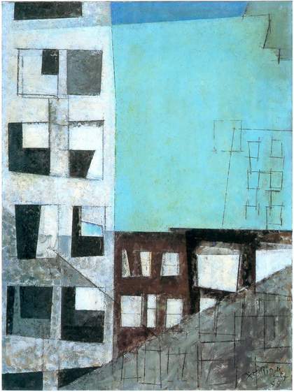
Fig.4
Lyonel Feininger
Factory Windows in Manhattan 1949
Oil on canvas
710 × 535 mm
Private collection
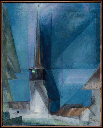
Fig.5
Lyonel Feininger
Gelmeroda 1936
Oil on canvas
1006 x 806 mm
Metropolitan Museum of Art, New York
© 2016 Artists Rights Society (ARS), New York/VG Bild-Kunst, Bonn
Feininger’s New York paintings, including Factory Windows in Manhattan (fig.4), are comparable to his numerous depictions of churches and cathedrals. If we are to compare his Gelmeroda 1936 (fig.5) with Factory Windows in Manhattan, both greet the viewer as an amalgamation of triangles and rectangles, featuring light as a structure rather than as transmissible energy. Again we see how Feininger’s abstraction was not only concerned with architectonic structure but also involved in the interplay of light solidified into structure. This was in keeping with the spiritual conversations at Willard, which artist Jeanne Miles remembered Lewis was a part of; in an interview on Lewis, Miles stated: ‘Willard had the spiritual gallery.’21 The term ‘spiritual’ is used by Miles to draw a connection to German expressionism, and the spiritualist leanings of Feininger, Wassily Kandinsky and others.
During his years exhibiting at Willard, Feininger became particularly close to Tobey, whom Kuh quotes in her Biennale essay. Discussing Feininger’s paintings, Tobey finds that architecture is inextricably joined to the natural world:
In his paintings of cities, I am reminded of those of New York; the buildings of Manhattan rise resplendent carrying within their magic structures the calligraphic black lines of window and ledge and plane. Man’s world of the city built of stone, glass and steel – yet to Feininger it reads as a message … from Nature herself as she surrounds and penetrates these forms now immanent, now remote.22
Tobey is referring here to Feininger’s Factory Windows in Manhattan, which does not feature a cathedral but nonetheless does showcase the monumental buildings of Manhattan: its skyscrapers and factories. Dotting the skyline of the modern city, these loom in New York, in contrast to the towering precedence of the cathedral in European cities, which points to their medieval past and shapes their skylines.
Tobey’s enraptured response to architecture was not new: artists had been making connections between the modernity of the American cityscape and its influence on art even in the 1910s. The city was the concern not only of Marcel Duchamp, when he wrote of America’s bridges in Blind Man in 1917, but also of artists Charles Sheeler and Georgia O’Keeffe, among many others.23 The wonder conveyed in Tobey’s description indicates how American architecture, with its formidably innovative pre- and post-war construction, encapsulated the magic previously reserved for places of worship, such as religious buildings in Europe. In Factory Windows in Manhattan, the factory, and specifically its windows, float. It is a man-made edifice that becomes part of nature because it is pierced by it. The light dematerialises the structure but that same light is again contained by a depiction of the building’s surface. This interceptive moment, where light acts as a principal feature of the natural world that Feininger delineates, and also as the paramount consideration in monumental urban architecture, is integral to his approach to abstraction. Light is the fulcrum by which we experience the architectonic surface – the skin of the solid form opened up to multiple possibilities in pictorial representation.
We know that Feininger and Tobey spoke extensively to each other about their work, and some of Tobey’s description of the way architecture intersects with nature would likely have been generated in those discussions.24 Lewis was also intrigued by the relationships between nature and the city. Joan Murray, Lewis’s longtime partner, wrote in an essay for his 1951 solo exhibition at the Willard Gallery: ‘Colors and lines merge to produce essences of moods, places, fantasies and fears, the gloom over a city, perhaps, or the chill black and white of winter, but transcending the particular with the unity and simplicity that make private experiences communicable.’25 For Lewis, who edited Murray’s essay, Cathedral is engaged with architecture but is also a negotiation of the artist’s personal relationship with space and with light. This is one of the differences scholars use to demarcate expressionism from abstract expressionism.26 We find this disjuncture when comparing Feininger’s approach with Lewis’s interest in conveying a personal relationship, even in works that address a similar subject.
In many ways Lewis’s Cathedral does not display the ready containment that we see in Factory Windows in Manhattan. For unlike both Feininger paintings shown in the Biennale, Lewis’s Cathedral is borderless. The paint spreads to the edges of the canvas. Variegated reds behave like light, appearing to peek out from among the dark lines. It is almost as if the rays of light spread away from the depicted structure, rather than being manifestations of light in solid form. Kuh described this quality in Lewis’s Cathedral as an example of a ‘jewel-like luminosity’, which corresponds to the ‘miracle light’ that she also ascribes to Tobey’s City Radiance 1944 (private collection).27 Both seem to contrast with the sharp angles of Factory Windows in Manhattan, which are engaged with light but are far more tied into Feininger’s analyses of the optical interplay of sharp radiating light. In the Lewis and Tobey paintings, light peeps through from the darkness. Their titles, Cathedral and City Radiance, evoke a general architectonic or urban infrastructure, rather than reinforcing readily identifiable subject matter. For Tobey and Lewis this is the chief departure of abstract expressionism, with its emphasis on the individual and the private, and on what Murray described as the ‘essences of moods, places’.
Since Feininger, Lewis and Tobey were all Willard Gallery artists, their similarities could relate to the collecting interests of Marian Willard and also to their shared interactions.28 However, there is something very dissimilar in the Lewis from the Tobey and the Feininger works. The surface of Lewis’s Cathedral certainly glows, and as stated his lines reach the borders. Unlike Feininger and Tobey, Lewis does not contain them in the space of the composition. Space in Lewis’s Cathedral is not expressionist or cubist and has only a hint of the calligraphic, which Kuh notes in her description of Tobey’s ‘white writing’.29 Thus, it is not controlled, as in penmanship, in the manner of the Tobey, and in this we see another divergence in this new abstraction in Lewis’s painting.
Extension: Lewis as abstract expressionist
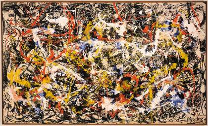
Fig.6
Jackson Pollock
Convergence 1952
Albright-Knox Art Gallery, Buffalo
© Pollock-Krasner Foundation/Artists’ Rights Society (ARS), New York
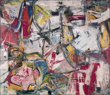
Fig.7
Willem de Kooning
Gotham News 1955
Albright-Knox Art Gallery, Buffalo
© Willem de Kooning Revocable Trust/Artists’ Rights Society (ARS), New York
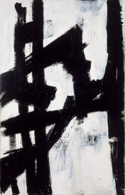
Fig.8
Franz Kline
New York, N.Y. 1953
Albright-Knox Art Gallery, Buffalo
© Estate of Franz Kline/Artists’ Rights Society (ARS), New York
If space in the medieval period can be understood in terms of emplacement – being put in place and contained therein – then by comparison modern space is more extensive. In the late 1940s and early 1950s, critical discussions of abstract expressionism often focused on entangled webs, labyrinths or vortices.30 Space was not tidy. These pictorial spaces were quite complicated to navigate, not neatly planned or laid out. As Kuh maintained in her discussion of the abstract expressionist works she exhibited at the 1956 Venice Biennale, these painters were not aiming for a ‘conscious’ depiction of the city. There is a ‘multi-colored rhythm’ in Jackson Pollock’s Convergence 1952 (fig.6), Willem de Kooning’s Gotham News 1955 (fig.7) and Franz Kline’s New York, N.Y. 1953 (fig.8). Kuh notes that these are not ‘city scenes’ but they are pictures ‘with no beginning, no boundaries, and no end’.31 Lewis’s composition for Cathedral participates in this kind of expansiveness. The extension of light to the borders of the canvas and lack of particularity in depicting a specific building or place are in keeping with de Kooning and Kline. Cathedral is not a church in Harlem or anywhere else in New York, but most likely another kind of cathedral. Perhaps, in common with Feininger’s cathedrals, it is a monument to the arts; however, in Lewis’s case this would be a felt interpretation of the arts.
Cathedrals are architecturally ambitious projects, and architecture and architectural interiors have often served as inspiration for modern artists when creating abstract compositions (see, for instance, Claude Monet’s well-known series of paintings of Rouen Cathedral, painted in 1892–4). If Feininger’s Factory Windows in Manhattan has an immanence or containment that we associate with expressionism and expressionist form, then we can see the lack of painted boundaries in Cathedral as associated with abstract expressionist space.32 In keeping with the opinions of critic Clement Greenberg, who found the reduction of pictorial space to be a noteworthy feature of abstract expressionism, Cathedral exhibits an oscillation of line in a shallow pictorial field.33 When one encounters the nest of lines in Pollock’s Convergence, or the black zigzag in a painting by Kline, there is no background in the same way as in Feininger’s Factory Windows in Manhattan. Lewis’s compositional strategies in Cathedral include the passage of paint to the edges on a flat plane that we see in abstract expressionism.
Lewis and the Venice Biennale
Alfred H. Barr Jr, the director of the Museum of Modern Art (MoMA) in New York, was involved in presenting American artists at the Venice Biennale for several years, and in 1954 MoMA bought the US pavilion. Barr used the opportunity to continue to showcase the work of emerging artists of the New York School. Despite his eager support, in exhibition after exhibition these artists failed to win the Grand Prix for painting. These hardships compelled MoMA to begin searching for curators who could put together an award-winning exhibition for the pavilion. Kuh, who for many years had a gallery in Chicago and by the mid-1950s was a curator at the Art Institute of Chicago, seemed the prudent choice. She was influential but not imbricated in the New York art world, and more likely would showcase a range of artists outside of the New York School.34
By 1955 Kuh had settled on American Artists Paint the City as the subject for the US pavilion for the twenty-eighth Venice Biennale to be held the following year.35 Her exhibition set out to link pre-war American art (for instance O’Keeffe and Edward Hopper) to post-war practices (such as those of Pollock and Kline). By choosing not to ground the exhibition in schools or movements, she aimed to draw connections between these artists and the modern American city. Because both New York and Chicago emerge from the Second World War unscathed, and subsequently experienced a post-war building boom, there were more skyscrapers dotting the skylines of both cities. From O’Keeffe’s precisionist skyscrapers to Florine Stettheimer’s Cathedrals series (1929–42) of New York City, the modern city as subject featured prominently in the first waves of abstraction after the 1913 Armory Show in the United States – the first major showcase of European abstraction in America. Kuh went a step further, positing that all American artists were the inheritors of a modernism derived from the American city. She stated in the catalogue, ‘From the gridiron construction of our cities, from their strangely lighted perspectives developing a new kind of space. In fact, form often seems less important than space, since American cities in contrast to those of Europe, are visually more alive at night.’36 Kuh refers here to artists drawing from the light of the modern city; we can therefore see how light from an American cityscape is tied to modernity, as opposed to European examples.
Records do not indicate when Kuh chose the works she included from the Willard Gallery. We know that on 27 February 1956 Marian Willard wrote to Kuh about the logistics of shipping Lewis’s Cathedral and two of the Feiningers (Factory Windows in Manhattan and The Spell). In her letter Willard related that Feininger had passed away a mere ten days before his solo exhibition opened at Willard, which was still on show. She states, ‘When life departs everything comes to a stand-still, until the mechanics of living are unraveled. My first such experience in the Gallery, don’t like it.’37
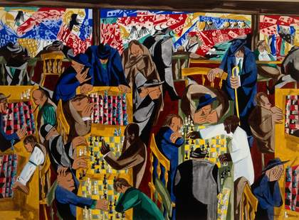
Fig.9
Jacob Lawrence
Chess on Broadway 1951
Private collection
© Jacob and Gwendolyn Knight Lawrence Foundation, Seattle/Artists Rights Society (ARS), New York/Art Resource, NY
It is curious that Kuh chose an early painting such as Cathedral to represent Lewis in Venice, since he had other works in the Willard Gallery holdings at that time that referenced the urban landscape, although few that refer to actual built structures.38 It is likely that the reference to a specific type of building is the reason Cathedral was chosen. It is important to note that Kuh also included Jacob Lawrence’s Chess on Broadway 1951 (fig.9). By no means an entirely realistic painting of a chess den in New York, it is nonetheless one that is representational of the city: bright lights on the modern thoroughfare and the chaotic interior of the chess hall, featuring over eleven matches in progress. Lawrence’s Chess on Broadway was also a painting from earlier in the decade, as were contributions from many other artists. One can conclude that for Kuh, the exhibition was not a temporal index of American painting in 1955–6, but rather a spatial index of the American city, as elucidated by her comments in the catalogue quoted above. The ‘modern’ meant not the contemporary moment, but the modern city.
In her attempt to fully explicate the experience of the American city at the time, Kuh’s inclusion of Lawrence and Lewis could also be seen as a means of engaging with the socio-political climate. Why did she choose this moment to include two well-known African American artists? It should be kept in mind that 1955 was the year of the murder of a young African American boy named Emmett Till, who had allegedly whistled at a white woman (she later retracted her statement). Later that year the now-famous Montgomery Bus Boycott took place, an early civil rights protest that was sparked by Rosa Parks’s refusal to give up her seat in the ‘coloured’ section of the bus to a white person. Between 1954 and 1956 Life magazine began extensive coverage of the civil rights movement, with increasing attention given to slavery and segregation and their damaging legacies.39 For Kuh, the decision to include Lawrence and Lewis in her exhibition, thereby showing art by African Americans in the US pavilion in Venice for the first time ever, might have been unconscious. However, Lawrence and Lewis were obvious choices – two African American artists who had been nationally recognised from the 1940s onwards and were conversant in the artistic interchanges of the period. They could also be seen to showcase two sides of a familiar dichotomous coin, with Lewis working abstractly and Lawrence’s paintings incorporating figuration. It is tempting to read Cathedral in juxtaposition with Chess on Broadway because of the shared background of the artists, who both hailed from Harlem; yet they had very little to do with each other’s practice. Rather, their inclusion is fitting, less in relation to shared interests in their work, and more with regard to the burgeoning awareness in the 1950s of American culture’s indebtedness to African American art praxis.40
In a discussion of Lawrence’s Chess on Broadway Kuh describes its relationship to the chaos of the city. It is a chaos that she argues is consciously depicted by the artist, whereas in Pollock’s Convergence she notes that the chaos is ‘not consciously related to the city, but reminiscent of the bewildering emotions resulting from its complexity’.41 In many ways Cathedral could be seen to hover in between these two analyses. The specificity of Lewis’s title, which Pollock refused to offer in Convergence, allows us to ruminate on the way that the formal elements, reminiscent of stained glass, relate back to their titular allusions in Cathedral.
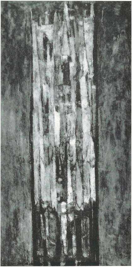
Fig.10
Joseph Friebert
Urban Cathedral 1954
Location unknown
Let us now return to Cathedral’s abstract expressionist qualities; as mentioned earlier, Lewis has been discussed as both a member of this movement and as operating outside of it. In order to do so it is important to compare it to the other cathedral painting on view in the Venice show: Joseph Friebert’s Urban Cathedral 1954. The whereabouts of the painting are unknown, but as may be seen in the image from the Venice catalogue (fig.10), it depicts a gothic structure clearly silhouetted against a dark sky. Its broken brushstrokes, which read as impressionist in style, make the painting reminiscent of Monet’s portrayals of Rouen Cathedral mentioned above (see, for example, Rouen Cathedral, Full Sunlight 1894, Musée d’Orsay, Paris). When Lewis’s Cathedral is set in contrast to Friebert’s Urban Cathedral, Lewis’s investment in abstract expressionist space is clearly gleaned: the architectural references in Friebert’s Urban Cathedral remain cohesive, as opposed to melding into and becoming extensions of the background. A more analogous work for comparison with Lewis might be found in de Kooning’s Gotham News, illustrated above, which was also shown in Venice. Kuh stated that she named this painting herself when she noticed that de Kooning had transferred newspaper text into the oil paint.42 The chaotic energy of the work reminded her of the jumble of the city, and because of the theme of the exhibition, she wanted a more concrete title and de Kooning had not minded her titling it. In this way, titles perhaps tell us more about the dialogues at the time than about the ways in which the artists intended specific elements in individual works of abstraction to be understood.
Cathedral could easily be read as a study in the architectonic as penetrated by light. Yet unlike Feininger, Lewis renders an amorphous atmospheric condition rather than showing us a hard-edge reconstruction of a broken surface. The action of the painting is a slow seeping of light, rather than jutting rays. As we have seen, Murray summed up best how we can regard Lewis’s work not as a depiction of a specific building but a conglomeration of feelings and moods about such structures. Akin to interpretations of other abstract expressionists, Cathedral incorporates the exterior space of the built environment along with the interior space, demonstrating Lewis’s mood in reaction to the building. For artists such as Lewis at mid-century, it was no longer exterior spaces that needed addressing, nor even dream-like surrealist spaces, but rather felt space. Cathedral has an all-over effect, achieved through its red glow of luminosity. Its lack of specificity is meant not as a manifesto, but as a means to communicate the personal on a universal platform – the very tenets that we associate with abstract expressionism.
