Room two Start Display
2 rooms in Start Display
An introduction to some of the best-loved artworks in the Tate collection
We live our lives in colour. Each one of us perceives colour differently, and how we react to colours might depend on our eyesight, our mood or where we are from. Artists often use colour to explore their thoughts or feelings or their place in the world. Artists have tried to expand the way colour is used, from paint to film to new materials. You can see examples in this display and throughout the rest of Tate Modern.
Where Do I Start?
Here are some ideas you can use in Start and the rest of the gallery. You might see artworks that make you question what art is. It could help if you look closely and think about:
- What is your first reaction to the work?
- Why does it make you feel or think like that?
- What is it made of?
- Why has the artist chosen those materials?
- Does the size of the work affect your experience of it?
- Where is the artist from and when did they live? How has this influenced them?
- What do you think the work is about?
- Why don’t you take a photograph of this list, so you can refer to it when you look at the art?
Let us know what you think #TateStart.
Ellsworth Kelly, Light Blue with Orange (Bleu Clair avec Orange) 1964–5
This is one of the complete set of twenty-seven colour lithographs which constitute Kelly’s earliest print series, Suite of Twenty-Seven Color Lithographs 1964–5. In this series Kelly used organic and biomorphic forms which had influenced his work ever since he was in Paris in the 1940s, where he became familiar with works by Joan Miró, Jean Arp and Constantin Brancusi. Soft curves, egg- and stone-shaped forms are the recurring theme of the Suite. The last five examples in the series (Tate L04111–L04115) are exceptions, featuring arrow shapes and straight-edged rectangles. While Kelly repeated a number of formal compositional ideas, he employed several colour combinations and exploited the possibilities of the lithographic medium for his own artistic means. Considering the Suite as a whole, Kelly can be seen to be experimenting with the perception of different colours and their significance in the process of composition.
1/23
artworks in Room two
Ellsworth Kelly, Blue and Orange and Green (Bleu et Orange et Vert ) 1964–5
This is one of the complete set of twenty-seven colour lithographs which constitute Kelly’s earliest print series, Suite of Twenty-Seven Color Lithographs 1964–5. In this series Kelly used organic and biomorphic forms which had influenced his work ever since he was in Paris in the 1940s, where he became familiar with works by Joan Miró, Jean Arp and Constantin Brancusi. Soft curves, egg- and stone-shaped forms are the recurring theme of the Suite. The last five examples in the series (Tate L04111–L04115) are exceptions, featuring arrow shapes and straight-edged rectangles. While Kelly repeated a number of formal compositional ideas, he employed several colour combinations and exploited the possibilities of the lithographic medium for his own artistic means. Considering the Suite as a whole, Kelly can be seen to be experimenting with the perception of different colours and their significance in the process of composition.
2/23
artworks in Room two
Ellsworth Kelly, Orange and Blue over Yellow (Orange et Bleu sur Jaune) 1964–5
This is one of the complete set of twenty-seven colour lithographs which constitute Kelly’s earliest print series, Suite of Twenty-Seven Color Lithographs 1964–5. In this series Kelly used organic and biomorphic forms which had influenced his work ever since he was in Paris in the 1940s, where he became familiar with works by Joan Miró, Jean Arp and Constantin Brancusi. Soft curves, egg- and stone-shaped forms are the recurring theme of the Suite. The last five examples in the series (Tate L04111–L04115) are exceptions, featuring arrow shapes and straight-edged rectangles. While Kelly repeated a number of formal compositional ideas, he employed several colour combinations and exploited the possibilities of the lithographic medium for his own artistic means. Considering the Suite as a whole, Kelly can be seen to be experimenting with the perception of different colours and their significance in the process of composition.
3/23
artworks in Room two
Ellsworth Kelly, Blue and Orange (Bleu et Orange) 1964–5
This is one of the complete set of twenty-seven colour lithographs which constitute Kelly’s earliest print series, Suite of Twenty-Seven Color Lithographs 1964–5. In this series Kelly used organic and biomorphic forms which had influenced his work ever since he was in Paris in the 1940s, where he became familiar with works by Joan Miró, Jean Arp and Constantin Brancusi. Soft curves, egg- and stone-shaped forms are the recurring theme of the Suite. The last five examples in the series (Tate L04111–L04115) are exceptions, featuring arrow shapes and straight-edged rectangles. While Kelly repeated a number of formal compositional ideas, he employed several colour combinations and exploited the possibilities of the lithographic medium for his own artistic means. Considering the Suite as a whole, Kelly can be seen to be experimenting with the perception of different colours and their significance in the process of composition.
4/23
artworks in Room two
Ellsworth Kelly, Blue over Green (Bleu sur Vert) 1964–5
This is one of the complete set of twenty-seven colour lithographs which constitute Kelly’s earliest print series, Suite of Twenty-Seven Color Lithographs 1964–5. In this series Kelly used organic and biomorphic forms which had influenced his work ever since he was in Paris in the 1940s, where he became familiar with works by Joan Miró, Jean Arp and Constantin Brancusi. Soft curves, egg- and stone-shaped forms are the recurring theme of the Suite. The last five examples in the series (Tate L04111–L04115) are exceptions, featuring arrow shapes and straight-edged rectangles. While Kelly repeated a number of formal compositional ideas, he employed several colour combinations and exploited the possibilities of the lithographic medium for his own artistic means. Considering the Suite as a whole, Kelly can be seen to be experimenting with the perception of different colours and their significance in the process of composition.
5/23
artworks in Room two
Carmen Herrera, Green Garden 1950
6/23
artworks in Room two
Ellsworth Kelly, Yellow over Black (Jaune sur Noir) 1964–5
This is one of the complete set of twenty-seven colour lithographs which constitute Kelly’s earliest print series, Suite of Twenty-Seven Color Lithographs 1964–5. In this series Kelly used organic and biomorphic forms which had influenced his work ever since he was in Paris in the 1940s, where he became familiar with works by Joan Miró, Jean Arp and Constantin Brancusi. Soft curves, egg- and stone-shaped forms are the recurring theme of the Suite. The last five examples in the series (Tate L04111–L04115) are exceptions, featuring arrow shapes and straight-edged rectangles. While Kelly repeated a number of formal compositional ideas, he employed several colour combinations and exploited the possibilities of the lithographic medium for his own artistic means. Considering the Suite as a whole, Kelly can be seen to be experimenting with the perception of different colours and their significance in the process of composition.
7/23
artworks in Room two
Maria Lalic, History Painting 2 Cave. Yellow Earth 1995
CAN COLOUR RELATE TO A PARTICULAR PERIOD IN TIME?
Maria Lalic’s paintings explore the history of colour pigments that were used to make paint. Each painting is made from semi-transparent layers of pigment that were discovered in the in the time referred to in the painting’s title. The artist was inspired by an old colour chart from paint manufacturerWinsor and Newton. It grouped pigments into six historical periods: Cave, Egyptian, Greek, Italian, 18th and 19th century, and 20th century. There is one painting for each period displayed here. Looking closely at the edges you can see the different paints she has layered to create the final colour of the painting.
‘I think I’m simply excited by recognising a time and place through colour.’
Start Gallery caption, 2016
Gallery label, July 2017
8/23
artworks in Room two
Maria Lalic, History Painting 8 Egyptian. Orpiment 1995
CAN COLOUR RELATE TO A PARTICULAR PERIOD IN TIME?
Maria Lalic’s paintings explore the history of colour pigments that were used to make paint. Each painting is made from semi-transparent layers of pigment that were discovered in the in the time referred to in the painting’s title. The artist was inspired by an old colour chart from paint manufacturerWinsor and Newton. It grouped pigments into six historical periods: Cave, Egyptian, Greek, Italian, 18th and 19th century, and 20th century. There is one painting for each period displayed here. Looking closely at the edges you can see the different paints she has layered to create the final colour of the painting.
‘I think I’m simply excited by recognising a time and place through colour.’
Start Gallery caption, 2016
Gallery label, July 2017
9/23
artworks in Room two
Maria Lalic, History Painting 14 Greek. Massicot 1995
CAN COLOUR RELATE TO A PARTICULAR PERIOD IN TIME?
Maria Lalic’s paintings explore the history of colour pigments that were used to make paint. Each painting is made from semi-transparent layers of pigment that were discovered in the in the time referred to in the painting’s title. The artist was inspired by an old colour chart from paint manufacturerWinsor and Newton. It grouped pigments into six historical periods: Cave, Egyptian, Greek, Italian, 18th and 19th century, and 20th century. There is one painting for each period displayed here. Looking closely at the edges you can see the different paints she has layered to create the final colour of the painting.
‘I think I’m simply excited by recognising a time and place through colour.’
Start Gallery caption, 2016
Gallery label, July 2017
10/23
artworks in Room two
Maria Lalic, History Painting 17 Italian. Naples Yellow 1995
CAN COLOUR RELATE TO A PARTICULAR PERIOD IN TIME?
Maria Lalic’s paintings explore the history of colour pigments that were used to make paint. Each painting is made from semi-transparent layers of pigment that were discovered in the in the time referred to in the painting’s title. The artist was inspired by an old colour chart from paint manufacturerWinsor and Newton. It grouped pigments into six historical periods: Cave, Egyptian, Greek, Italian, 18th and 19th century, and 20th century. There is one painting for each period displayed here. Looking closely at the edges you can see the different paints she has layered to create the final colour of the painting.
‘I think I’m simply excited by recognising a time and place through colour.’
Start Gallery caption, 2016
Gallery label, July 2017
11/23
artworks in Room two
Maria Lalic, History Painting 42 C20th. Winsor Yellow 1995
CAN COLOUR RELATE TO A PARTICULAR PERIOD IN TIME?
Maria Lalic’s paintings explore the history of colour pigments that were used to make paint. Each painting is made from semi-transparent layers of pigment that were discovered in the in the time referred to in the painting’s title. The artist was inspired by an old colour chart from paint manufacturerWinsor and Newton. It grouped pigments into six historical periods: Cave, Egyptian, Greek, Italian, 18th and 19th century, and 20th century. There is one painting for each period displayed here. Looking closely at the edges you can see the different paints she has layered to create the final colour of the painting.
‘I think I’m simply excited by recognising a time and place through colour.’
Start Gallery caption, 2016
Gallery label, July 2017
12/23
artworks in Room two
Byron Kim, Synecdoche 1991–2018
Byron Kim’s skin tone paintings are portraits of different people. Sitters include friends, family, fellow artists and even strangers. Their names are listed in the works title. The paintings in front of you are part of an ongoing series of around 500 portraits. Kim attempts to represent an individual through a single colour. The absurdity of this gesture is where the humour of the work can be found. The name of the series is Synecdoche. This means when a part of something stands in for the whole. Kim hints towards the importance of the individual in conveying the complexity of society.
Gallery label, November 2021
13/23
artworks in Room two
Maria Lalic, History Painting 35 C18/19th. Cadmium Yellow 1995
CAN COLOUR RELATE TO A PARTICULAR PERIOD IN TIME?
Maria Lalic’s paintings explore the history of colour pigments that were used to make paint. Each painting is made from semi-transparent layers of pigment that were discovered in the in the time referred to in the painting’s title. The artist was inspired by an old colour chart from paint manufacturerWinsor and Newton. It grouped pigments into six historical periods: Cave, Egyptian, Greek, Italian, 18th and 19th century, and 20th century. There is one painting for each period displayed here. Looking closely at the edges you can see the different paints she has layered to create the final colour of the painting.
‘I think I’m simply excited by recognising a time and place through colour.’
Start Gallery caption, 2016
Gallery label, August 2017
14/23
artworks in Room two
Carla Accardi, Big Blue 1974
15/23
artworks in Room two
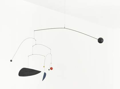
Alexander Calder, Mobile c.1932
By suspending forms that move with the flow of air, Calder revolutionised sculpture. Marcel Duchamp dubbed these works ‘mobiles’. Rather than a solid object of mass and weight, they continually redefine the space around them as they move. Calder’s subtle balance of form and colour resulted in works that suggest an animated version of paintings by friends such as Joan Miró. This very early example was acquired by Julian Trevelyan when he first got to know Calder in the early 1930s.
Gallery label, July 2008
16/23
artworks in Room two
Virginia Chihota, Fighting One’s Self 2016
This is one of two screenprints in Tate’s collection by Virginia Chihota that share the same title and date; where this one is portrait format, the other (Tate T14806) is landscape format. Both prints are unique and therefore not editioned, and form part of an ongoing series of monoprints – five at the time of writing – with the collective title Fighting One’s Self (‘Kuzvirwisa’ in the artist’s native Shona language). The title and images communicate varying aesthetic approaches to the theme of mental and physical isolation. Though created in series, the works are considered individual and can be displayed as such. This particular print is notable for the aqueous application of typically viscous screenprinter’s ink, producing a watercolour-like effect. The cool palette is predominantly blue and purple, overlaid by thin washes of red. Only toward the left-hand margin can one discern filaments of the boldest red hue for which Chihota’s earlier works are known. Large concentric ovals of blue, purple and pale red form egg-like layers, within which a figure shields its face from view. The landscape-format work is dominated by luminous gold ink, suspended in the centre of which is a large sac-like form positioned along its horizontal axis. The ovoid shape contains a human figure whose small black face and torso recede in relation to the flexed arm and disproportionately elongated leg, both articulated in taupe. The warm pink tones surrounding the figure are accented by two small striated Y-shapes rendered in blood red, evoking a uterine environment. The composition of both prints bears strong allusions to fertility, the placement of the human figure within such a sac being intentionally womb-like.
17/23
artworks in Room two
Henri Matisse, The Snail 1953
WHAT EFFECTS ARE CREATED BY PLACING DIFFERENT COLOURS NEXT TO EACH OTHER? Henri Matisse loved making art. But when he was in his 60s ill health made it difficult for him to paint. Instead he started ‘painting with scissors’, cutting painted paper into shapes. He had assistants to help him in the studio. They moved the paper pieces following Matisse’s directions, pinning them to the walls of his studio. If you look closely at The Snail you can see small pin holes. Matisse has arranged the paper in the spiral shape of a snail’s shell, placing colours next to each other to create a vibrant effect: green and red, orange and blue, pink and yellow.‘It is not enough to place colours, however beautiful, one beside the other; colours must also react on one another.’
Gallery label, July 2020
18/23
artworks in Room two
Sonia Delaunay, Triptych 1963
A pioneer of abstraction and an innovator in the fields of fashion, interior decoration, architecture and advertising, Sonia Delaunay’s career spanned much of the twentieth century. Her early abstract paintings attempted to capture the dynamism of the modern city and she continued to experiment with abstraction throughout her life. In Triptych, made in her late seventies, she set herself the challenge of introducing a white area in the centre of the work, making it more difficult to create a unity between the three sections. She wrote this work ‘opened up new vistas for me’.
Gallery label, February 2016
19/23
artworks in Room two
Bridget Riley, To a Summer’s Day 2 1980
Coloured stripes cross along a common band, reminiscent of twisting ribbons, to create a wave pattern. The choice of colours was intended to provoke an optical mix in the eye, with as much interaction as possible between colours. Light blue and yellow ochre form the basic pair of colours into which occasional threads of rose and violet are introduced to accentuate the warm and cold accents across the canvas. The title refers to William Shakespeare’s sonnet ‘Shall I compare thee to a summer’s day?’
Gallery label, October 2016
20/23
artworks in Room two
Yves Klein, IKB 79 1959
In 1947, Klein began making monochrome paintings, which he associated with freedom from ideas of representation or personal expression. A decade later, he developed his trademark, patented colour, International Klein Blue (IKB). This colour, he believed, had a quality close to pure space, and he associated it with immaterial values beyond what can be seen or touched. He described it as ‘a Blue in itself, disengaged from all functional justification’. Klein made around 200 monochrome paintings using IKB. He did not give titles to these works but, after his death, his widow assigned a number to each one.
Gallery label, November 2005
21/23
artworks in Room two
Fiona Rae, Untitled (grey and brown) 1991
In the early 1990s Fiona Rae started painting big, busy paintings which feature a wide range of colours. Does this picture seem chaotic or messy at first glance? In fact, every element has been carefully considered by the artist. Look closer at the different kinds of marks that Rae has made with the paint. You’ll be able to spot thick brush strokes, dribbled liquid paint, and even patches smeared with a fingertip. You might also see recognisable shapes or images. Rae borrows the techniques and ideas of other artists and combines them with pictures and styles taken from popular culture. For the artist, ‘any one kind of painting language is ... as interesting as another’.
Gallery label, November 2021
22/23
artworks in Room two
Ellsworth Kelly, Red-Orange (Rouge-Orange) 1964–5
This is one of the complete set of twenty-seven colour lithographs which constitute Kelly’s earliest print series, Suite of Twenty-Seven Color Lithographs 1964–5. In this series Kelly used organic and biomorphic forms which had influenced his work ever since he was in Paris in the 1940s, where he became familiar with works by Joan Miró, Jean Arp and Constantin Brancusi. Soft curves, egg- and stone-shaped forms are the recurring theme of the Suite. The last five examples in the series (Tate L04111–L04115) are exceptions, featuring arrow shapes and straight-edged rectangles. While Kelly repeated a number of formal compositional ideas, he employed several colour combinations and exploited the possibilities of the lithographic medium for his own artistic means. Considering the Suite as a whole, Kelly can be seen to be experimenting with the perception of different colours and their significance in the process of composition.
23/23
artworks in Room two
Art in this room
Sorry, no image available
You've viewed 6/23 artworks
You've viewed 23/23 artworks