American comics were first printed in the colour supplements of Sunday newspapers more than 100 years ago. The people who created them became immensely successful and reached a larger audience than any other medium at the time. Even from the earliest days, their images were sophisticated and often multilayered in meaning – able to entertain child and adult alike. One of the most innovative practitioners was Winsor McCay (1867–1934), who did for comics what D.W. Griffiths did for film and Louis Armstrong did for music: he made them one of the great forms of personal expression in twentieth century America, and would in turn influence generations of comic and fine artists. His best known strips, Little Nemo In Slumberland and The Dream of the Rarebit Fiend, started appearing in the New York Herald around 1905. A famous Little Nemo page from 1908 shows the boy’s bed growing to enormous proportions and walking from his suburban home into the city. It is full of the kind of visual dexterity that would characterise the best cartoons. The panels grow in proportion to the bed legs, their Art Nouveau shape contrasting with the rectangular grid of the page and the office buildings in lower Manhattan. The legs gracefully tangle with a round yellow moon that shows up in the eighth panel and bounces through to the end with a visual rhythm which breathes life into the design.
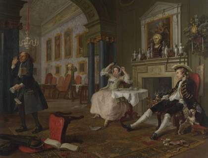
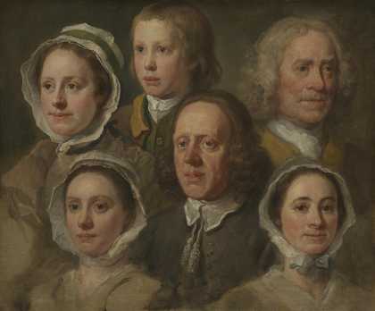
Nowadays, we are all familiar with the iconography and styles of comics produced in print and on screen around the world, but where did they originate? One of the founding fathers was William Hogarth (1697–1764). His A Harlot’s Progress 1732 was a sanctimonious and titillating series of theatrical scenes that poked fun at John Bunyan’s A Pilgrim’s Progress, with a promiscuous woman rather than a religious figure as its hero. A Harlot’s Progress and its sequel, A Rake’s Progress 1735, embodied the hallmark of what were to become comic strips in the twentieth century - stories told in a sequence of related images centred on a recognisable cast of characters.
Hogarth needed to make money throughout his life, so he published inexpensive prints of A Harlot’s Progress, including one edition with three images on each sheet and an explanatory caption underneath. These picture-stories became so popular that they were pirated and disseminated widely for decades. An 1828 version of A Harlot’s Progress, simplified and printed in a vertical row of sequential panels, appeared in Bell’s Life in London and Sporting Chronicle, in what was subsequently called “the first ever newspaper strip” – reprinted here for the first time.
Later in his career, Hogarth developed a series of prints intended to be absurd picture puzzles, such as Satire on False Perspective 1754, which shows men hunting and fishing as they recede into the distance. One of many deliberate incongruities is a man hiking at the top whose pipe is being lit by a woman leaning out of the attic of a house in the foreground – just the kind of pictorial liberty that cartoonists would later employ as a matter of course.
He also published a book called The Analysis of Beauty 1753 with engraved plates illustrating his ideas. The first shows a courtyard in which classical sculpture is juxtaposed with contemporary images. Within the picture, Hogarth employs a variety of visual gags that simultaneously reinforce and undermine the classical ideal of art. A well-dressed man holding the arm of a nude sculpture is placed next to a detailed drawing of a man’s leg muscle with a boot lying in the foreground. Around the border is an unusual series of “how to” drawings that illustrate the wide variety of methods by which images can be represented on paper, ranging from three-dimensional portraits rendered with great skill to flat cartoon doodles.
Although American comics are often seen as throwaway amusement, there are many examples that demonstrate how cartoonists such as McCay and George Herriman (1880-1944) were as much heirs to Hogarth’s tradition as artists who displayed their work in galleries. In a Krazy Kat page from a 1936 newspaper, Herriman plays with the nature of reproduction and reality as Hogarth did in The Analysis of Beauty. The title panel is a portrait of Krazy Kat with a frilly lace collar typical in Old Master paintings. The next shows Offisa Pup holding a brush and palette in front of an easel while Krazy looks on, puzzled by what she sees. The third panel reveals it is a portrait of Ignatz Mouse (Pup’s obsession and Krazy’s true love) in jail. Krazy steals the portrait, runs off across the mesa and eventually hangs it over the jailhouse window in such a way that it looks as if it is the “real” Ignatz. Pup comes by, thinks it is Ignatz and remarks: “There. is the original of my picture” to an art critic, whose reply shows his own confusion between art and reality: “Lead us on to your masterpiece.” Pup’s new obsession with art leaves Ignatz free to sling a brick at Krazy’s head in the final panel, while the characters muse over what Pup should title his painting. In this simple funny fable, Herriman was able to meditate on art, reality and love, in a manner not far removed from Hogarth.
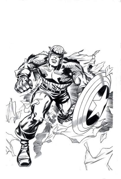
Jack Kirby and Syd Shores
Captain America #109 1969
Drawing for cover
Pen and ink with graphite
53.3 x 55.6 cm
© 2007 Marvel Characters Inc. Used with permission © Collection of Joe Maddalena/Marvel CharactersTM
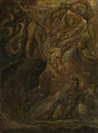
While Hogarth worked in a series of narrative images, William Blake (1757–1827) integrated his images and texts in a truly synchronised fashion. Blake stated his case in an advertisement describing his self-printed books as employing “a method of Printing which combines the Painter & the Poet. a phenomenon worthy of public attention, provided it exceeds in elegance all former methods”. His visionary integration of simplified figures and background designs, as well as his dark, expressive style, was a lesson to many graphic artists on how to transform illustration into a medium for personal expression. Echoes of his flattened muscular style reverberate throughout the comic’s heroic phase, particularly by artists such as Jack Kirby (1917–1994), creator of Captain America, The Hulk, X-Men and the overall look of Marvel Comics. One of Kirby’s characters, The Thing (one of the Fantastic Four) on the title page of This Man, This Monster, resembles Blake figures such as Lucifer from his illustrations for Dante’s Divine Comedy. Kirby used techniques pioneered by Blake to create a realistic sense of epic action through the combination of muscular figures with exaggerated patterned backgrounds that conveyed the mood of his characters as much as their facial expressions or dialogue.
However, Blake’s influence went beyond visual similarity. The dreamlike character of his work, and the way he mixed visionary poetry with simple childlike illustrations, laid the foundation for a more personal comic style. His ability to combine striking imagery with ideas was not fully appreciated in his day, but became the cornerstone of visionary art in the nineteenth and twentieth centuries.
In literature, the American writer Edgar Allan Poe (1809–1849) developed a similar approach in his writing to that which Blake brought to his illustrated poems, mixing popular sentiments with traditional forms to express a sense of dread and wonder. In doing so, Poe helped to create many of the popular genres in twentieth century culture – horror, suspense, science fiction and the detective story. Stories such as The Tell Tale Heart and The Pit and the Pendulum had as much impact upon comics as they did on pulp fiction and filmmaking. In fact, the gory pulp comics of the 1950s such as those published by EC under the titles Tales from the Crypt, Weird Science and Frontline Combat flowed directly from Poe’s fevered influence. The key creative figure at EC was Harvey Kurtzman (1924–1993), who founded MAD for the publishing company and put an ironic twist on Poe’s stories by parodying popular conventions. The cover of MAD #6 shows a troop of hapless explorers standing in the footprint of a giant beast while complaining: “Bah! We haven’t found a trace of anything! I think the story of a monster living here is a fake!” Kurtzman’s formula became the benchmark for independent comics through his influence on and direct mentoring of Robert Crumb (born 1943) and Art Spiegelman (born 1948), who turned his use of irony towards the world of popular culture.
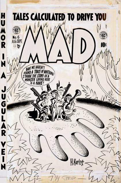
Harvey Kurtzman
MAD #6 1953
Drawing for cover
Pen and ink with coloured pencil
50.8 x 35.6 cm
© 1954 E C Publications Inc. All rights reserved. Used with permission © Collection of Glenn Bray
Poe’s tales had an artistic influence in Europe and America beyond inventing popular genres, thanks to translations of the American’s work by Charles Baudelaire (1821–1867). He understood and wrote about the way in which Poe’s “unity of effects” used the form of writing to reveal obscure relationships, which were as important as the stories themselves. Baudelaire, in turn, adopted this aspect of Poe’s work to develop his idea of hidden “correspondences” between things that led to his prescient perception that realism wasn’t about mirroring surface appearance. It also gave him the insight to understand how satiric illustration went beyond its seemingly transient existence. In the article “On the Essence of Laughter, and in General, on the Comic in the Plastic Arts” (1855), Baudelaire wrote: “There are two sorts of works which are to be prized and commended for different and almost contrary reasons. One kind have value only by reason of the fact which they represent. But the others. contain a mysterious, lasting, eternal element, which recommends them to the attention of artists.”He used the term “mysterious” to identify the double layered aspect of caricature, which allowed this seemingly disposable form to represent, better than most traditional art, how the world actually was.
Baudelaire’s respect for complex popular forms of expression also led to his interest in the work of Honoré Daumier (1808–1879), J.J. Grandville (1803–1847) and Gustave Doré (1832–1883), who contributed to the visual representation of the “mysterious”, much as Poe was able to do in literature. Grandville, in particular, helped to provide a firm basis for absurdity in comics as well as modern art through the surreal juxtaposition of ordinary objects and settings. His depictions of Parisian bridges connecting planets in space and animal figures going about ordinary urban tasks paved the way for Herriman’s animal allegories, as well as Spiegelman’s figuration of Jews as mice and Nazis as cats in Maus, his graphic novel about his father’s experience during the Holocaust. Doré’s illustrations, London: A Pilgrimage, were serialised in Harper’s Weekly in 1872, which made them immediately available to American illustrators eager to find fresh pictorial sources.
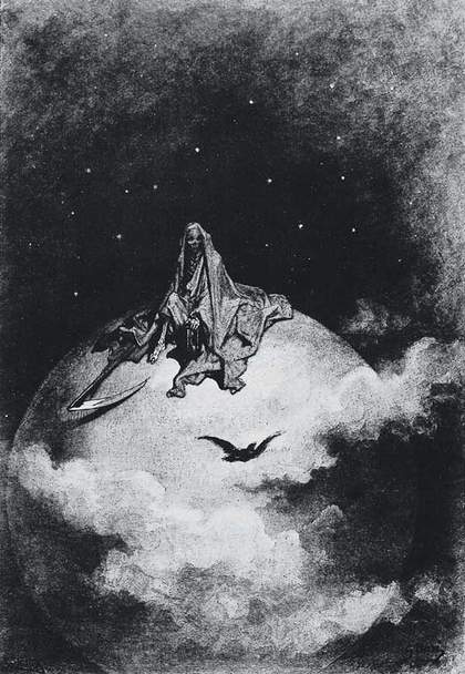
Gustave Doré
Illustration for Edgar Allan Poe’s The Raven 1832–3
© DACS, London 2007 © Ohio State University Cartoon Research Library, San Francisco Academy of Comic Art Collection
While Hogarth and Blake integrated their images sequentially, Francisco Goya (1746–1828) created pictures that could work if seen in isolation, even if they were printed as part of a series. In plate 59, called And still they don’t go!, from his series Los Caprichos, we see a rectangular slab of rock weighing down a group of people, as if the right hand border of the panel had come undone and dropped into the picture. Goya treated the light in his prints graphically, rather than realistically. Instead of trying to give the illusion of real space, he created a flat picture plane using patterns of light and dark pierced by lines and arrangements of figures. Thus, he devised new graphical means to convey social and psychological themes that elevated caricature into a truly expressive medium. His prints expressed inner reality as accurately and diligently as Hogarth portayed external reality.
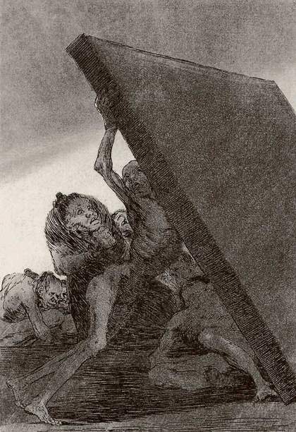
Francisco Goya Los Caprichos
Plate 59, “And still they don’t go!” 1799
Etching
21.9 x 15.2 cm
© National Gallery of Victoria, Melbourne, Australia
The artistic calibre of American comics owes a debt to both artists’ graphic depiction of light as a way of fusing content on the level of image and form. For example, Lyonel Feininger (1871–1956), a brilliant cartoonist (who also taught at the Bauhaus), created a series of Sunday comics called Wee Willie Winkie’s World in 1906 that bring the spirit of nature alive through sophisticated design elements to depict the feeling of a storm moving in as much as the physical clouds, lightening and rain. This approach can be seen throughout the history of comics, particularly in the depiction of movement and force. We can “feel” Popeye’s famous punch because its creator, E.C. Segar (1894–1938), was able to use graphics to convey the feeling of action rather than merely showing it.
By the early twentieth century a number of artists such as McCay and Herriman had created bodies of work that brought the formal complexity of Hogarth’s illustrations, Blake’s pictorial poetry and the expressive depth of Goya’s prints to comics. As well as these influences, many were well aware of the language of Modernism or, like Feininger, had a rigorous art training, and would make knowing art references in their work. By the late twentieth century, Crumb and Spiegelman added an autobiographical dimension to narrative illustration, which took comics to another level. Spiegelman’s graphic novel Maus is not just the heartbreaking story of his parent’s Holocaust experience. It showed how comics had matured to the point where it was the best way to tell that story. Comics were no longer a medium of fantasy with artistic aspirations. They had become one of the pre-eminent ways that artists could express themselves in contemporary society.
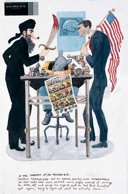
Art Spiegelman
Drawing for In the Shadow of No Towers 2004
Watercolour, gouache and ink
39.4 x 26.7 cm
© Art Spiegelman
Among contemporary cartoonists, the work of Gary Panter (born1950), such as Jimbo in Purgatory, uses a mix of drawing styles and graphic designs that evolve as we read them, so the story becomes as much about how the formal patterns change as what happens to the characters. His version of Los Caprichos is a story from 1986 about a postapocalyptic American metropolis in which Jimbo wanders and survives without seeming to have a sense of purpose. The final image shows Jimbo stretching his arms in despair next to a dead horse, which has fallen from a cliff to the ground by his side. Panter, like Goya, does not merely illustrate his character’s emotions, he shows them in the style of his composition.
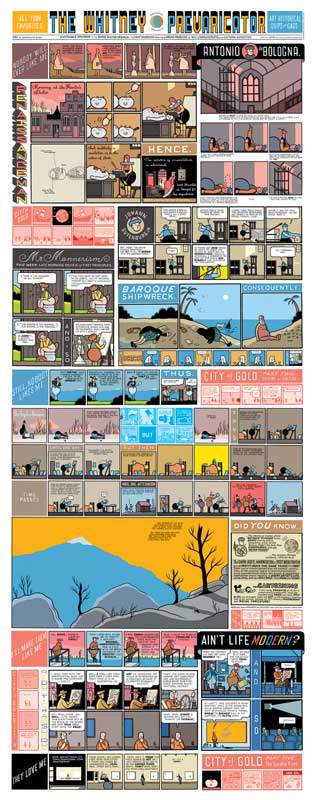
Another contemporary, Chris Ware, uses an encyclopedia of formal conventions that take us back to Hogarth’s ideas in The Analysis of Beauty – an image that the artist keeps on the wall at home near his drawing table. But Ware does so to take on the deeper and more difficult psychological realities of the twenty-first century, adding a new dimension in work such as The Whitney Prevaricator to what Hogarth invented and artists such as Herriman and Spiegelman expanded upon in the art of twentieth century American comics.

