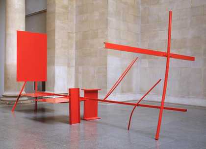
When you visit some of the ancient sites around Britain, such as the Stones of Avebury, you feel that their weight and size is challenging. This is the sensation that I experienced as I entered the Duveen Galleries at Tate Britain and encountered (I think the word encounter is good in this context – the Oxford English Dictionary defines it as ‘a meeting face to fac’) Anthony Caro’s great new work, Millbank Steps 2005.
Avebury is a work of architecture, but it defies modern, and indeed Vitruvian, definitions of architecture. It lacks a roof, for one thing. So what is the architecture of these henges? I think it is their definition of interiority. We don’t know what went on in these places, but we can guess, or perhaps we need to imagine that the experience was special. This experience of place is a characteristic of architecture that is more than visual. We are not just confronted; we are involved in a social, spatial, physical and kinetic sense. Millbank Steps also involves as well as confronts us.
I was an architecture student when I first encountered Caro’s work in the 1960s, and I and my contemporaries were amazed initially by its levitational quality. The Modern movement in architecture had achieved the sense of flotation with cantilevers, but we had never thought that colour could dematerialise and neutralise gravity in this way. I confess that we went back to our ramshackle lodgings on the Westminster Bridge Road, behind Waterloo Station, with plywood and slender sections of timber, some pots of yellow paint – or possibly pink – to see if we could mimic something of this levitational magic. Our efforts were not very good.
At the time I was particularly interested in the work of Frank Lloyd Wright, and a Caro sculpture of that decade which had particular resonance with that enthusiasm was Prairie 1967. Prairie was the trade name of the dusty yellow paint which colours the work and amplifies its extraordinary weightless hovering just above the ground plane, to which one might say it is lightly attached rather than upon which it stands. The sculpture had abstracted the cantilevering and horizontality in Wright’s work in what coincidently has been called the Prairie Style.
Many commentators, including Caro himself, have explored the relationships between his work and architecture. What occurs to me, in retrospect, is that his abstraction of architectural ideas into the idiom of sculpture coincides with a loss of confidence, in the architectural profession, in the abstract and formal power of architectural aesthetics. In 1958 the Royal Institute of British Architects (RIBA) decided to divorce architecture from the art schools and reposition it in the universities, where it was reclassified as a science, or, more usually, a social science. This had much to do with perceived failures of the Modern movement. Architecture had to become humble, non-confrontational and friendly. By the late 1960s it seemed every project, big or small, had to become a bungalow, hiding under a pitched roof.
What architecture evaded was the very thing that Caro was investigating – the idea of presence and encounter, as in relation to the anthropomorphic character of standing stones. There is an argument that the standing stone becomes the column of classical architecture, and that every column is implicitly a caryatid. I think this is an interesting speculation, but the characteristic of classicism that we lost and which is important in the argument is the idea of façade (from the Italian facciata, meaning face). Again, this is implicitly anthropomorphic, as children’s drawings of houses tell us. When we encounter a great classical building, Michelangelo’s capitol in Rome for example, we feel we are ‘face to face’. Maybe as a sculptor Michelangelo understood that possibility better than any architect.

Sir Anthony Caro
Early One Morning (1962)
Tate
The idea of the façade can be abstracted into the idea of front (still anthropomorphic, from the Latin frons, for forehead). Caro recovers that idea of frontality in his early abstract works, astonishingly so in Twenty Four Hours 1960 and Early One Morning 1962. The latter in particular evokes for me one of Le Corbusier’s early masterpieces, the Villa Garche, which presents a tremendous sense of frontality in a façade where the basic symmetry is challenged and made more compelling by asymmetrical events – something that Robert Venturi wrote about in his contemporary treatise Complexity and Contradiction in Architecture.
But there is another characteristic of these works which Caro himself commented upon: they have an architectural depth achieved by recessive frontal planes. They are layered, and this layering depends upon a highly legible distinction between front and sides to build up a powerful sensation of spatial depth.
One of my teachers and lecturers at Cambridge at this time was the great architectural historian, theorist and RIBA gold medallist Colin Rowe. He had written an essay called Literal and Phenomenal Transparency. In brief, his argument was that the literal transparency of Modernism through the use of glass – his example was that as used by Walter Gropius at the Bauhaus – was not as important for the development of architecture as the frontality and potentiality in the layering inherent in Villa Garche. The composition of the rectangular elevation of Garche is almost that of an abstract painting, and, of course, Le Corbusier was a painter as well as an architect. Rowe’s principal exemplar was Le Corbusier’s unbuilt League of Nations competition proposal, where the main conference building establishes a frontal plane, like Early One Morning, at the rear of the composition as the site is entered. The roads form oblique longitudinal connections alongside which other buildings layer the space and mark its depth. As a student I didn’t really grasp this as something I could develop, in retrospect perhaps because I was interested in the early work of Frank Lloyd Wright, in which distinctions between fronts and sides are often hardly evident because of a three-dimensional language that turns corners and tends to have equivalence in both axes.

Sir Anthony Caro
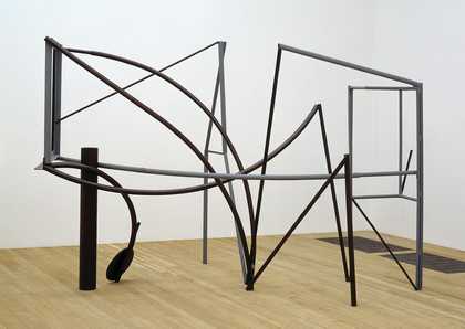
Emma Dipper (1977)
Tate
I think I finally understood what Rowe had been about and what was implicit in Early One Morning with our Cable and Wireless College, Coventry (1994). It consists of receding layers of curved roof teaching laboratories eventually halted at the rear by the flat plane of the 200-metre long residential building, penetrated obliquely by shafts of circulation marked by a radio mast. These shafts are the equivalent, though not in any conscious sense, of the rods that delineate the depth of works such as Early One Morning. The spatial dimensions of these sculptures introduce a time-based experience in exploring their depth. This is an essential characteristic of architecture as it goes beyond the immediate sense of spectacle, the ‘looking at’ which we can photograph, to the ‘being in’ which we can not. In Caro’s work this involvement starts as virtual experience and evolves into the actual experience in the towers. We are invited to enter imaginatively into the space in pieces such as Emma Dipper 1977, but we can’t actually go into it. In Sheila’s Song 1982 and The Soldier’s Tale 1983 we could just about enter the void of the half sphere partly concealed by the frontal plane, but we do not. Caro has said of his early works: ‘It is something outside which we are.’ Not only have the works no use, we don’t touch, they stand removed in the territory of art; their interiors are prohibited. He goes on to say: ‘Art thrives on the discrepancy between its territory and the real world, and it exploits the tensions between these frontiers.’
Here we seem to have a definition of the difference between architecture and art, or do we? The most potent space in Libeskind’s Jewish Museum in Berlin is its inaccessible and prohibited centre. But I think this is an exception. The experience of architecture lies in a duality between its perception as visual art which privileges its symbolic status and its obligations to the physical world of construction and usefulness. The paradox is that the aesthetics of architecture reside, to some extent, in the disciplines of construction and the experience of its use.
In relation to the conventions of sculpture, Caro’s use of industrial steel remains wholly innovative and surprising, but less so in relation to the evolution of the steel frame in nineteenth-century architecture and its declaration of structural intent in the twentieth century, in the work of Mies van der Rohe, and to the British hi-tech engineering tradition led by Foster, Rogers, Hopkins and Grimshaw. The components of Caro’s early works might have come from a construction site, but his intention diverges entirely from that of hi-tech, which is to normalise the aesthetics of construction. The sculptor defies and contrasts constructional expectation with improbable playfulness in which sometimes very heavy steel elements are made to perform balletic tricks. The scientific constraint of engineering has been invaded and usurped by another kind of understanding that resides in the mind’s eye. In this sense, Caro’s work anticipates the deconstruction of architecture which now challenges the hegemony of hitech and suggests a merging of sculpture and architecture in buildings such as the Guggenheim Bilbao. It seems highly significant that Caro collaborated with Gehry back in 1987 in the construction of a ‘sculptural village’.
In architecture, aesthetic experience is bound up with use. It is practical rather than fine art in an Aristotelian sense, and has to refer to something other than itself. This is a contradiction of Clement Greenberg’s perception of architecture in the 1950s. To illustrate this, one could compare Caro’s table sculptures with domestic utensils, cutlery, spoons, plates and bowls, or implements that have a meaning invested in their use and an aesthetic significance which is partly visual and partly to do with physical interaction with these objects. What it feels like is a conflation of these different senses. One could also say that the forms of these kinds of artefacts really are determined by their use – form really does follow function. Caro’s table sculptures refuse use and facility; in particular Cuckoo Talk 1989–90, which is actually made up of tools and implements, deliberately denies usefulness so that it must emigrate into the territory of art.

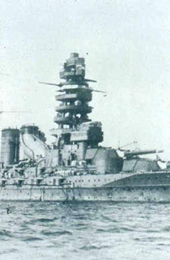
Nagato Japanese battleship, late 1920s
© Courtesy MacCormac Jamieson Prichard
Architecture is, of course, more complicated than a utensil or artefacts shaped by some singular purpose, such as an aeroplane or sailing ship. The relationship between form and function is much less determinate, and the functions that determine the form may not be obviously utilitarian. For example, to take a current project of mine, the redevelopment of the BBC, the function that determines the circulation routes, lifts, stairs and break-out areas and their relationship to the news room at the heart of the building and of the organisation is symbolic and social. To sustain the idea of a great broadcasting community all these areas visually and physically interlock so that people are aware of and meet each other as they move about. This is a definition of function, but I hope it will lead to an aesthetic experience. The whole building horizontally and vertically is interpenetrated and explored spatially by landings and stairs that work their way up through eight storeys and are a dominant motif.
I have described this because Caro’s towers, with their stairs and explorable internal spaces, are the most convergent with architecture in a formal sense. They create an unprecedented repertoire of compressed spatial exploration. They make me think of all kinds of things, of fairy tales in which you enter the trunk of a tree, of spiral stairs in castles, of 1930s trams, of tree houses and Second World War battleships and Tatlin’s tower with its revolving spaces.
The difference between sculpture and architecture is usually thought to be one of context and motivation; the artist is unconstrained and free, the architect caged by function. But in practice is it as simple? Caro has said: ‘I need ways of getting started.’ His towers seem to me to be technically and spatially very exacting in the disciplines they impose. Artists think architecture is much more difficult because there is less freedom, but perhaps it is just different because it has a functional starting point. In architecture the trajectory of a spatial idea may be kick-started by an interpretation of function, as with our BBC interior. In all creativity constraints must be translated into opportunities.
