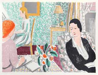
Vanessa Bell, The Schoolroom 1938, lithograph, 46 x 61.5 cm
© Estate of Vanessa Bell, courtesy Henrietta Garnett, photo: goldmarkart
In October 1932, incensed by a reviewer who had ‘omitted’ to label her work ‘highbrow’, Virginia Woolf wrote a letter to the editor of the New Statesman and Nation. Intimidating and humorous in equal parts, it ended:
‘If any human being, man, woman, dog, cat or half-crushed worm dares call me “middlebrow” I will take my pen and stab him, dead. Yours etc., Virginia Woolf.’
The missive was never posted, but was included in the posthumously published essay collection The Death of the Moth and Other Essays. Despite writing two series of essays titled The Common Reader, in which the author ostensibly identifies as both a common reader and champion of common readership, Woolf could not bear to be described by a term the Oxford English Dictionary defines as ‘only moderately intellectual; of average or limited cultural interests’.
Until recently, the art world has held similar views, shying away from the idea there might be value on the middle ground, or among the diverse tastes of the broadbrows. There are few mentions of the term in any art historical publications, and there has never been an exhibition that explicitly explores this type of work. By contrast, for the past 20 years the literary world has celebrated what have been regarded as middlebrow publications, particularly those from the interwar period.
According to literature scholars Douglas Mao and Rebecca L Walkowitz, the merits of middlebrow culture include ‘experimental and engaging tactics’ spanning ‘diverse genres and styles’, distributed to a large cross-section of the public. The ‘jazz-age’ consumers of middlebrow art forms likewise engaged with works of dynamic variety, combining ‘both intellectual and whimsical tastes and attitudes’.
To date there have been few comparable conversations in the visual arts, yet the ground is slowly shifting. One of the outcomes of a recent symposium called ‘Art History and the Middlebrow?’ was the idea of middlebrow art being seen in a more favourable light.
But what does middlebrow art look like? A good example is a pioneering project from the 1930s, which tried to bridge the gap between modernist exclusivity and a more populist appeal. In 1936 John Piper and Robert Wellington founded the print scheme Contemporary Lithographs. Their aim was to put contemporary art on school walls by commissioning lithographic prints that were ‘representational in style but with good formal qualities which could be sold cheaply’.
Whereas Contemporary Lithographs’s first collection was geared specifically towards schoolrooms, Piper sought to cultivate the relationship between the middle classes and fine art by marketing the second collection, which offered a ‘representative and wide choice of good modern work’, to households with small incomes. Artists produced the lithographs by drawing directly onto the plates or stones at the Curwen or Baynard Presses, thereby directly capturing their conceptions without intermediary craftsmen or photographic reproduction.
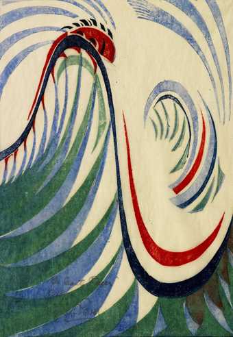
Cyril Power, The Giant Racer c.1930, linocut, 27.6 x 19.2 cm
Photo © Osborne Samuel Ltd, London/Bridgeman Images
A similar approach was taken by the Grosvenor School linocut artists. Along with Claude Flight, their tutor and champion of the linocut medium, notable pupils Sybil Andrews, Lill Tschudi and Cyril Power created prints that were avant-garde in form while focused on everyday subjects, such as leisure activities and commuting. Crafted and pulled by the artist’s hand, these linocuts were available in multiples of 60 per print. Flight’s vision was to supply ordinary homes with art suitable in size, subject and affordability for pleasurable domestic display.
Sadly, however, such ideals didn’t translate into the wider population in the way these artists had hoped. Critics and writers of the interwar period placed high, middle and lowbrow cultures into distinct and opposing categories, instituting a divisive view of cultural hierarchies that we have inherited. This battle of the brows was energetically fought in the public arena, the result of which was a modernism that was anxiously protective of an elitist and highbrow position.
While Virginia Woolf vehemently denied any affinity between her work and the middlebrow, Vanessa Bell (Woolf’s elder sister) had recognisable middlebrow attributes in her art. Much of Bell’s fabric design work, for example, is modernist in design yet intended for a broad audience. Along with several other widely respected modernist artists, including Frank Dobson and Duncan Grant, she designed textiles for small-scale industrial manufacture at Allan Walton’s factory during the 1930s. A sign of their importance in the history of 20th-century design is that many of these works have since been gathered by public collections; proof of their enduring popularity is that several prints from Bell and Grant’s portfolios have also been reproduced by museum shops and design firm Laura Ashley for consumption by a broader market.
Perhaps, given this excellent company, even Woolf might have been persuaded to reassess the value of the middlebrow, and to embrace the middle ground that she castigated in her ‘middlebrow’ letter as the ‘betwixt and between’.
Hana Leaper is the John Moores Painting Prize Senior Lecturer and Development Manager, based at Liverpool John Moores University. She is author of the catalogue raisonné Sybil Andrews Linocuts (Lund Humphries, 2015).

