Marc Camille Chaimowicz I was talking to a young assistant recently who also works in a bookshop as well as on a range of projects across different media and she referred to herself as part of the slash/ slash/slash generation, which I found interesting in relation to Paul Nash.
Inga Fraser Well, that approach has something of an ambivalent history in the UK. In fact, in 1927 Nash wrote: ‘In England we are still prone to cling rather sentimentally to the idea of the Fine Arts, and we think it a little undignified, or at least unusual, for artists to concern themselves with anything but painting and sculpture, with the result that, for the most part, such arts as interior decorations, stained glass work, theatre decor, textile designing, are left in the hands of [the] competent, but uninspired... we should begin to consider patterns as important as pictures.’ In his writing he repeatedly talks about the importance of the so-called ‘applied arts’. For example, in 1932 he complains about the way in which Picasso and Léger were able to work with many materials, whereas he found this not easy at all in England. Nash pursued a whole sweep of cultural influences, from the 18th-century furniture of Robert Adam to the theatricality of Giorgio de Chirico, which led him to experiment with an extraordinary range of media. It’s this breadth of artistic practice we should consider in addition to his paintings. Michael, you often take the long view of history in your writing. What is your opinion of Nash in this context?
Michael Bracewell As Brian Eno says, if you want to know about a period, it’s good to look across all the different media and see if they fall into a pattern. More often than not, you find they are very distinct. However, there was something interesting going on in British culture between the two world wars, which is still with us. Nash is terrifically eloquent on those issues that were partly political, while the poet and novelist Stephen Spender writes in 1932 that he feels ‘hounded by external events’. There was this sense that if you were creative, you were almost obliged to be aware of a worsening international situation. This runs parallel to a small coterie of writers and artists, of differing approaches and certainly different beliefs, who are looking at form, and who are trying to find a way of expressing, legitimately through their art, this very curious time that they find themselves in historically. Nash refers to such a time in which he lived as an air pocket. That image is very Auden-esque. Auden emerges as being the Magus, the enshrined figure around whom these different approaches to the modern are constellating. I wonder if that’s what we are picking up on now – we, too, are hounded by events. it’s difficult to shut things off and live solely for aesthetics. In addition, today’s artists are very concerned with the nature of boundaries. They may be a painter, but they also might make a performance or a film, or design wallpaper. in all these regards – politically, historically, culturally – Nash does seem to meet us in a similar way that is very up to date.
IF Yes, in veering between different media, you see that he followed a very interesting trajectory during the course of his career that may resonate with a younger generation of artists.
Alice Channer Is that also because his career was interrupted by two world wars?
IF Absolutely. It is the events that are political, national and international, as well as personal, which shape an artist’s career. There is a lie that a certain sort of history seeks to generate. An artist’s CV is a narrative that omits those commercial projects which may, nevertheless, have had an impact on someone’s artistic development. So in Nash’s work you see a progression of ideas: those in a painting would also find themselves in a textile design or photograph.
MB It is strange how he does this almost mystical, supernatural, quite spooky painting, and then paces that with cool, crisp design work and photography – going between the idea of the ancient and modern, with the two being a balance and counterbalance. I don’t know whether it is all part of the same thing, or whether the design aspect enables the deep subjectivity of the fine art.
IF He does describe explicitly how he uses the natural features of the landscape to express his psychological, emotional ideas, but admits that the opposite, working on an abstract design or pattern, may also provide a degree of relief or escapism.
MC I find the landscape world of Nash very distant, almost to the point of excluding me, perhaps because it’s so parochial. it is a lot easier for me to access his ornamental and decorative work. The thing about decoration is that it has always existed outside of boundaries. Its origins come from sources as diverse as the gothic, Islamic architecture and illustrated manuscripts. It’s cross-cultural, and given the current serious and urgent debate about migration, we could extend that to the premise of the migration of ideas.
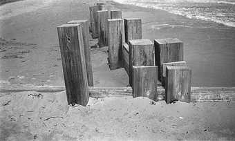
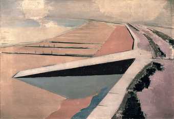
IF After the First World War, Nash moves to Dymchurch in Kent, where he finds great inspiration in the coastline. He begins to make this series of works, again across different media, all of which depict the border between the sea and the land. alice, you’ve spent time and developed work in Dymchurch...
AC There has been a sea wall there to mitigate flooding since Roman times. The current version is epic, made from solid concrete sections cast into wave shapes, and stretches for several kilometres along the coastline. I was fascinated by this in-between object and how and why Nash repeatedly drew and painted it. It is a weird industrial, sculptural barrier between the inorganic and organic – built by humans to keep out the waves. It’s elegant, majestic, but also incredibly awkward. It seems a very 21st-century thing to erect something like this against nature.
MC It could equally be architecture from the defences of Britain during the wars...
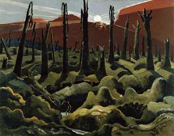
AC Yes, exactly – but today the war is with nature. He painted and drew the sea and the sea wall from strange perspectives, from above the landscape, as if he’s levitating, disembodied. His eye is always elevated. I then started looking at his landscape works from the First World War. In The Menin Road 1918–9 you find uncannily accurate parallels between the trenches he depicts and recent images of ecocide, for example aerial views of the Athabasca oil sands. Similarly, in We Are Making a New World 1918 the image looks exactly like contemporary aerial pictures of rainforest deforestation. Nash portrays nature strangely. It is both organic and extremely formalised. A good example is Winter Sea 1925, in which the waves resemble industrially folded sheets of metal. He repeats the same idea in Totes Meer (Dead Sea) 1940–1. It is clear that a lot of these industrialised forms are coming out of his work as a war artist. It has made me wonder about the strange emotional connection between industrialisation, war, formalism and pattern making, the organic and the inorganic, which is what makes his work very contemporary.
IF What is it about these war works that resonates with you?
AC In my own work I’m also attempting a deliberate and often awkward confusion between organic and inorganic matter. Looking at his war landscapes in 2016, I see a new kind of imagining of nature that we are desperately in need of now and that many artists today are working towards. Nash looks out across the trenches and paints apocalyptic landscapes that are themselves broken, destroyed, undulating bodies. I find these landscapes deeply sensual, full of new possibilities; I don’t think the title We Are Making a New World is entirely ironic. He rarely includes human figures in these landscapes, and if he does, they are so small they read as part of them, which is exactly the point. Here we are, nearly a century later, looking out at identical and vast landscapes of industrial destruction. These are seemingly dehumanised landscapes, imprinted everywhere with human activity on a vast and totalising scale. Nash’s war landscapes give us some idea of how we got here.
MB These similarities that you’ve noticed are fascinating. Also, from what you’re saying, it’s a reprise to some extent of Nash’s famous essay Seaside Surrealism, first published in The Architectural Review in 1936, in which he talks about the way that the coast does produce these astonishing forms. There is something about the period for forward-thinking, aggressively modern artists and writers, as so much contemporary imagery is to do with airmen and secret agents, crossings, mines and frontiers. When Auden writes his epigraph to Erika Mann at the beginning of his book Look, Stranger! in 1936, at the start he refers to ‘the baroque frontiers’ and ‘the surrealist police’ as the two forces that he sees as very operational at that time. I wonder whether this is something Nash is tuning into – that there is the sense of modernity, of violent change, of threat. And beyond Spender’s idea of being hounded by events, there is this deep subjective core which is nearer to Alice in Wonderland and begins to bleed into the films of Michael Powell and Emeric Pressburger around the second World War, where surrealism is never distant from the idea of death or warfare, or death by warfare.
In one sense, the proximity of catastrophe to irrational avant-garde forms seems to be expressing something to do with psychology or psychosis. Then the whole question is further spun by a very direct engagement, as Marc commented, with aesthetics. And where does all this sit in relation to something as difficult an idea as beauty, or as ornament? I think the period in which Nash is working is much spikier than a lot of people might want to believe. We have this rather sentimentalised view of the 1920s and 1930s, because the glamour of it was so dazzling. But this is also the time in which the historian Samuel Hynes describes for the modernists their private myth: that they’re trying to deal with themselves as troubled countries, with their own borders and boundaries.
IF The majority of the paintings Nash made relating to the First World War don’t have figures, which is why they open themselves up to other potentially anachronistic interpretations. Abstraction in art in general became so much more possible after the experience of having seen the very ground under your feet ripped up by warfare. Suddenly painting a land that looks liquid or a sea that resembles metal doesn’t seem so far-fetched.
AC So is there a relationship between his war work and more decorative work?
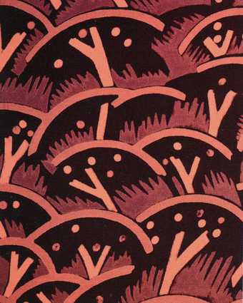
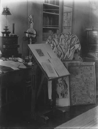
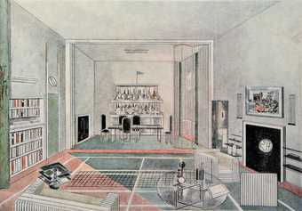
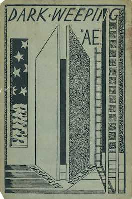
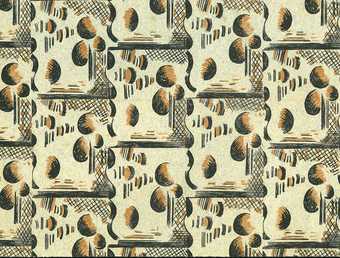
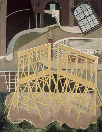
IF There are drawings Nash made for Richard Aldington’s Images of War, published in 1919, evoking shell fire and explosions, which become a repeat pattern on the cover of the book, but later morph into the textile design called Cherry Orchard, so, yes, an idea that comes from a terrible experience is later adapted for a quite different purpose. The experience of working with textile designs creeps into Nash’s painting too, with works such as The Studio 1929. There is a change in the way he represents the world. Areas of pattern intrude and the flat planes disrupt a normative idea of perspectival space. He interrupts the figurative pictorial space with these architectonic structures. It’s something he also explores in interior design. His first effort was a response to a competition run by The Architectural Review to create a room for Lord Benbow. Nash’s design used sporting motifs in a way that expressed his burgeoning interest in surrealism.
AC His design seems incredibly playful and optimistic from someone who, 12 years before, had painted We Are Making a New World.
IF The competition led to a real commission, which Nash worked on in 1935 and completed in 1936: an extraordinary design for a bathroom for the wife of surrealist patron Edward James, the Austrian dancer and film star Tilly Losch.
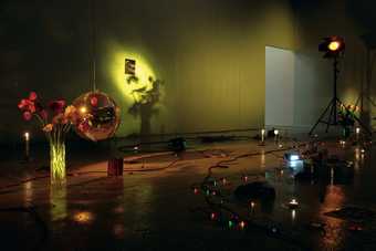
MB It reminds me of Oliver Hill’s original designs in 1933 for the Midland Hotel in Morecambe. He wanted to capture the dramatic sunsets on the façade, so he used paint containing ground glass to make the hotel literally sparkle as the sun was setting. To complement that, the cocktail bar tables included lucite crystals, while elsewhere there were Marion Dorn’s rug and mosaic designs and an Eric Ravilious mural. Now it only takes a shift of perspective and intention to view an interior like that as an installation. When you start thinking in those terms, you encounter something that is central to what Marc does, and something you’d recognise as well, alice, which is the idea of art-directed lifestyle. The uptake of ideas from the modern movement, art deco and the early 1970s by pop stylists was this notion that you took something from the world of fine art, and you put it on to the front line of mainstream pop culture, and you lived it. You would go to the average boutique or a hip flat in Notting hill in 1972, and somebody would be projecting something from 42nd street on the wall; there would be huge painted palm trees and people wearing green lurex. When perspectives shift, and I am thinking of a work by Marc such as Celebration? Realife 1972, that is very much an installation. But it is also on the aesthetic frequency of being in a very cool room, or a set for people in which to act something out. What interests me is the blurring between something that has been designed as part of the service industry and something which is being used as almost a prop.
MC The rebellious need for change and the questioning of boundaries – both aesthetic and socio-cultural – did propose a radical change of backdrop. To follow on from what you were saying, Michael, I was working this morning in Peckham, which, as we know, is now the new Hackney. It’s a very strange place indeed. I’m there because I’m working on what will tragically be the final show for John Latham’s Flat Time House. I’m introducing the work of the late Bruno Pélassy, an important French artist unknown in the UK. The result will be some kind of culture clash on a number of levels, all happening within this modest Victorian terraced house that was transformed into a conceptual think tank. We’re a long way from that Morecambe hotel, but there might, none the less, be a curious form of cultural contamination, which is what we’re hinting at.
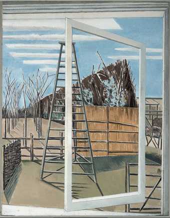
IF Thinking about the expressionistic creation of environments, you can have something seemingly slick produced by an artist or designer working to a particular commercial brief, such as the bathroom, that nevertheless incorporates these incredibly personal motifs. For example, Nash put a ladder in the bathroom because Losch was a dancer, but also because he wanted to fashion a moving, kinetic atmosphere through the mirrored surfaces. The ladder is a recurrent motif for Nash. It is part of the metaphysical architecture that he often creates, and appears in paintings such as Month of March 1929 as well as book designs. Marc Camille, in a catalogue for one of your exhibitions you asked a question: ‘How much do we progressively project our fantasies and sense of self on the outside world?’ Do you get a sense of this in Nash’s work?
MC Nash is what in medieval times would have been referred to as the journeyman. He’s responding to a commission, adapting his know-how according to client requirements, which implies a certain humility – a fascination for something that’s unsigned and is the antithesis of fine art practice centred on the ego. Ego is central to what we inherit from the Renaissance, whereas the craft tradition is, by definition, anonymous.
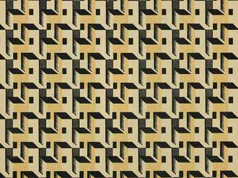
IF What he was extraordinarily skilled at was adding to his artistic ego from any number of activities, letting that inform his artistic identity, as in the essay he wrote for the Curwen Press Pattern Papers book. Researching the history of pattern papers, Nash finds that they first came about as a means to obscure censored texts, where a pattern was printed in repeat over the words so they could not be read, and publishers could re-sell the paper for decorative use.
MC It’s a very interesting essay. The pattern papers often end up lining drawers, as we might find in our grandmothers’ houses.
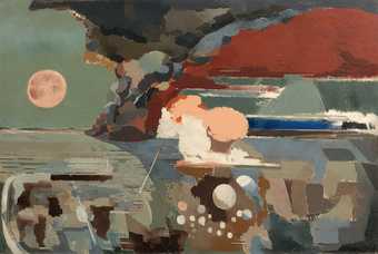
IF One method of patterning used in this way was marbling, and we can see this type of imagery – perhaps more led by the subconscious – in Nash’s later work. With Battle of Germany, made in 1944 during the Second World War, for instance, he was developing this flat, almost ink blotch technique through which a painting on the subject of war becomes incredibly aesthetic, and which is very much aligned to the semi-automatic painting and drawing methods used by the likes of Ithell Colquhoun and other surrealists.
MB The one notion that keeps coming up in this conversation is that of boundaries. This was central to the modernist imagination of the 1920s and 1930s. We’re talking about breaking boundaries between countries; the idea that you were aware of an international situation. There are also the frontiers and boundaries in cultural media, and within individuals. One of the great questions of modernism in Britain was: how does the private self address the public world? I can’t help thinking about a generational conduit in all of this being Derek Jarman, sitting there at Dungeness, with his seaside garden, looking at a nuclear power station, photographing beautiful young men, making these films, strange paintings and collages. That leads one to think that one of the other things that we’re recognising in Nash, which only really happened after 1900, was the idea of hybridisation. It’s a very modernist concept, a bit like collage. Up to 1900, the aesthetic movement was totally at home with the idea of a house beautiful and a dialogue between fine art and decorative art. And these boundaries are being blurred. Looking at Nash’s work you begin to realise quite how breathtaking that proximity is between being a participant in the mass culture of glamour, the precursor to what we know as pop culture, and being a painter in a visionary sense.
MC I think we could further add, perhaps, the boundary in terms of gender politics. This varied practice is perhaps an example of what we’ve tended to associate with the feminine rather than the masculine, which is the idea of being able to multitask. The fact that he was married is neither here nor there really. The great French cross-lateralists, although many, such as Jean Cocteau, were not heterosexual, had a different psychology which enabled them to be a lot more fluid. And, actually, this makes Nash curiously contemporary.
IF Yes, completely. One of the primary distinctions we appear to be identifying in the period in which Nash is working, which is not existent now, is the boundary between the domestic and the public realm. Some of the few modern european art exhibitions in the 1930s in Britain happened at the Mansard Gallery in Heal’s, and I wonder how you think this boundary between the public and domestic space was changing at this particular time? Of course, some of the interiors Nash painted in the early 1920s are far more traditional compared with those he was creating in a design context...
MC I don’t find his 1920s painted interiors the most pertinent aspect of his practice. If we were to compare him even loosely with, say, Giorgio Morandi or a number of the Italians, he hasn’t particularly struck a chord: the implied narrative of intimacy is absent.
MB I think his strongest work was actually to do with literally looking out of the window into the landscape, however intimately he then repackaged that landscape. I can imagine he was probably happy walking over the downs with his sketchbook. There should be parallels between what was happening in Bloomsbury and the Omega Workshops. The Bloomsburys did not get involved with the war because, as Wyndham Lewis says, they were in East Sussex ‘planting gooseberry bushes, and haymaking, doubtless in large sunbonnets’.
IF Nash did work briefly for the Omega Workshops and then denounced their approach, saying that it was sacrilege to give design work to painters who merely painted the surfaces of things. This approach jarred with his real engagement with modern industrial design processes and materials.
AC I see a connection here to artists of my generation working with industrial and post-industrial production processes and materials. We, too, are ‘hounded by events’ in that there are no boundaries between us and materials, nature, landscape. Like Nash, we do not see ourselves as separate from these things, but deeply implicated and embedded within them. I cannot work with plastics (whose production, incidentally, owes much to chemical technologies developed during the First World War), for example, without knowing and feeling that they are part of many different human and non-human bodies, geological ones included. This has huge implications for authorship, intention, what it means to have a body, to be an artist. I would describe my works as ‘authored by many different beings, only one of which is me’.
MC I was thinking of parallels with Carlo Mollino, who – for different reasons – ravaged the William Morris legacy and welcomed the creative potential of working with industry and, indeed, cutting-edge technologies. Nash is very sceptical, to the point where he’s very critical of the Arts and Crafts tradition.
AC There’s nothing puritanical in his work. He isn’t afraid of complexity. He doesn’t need or want to separate himself from the landscapes of the trenches in order to paint them, for example. That’s a deliberately difficult position for an artist to assume. It is in contrast to someone like Barbara Hepworth, who claimed: ‘I, the sculptor, am the landscape.’ For Hepworth, after two world wars, nature becomes something stable, something into which to escape. Although the results in her work are equally remarkable.
IF It’s true that, above all, Nash’s modernism was generous and inclusive, and we get a sense of this in an undated manuscript in which he is writing a series of notes for a lecture on pattern. He writes three pages of prose, but then stops and begins simply to list things: ‘Cézanne, cubism, artificial pattern, bricks, mosaics, stones, tiles, machinery, Léger, photography, hieroglyphics, block printing, cloth making, and film, natural forms... miscellaneous fireworks, sign, lighting... Woolworths.’ It gives you an idea of the breadth of references he was drawing on in relation to his work throughout his life. And, as Marc said earlier, it’s a process by which he was bringing together quite diverse elements for all kinds of reasons, commercial and personal as much as artistic. Retrospectively, Nash was able to knit all these strands together in a way that gives us an incredibly rich idea of who he was as an artist, and what directed his work.
MC He was a slash/slash/slash artist...


