Paulina Olowska
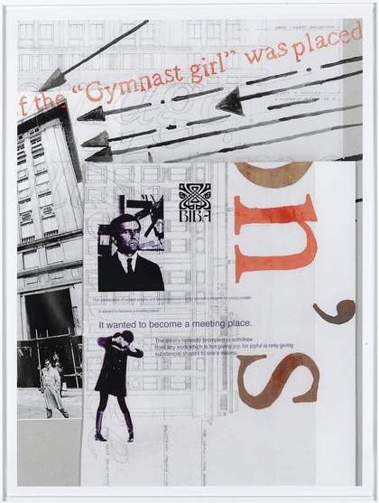
7 from the series Accidental Collages 2004
Colour print on paper, 940 x 700mm
Courtesy Stedelijk Museum, Amsterdam
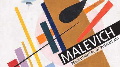
In 1927 Malevich travelled to Warsaw to present a series of his works including figurative and Suprematist paintings, architectural models and analytical charts. He also gave a lecture at the Hotel Polonia entitled ‘The New Directions in Art’, with his charts forming the backdrop to a discussion on Impressionism, Cézanne, Cubism, Futurism and Supermatism.
In 2004 I went to see a Malevich show at the Stedelijk Museum in Amsterdam, which also included the charts - didactic visual diagrams with strong graphics and collage whose condensed themes and clear delivery of concepts served as the basis of my 2004 work Accidental Collages. Using his diagrammatic method of comparing forms and styles, I wanted to spell out my paradigm of an upcoming change of reality. I viewed Malevich’s work as a revolutionary symbiotic way of seeing abstraction and figuration; of seeing a world that is much more simple and logical. He strongly believed that painting is a tool of social change, which encouraged me to continue on my path in the art form. I love his Self- Portrait from 1933. Wearing Renaissance clothes with flatly painted shapes of red, green, black and white, he makes a bizarre L-shaped hand gesture with his thumb up. It could be a move from an abstract dance, or a futuristic new universal sign for ‘hello’.
The efficiency of Malevich’s gestures and symbols can be seen everywhere today - from chocolate packaging and clothing to furniture design and architecture. The figures in his Sportsmen paintings from 1928 to 1929 have a similar outline and simplification to Jan Mucharski’s 1961 neon Volleyball Player in Warsaw’s Constitution Square. Why use a plethora of colours and forms when you can present something in primary terms?

