Richard Hamilton's design for the cover of The Beatles 1968
© Apple Corps 2013 and Estate of Richard Hamilton
The whiteness of The Beatles, aka The White Album, November 1968, everywhere
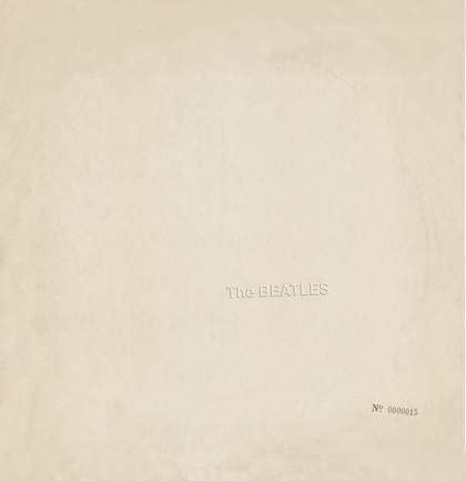
Nobody had ever seen anything like it. The packaging of the internationally anticipated new record by the most famous, most influential, most controversial, most loved, most recognised, most imitated rock group in the world was… white. Incredibly, almost immediately, a shorthand description of its packaging replaced its actual title, as it still does. The Beatles became known around the world and for all time as The White Album. It seemed less of a name change, and more an act of conceptualist transubstantiation: the conversion of a rock record into the mythic avatar of itself.
The enabler and creator of this exchange, the record cover’s designer and conceiver of its visual identity, Richard Hamilton, was already established as an artist, guru, ideologue and intellectual pioneer whose ideas and interests might be summarised, culturally, as a unique hybridisation of American glamour and European intellectualism. And even with this one achievement, barely a side-project initially undertaken somewhat warily by the artist, he seemed to hone the precision-symmetry of his intellectual and artistic vision, creating a conceptualist-aesthetic pronouncement (it was both an aphorism and a monument, at the same time) out of all that might comprise our understanding of an accelerating modern world: commodity, glamour, technology, mass media, consumerism, design, belief, communication, politics, fame, image… The whole trip…
If an endorsement of Hamilton’s vision – or mission, or research – lay anywhere, in the swinging winter of 1968, it surely lay in the fact that his understanding of what Andy Warhol had called ‘a total Pop world’ was so astute that he could work with the most powerful entertainers and media stars on the planet, and re-express not only their fame, but the pan-global consciousness of that fame.
To be specific, when you held the album – it was of course a double LP, in a gatefold sleeve – your immediate experience could be summarised as intimate contact with visual and tactile ‘perfection’: a heavy gloss surface, cool and smooth to the touch, for all the world, in those days of the Space Race, as though you were touching the surface of some impossibly advanced lunar research equipment. The whiteness and the gloss were simultaneously industrial and cold, like a presentiment of infinite and pristine mass-production, and at the same time as magical and entrancing as a vast expanse of freshly fallen snow. Warmth and cold, emotion and mechanistic impersonality, romanticism and industrialism: how could an album, a product, a design solution, a piece of packaging, an artwork, be at once so apparently ‘empty’, yet simultaneously so visceral, present, immediate and thrilling? The thing is, Hamilton made it look so simple, almost throwaway; and in the balance of conceptual richness and simplicity of execution lay the beauty. Within, the sleeve contained four photographic portraits of the Fabs by John Kelly, and a Hamilton-created collage in the format of a poster, comprising images of the group members individually selected by The Beatles themselves.
If the ‘whiteness’ of The White Album conflated a sense of cold industrialism with a richly glamorous, modern aesthetic, then in doing so it exerted phenomenal visual and conceptual tension – the perfect host, in terms of picture plane and surface, to receive the embossed imprint of the group’s name (tipped at a slight angle, as though to emphasise the mass-reproduction process) and a machine-stamped serial number running into the millions. All over the world, people were able to buy a great work of art, and take it home and allow its presence and materiality to absorb them; and they did. In the two typographic gestures resided a myriad ideas and insights: that The Beatles were so famous that their name had become a trademark while their true identity became increasingly unknowable; that a product which would sell in the millions was also an individually numbered ‘edition’ of a great work of art; that no representational image could now communicate what The Beatles had become, and their name alone was a deafening semiotic transmission; that the whiteness instigated a total gear change in the sub-cultural zeitgeist, away from, say, the pantomime Regency of the Sgt Pepper sleeve, and into a colder future… And so on. This was the modern world.

