My parents became aware of Pat’s extraordinary artistic ability when he was very young, and they nurtured it. He and my father were very close, and Pat was always sent to schools that took art seriously. He owed a lot to a brilliant teacher at St George’s in Harpenden, who would take him up to London by car to show him a Cézanne at the National Gallery. By that time it was obvious he was going to be an artist, and that’s what everything was geared towards.
As a very young man, he went through several phases: a Cézanne phase, a Braque phase, a Bonnard phase, all of which are evident in his early paintings as he developed a voice. When Cresta Silks moved into a large new building, there was a little spare room that became Pat’s studio – he was about only nineteen or twenty. At the same time he was attending the Slade, although I don’t think he ever did more than about two days a week. In the post-war years, he was doing designs of a modern sort – he’d moved to London and was travelling between there and Welwyn, trying to get established as a painter. There was a huge relationship between his designs and paintings. I think the very way in which colour became central to his art owed a lot to the colour and designs of the textiles produced by Cresta.

Patrick Heron
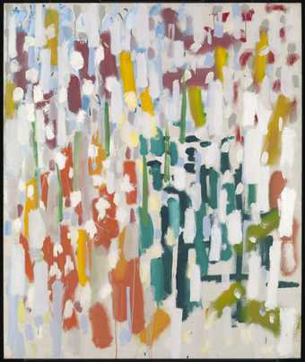
Azalea Garden : May 1956 (1956)
Tate
It was my dad’s suggestion that he should do a design for Cresta. At the age of fourteen he produced Melon 1934, and then two years later, Amaryllis, which was his first repeat pattern, block-printed design. Our father would explain to him: if you have a square scarf, you don’t wear it as a square, you wear it folded up, and therefore you must think of it as two or four triangles – always getting different results. You can see this was taken on board in this design. Pat was also very keen on Paul Nash’s designs, such as Cherry Orchard 1931. He was inevitably aware of the artist-commissioned designs being produced for Cresta and would sometimes look to those artists for inspiration.
As his paintings got more and more influenced by the likes of Cubism, so his designs got more outrageously modern. Aztec 1945, for instance, is designed by somebody who’s deeply immersed in modern art. The most extraordinary squiggles as motifs, scattered over the surface. Each informed the other, though he was developing and learning as a painter when he began to produce designs.

Patrick Heron
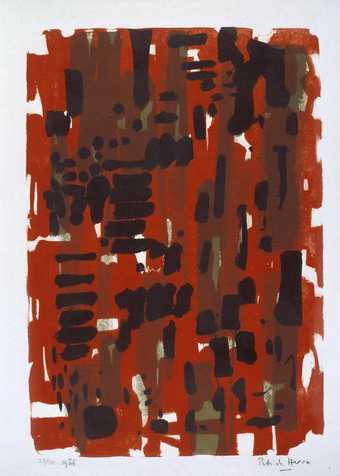
Red Garden : 1956 (1956)
Tate
The painting Camellia Garden: March 1956 was made at Eagle’s Nest, near St Ives in Cornwall, when he officially went abstract as a painter, but, to me, that could have been a Cresta design. It’s in things like this that I see the close connection between painting and fabric design. We have pictures in the house now that show visibly the development and transition from the representational, through various liberating aspects, to abstraction. Red Painting: April 1956 is another that could perfectly well have been a silk design. It would have to be repeated and controlled in a way that would work on fabric.
