Bridget Riley
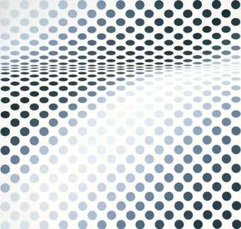
Hesitate 1964
painting
106.7 cm x 112.4 cm
© 2006 Bridget Riley
Although Hesitate is familiar art history from 50 years ago, it seems contemporary, referencing the easy curves familiar in modern urban architecture such as skateparks or Zaha Hadid’s Olympic Aquatics Centre, and the distortions of two-dimensional space available at a click and drag to Photoshop users.
This painting’s imagery isn’t stuck in the past; is shapes and colours don’t just belong to a bygone age, they resonate now.
It might seem to be a reductive and withholding decision to set out to fill a canvas with only monochromatic ellipses on a white ground, but the effect is psychological, tense and spacious. The simple formal means belie the outcome.
Despite the almost queasy experience of looking at the spatial distortions of the painting, its handmade facture keeps the viewer constantly aware of its actual physical presence. It doesn’t leave the realm of real paint, board and nails, and it doesn’t disappear completely into special effects and trickery.
Riley broke the old-fashioned rules about what you are supposed to do in an abstract painting: she punched holes in the picture space and, in doing so, made a painting which puts the viewer in the middle of the experience.

