Whaam! has been described as one of the most powerful monuments of 1960s Pop Art, and remains one of Tate’s most popular works on display. But how was it made?
Whaam! 1963 is a deceptively simple work of appropriation. The compositional template was taken from a comic-book panel in DC Comics’s All-American Men of War #89 (February, 1962), created by Russ Heath and Irv Novick.
Having found an elemental source for his work in comics in 1961, Roy Lichtenstein began to develop a painting technique which combined flat-print areas of solid colour with Benday dots: ‘I am nominally copying, but I am really restating the copied thing in other terms. In doing that, the original acquires a totally different texture. It isn’t thick or thin brushstrokes, it’s dots and flat colours and unyielding lines.’
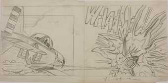
The piece was drawn directly on to canvas with pencil and painted in layers of oil and the Magna brand of acrylic paint. Layering meant the paint could remain wet during the production process and allow for manipulations of shape and colour. The Benday dots were produced using a scrub brush and handmade metal screen, the outline of which is evident, on close inspection, in parts of the background. From the preparatory drawing we can see how Lichtenstein has manipulated the original source, including the text.

Roy Lichtenstein
Drawing for ‘Whaam!’ (1963)
Tate
The horizontal strips of colour emanating from under the plane’s right wing connect the yellow balloon and the onomatopoeic lettering ‘WHAAM!’ with the exploding plane in the right panel. Above the three-tiered explosion, ‘WHAAM!’, integrated with the image and following a jagged line, acts as an off-screen voice, as though a response by the artist to the text in the balloon. The two panels also refer to the self-contained pictorial unit of the original comic strip, with a clear line dividing the attacking plane on the left from the explosion on the right.
Such careful construction prioritised graphic power over simple depictions of combat: ‘A minor purpose of my war paintings is to put military aggressiveness in an absurd light,’ Lichtenstein wrote. He also said that ‘my work is more about our American definition of images and visual communication’. The painting’s vivid style refuses emotion, making it a key example of American Pop Art’s seductive materiality.

