Niklas Maak
Our experience of visiting museums and galleries is traditionally characterised by the quasi-religious atmosphere: nothing is to be touched, one is rather quiet and reverent, nobody laughs, it is eerily still, nobody is allowed to talk loudly. However, in one of the historic illustrations – Hermann Schlittgen’s Kunst und Liebe (Art and Love) – which you, Charlotte, show in the beginning of your book, the museum is a place of intense physical experiences and overflowing desires – a romantic space of lived physicalities, lived desires.
Charlotte Klonk
Yes. Since the end of the eighteenth century, when museums turned into widely accessible public spaces, they were apparently used not only to cultivate relations with objects, but also with subjects. Schlittgen’s caricature from 1885 ridicules this. It shows a man in a gallery as he is approaching a young woman from behind. He obviously fears that the woman’s mother, who can be seen in the background sleeping on a sofa, could discover them. She, however, assures him that her mother always sleeps especially well in museums. The man’s attempt at flirting in this venue does not seem particularly to surprise the young woman. We know that people went to the National Gallery in London shortly after it opened in 1838 in Trafalgar Square to have picnics or teach their children how to walk. It was simply a public space in the midst of the city that could replace the park on rainy days. When, I asked at the beginning of my research, did it become clear that you had to behave rather differently in the museum than in the park? How were the unwritten rules of conduct in a museum developed and communicated? The answer I now give in the book is that it happened indirectly, through the interior design and layout of the rooms.
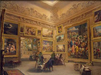
Frederick Mackenzie
The National Gallery at Mrs J.J. Angerstein's House, Pall Mall, prior to May 1834 1834
Oil on canvas
47 x 63 cm
© V&A Images
Niklas Maak
Did museums back then have guards or ushers keeping an eye on everything?
Charlotte Klonk
Yes, they existed from the beginning, although there are stories of some galleries which prove that guards were initially unsure as to whether there could be any talking, flirting, or lounging around in public museums.
Niklas Maak
And when does this cleansing process, leading us to the idea of the gallery as ‘white cube’, begin?
Charlotte Klonk
The disciplining began at an early stage with the design of reverential entrance halls and exhibition rooms. They were sumptuously decorated, but weren’t intended to distract from viewing the art. Some people seem to think that nineteenth-century museums were full of plants, carpets and pieces of furniture, but this is a completely anachronistic idea. There were merely a few seats.
Niklas Maak
You explain that the white cube was initially only a variance of a rich tradition of differently coloured rooms in museums around 1900.
Charlotte Klonk
The white cube has various roots which all finally come together in the 1930s in the Museum of Modern Art in New York. Before and after the First World War, there was a desire to show pieces of art against a background with the greatest possible contrast to the dominating colours of the paintings. The Folkwang Museum in Essen, for example, hung the paintings of German Expressionists, dominated by heavy black outlines, against a white background. But a Rembrandt would have never been exhibited against this background. The valorisation of white paint was also supported by the architectural discussion of the time, in which hygiene considerations played a role: dirt shows, of course, more easily on white walls than on other colours. Then in the 1920s discussions in which white received connotations of infinite space started to emerge, mainly among Constructivist artists and architects. This coincided with temporary exhibitions becoming increasingly important in the museum, and with them the moveable partition wall and flexible groundplan.
Niklas Maak
When did white assert itself as the wall colour?
Charlotte Klonk
In Germany, interestingly, this takes place during the Nazi period in the 1930s. In England and France white only becomes a dominant wall colour in museums after the Second World War, so one is almost tempted to speak of the white cube as a Nazi invention. At the same time, the Nazis also mobilised the traditional connotation of white as a colour of purity, but this played no role when the flexible white exhibition container became the default mode for displaying art in the museum.
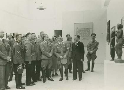
Exhibition co-ordinator Hartmut Pistauer leads Nazi party officials through the Degenerate Art Exhibition at the Kunst Palast in Düsseldorf 1938
Courtesy Landeshauptstadt Düsseldorf. Photo: Alfres Smolarczyk
Niklas Maak
I imagine different architectural types of museum would have different effects too – from classic, temple-like buildings such as the National Gallery in London or Schinkel’s Altes Museum (Old Museum) in Berlin, to later buildings such as Mies van der Rohe’s Neue Nationalgalerie (New National Gallery) and Lichtwark’s Kunsthalle in Hamburg that increasingly opened up the exhibition space to the city. This development continues until art itself leaves its glass shrines behind and becomes independent of architecture in the public space.
Charlotte Klonk
Don’t you agree that opening a gallery such as the Altes Museum opposite the royal palace in Berlin in 1830 to everybody might have been a much more radical step than opening up the exhibition space to the city? How revolutionary by comparison are van der Rohe’s transparent walls in the Neue Nationalgalerie?

The pavilion entrance area of Mies van der Rohe's Neue Nationalgalerie, Berlin 1962
Photo: Balthazar Korab
Niklas Maak
But it has to be said that it’s an absurdly pathetic emancipatory gesture to say ‘let’s rebuild a temple just so that we can then open it to the public’.
Charlotte Klonk
I don’t think that’s pathetic at all, because if you try to understand what a new kind of experience is created by doing so, then it is not a romantic but a revolutionary gesture. What had previously been enjoyed only by the king and his entourage was now suddenly made accessible to all.
Thomas Demand
Accessibility for the public is one thing, but museums are also guardians of artefacts that are important for society. They are strongholds in which time and its destructive effects are suspended as much as possible. The much praised Neue Nationalgalerie, however, is the exact opposite of a treasure chamber. In itself it might be a big display cabinet, but it is hardly suitable to preserve things – these have to disappear into the basement.
Charlotte Klonk
There are only a few exhibitions which have been successful in the upper room of the Neue Nationalgalerie. However, Thomas, yours in 2009/2010 worked. How did this come about?
Thomas Demand
We didn’t want to create a homage to Mies, but we also didn’t want to install something contradicting the room and its requirements. Rather, it was about creating a temporary architecture radiating a certain naturalness without suggesting a neutral environment. I began my research to gain an overview of all previous exhibitions, but to my surprise there was no continuous archive. We painstakingly collected the information over one and a half years. I then noticed that the fixtures, installations and alterations allowed for a very exact chronological classification. In the 1970s, for example, quick-build walls with lamp systems had been fitted, just like those seen today only at dull industrial fairs. Possibly the most classic way to utilise the space stems from Mies’s office for the opening exhibition in 1968 with pictures by Piet Mondrian: hanging panels which are, however, rarely hung level as, depending on the temperature and weather, the ceiling arched or sagged. This is something you cannot see in the old photos. So during this exhibition, Mondrian, of all people, was always hung a few degrees off.
Charlotte Klonk
But where did the wonderful idea of the curtains which you used as backgrounds in your exhibition come from?
Thomas Demand
The only thing in the past radiating a certain timelessness in the Nationalgalerie which remained unchanged over decades was the background, the curtains. A plain curtain has hardly any chronological connotation. Curtains were around 500 years ago, and they still exist today. With the curtains, something else surfaced: I thought you could see this Mies building not only as a museum, but as a somewhat over-sized prototype of the modern bungalow. In the 1950s and 1960s life in the bungalow appeared quite open because the situation in the Federal Republic itself promised to be open and democratic. Then, however, people noticed that the neighbours were also building new houses, and that these were coming closer and closer to their property lines. Seeing as there was no need to be quite that open, curtains were fitted. We wanted to suggest to the approaching visitor that somebody lived here, and had done so for quite some time.
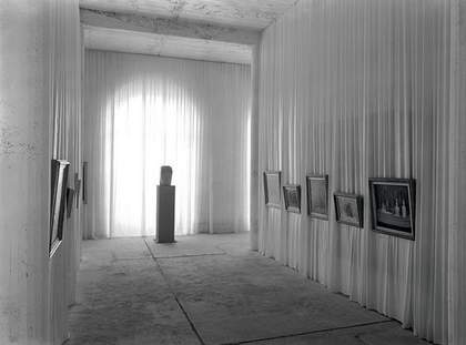
Installation view of works by Gustav H Wolff and Giorgio Morandi at Documenta 1, Kassel, curated by Arnold Bode 1955
© Documenta Archive, Kassel.. Photo: Gunther Becker
Niklas Maak
You describe a way of exhibiting which reacts to the space in an extreme way. The history of museum architecture, however, is mostly one of building for artworks that are already there. We could, of course, debate whether what you have done is still an exhibition in the classical sense, or if certain forms of production have been amalgamated with a new form of display; whether the term exhibition has changed to such an extent that the rooms also have to change.
Charlotte Klonk
Is this fusion of production and display new? In my opinion this development begins on a big scale in the 1960s. Although there are forerunners such as Kurt Schwitters’s Merzbau (Merz Building) from before the Second World War or El Lissitzky’s Abstraktes Kabinett (Abstract Cabinet) in Hanover, it is noticeable that in the 1960s more and more artists began to install project rooms and environments and fused production and display in happenings and performances. I see this as a reaction to the overwhelming displays that curators where by then creating. In the 1964 Documenta, for example, its founder and chief curator Arnold Bode hung the large abstract paintings of the German artist Ernst Wilhelm Nay above the heads of visitors in Kassel. It was an arrangement which obviously did not correspond with the artist’s intentions. After that, curators of contemporary art began to withdraw from the exhibition room. Often, the artists are now left to take the reins.
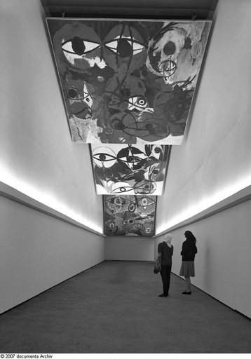
Installation view of works by Ernst Wilhelm Nay at Documenta 3 in Kassel, curated by Arnold Bode 1964
© Documenta Archive, Kassel. Photo: Gunther Becker
Niklas Maak
And what do you think this means for the art museum?
Charlotte Klonk
Whereas in the past the field of activity of a museum director was mainly the design of the interior, their main task today is to create a thematic framework for the exhibition. In the past, curators guided the viewing process in a sensory way through the decoration of the gallery rooms, whereas today this is carried out intellectually by providing a problem-orientated context. On the one hand, of course, the conditions of perception are more consciously acknowledged in environments created by artists, but on the other hand the framework of the exhibition space itself is pushed further into the background. For functional reasons, the artistic interventions make the neutral museum-container even more necessary than before. As every artist has different demands, so the guideline for architects and museum curators continues to be the creation of unarticulated, flexible and adaptable exhibition spaces.
Niklas Maak
You describe this with a somewhat critical undertone. I have the feeling that you think something valuable has been lost. Could it not also be said that we are finally getting rid of highly problematic atmospheric rooms? You write, and I found this quite fascinating, that around 1900 even psychologists influenced the presentation of art – with rather grotesque consequences.
Charlotte Klonk
Cognitive psychology is one of those fields of discussion which was, at least historically, of great importance for the exhibition of art. The first director of the National Gallery in London, Charles Eastlake, preferred hanging paintings against a background of red material, something he introduced in the middle of the nineteenth century (previously walls in public exhibitions were mainly a greyish green colour). He was backed by the latest research into sensory physiology which examined the subjective contributions made by the eye itself in the process of seeing. Red was the only possible background colour for most paintings, as the interaction with the golden frames and the mainly cooler colours of the paintings themselves led, according to this research, to a harmonious effect in the beholder’s visual experience. Behind this was the thought that the eye required the triad of the primary colours, red, yellow and blue, to achieve a balanced perception. Instead of accepting a disembodied eye and hanging walls full of paintings from top to bottom, Eastlake endeavoured to move the pictures closer to the viewer by hanging them at eye level. This resulted in the gallery wall suddenly being emptier and its own colour scheme playing more important role. For the first time, the colour of the walls was explicitly up for discussion. As did most of his fellow contemporary gallery directors, Eastlake decided on red. Later on, around 1900, some gallery directors in Germany consulted the colour perception studies of the psychologist Wilhelm Wundt to create differently coloured frameworks for exhibits. Again, the thought was to make art more accessible from a sensory perspective.
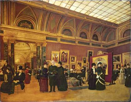
Giuseppe Gabrielli
The National Gallery 1886
Oil on canvas
110 x 142 cm
Courtesy the Government Art Collection
Niklas Maak
But this intellectual concentration also opens up room for interpretation which does not allow for overwhelming colour effects.
Thomas Demand
The idea behind this is not manipulation, but the need to vary the rooms’ atmosphere in order to emphasise the temporary nature of exhibiting and simultaneously to mark points worth remembering. What we should not forget is that the main focus of today’s curators is on the combination of objects in different media. The field of interest has become so much bigger and more complex, and curators already have enough work on their hands simply showing us things we would not otherwise see.
Niklas Maak
I would like to resist the physiological patronising of viewers where curators force visitors into a certain perception. With due respect to all the great decisions Udo Kittelmann made, I do think that the colour rhetorics he recently came up with in the new display of the collection in the basement of the Nationalgalerie are verging on kitsch. When following his chronologically arranged history of German art between 1900 and 1945, the walls turn a dark brownish grey in 1933. The viewer enters a gloomy world and the awareness of the continuities dwindles. The Third Reich appears as a strange power outage in German art history.
Charlotte Klonk
Yes, but there are good and bad modes of sensory interpretation, just as there are good and bad intellectual contextualisations in exhibitions. What is important in my opinion is that the room is honest, so there is no patronising.
Niklas Maak
When is a room honest?
Charlotte Klonk
Well, as soon as what is being aimed for becomes obvious to the viewer. What remains too subliminal, for example, are the colour nuances in the new display of the collection in the Nationalgalerie. If visitors are not paying enough attention, they don’t realise that the white in many of the rooms is not actually white, but varies between shades of yellow and blue. Thus, there is a subliminal creation of different atmospheres. Even if viewers notice what is happening, they still do not know why. I think that’s manipulative.
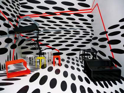
Cafeteria at the 53rd Venice Biennale designed by Tobias Rehberger 2009
Courtesy Neugerriemschneider, Berlin © Tobias Rehberger
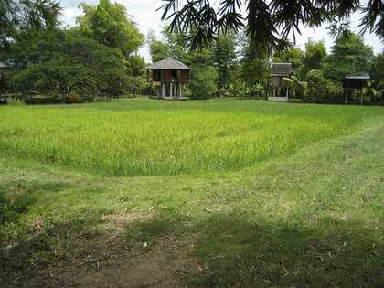
Part of the self-sustaining community near the village of Sanpathong, Chaing Mai, Thailand, initiated by Rirkrit Tiravanja and Kamin Letchaipresert
Courtesy the artist and Gavin Brown's enterprise, New York © Rirkrit Tiravanija
Niklas Maak
The white cube is itself a quasi-neutralised identification of art. It is a label. Whenever I see a dysfunctional industrial building of the nineteenth century is painted white I know – from now on there will be art here. These white signals are always forerunners of gentrification and urban development. Then again, many artists produce pieces which are extremely architectural. Whether it is Rirkrit Tiravanija who invents an entire village with houses built by artists, whether it is Tobias Rehberger whose Cafeteria in Venice not only decorated a room but also created an architectonic world, or whether it is you, Thomas, with your project for a Chinese house in Zurich. In all these examples, art produces its own arena of experience and emancipates itself from the notion of the exhibition as an introduction of a piece of art into a room. Maybe it is no coincidence that the architecture and art biennales in Venice are becoming in an absurd way increasingly similar. The main pavilion at the art biennale is dominated by the architectural bubble utopias of Tomas Saraceno, who has a degree in architecture, while at the architecture biennale the same space was dominated by Thomas’s Nagelhaus project.
Charlotte Klonk
Could you describe the Nagelhaus project more precisely please?
Thomas Demand
We were invited to a competition to restructure what is currently a rather shabby square under a motorway bridge in a newly developing district in the middle of Zurich, and to brighten it up with art. The Escher Wyss Square is currently mainly characterised by prostitution, drug use and vandalism, at least at night. During the day it is a bus and tram stop used by thousands of workers. The city wanted architects and artists to reinterpret the urban space. My suggestions, which I developed together with the architects Caruso St John, initially consisted of two buildings that generate their own social space: a restaurant and a kiosk which were meant to stretch the square diagonally. After a while, my ideas for a specific building turned towards so-called holdouts, an architecture topos broaching the issue of the resistance of the existing against the new, for example the old lady who doesn’t want to leave her house so that a skyscraper can be built. I thought about the latest globally known case of a house in Chongqing which literally ended up standing on a tower when the excavation pit was dug around it. This story made for various chains of associations in a new context, eg memories of the tradition of the Chinese pavilion in European baroque which, as with the Chinese house in Chongqing, we know about only through hearsay. In my eyes, the resistance in China seemed to stem from a bourgeois need to defend the individual’s right against the big unknown investor. This is also a very Swiss conception of their own national character.
Niklas Maak
But the reference to the house in Chongqing has led to misunderstandings…
Thomas Demand
Yes, the motive for the house in Zurich should not be confused with the house itself. This is no different from Titian, just to give a simple example. When looking at his portrait of Karl V, you do not see an older ruler, but a Titian painting, and it is almost irrelevant whether the emperor really looked that way or not. The row provoked by our project revolved around the Chinese house. People wondered what Switzerland has to do with China (an absurd argument, by the way, as the whole of the world’s money is in Switzerland’s safes). But the Nagelhaus was no Chinese house. It would have been built in Switzerland, it was a German-English idea and it is only indirectly linked to China. It follows, so to speak, incidents which have been transmitted via diverse media and therefore affect our image of the world and how individuals in this world act (or don’t).
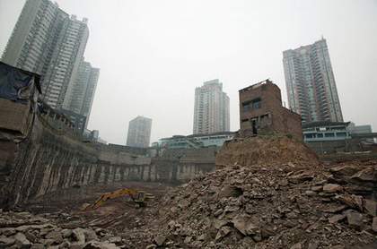
Wu Ping's house in Chongqing, China, after she refused to move for a property project in 2007
© Eye Press Images, Hong Kong
Niklas Maak
You have never seen the house yourself. You have seen only a picture of it. It could be argued that what you do – building fiction with a relation to a picture anybody can see on TV, on Chinese TV – is a kind of exhibition in itself: building as an act of exhibiting a picture. This kind of exhibition means creating a space in which certain interactions become possible. It should also not be forgotten that this house was not meant to be simply a sculpture, but also a restaurant.
Thomas Demand
Yes, we wanted to reinterpret the space and give it a social function. Every day thousands of commuters would have had to live with it. Our idea was also to incorporate a purely practical use: a restaurant, open around the clock. As far as we know, our competitors decided on solutions which followed conventional models that we know from the museum: stand in front of an artefact, look at it and continue walking pensively. That is possible as well, but a public space is subject to completely different requirements. It should also be added that this project demonstrated a co-operation that does not happen too often. It is neither a piece of art by myself, nor is it a house by Caruso St John – it is both at the same time.
Niklas Maak
Charlotte, you wrote a book which begins with pictures and stories illustrating that people also go to a museum to flirt, to have picnics and to meet other people. Thomas, you planned a sculpture, a rebuilt after-image in which people could have had meals around the clock, something that is still very unusual in Zurich. Both cases deal with fundamentally different experiences and social rituals facilitated by art spaces. Thomas refers back to Gordon Matta-Clark, who questioned the museum’s space with his restaurant project in the 1970s in New York. For the general public, it still seems to be difficult to accept that art can be usable. To eat in an artwork appears not to be possible without questioning the legitimacy of the piece of art itself. The fact that a restaurant could have been built a lot cheaper was one of the things Thomas was reproached for in Zurich. It was impossible to explain to those people that it was a piece of art, and that the rules applying to it are different from those applying to a cheap snack bar. All that was said was that ‘the artist is building an expensive restaurant; that could be done for less’, instead of ‘hurray, we are getting a great sculpture which can also be used as a meeting place, as a restaurant’.
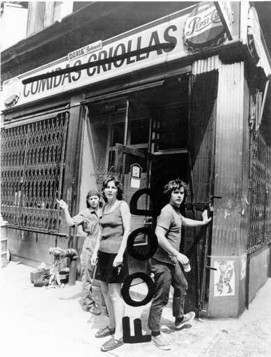
Tina Girouard, Carol Goodden and Gordon Matta-Clark in front of Food restaurant, Prince Street at Wooster Street, New York 1971
© Estate of Gordon Matta-Clark. Photo: Richard Landry
Thomas Demand
I would like to point out that the idea of the restaurant was there first. Then came the question of what kind of restaurant it should be, what it should look like and what should be represented in its context. I do believe in an architecture parlante which cannot be reduced down to Disney. For the right-wing populist opposition which won in the end, the required disabled toilet was a point of attack. That way, art had lost right from the start. I believe we fulfil different needs. Politics always wins when it concerns itself with flower pots, climbing gardens and other folklore, not when it deals with art which cannot be reduced down to four-word sentences.
Charlotte Klonk
But actually this is quite a big compliment. The Nagelhaus has forced the public to deal with it and with one another precisely because it is a piece of art and not just a restaurant, even if the mood was swung by right-wing populism in the end. At least there is something like a civic movement which considers the public space its own and therefore demands a voice and a veto in the matter. How can we achieve this in the museum? That is a public space as well.
Niklas Maak
I think as soon as it is labelled ‘museum’, the thing itself as a space for a certain open exchange and discussion is clinically dead.
Charlotte Klonk
That means serious debate can exist only in a public space itself?
Niklas Maak
I think that the word museum triggers a specific cultural behaviour – devout, silent. I believe that exhibiting in a white cube is by now an exhibiting in both senses of the German translation, ausstellen – on the one hand a ‘showing’, on the other a ‘switching off ’ of aesthetic reviving energies. Whoever wants to allow for a different experience of space and art has to, as Thomas has done, build their own building, or invent other spaces such as the Berlin Forgotten Bar. This was opened by artists with the idea of having a different show every day. It represents an anti-museum and goes beyond the notion of what an exhibition is: namely that artists sit in a studio for two years, have an exhibition, then get back to their cubbyholes to create new pieces. At the bar, exhibiting suddenly meant to take a fragment, to discuss it for one evening, and then it is the next piece’s turn. This is a different understanding of displaying, and the Forgotten Bar was the first project to follow it through so consistently. It is not the finished work which is shown, but an idea, an approach.
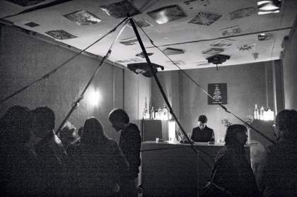
Inside Galerie Im Regierungsviertel's Forgotten Bar, Berlin
Courtesy Galerie Im Regierungsviertel © VG Bildkunst Bonn/Tjorg Douglas Beer 2011
Thomas Demand
There are two aspects which should not be ignored. One is the function of the museum. It basically consists of publicly recognised quotation marks in which objects or activities can be understood as examples and therefore might lose direct relevance while, at the same time, becoming metaphorically charged. The other issue is that the Forgotten Bar reveals a certain mistrust in other possible activities within a museum. Consuming food or drink is obviously quite important, but this does not mean that creating a space in which food and drink will keep people long enough to indulge in the pieces of art is necessarily an alternative. Visiting a museum naturally has the tendency to become tiresome quite quickly. But this in itself is the challenge: to reactivate the exhibition space continuously.
Charlotte Klonk
Yes, exactly. Why should art function only within the context of bars or restaurants? What is great about museums is that they are places in which we can publicly come together, sometimes even with complete strangers, without the need for joint eating, drinking or consumption as a catalyst for social interaction.
Niklas Maak
All public spaces are almost always shaped by passive consumer behaviour. We go somewhere and buy something. But the question that remains is: is there another type of space that activates people differently, which, instead of making them a consumer, makes them actors within the public space?
Thomas Demand
Tate Modern managed to add contemporary art to these passive types of recreational activities. Even if this was done only by creating a public space in the Turbine Hall where no entrance fee has to be paid.

Installation view of Ai Weiwei's Sunflower Seeds 2010 at Tate Modern
© Ai Weiwei. Photo: Tim Callaghan
Niklas Maak
As soon as the museum is understood within the context of its etymological origin, we come closer to another concept. In classical Athens, the museuion was no solitary building, but a quarter with many buildings to honour the muses, the ideal counter-image of the actual city, in which rules different from those of commerce applied. The world of commerce (handel) was here opposed by a world of acting (handeln). Maybe we have to go back to thinking of the museum in these terms. This is what your research, Charlotte, leads to, and what your art projects, Thomas, allude to. Maybe we need to move away from the notion of the museum as a temple of sacral, passive, exclusively contemplative viewing of art, which, of course, should continue to exist, and towards a counter-city as a public space, an open stage on which certain encounters and experiences can take place. A social experience of community which is not dictated by consumer behaviour. To me, such a museum seems to be one of the utopias in architecture and highly important for a culture which has to ask itself what the res publica in the light of dramatically changed social rituals and developments should be.

