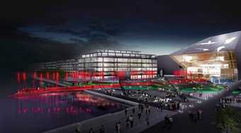
Artist’s impression of Dublin Docks, Grand Canal Square, designed by Martha Schwartz Patrners
Courtesy Hayes Davidson and Dublin Docklands Development Authority
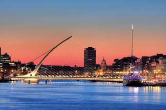
Santiago Calatrava
The Samuel Beckett Bridge in Dublin, 2009
Photo: Hauke Steinberg
Dublin Docklands is a haunting place. Here, the long straight Liffey runs past a series of ‘signature’, ‘iconic’ buildings. Some are by local architects – council tower blocks in all but name, only with off-centre patterned windows and irregular balconies, aimed at executives rather than dockers. They surround something more willfully spectacular – a tilted drum of a Convention Centre by Kevin Roche, a geometric hotel by Manuel Aires Mateus, the Samuel Beckett Bridge by Santiago Calatrava and the empty concrete skeleton of the abandoned Bank of Ireland. Dublin’s industrial archaeology – a warehouse here, a grain silo there – clings on in the shadow of Martha Schwartz’s bright, optimistic landscape architecture. Dominating them all is a combined office complex and theatre by Daniel Libeskind, architect of Berlin’s Jewish Museum. Two years after the financial whirlwind which tore especially harshly through the Republic of Ireland, this showpiece is windswept, empty, limping to completion, years late. The flats may never be sold, the trading floors never occupied, but the theatre, at least, receives its first audience.
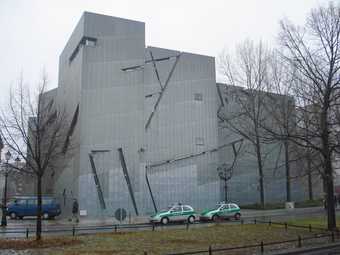
Daniel Libeskind
The Jewish Museum, Berlin
Photo: Mark Hauler
This is a space of hubris, the monumental culmination of an insane paroxysm of finance and property speculation. Dublin Docklands is a space of new ruins, dated before it had even been completed. The ideas behind it – of an architecture and an economy suspended without any visible, concrete means of support – are as derelict and desolate as the buildings themselves. There are innumerable places like this, from Salford to Leeds, from Baltimore to Bilbao, anywhere that titanium-clad monuments parade their hyperbolic paraboloids in front of towers of unlet flats. In 2009 I spent a year or so composing recession reports for the architecture paper Building Design which form the basis of A Guide to the New Ruins of Great Britain, where I try to chart the UK’s new spaces of urban tourism and aesthetic consumption.
The sense of retrospective melancholia in a place such as Dublin Docklands is apt, as the architecture of the spectacular galleries, theatres and vague interactive centres originally concerned itself with memory and loss, although it is ironic that it seemed to forget this soon before its world collapsed. At the Berlin Jewish Museum – at least before it was filled with faintly patronising exhibits and captions telling us what the architect was trying to make us think about – Libeskind promised an architecture of memory, a style with all the holes and distortions left by the process of memory, unsurprisingly aggressive and unforgiving in the context of the city. But he then rolled out decidedly similar forms for a panoply of wildly different functions – a graduate centre at London Metropolitan University, the Imperial War Museum in Manchester, or a residential tower left unfinished post-2008 in the centre of Warsaw.
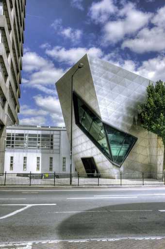
Graduate centre at the London Metropolitan University, designed by Daniel Libeskind
Photo: Wojtek Gurak
Daniel Libeskind
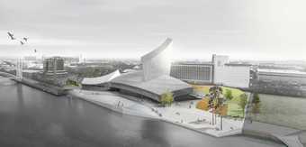
Artist’s impression of the Imperial War Museum North
Courtesy Studio Daniel Libeskind
Libeskind always carried his piety around with him, to the point where he was described by critic Martin Filler as a ‘walking, self-igniting Yahrzeit candle’. But his formal distortions and titanium surfaces were paralleled, as a more straightforward spectacle, by Frank Gehry at the Bilbao Guggenheim, the computer-aided design of which led to the eventual coining of the phrase ‘Bilbao effect’. Take any ex-industrial town, give it a cultural space of some description, and just wait for the property developers – helped or not by a previous intervention by the ‘creative classes’ – and ‘regeneration’ is the instant result. Culture, property, finance and architecture are tightly intertwined.
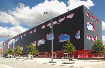
Will Alsop
The Public in West Bromwich 2008
Photo: Alsop Sparch 2010
Regeneration has focused around museums, galleries, or self-contained theme park-like environments such as Gehry’s Experience Music Project in Seattle, or Nigel Coates’s (quickly defunct) National Centre for Popular Music in Sheffield. Many opt for the laconic logo-like name: Urbis in Manchester, The Public in West Bromwich, FACT in Liverpool. Its most extensive expression is not, however, in the UK or US, with their vestiges of representative democracy, but in the oligarchies of China or the United Arab Emirates. Abu Dhabi, for instance, has set aside a district solely for ‘iconi’” cultural buildings by Gehry, Zaha Hadid, Norman Foster and Jean Nouvel (who has designed a branch of the Louvre). Barry Lord, its ‘cultural consultant’, notes that ‘cultural tourists are older, wealthier, more educated, and they spend more. From an economic point of view, this makes sense.’ No doubt this applies equally well in theory to West Bromwich or Salford.
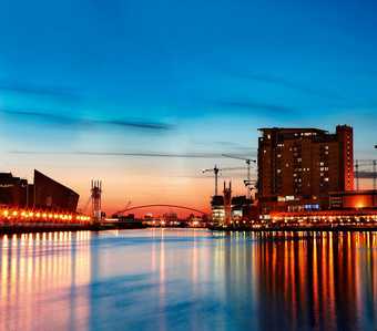
Salford Quays, Manchester, home to Media City:UK, The Lowry and Imperial War Museum North
Photo: Imran Rashid
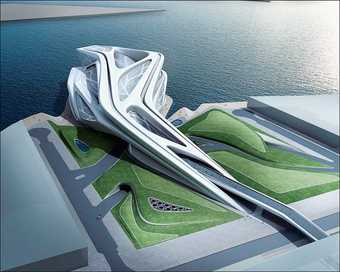
Zaha Hadid
Artist’s impression Abu Dhabi Performing Arts Centre in Saadiyat Island’s cultural district
Courtesy Zaha Hadid Architects
I knew in Dublin Docklands that I’d seen this place before – it was Salford Quays, where the docks of Greater Manchester were transformed into a combination of a cultural centre and a development of luxury apartments. Here’s Libeskind, of course – his Imperial War Museum North, with its sloping ceilings and a form which apparently represents a world divided, is supposed to incarnate the experience of war – and nearby is Calatrava, whose structures are invariably placed in areas that are busy being transformed from proletarian spaces of work or habitation into regenerated areas of bourgeois colonisation, all unique, all identical.
With Libeskind, Calatrava and their contemporaries you find the reduction of the building to a logo, to an instantly memorable image – one which is best appreciated in movement, as from a passing car, while quickly walking through a museum on the way to the gift shop, or indeed while shopping, as with Future Systems’s or Herzog & de Meuron’s work for Selfridges and Prada in Birmingham and New York, respectively. Although it may accompany exhibitions of art or simulations of war, it is not an architecture of contemplation but of distraction and speed.
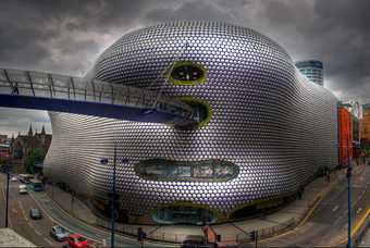
Future Systems
The Selfridges building, The Bullring, Birmingham
Photo: Dave Ellins
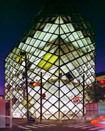
Herzog & de Meuron
The Prada Store, Tokyo
Photo: Mark A Brown
Dublin Docklands or Salford Quays are the result of clearances, virgin territory. That’s not the case in central Manchester, where regeneration has been more extreme than anywhere else in the UK. Urbis was briefly its best-known ‘icon’ – a dramatic, glazed flatiron of a building, housing an urban exhibition centre. Justin O’Connor, the academic partly responsible for Urbis, recalls: ‘About two years into the project, Ian Simpson unloaded his pre-prepared designs with no reference to content (a glass building for an interactive museum) and a management team was cobbled together; only then did a stray question at a council meeting (‘what was going to go into this building?’) led the cultural supremo of Manchester to track down the authors of the original eight-page memo (me, with some input from Tony Wilson) and ask us to tell him what it was all about.’ In classic Bilbao-effect fashion, form preceded function by several leagues. ‘In effect, all they had been concerned about was the building as icon. Ian Simpson exemplified the no-politics, no-intellect “intellectual” – able to strut with black polo-necked arrogance through his building refusing any signage (like entrance and exit) in the name of aesthetic purity, even when rain was coming in from the roof.’ After a few intermittently successful years, by the end of 2009 Urbis was emptying itself of its original purpose to become the National Football Museum, as if as a final judgment on the ideas-above-the-station nature of a museum dedicated to a concept so abstract and arty as ‘The City’.
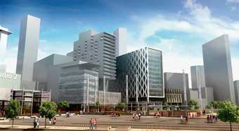
Sheppard Robson
Media City:UK, Salford Quays, Manchester
© Sheppard Robson
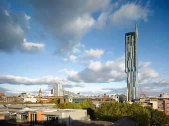
Ian Simpson
Beetham Tower, Manchester
© Daniel Hopkinson Architectural Photography
Simpson couldn’t be held responsible for this, of course, though he can be for the way his Beetham Tower dominates contemporary Manchester, where a mix of empty flats and footballers’ penthouses looks out over Cottonopolis, the Pennines and, on a clear day, to Liverpool. The Beetham Tower stands out through negative virtues, its lack of the aesthetic bet-hedging and confusion of most recent high-rises – a mediocre architect at the very top of his game. The curtain wall is confidently unencumbered by the insufferable ‘vernacular’ red terracotta and slatted wood that dominates everywhere else, while its top-heavy massing creates a clear, distinctive silhouette without resorting to the silly hats worn by its contemporaries. Inside, the glass greenhouse effect is offset by lightness and opulent pseudo minimalism. But ‘culture’ is central here too – the sky-bar’s cocktail menu offers a range of drinks named after songs by Manchester luminaries: the Buzzcocks, the Smiths, Happy Mondays. Meanwhile, as if intent on re-enacting the plot of J.G. Ballard’s High-Rise, Simpson himself purchased the penthouse at the top for £3 million, which he proceeded to fill with an olive grove, revealed on a short BBC film about the tower. ‘It is aspirational,’ he proclaimed. Post-punk Ballardianism was, then, reborn in the Beetham Tower in a most unexpected fashion.
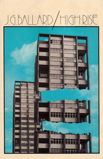
J.G. Ballard
High-Rise 1975
Book cover design
Courtesy Mike Holliday
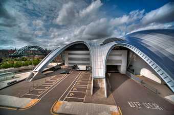
Foster and Partners
The Sage Gateshead
Photo: Charlie Charlton
Aided by an already spectacular site, Tyneside has some of the most photographed examples of these new spaces – the Gateshead ensemble of Baltic, Sage and Millennium Bridge. They are easier to get to from Newcastle’s Quayside than from Gateshead itself, via Wilkinson Eyre’s Millennium Bridge, an etiolated structure representing the ease of an allegedly leisured society, as opposed to the fiercely mechanical Tyne bridges upstream. Norman Foster’s Sage, though it looks beautiful from the High Level Bridge in the drizzle, opens itself out into a car park, particularly unforgivably in the context of one of the few British cities with a decent public transport system. The Baltic, a huge multi-level art gallery built into the former Joseph Rank grain silo, is undeniably aimed at tourists, but accusations that it is over-scaled and irrelevant to the surrounding area always seem a tad patronising. But whatever the merits of these buildings, they turn their back on Gateshead. There was, briefly, a reference here to the place’s industrial past – a poster draped over the riverside façade taken from Martin Parr’s collection, advertising his ‘Parr-world’ exhibition. It’s a miners’ strike-era banner, declaring ‘Victory to the Miners, Victory to the Working Class’. Seen kindly, it was an irruption of the forgotten, but mostly it just seemed a bad joke. And springing up behind the Baltic is a cluster of poorly designed ‘luxury” tower blocks with attendant car park (far less architecturally distinguished than Owen Luder’s fiercely powerful ‘Get Carter car park’ in central Gateshead, demolished as an “obstacle” to regeneration in July 2010). Meanwhile, the regenerative effect has not reached north Tyneside, where a particularly ‘creative’ subterfuge has resulted in Potemkin shopfronts, trompe l’œil high streets to hide the recession’s dereliction.
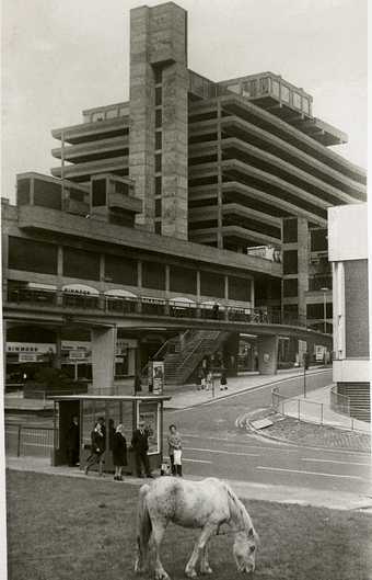
Owen Luder
Trinity Square car park in Gateshead known as the ‘Get Carter car park’ after use in the film starring Michael Caine. Demolished 26 July 2010
Courtesy Gateshead Council
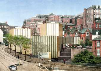
Caruso St John
Artist’s impression of Nottingham Contemporary
Photo: Hélène Binet
Courtesy Caruso St John Architects
At least one of these new spaces is more daring – Caruso St John’s Nottingham Contemporary. What we have here is a series of curtly corrugated boxes stepping down a hill, whose green and gold concrete cladding is, now famously, dressed in lace patterns. Initially, this seems like one of those ubiquitous shallow gestures at contextualism (with the former lace mills nearby) which hide a slash and burn approach to urbanism. After its completion, several proposals for ‘doily’ façades by lesser architects would follow, standard blocks overlaid by repeated images of some local talisman – a building proposed by Bond Bryan for Sheffield Hallam University would reduce this to farce, featuring a pattern of cutlery on its curtain walls.
Yet Nottingham Contemporary is harsher, more puzzling and oblique than anything else designed in this decade of competing egotistical icons, and the architects at Caruso St John, usually purveyors of a sober minimalism, seem almost ashamed of their directness, of the possibility they’d veered into kitsch. But the rippling colours and patterns of the façade are intriguing enough not to need a direct excuse, and in terms of its ‘meanin’”, Nottingham Contemporary seems to signify something unexpected, something pointed. While the other schemes try to wipe out the past, creating grinningly jolly containers for a perpetual present, here we have a visual amalgam of nineteenth-century industry – intricate patterns, made by underpaid workers on the inhuman machines of the nearby mills – and the twenty-first century’s semi-automated, out-of-town industries, the non-aesthetic of containerisation and its windowless warehouses. It’s a return of the repressed, the mechanical, the far from
