Rita McBride on Wall

Rita McBride
Rock Wall 2008
Wood, neopur, billboard paper
871 x 95 cm
Courtesy the artist, Alexander & Bonin, New York
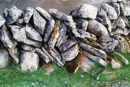
About a year ago I was driving in the West of Ireland and I noticed these very particular stone wall structures. They look like enclosures but were not used for herding animals and nobody seemed to know why they are there.
At the time I was interested in ideas of territories and human markings – from the post boxes people put at the end of the drive to the little rock mounds that you find in the U.S. that signal the beginning of their driveway.
So, I took some photographs of all these walls because I was trying to consider how we mark such territories. I then blew up the image up to billboard size and bought some styrofoam and shaped it into the forms of rocks underneath, placing the image over the top. So it looks like the surface of a wall.
I wanted to a make an open system so it could go on and on and on, so there is quite a bit of Photoshop in the image which creates these Rorschach surprises when you look at it. I got rid of any human elements that had been in the original picture – bits of rubbish and barbed wire, and painted the sky to make a fake photo background. All my ideas come from a very real place and go through some sort of translation usually, a sculptural language, occasionally images. The piece does relate to the original structure and the image of a structure, but it has been removed from its original intention, whatever that might have been.
Corey McCorkle on Dandelion Wine

Corey McCorkle
Dandelion Wine 2009
30 glass bottles
Dimensions variable
Courtesy of the artist and Maccarone, New York. Photo: Dara McGrath
I came up with wanting to harvest something in the garden at Lismore, and wanted to present it in the greenhouse. I wanted to work with something that deals with a specific time and place (in this case harvesting and fermenting). I make a lot of work in gardens and I am very interested in the irrational in various structured environments.
I proposed the idea to harvest the weeds in the garden and making dandelion wine to the curator [Philippe Pirotte], not knowing the exactly the climate of Ireland. And I got lucky…the dandelions appeared just as the exhibition opened – allowing me to pick the blossoms to start the fermentation process.
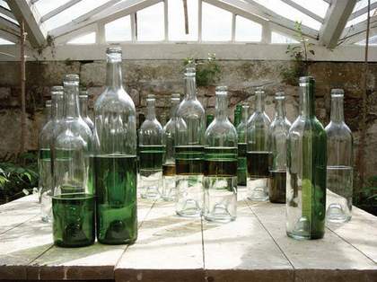
I spent about five hours picking. In advance, I made new wine bottles out of old ones – but cutting them and repackaging together – joining the top half of a Sancerre bottle with the bottom of Bordeaux bottle – in the end, the equivalent of a an ‘exquisite corpse’.
I decided to show the reconstituted bottles – which are filled with the dandelion wine – in Lismore’s hothouse. It was designed by Joseph Paxton, and I believe is the only Paxton greenhouse left in Ireland. I have a background in architecture as well as sculpture, and for me Paxton is a great figure in modern architecture, ushering it in through the grammar of the greenhouse. I knew that Paxton was the Duke of Devonshire’s’s private gardener and botanical companion, so I was really excited to see this sketch for the Crystal Palace. If I hadn’t been researching Paxton I wouldn’t be doing this particular piece.
Stefan Brüggemann on Conceptual Decoration

Stefan Brüggemann
Conceptual Decoration (Black on Silver) 2009
Wallpaper Silver and Black font: Arial Black 10pts
Courtesy the artist
I’m working with language and come out of the traditional of conceptual art – but at the same time I’m trying to put in crisis the idea of what is conceptual. I like this conflict between what is visual and what is mental, so I came upon the notion of conceptual decoration, of using wallpaper.
Wallpaper is the most banal material for something visual. Or it’s a less art respected material. It plays that game that it’s the most vulgar or the most decorative form of decoration.
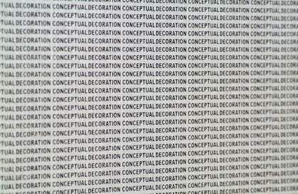
I made a wallpaper of silver with black text that reads ‘Conceptual Decoration’ repeated as a pattern. When you see it closely you recognise this as a text and then it becomes an idea. Though when you see it from a distance it just becomes a surface, it looks grey. However the more silver the colour, the more industrially mass produced it looks.
The repetition of things and you know this constant multiplication of things, becomes too much. I like the rhythm that this silver and black combination creates. It flickers. It looks straightforward but it has an aggressiveness to it. As John Peel said: ‘It is always different, always the same.’
