Nick Rosen on George Morland’s The Door of a Village Inn late eighteenth century
Most Brits like their countryside to be of the chocolate box variety. That’s why our planning laws are designed to prevent almost all building outside towns and villages. The result is a theme park in aspic.
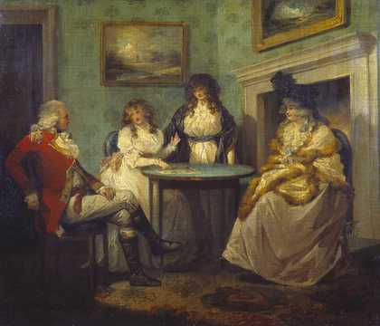
Rural poverty exists today, but is nowhere near as prevalent as it was when this painting was created in the late eighteenth century. It is not the picture we normally see: ragged children staring blankly from a dark doorway to a crude dwelling, while a harassed landlady dispenses beer to a passing rider.
Staring out into the countryside from their pricey houses nowadays, many believe they have paid for the unspoiled view and that is how it should remain. They forget that the country used to be a thriving place, teeming with activity. We have all but eradicated rural poverty by the simple means of making it impossible for the poor to live there. High house prices and a planning law that forbids anyone living for the summer on a patch of land mean we have consigned our poorest families to the cities, where they are more likely to be miserable.
At least in the country they could pick and catch food, and enjoy the surroundings. And they still could if we reformed the laws to allow low-impact dwellings such as the one in the picture to be built – houses without access to mains power and water, depending on rainwater, wood fires and solar energy.
The Door of a Village Inn was bequeathed by Sir Oscar MP Clayton in 1892.
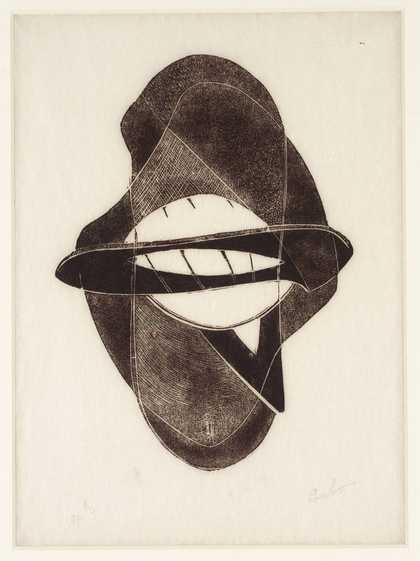
Naum Gabo
Spiral Theme (1941)
Tate
The Work of Naum Gabo © Nina & Graham Williams / Tate, London 2023
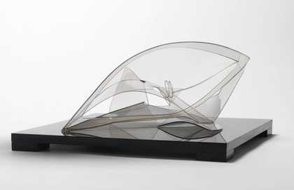
Peter Newman on Naum Gabo’s Spiral Theme 1941
The day I arrived in St Ives the sky was clear, the sun turned the water crystal and an offshore breeze carved the waves into crisp rhythmic parallel lines. Surf ‘s up and I’m in.
Years ago, I took surfing lessons on the beach in front of Tate St Ives. It was cold, windy and raining; the sea a washing machine of white water. Hard work and slow progress, this was not the blissed-out Hawaiian experience I had been looking for. On more than one occasion, after yet another fall from grace, I looked up and wondered if I wouldn’t be better off taking another turn around the artworks in the gallery. So finding myself back there, I couldn’t help but smile to see a line of distinctive yellow foam boards (the surfing equivalent of a big red L stuck to your wetsuit) and another bunch of urbanites eager to catch a different kind of tube.
There’s plenty of motion of the ocean in Spiral Theme. Made during a stay in nearby Carbis Bay, its curvaceous form pre-dates the surfing era, yet seems made by someone intimately familiar with the sea. The way the light catches the Perspex on the long curving arch is just like the lip of a wave overhead. At its centre, a spiral, which could be the hollowed out core of a breaking wave, the trail that curls behind you, or the sensation after a tumble with no sense of up or down. There’s something exuberant about it. It has a fin, or maybe a wing.
The uniqueness of surfing comes from the fact that the surface over which you travel is not static, but constantly changing; a sense of everything moving in different directions and of being lifted up by something bigger than you. The sea comes alive. Spiral Theme is that creature.
Spiral Theme was presented by Miss Madge Pulsford in 1958. If Everybody had an Ocean: Brian Wilson: An Art Exhibition, Tate St Ives, 26 May - 23 September 2007.
Giorgio de Chirico
The Melancholy of Departure (1916)
Tate
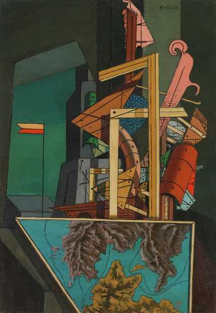
Peter Peri on Giorgio de Chirico’s The Melancholy of Departure 1916
Many iconic modern paintings have bad titles and some even threaten to compromise the work itself. Jackson Pollock’s Lavender Mist comes to mind. Surrealist titles can seem the most dated, but I’ve always liked Giorgio de Chirico’s. They achieve a level of portentousness and repetition that matches the paintings themselves: words like enigma, melancholy and infinite appear almost as regularly as do long shadows and watchful buildings. But it’s not only that they match; de Chirico’s titles are vital because it’s often only through them that a human presence is referenced; the paintings themselves remain impressively unpopulated.
A characteristic of de Chirico’s paintings, and Metaphysical painting as a whole, is their ambivalence about distance. The Tate’s The Melancholy of Departure is a good example. The top two thirds of the canvas are taken up with an interior containing precariously stacked shapes and sections of wood. Below and in front is a framed depiction of an anonymous coastline seen from an aerial perspective. This sudden shift in scale, between intimate and long range, transmits a shock. It’s as if there is a lofty indifference at work, a pessimism that gives the painting monumental and inhuman proportions.
The disjunction between what could be picture frames and what is nearly a map makes fixing on a specific painted element in The Melancholy of Departure seem inappropriate. The title, on the other hand, seems to me to function as the painting’s one fixed point and most significant detail. It introduces the possibility of an individual’s presence and sentiment, which lends this austere picture the spectre of human feeling.
The Melancholy of Departure was purchased in 1978 and is on display at Tate Modern.
William Blake
‘Songs of Innocence’: Title-Page (1789, reprinted 1831 or later)
Tate
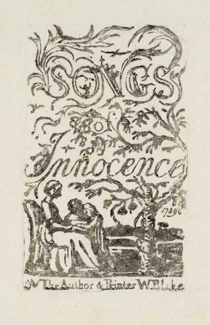
Tom Hodgkinson on the title page of William Blake’s Songs of Innocence 1789
If I am criticised in my own work for romanticising the past, then I always summon up the example of William Blake, poet, artist, visionary and “author and printer” – as he calls himself on this title page. Blake was always my favourite poet at school, and he still is today. At school I liked his simplicity: much of the other poetry we were taught was difficult, while Blake’s Songs of Innocence was not. He paints a magical world of laughing children, merry angels, green woods, little lambs and echoing greens. His purpose was not sentimental nostalgia, but to attack the new system that was establishing itself in England at the time – a mechanical social order of factories, steam, machines, wage slavery and sixteen-hour days in the mills. By invoking a higher ideal of simple living and being close to nature, he was performing an important artistic task. I’m also attracted by a certain amateurishness in the work, and the happy collision of words and pictures. The page is not exactly neat and tidy, and it is very wild and free: there is no real logic. If I want to put an angel in the “O”, Blake seems to be saying, then I’ll put an angel in the “O”. His belief in angels is another impressive element of his work, echoed in more recent times by the Abba song. I always remember the dinner ladies at school singing “I believe in angels.” as they washed up.
Songs of Innocence was presented by Mrs John Richmond in 1922. A special display of Blake’s work opens at Tate Britain on 5 November 2007.

