Graham Harwood’s net art work Uncomfortable Proximity 2000 takes the form of website that was built to mirror and spoof Tate’s website. Harwood’s site appeared as a pop-up when visitors accessed Tate’s website between July 2000 and July 2002 and can currently be accessed via Tate's Intermedia Art pages. Uncomfortable Proximity combined Tate’s existing digital infrastructure with Harwood’s visual and critical reflections. In design and layout, the work was largely indistinguishable from Tate’s website at the time. Harwood replaced images and rewrote text with the aim to ‘expose the “aura” of racial and class discrimination that surrounds museums and their connections to the cultural, social and liberal elite’.1 ‘While Tate can never be fully inclusive of peoples’ histories that may have run counter to its own’, he reasoned, ‘it can at least be a site of critical participation in the present history’.2
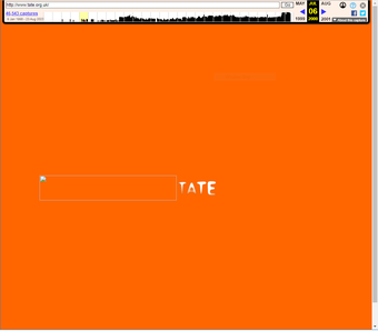
Fig.1
Tate’s landing page in 2001, accessed via the Wayback Machine, capture taken 27 June 2001, http://web.archive.org/web/20010627071223/http://www.tate.org.uk:80/. This page could have four different colours and would redirect visitors automatically to the homepage.
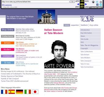
Fig.2
Partial view of the Tate homepage in 2001, accessed via the Wayback Machine, capture taken 3 June 2001, http://web.archive.org/web/20010603144736/http://www.tate.org.uk:80/home/default.htm. The page shows some distortion at the top, where the flash banner with the image of Tate Britain should be within the purple header at the top. In order to display the banner it was necessary to set up the browser to allow the playback of Flash files.
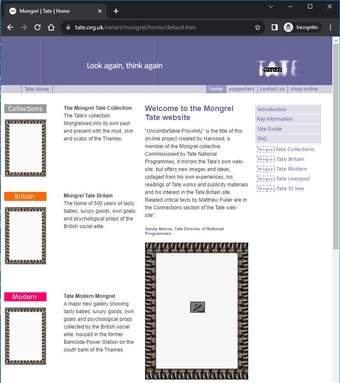
Fig.3
Partial view of the homepage of Uncomfortable Proximity, see https://www.tate.org.uk/netart/mongrel/home/default.htm, capture taken 27 October 2023.
Based on historical captures available for the Tate homepage in 2000, we can retrace the experience of a visitor while the work was active.3 A visitor would first arrive at a landing page featuring Tate’s colours and logo (fig.1). They would then redirected to the homepage. Once the homepage had loaded, Uncomfortable Proximity would appear as a pop-up (figs 2 and 3). There, the word ‘mongrel’ was superimposed on the Tate logo and inserted into the titles of almost all the links on the homepage. Links to pages on ‘The Collection’ or ‘Tate Modern’, for instance, read ‘The Mongrel Collection’ and ‘Tate Modern Mongrel’.
At the top of the landing page for Uncomfortable Proximity was an introduction to the work written by Sandy Nairne, Director of National Programmes at Tate from 1994 to 2002:
Commissioned by Tate National Programmes, [Uncomfortable Proximity] mirrors the Tate’s own web-site, but offers new images and ideas, collaged from his [Harwood’s] own experiences, his readings of Tate works and publicity materials and his interest in the Tate Britain site.4
Harwood created images for the site by combining photographs of paintings he took in the galleries with images of mud and slime from the Thames and close-up photographs of the bodies of himself, his family and his friends. Harwood's photographs included paintings by J.M.W. Turner, William Hogarth, Gawen Hamilton, Thomas Gainsborough, John Singleton Copley and John Constable. His texts are critical explorations into the troubling background of cultural institutions through rewriting the website’s core pages from alternative perspectives. On the ‘Supporters’ page, for example, writes:
Emerging social elites seem to find it necessary to justify their ‘natural’ right to wealth and privilege. This is done in many ways. The one that interests us here is the use of aesthetics to negotiate the social positions of new economic forces. Henry Tate himself directly convinced Harcourt, the Chancellor of the Exchequer, to help with funds to build the Tate in order to circumvent the established aesthetic orthodoxy of the time. From its beginning, the Tate has supported the taste values of whichever social elite was contemporarily emerging.5
Harwood’s use of the word ‘mongrel’ in the work, a reference to the racist term for someone of mixed descent, comes from the artists’ collective Mongrel, of which he was a founding member. The collective was founded in 1997 and included such artists as Matsuko Yokokoji, Mervin Jarman and Richard Pierre-Davis. The group’s website describes them as a ‘mixed bunch of people working to celebrate the methods of an “ignorant” and “filthy” London street culture ... imploying any and all technological advantage that we can lay our hands on’.6 On the Mongrel Tate website, Harwood describes his approach to the work as a ‘personal response to the cultural attitudes that I found within the aura of the collection’.7
Making and commissioning
In 1999 Mongrel were invited by Sandy Nairne and Matthew Gansallo, Senior Research Fellow at Tate from 1998 to 2001, to create Tate’s first Net Art commissions. The collective ultimately declined to take part as a group. As Harwood recalls, this was because 'when Black or Asian members of Mongrel came to the Tate, there was very little for them’.8 Instead, Harwood, the only White member of the collective, led on the commission.
When Harwood began working on the commission in 1999, Tate was undergoing significant institutional change. The Tate website had launched the year before, Tate Modern was to be opened in January 2000 and Tate Britain was being redeveloped. Working closely with Nairne and Gansallo, Harwood was given access to Tate Britain in the evenings after it had closed to the public. He spent time freely exploring the galleries and photographing paintings, with a ladder to climb and a member of staff accompanying him.9 He also undertook archival research exploring the history of the collection, including the history of the Tate Britain site and the relationship between Tate Liverpool and the 1981 riots.
While Tate Britain’s building was being scoped for development, human remains were discovered underneath the Clore Gallery. These were found to be remains of prisoners who had died while incarcerated on the site when it was Millbank Penitentiary (1816–90). This prompted Harwood to research into the hidden or buried institutional histories of Tate. He wanted to bring to light different personal, public and institutional voices from the past, and wrote several texts for Uncomfortable Proximity from the perspective of the buried prisoners. In one of his writings on the website, under the title ‘Introduction to the Foundations of Tate Britain’, Harwood delved into the history of Millbank Penitentiary and the socio-political implications of the prison site being converted into a museum. Drawing the connection between museums and prisons as spaces for the assertion of power and social control, he wrote: ‘If the prison changed you through discipline and punishment, then the museum was a way to show and tell so that you might look and learn. Here, the purpose was not to know about people’s culture but to address people as the subjects of that culture.’10
The conditions and technologies of the internet at the turn of the millennium were crucial in the making of Uncomfortable Proximity. The internet gave Harwood the ability to ‘play’, ‘manipulate’ and ‘create new assemblages’ from the collection in a way that would have been previously impossible. Increased use of the internet also created the opportunity to share the work with people around the world. For Uncomfortable Proximity the ability to create connections with people in Australia was particularly significant since the work detailed Tate Britain’s location as the site of Millbank Penitentiary, which from 1840 to 1853 had served as a temporary holding facility for convicts being transported to Australia.11
Reception and interpretation
The artwork’s title is based on Harwood’s experience of working with Tate and how it forced him ‘into an uncomfortable proximity with the economic and social elites’.12 Through the work, Harwood exposes the direct connections to histories of colonialism and enslavement that underlie the cultural, political and financial capital held by institutions such as Tate. Writing with his occasional collaborator Matthew Fuller in an article a year after the commission, Harwood reflected: ‘I found myself awkwardly situated [between] my admiration for parts of the Tate collection and my equal disdain for the social values that framed the creation of much of its art and of the collection itself.’13 He added: ‘I hoped the Tate would embrace this work as a legitimate counterpoint to some of its own agendas and maintain the momentum.’ Fuller describes how Harwood questions representation through the act of ‘self-composition’, bringing signifiers of his working-class identity into the gallery, an identity he considered had been ‘scrubbed from the walls of the museum’.14 He hoped Uncomfortable Proximity could create space for change in practices around representation in museums by ‘providing the foundations for opening things up still further’.15
In her book The Body and the Screen, Michelle White reflects that Uncomfortable Proximity emphasises the ‘deeply constructed aspects’ of realistically rendered website images.16 She describes how ‘Harwood’s disturbing visuals, which make the spectator look away, direct attention to the structure of the museum and the kinds of spectatorship it ordinarily facilitates’.17 In contrast to Fuller’s take on the work, however, White is sceptical about the work’s potential to create real change in the museum. She finds that the commission could allow the museum to ‘perform a kind of self-examination while remaining largely the same’.18 Harwood himself acknowledged that Tate was willing to take the risk of commissioning an artwork so critical only because it could be contained: ‘Giving a few naughty artists the odd bit of gallery-space or web space can then be used as a pretext for the careful shunting of these problems outside of the "purified" high-cultural sphere.’19 The artist and theorist Anna Munster focuses on Harwood’s use of digital technologies in processes of re-composition and decomposition. She explores how by ‘break[ing] up’ the familiar and branded experience of the museum website, our attention is diverted to what lies behind the history of the museum. This includes uncovering some of ‘the differential voices that comprise the history of institutionalised collecting’.20 In his book Racing Cyberculture, Christopher McGahan identifies the question at the centre of Uncomfortable Proximity: whether ‘the emergence of digital technologies would actually lead the Tate and other museums to proceed in more than token fashion toward democratizing their approach to acquiring and presenting art’.21
The artist’s practice
Graham Harwood has been engaged with collaborative and socially engaged projects since the 1980s. In 1987 he co-founded the Working Press with artist Stefan Szczelkun, producing books by and about working-class artists.22 In 1995 he began working at Artec, the London Art and Technology Centre, providing substantial grants and training in new media and arts practice to support the long-term unemployed.23 For Harwood, Artec was ‘about cultural voices and how technologies could be used to allow for different forms of cultural voice to emerge’.24 With substantial funding from the European Union, the organisation provided unemployed people with childcare, food, transport and equipment for a year. As Harwood describes, ‘it populated so many of the tech companies in London, but from people that would have never had a hope’.25
Mongrel was formed at Artec in 1997, combining the practices of Richard-Pierre-Davis, Mervin Jarman, Harwood, occasionally Matthew Fuller, and Harwood’s long-term collaborator Matsuko Yokokoji. Richard Wright joined Mongrel in 2004, helping form MediaShed, a free media lab in operation from 2005 to 2008. Mongrel, who define their collaboration as a ‘mixed bunch of people and machines’, make work that engages with ideas of race, identity, class and discrimination. Natural Selection 1999, for example, is a mock internet search engine that hacked Yahoo!. When someone searched for one of 5,000 racist terms identified by the collective, Natural Selection would provide them with links to ‘a series of sites of exaggerated bigotry, many containing the same coarse language and crude imagery as the racist sites they intend to parody’.26
Matsuko and Harwood have maintained a separate partnership since 1994 called YoHa. The duo uses art and ‘action-research’ as a way to explore how power operates in a variety of environments, objects and situations.27 YoHa’s work is always done in collaboration with others and often involves what they refer to as ‘technical objects’, components such as data that often go unnoticed.28 Their project Plastic Raft of Lampedusa, for example, makes visible international networks of people and power through an investigation into the making, circulation and use of the inflatable boats by migrants to travel across the Mediterranean.29 Influenced by net art and software studies of the 1990s, YoHA explores network culture both online and offline, identifying the buried relationships that form culture and society.30 Harwood explains how their emphasis shifted in this period: ‘We spent a lot of time looking at how databases construct governance, so I think network society rather than specifically the internet became, yes, much more prescient to us.’31
Technical narrative
The Uncomfortable Proximity pages were designed as standard webpages to match the design of the Tate website in 2000. They were built in collaboration with Tate's website team and use standard HyperText Markup Language (HTML) to structure the pages, with JavaScript and Macromedia Flash Player (Flash; later Adobe Flash Player) to provide animation. At that time the page layout was described wholly using HTML. This is visible in the code of the page, which can be viewed with the help of browser-based developer tools.
We used the Internet Archive’s tool Wayback Machine to access historical captures of Uncomfortable Proximity as it would have appeared in 2002. There were several aspects of the work, however, that are not reproduced using these captures; namely the length of time the webpage appeared as a pop-up and the details of that behaviour. The pop-up behaviour has been inactive since 2002, and the information we have about how it was set up lacks technical detail. We wanted to find out how long Uncomfortable Proximity was active on Tate’s homepage and how the page would have appeared to visitors. We also had some questions about the appearance of the site via the captures, which in some cases did not match what we would expect.
In order to establish the period over which the work was active, we looked at historic captures of the Tate homepage. We can see from a capture taken on 6 July 2000 that the homepage already redirected to the Uncomfortable Proximity pages, even though the first capture of those pages was not taken until 18 August.32 The last capture of the Uncomfortable Proximity pages with the original URL (http://www.tate.org.uk/webart/mongrel/home/default.htm) was taken on 6 June 2002.33 The following capture of that URL, on 6 August, led to a ‘page not found’ notice. A capture from 10 October shows Uncomfortable Proximity under the ‘net art’ section of the site (http://www.tate.org.uk/netart/default.htm), together with Le Match des Couleurs by Simon Patterson, BorderXing by Heath Bunting and Tate in Space by Susan Collins.34 We could therefore estimate that the work was active on the Tate homepage between July 2000 and June or July 2002.
Descriptions of the work implied that Uncomfortable Proximity appeared instead, or in place of, the Tate homepage.35 However the historical captures and the JavaScript recorded for each capture indicate that Uncomfortable Proximity appeared as a pop-up window, in front of the Tate homepage.36 The textual sources also mention that Uncomfortable Proximity would be seen by every third visitor, but looking at the Javascript code on the Tate homepage, it appears this was not the case. The only visitors who would not be presented with the artwork were those using Netscape v2, which could not support the JavaScript code that opens the pop-up window.37 It is therefore likely that the majority of visitors visiting the Tate website between June 2000 and July 2002 would be presented with the artwork.
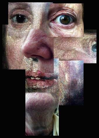
Fig.4
An image with filename Mumhog.jpg, which appeared on the ‘Collections’ page of the website. It combines details of a painting by Hogarth and a photograph of Graham Harwood’s mother. See https://www.tate.org.uk/netart/mongrel/collections/mong0.htm, accessed 27 October 2023.
Moving on from the behaviour of the page to its content, we analysed the elements that make up the pages. The webpages embed images in JPEG and GIF formats, which were common at the time and remain so today. The size and resolution of the image files is low by current standards, in keeping with net art of the time, which in the UK was usually accessed via a low bandwidth dial-up internet connection. The image file Mumhog.jpg (fig.4), for example, which appeared on the ‘Collections’ page of the website, has a resolution of 468 by 650 pixels and a file size of 61 kilobytes.
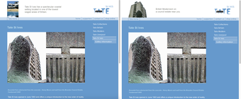
Fig.5
The ‘Tate St Ives’ page within Uncomfortable Proximity showing two examples of the changing top banner, http://www2.tate.org.uk/netart/mongrel/stives/default.htm, accessed 1 February 2020
Like the Tate website, Uncomfortable Proximity included Flash elements, which allowed the banners at the top of the page to change. The banner on Harwood’s ‘Tate St Ives’ page (fig.5), for example, behaved like the one on its parallel page on the main Tate website, with new text and images supplied by the artist. One of the banners reads ‘Tate St Ives has a spectacular coastal setting’, to which Harwood added ‘located in one of the lowest waged areas in Britain’.
Most of the artists commissioned as part of the net art series included technical specifications for how their work should be viewed. For Uncomfortable Proximity there is a page within the artwork’s website with information about the technologies used and recommendations on preferred browser and monitor settings: ‘The Tate site is designed to look best on monitors set to at least a 800 x 600 resolution and using more than 256 colours. You can edit these settings in the control panel section of your computer’.38 The low minimum resolution and limited number of colours indicate the extent of technological change since the work was made. The text also indicates the artist’s concern for the audience’s experience.
Current condition
Like many of the other commissioned net art works at Tate, Uncomfortable Proximity uses Flash, in this case to animate the banner at the top of each page. Flash reached the end of life in December 2020, so these elements no longer function.39 Unlike other works explored in this case study, however, the Flash elements are not essential to understanding the work. One could see it as a painting that has lost its original frame, the content remaining mostly unchanged.39
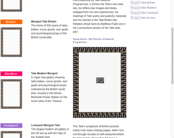
Fig.6
The Uncomfortable Proximity homepage, featuring empty picture frames, one of which frames an icon representing a broken link. The icon is part of the JPEG image and is therefore not a signifier for a missing link and must have been added intentionally; http://www2.tate.org.uk/netart/mongrel/home/default.htm, accessed 1 February 2020.
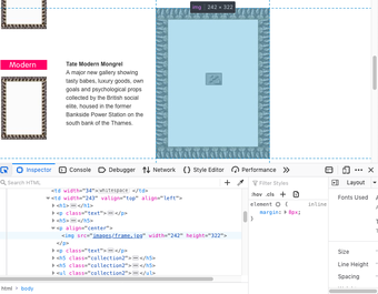
Fig.7
The Uncomfortable Proximity homepage on the Firefox browser, with the developer tools open. The images/frame.jpg file refers to the highlighted image of the frame on the webpage itself.
There are also literal empty frames in Uncomfortable Proximity, such as those on the work’s homepage (fig.6). These may initially appear to signify a problem with the webpage, perhaps where images have been lost. Matthew Fuller’s essay, however, suggests the empty frames were part of the original design of the page, as he describes the work as ‘an exact replica of Tate Online as it existed in the year 2000, however images appear to be missing’.40 By analysing the HTML code of the page (fig.7) we could access the image file and see that the symbol for a missing link is part of the JPEG image, and did not signify a missing or broken element. This discovery highlights the need for museum and art workers to understand the technical aspects of a work, namely the underlying code, in order to be able to evaluate a work’s condition.41 In this case the page had not changed.
Because the website mirrored Tate’s design and language in 2000, today it is almost entirely disconnected from its historical meaning and intention. The nuances, Harwood’s ‘twist of the words’, are more difficult to spot without direct comparison, and there is no longer the risk or reward of public reaction. For Harwood, the sense of play and critical thinking that was possible using the internet in 2000 is an important historic example for institutions: ‘I think there was a certain kind of freeness at that moment that’s well worth recording – seeing that it didn’t actually cause huge problems’.42 It was, as he describes a ‘kind of bold experiment on all sides’, a process-based practice that is not perhaps well suited to traditional conservation within a static collection. For Harwood, Uncomfortable Proximity was focused on ‘critically engaging with the living’. ‘Whether we’re forgotten’, he reflects’, ‘it doesn’t really matter. It’s about a living culture rather than a dead one’.
Conclusion
Looking back at Uncomfortable Proximity today highlights the importance of access in relation to net art in the museum. In making the work, Harwood depended on access to the galleries to photograph artworks (which had not at that point been digitised); access to the National Programmes director, Sandy Nairne, to discuss and co-author the texts on the website; and access to the space. He also needed access to a certain authority, that which allowed him to tell a different story of the privileged institution, its history and collection.
For an online viewer in 2000, access to net art was often a challenge. Artworks were difficult to find for those outside net art circles, and there were a host of technical barriers. In 2000 local telephone calls in the UK were charged by the minute (although sometimes free in evenings and on weekends). Many accessed the web by connecting via modem to a landline and dialling in, which could be slow and expensive. It was only in 2000 that the first commercial broadband service was offered in the UK, and most home computer users did not take it up until the mid-2000s.43
Tate’s decision to commission a series of net art pieces signalled the museum’s desire to illuminate a path into the web to help people find art there. It is significant, therefore, that Uncomfortable Proximity may have been a visitor’s first experience of Tate’s website. The commissioning curator, Matthew Gansallo, Tate’s marketing team and representatives from BT (who sponsored Tate’s website) held discussions about whether encountering a pop-up window with apparent ‘disinformation’ would dissuade visitors from returning to Tate’s website.44 Conversations about the technical accessibility of websites to users – such as for blind and partially sighted people; or for the many without access to a personal computer, internet connection and broadband subscription – were addressed with less urgency.
Uncomfortable Proximity mimics and spoofs the museum’s institutional webspace, drawing attention to Tate’s hype-driven language around new and seemingly accessible digital spaces. With its now degraded technical functioning, the work itself serves as a cracked portrait of the Tate at a particular moment in its recent history. Accessing historic net art is now reliant on the preservation efforts of conservators in time-based media and software, who can dig beneath the sleek foundations of the institution’s web presence to find the remains of the works that used to live there.
