Launched in August 2002, Tate in Space is a fictional journey into institutional expansion by Susan Collins. The project was embedded into Tate’s website, drawing on the organisation’s language, design and marketing strategies to present an alternative narrative. As Collins wrote at the time, it was intended to be ‘a proposition documented, discovered and activated through a website’ and ‘an opportunity to take the Tate brand into new territory’.1
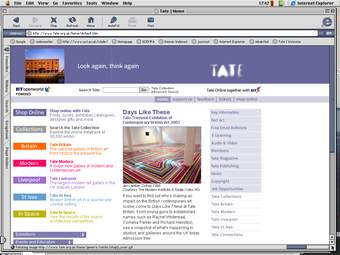
Fig.1
The Tate homepage showing the link to Tate in Space at the lower left
Screenshot taken in 2003 by the artist
© Susan Collins
Over the course of a year, Tate in Space could be found on the Tate’s homepage (fig.1). Beneath links to ‘Shop Online’, ‘Collections’, ‘Tate Britain’, ‘Tate Modern’, ‘Tate Liverpool’ and ‘Tate St Ives’ was an additional link to ‘Tate in Space’. The text below the link pitched it as ‘a radical new location for collection, curation and display’.2 On clicking the link, visitors would enter the Tate in Space pages, which included visitor information, details on public programmes, frequently asked questions and job opportunities, each modelled on equivalent pages on Tate’s website. Additional pages included writing about the conservation issues of art in space, information on space art and space architecture, and an essay by the Brazilian artist Eduardo Kac titled ‘Against Gravitropism: Art and the Joys of Levitation’.3
In order to blur the line between fiction and reality, Collins worked with a branding toolkit developed by creative agency Wolff Olins to coincide with the opening of Tate Modern in 2000.4 Collins also echoed Tate’s institutional, authoritative voice in the website text. Sandy Nairne (Director of National Programmes, Tate, 1994–2002), is quoted on the website:
In order to fulfil their mission to extend access to British and International modern and contemporary art, the Tate Trustees have been considering for some time how they could find new dimensions to Tate's work. They have therefore determined that the next Tate site should be in space... This will clearly continue the Tate tradition of innovation and exploration, and provide a radical new location for the display of the Collection and for educational projects.5
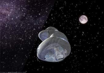
Fig.2
Extra-Terrestrial Architecture Laboratory (ETALAB)
Proposal for Tate in Space, 2002
© ETALAB
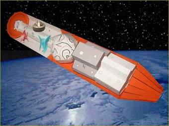
Fig.3
Softroom
Tate Space Island, proposal for Tate in Space, 2002
© Softroom

Fig.4
Sarah Wigglesworth Architects
Paper model for a proposal for Tate in Space, 2002
© Sarah Wigglesworth
Courtesy Susan Collins
One of the sections of the website is called ‘Space Architecture’. It includes proposals for an intergalactic gallery – a ‘new Tate’. Collins invited three ‘future thinking architectural practices’ to contribute a scheme. Extra-Terrestrial Architecture Laboratory (ETALAB), which is described on the Tate in Space page as ‘an innovative architectural office specialising in the design and implementation of real and virtual high-technology environments’, proposed a ‘transparent, rotating cylinder’ that would ‘respond to the environment of outer space and to the unpredictable needs of artists, curators and visitors engaged with post-millennial extra-terrestrial art’ (fig.2).6 Operating in ‘micro-gravity with the possibility of introducing artificial gravity’, both art and people would be ‘liberated from the need for conventional architectural elements’.7 The second proposal, Tate Space Island (fig.3), came from Softroom, a London-based architecture studio founded by Chris Bagot, Dan Evans and Oliver Salway in 1995.8 Their galleries would be divided into three zones. In the first zone, ‘the visitor passes through... a chamber where they can be totally surrounded by artworks that float freely around them’;9 the second zone has a curved surface, creating alternative conditions for creating and displaying art; and the third zone provides a space for artificial gravity within which artists could play with different ‘gravitational strengths’.10 The third architectural proposal, from London-based architecture practice Sarah Wigglesworth Architects, drew inspiration from ‘iconic artworks owned or exhibited by the Tate’. The text on the website specifically cites Rebecca Horn’s Concert for Anarchy 1990, featuring a grand piano suspended upside-down from the ceiling, as an inspiration for Wigglesworth’s exploration into how art and everyday objects might ‘adapt under the impact of zero gravity’.11 Models for all three proposals were made available as PDFs on the website for people to download and construct out of paper or card (fig.4).12 There was also a student competition launched to gather further proposals.13
The website also included a fake live webcam stream from a pilot satellite supposedly launched on 6 June 2002. Visitors to the site could view the webcam images ‘focused on our own planet, earth’.14 In fact, these blurry images were photographs taken by Collins of a small rubber ball designed to look like the Earth. People could also track the imaginary satellite’s movements using calculations provided by physicist Caitriona Jackman. Within the ‘Visiting Information’ section, the ‘Sightings’ page describes the satellite as ‘orbiting at an orbital velocity of 7.67 km/sec approximately 400km from earth in a polar to polar low earth orbit. The satellite orbits earth every 92.56 mins and traverses the entire globe in the course of 15.56 orbits – 24 hours – 1 day.’15
To further engage visitors on the website, there were discussion lists hosted by the academic mailing list service JiscMail, within which Collins introduced conversation topics such as ‘space materiality – zero gravity and sound – the physical properties of making work in and for space’ and ‘space invaders? – cultural ambition and the search for new audiences’.16 By 2004, there were over 100 people contributing to discussion lists,17 ranging from those interested in space and art to artists, new media curators and writers. There is therefore an archive on JiscMail of engagement in the ideas and the development of the work.
Making and commissioning
Susan Collins was invited by Jemima Rellie (Head of Digital Programmes, Tate, 2000–2007) to submit a proposal to create a work for the website in 2001.18 Tate was looking for proposals that could ‘respond to the historical context of network art; or, respond to the context of Tate as a media and communication system; and that might involve significant elements of interaction’.19 It was selected and launched at the same time as Heath Bunting’s BorderXing Guide.20 Curator Lisa Haskel, who acted in an advisory role for several of the early net art commissions, described the proposed work as follows: ‘It has a satirical edge, providing space for debate and, in a humorous way, encourages reflection on the ambitions of culture institutions such as Tate and the Guggenheim. The project also keys into recent activity among artists in the realm of “space art”.’21
Collins was in post as the director of Tate in Space for a year. ‘I didn’t want the site to remain “active” for more than a year’, she explained to Jemima Rellie in 2004, ‘because there’s nothing more boring than a project that’s tired and not updated regularly, so now it’s in archive form in a sense.’22 The result is that Tate in Space is ‘a record of a moment’.23
Reception and interpretation
Collins was interested in the increasing real-world and online expansion of large-scale museums in the 1990s and early 2000s. The Guggenheim had launched satellite museums in SoHo, New York (1992), Las Vegas (2001), Bilbao (1997) and Berlin (1992); while Tate Modern opened in London in 2000. Playing on this moment of museum expansion and the associated language for the potential to reach new audiences, Collins used the Tate website as a platform to critique and to fictionalise the development, branding and ambition of large-scale art museums. As she described in a recent interview: ‘It’s not really about being site specific, it’s situation specific. It is context. It’s about a moment in time and responding to that so the context is everything.’24
Collins saw the work as an example of ‘speculative fiction’ in the sense that the work is ‘rooted in potentiality, with developments in the present suggesting a plausible future’.25 Playing the role of Director of Tate in Space gave her licence to speculate about the institutional drive for expansion: ‘I was really interested in the arrogance of earthlings thinking that we put stuff out there... I was wanting to question earth-centrism... the assumption and the sense of entitlement.’26 Collins achieved this by drawing on the fertile if little-known area of science-art practice concerned with astronomy and outer space. She was interested in how Tate in Space could unfold and ‘spiral’ as people engaged with it.27 In 2004, Collins compared this unfolding engagement with the website as a ‘kind of architectural space if you like, the architecture of the web delivering a public space that people can then occupy and inhabit and make happen or not as they desire’.28
To coincide with the commission, curator Paul Bonaventura was commissioned to write an essay on the work, which sat alongside a link to the commission on Tate’s Net Art pages, as well as on the Tate in Space website. In ‘Floating Worlds’, Bonaventura considers the work’s proximity to reality and speculates about the motivations behind it: ‘Collins's project is less to do with real or imagined artefacts in space or opportunities for artists outside the earth’s gravitational pull and more about examining the contexts in which art institutions, artists and viewers play out their interconnecting roles.’29 Other writers such as Vince Dziekan have explored Tate in Space as an example of the impact of digital technologies on curatorial design and the implications of virtuality on exhibition-based practices.30 ‘Because of the interdisciplinary nature of the role’, Dzeikan argues, ‘the curator in the future ultimately needs to be capable of operating as a “producer”, act as a “mediator” between the artists and institution, and be skilled in “negotiating” across disciplinary borders and conventional organisational structures of the museum.’31
Tate in Space captured the zeitgeist of that moment for ideas exploring space and art, which were often layered with notions of institutional expansion by arts organisations in the early 2000s. The arts organisation Arts Catalyst (founded in 1994), for example, presented projects exploring sub-orbital space in 1999. The topic is explored in the Tate in Space discussion lists through posts by those including Rob Le Frenais, Curator at Arts Catalyst from 1997 to 2014, and ‘an alien presence’. The crossover between art, technology and space exploration intensified once the project went online. Collins recalls that it was picked up by the British National Space Centre, who contacted Tate requesting to see their license for the satellite.32 It was reported by NASA, listed in the Stock Exchange and reviewed and highlighted by journalists in publications including Discover magazine and The Globe and Mail (Canada).33 Collins was interviewed about the project live on J-Wave Radio, Japan.34 By inviting proposals for the design of Tate in Space from architectural practices, the project was also picked up in the architectural press.35
The artist’s practice
Susan Collins engages with ideas of transmission, networking and site or situation, often approaching these ideas with humour and speculation. She has worked with technology and audience interaction and human behaviour since the late 1980s.36 In 1995, she founded the UCL Slade Centre for Electronic Media in Fine Art and she was Slade Professor and Director from 2010 to 2018.
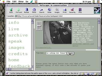
Fig.5
Susan Collins
In Conversation website screenshots, Brighton, 1997
© Susan Collins
Source: http://www.susan-collins.net/inconversation/brighton.html#
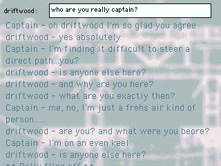
Fig.6
Susan Collins
Cruisin’ website screenshots, 1999
© Susan Collins
Source: https://susan-collins.net/1990s/cruisin/
Collins uses the internet in her work as both a public space and a ‘means of distribution’.37 She has written about the way in which ‘a networked context can act as a catalyst for generating interactive narratives and collective fictions’,38 and explored the engagement between public space and the internet through the installation In Conversation (1997–2001) (fig.5). The work is made up of two halves: a website (which can be activated as an installation in a gallery) and an image and sound projection in the street. People could visit the website and watch a live video stream of the street. They could type messages or comments into the website that would be broadcast to passers-by through concealed speakers, creating a way for people to ‘inhabit the work’. The time delay between the typing and transmission of the message ‘became essential as part of the fabric of the work’ as it ‘gave rise to some wonderful collective sentences and parallel conversations’.39 In 1999, Collins created Cruisin’ (fig.6) for the online project Containership initiated by E-2 and Simon Faithfull, wherein ‘artworks would be adrift in the international waters of the world-wide-web’.40 Like Tate in Space, Collins’s work for Containership created a ‘fictive environment’.41 People could enter into a dialogue online with characters on the ship, including a fictive captain.
Technical narrative
The pages of the Tate in Space site were designed and coded using the same design templates and technologies used for the Tate website. A standard combination of HyperText Markup Language (HTML), Adobe Flash Player elements and JavaScript were needed to run the pages. Although Cascading Style Sheets (CSS) – a language that describes how HTML elements should be presented – was already widely used by 2002, the layout of the pages was still defined using HTML. The assets for the pages were built by Collins, who then worked with the Tate Digital team to integrate them with the main website.42 Finally, Collins made use of the pre-existing email discussion list platform JiscMail, which hosts discussion lists for the UK Education and Research Communities. Collins used the New Media Curating list, aka CRUMB, as a model for the Tate in Space list.43
Current condition
The link on Tate’s homepage to Tate in Space was removed in October 2003, signalling the end of the project’s ‘live’ period and its transformation into an archive. The webpages for the work remained online without change as the web around them continued to evolve. The most visible consequence of these shifts is its diminished potential to parody Tate’s website. Due to changes to the design, institutional language and branding of the museum’s website in newer iterations, and to the increased size of browser windows since 2002, Tate in Space no longer convinces visitors to Tate’s website into believing there is a fifth site in space. These contextual changes affect the way the work is encountered. At the time of its commission, there were two routes into the work: an unknowing chance encounter on the website and a more deliberate engagement, perhaps through connections to net art. Now, as Collins points out, ‘only the knowing route exists’.44
Conservators working on the Reshaping the Collectible project first accessed Tate in Space through the work’s webpages. There, they encountered an artwork composed of different stages and layers, which over time has lost some of its critical context, its integration with the Tate website and functionality. During the commission, there was full engagement from Collins and Tate to realise and host the work. Tate in Space first appeared in the Tate website in October 2002,45 the architecture competition was advertised in February 200346 and the results were published in April 2003.47 At this point Tate supported the illusion of Tate in Space as a new Tate site by keeping the link integrated with the links to the other Tate sites on the homepage. In October, the link to the Tate in Space site was moved from the homepage to the Net Art page. The discussion list, which was set-up concurrently with the webpages, continued as a live element into 2006, with only sporadic posts after that. Archived discussions are still available on the JiscMail site, but posting is no longer possible.48
In 2010, the link to Tate in Space was moved from the Net Art pages to the Intermedia Art project pages, where it became further removed from the main website. When the link to the Intermedia Art pages was removed from the Tate homepage in July 2011, it became nearly impossible to find the work unless a visitor was explicitly looking for it.49 Tate’s website was redesigned in April 2012,50 which further decontextualised Tate in Space as a parody of the institutional website. The pages, however, remain accessible. A few functionalities have been lost due to the discontinuation of Flash in 2020, most noticeably the fake webcam.
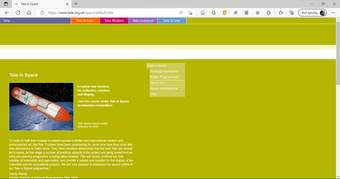
Fig.7
Tate in Space landing page, screenshot as experienced on the live web during the Reshaping the Collectible project, on a personal laptop
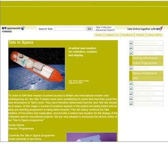
Fig.8
Tate in Space landing page, accessed via the Wayback Machine, capture taken 10 February 2003, https://web.archive.org/web/20030210105113/http://www.tate.org.uk/space/default.htm
There are several types of loss at play in the conservation considerations of this work. The most obvious loss is the live element, which occurred at the end of the initial project when both the artist and Tate stopped actively engaging with it (fig.7). There is also the stated loss of context, and with it the parody of Tate’s expansionist museum practices. Finally, there is a loss of technical functionality, as elements of the site fail as technology shifts around them (fig.8).
We can see similar losses in other works commissioned for the net art series. agoraXchange 2003 by Natalie Bookchin and Jacqueline Stevens stopped functioning as a space for discussion long before the website was taken down, while Watercouleur Park 2007 by Qubo Gas was rendered defunct in 2020 due to its dependency on Flash.51 From a conservation perspective, it is clearer to describe the website as one of the many elements that compose the overall work. Classifying it as an element of an artwork affords the digital realisation a degree of care that is usually not available for documentation. The extensive documentation of the site on the Wayback Machine might be deemed sufficient to preserve the work, but with enough resources it would be possible to rebuild the site’s functionality.
Tate in Space is bound to a particular moment in history, a time in the early 2000s when the institution was expanding both to new physical locations and online as it began to explore digital programmes. This time-bound quality – in concept as well as in the page design and the technologies used – challenges conservators and curators to present these anachronisms. It also opens the possibility of maintaining a historical illusion of a Tate that was in space in 2002.
Conclusion
Tate in Space shares one of its main characteristics – of parodying its commissioning museum – with an earlier Tate net art commission, Uncomfortable Proximity by Graham Harwood. In both cases, Sandy Nairne was an instrumental figure in providing access for the artists to reconfigure the institutional voice and authority of Tate. The artwork remains as a series of documents, webpages and unrealised (and unrealisable) architectural plans for an orbiting satellite venue in space. Interestingly, Tate’s mission does not encompass art of the future, but defines its interests as art ‘from the 16th century to the present day’. Despite its speculative framing, Collins’s work exemplifies the ‘present moment’ of 2002, a time when many museums were positing global expansions and drumming up support from Silicon Valley (or Silicon Alley). Artists, meanwhile, were mimicking corporations, performing institutional critique through the media landscape, all the while imagining new technological environments their works might get to live in, free from pesky material concerns like fossil fuel supplies or gravity.
