Interpreting John Martin: What do you think?

For every exhibition at Tate, we produce a range of interpretative materials to help visitors understand and engage with the art on display.  Our approach varies with each show, depending on the exhibition’s focus (for example, the interpretation for the Turner Prize is different to that for an exhibition of paintings by Turner). We work very closely with the exhibition curators to produce interpretation that visitors will find useful and informative.

The main interpretation in each room of John Martin is the wall text. The exhibition is arranged chronologically and the texts introduce the main ideas of each section – tricky to do in under 200 words! The curator also wrote captions for most of the works on show.

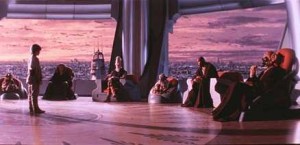
The exhibition leaflet explores the huge influence John Martin has had on film makers, writers, musicians and other artists.  We sourced images – from films like Intolerance (director DW Griffith based the look of the film directly on Martin’s paintings) and 2012 – that show a Martin-like apocalyptic vision.  Many people have spoken about his influence and we tried to include quotes from them. Looking at the works on the wall of the exhibition it is amazing how contemporary some of them seem.

Still from The Phantom Menace 1999 © Photos 12 / Alamy

John Martin 'Satan in Council' (1831) © Michael J Campbell

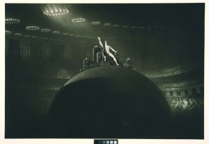
A number of Martin’s large oil paintings went on extensive tours and we tried to demonstrate the sense of awe and excitement the viewers of these paintings at the time would have had. We have done this through a dramatic sound and light show. The exhibition curator Martin Myrone discusses it brilliantly on the Tate blog.

© Tate

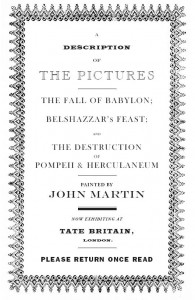
We have also produced a pamphlet that recreates the catalogues that were produced to accompany tours of Martin’s paintings (the originals are also on display). They include etched painting outlines and descriptions. We toyed with the idea of putting this information on a wall panel – but in the end we thought it would be more useful (and more fun) to re-create the material in the same format as the original.

We have produced an audio tour for the show. This goes into more depth on about 20 works in the show and is useful for anyone who wants a bit more information – it is especially interesting to hear Martin Myrone talking about John Martin.

You could argue that the final painting in the exhibition provides a final piece of interpretation. It is The Tragic Conversion of Salvador Dalí (after John Martin) by contemporary artist Glenn Brown. It was a curatorial decision to put it in the show but its juxtaposition with the John Martin works that inspired it perhaps makes a comment about the Martin paintings that words cannot do… What do you think?

I am really interested to find out about what you think about exhibition interpretation. Is there too much text on the walls? Not enough? What is the purpose of the leaflet? Should it contain the wall texts or can it be an additional information resource?

Read More Comments Off Share on Facebook + Twitter

Loud Tate 2011 in Pictures

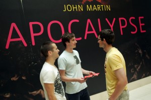
Loud Tate 2011 took place on the hottest October weekend you could possibly imagine, lending a nicely apocalyptic turn to proceedings.

© Richard Eaton

Did you come down? Can you spot yourself in any of these pics?

© Richard Eaton

The classic Tate Collective badge making was a big hit, with members of the public designing their own all day (we also took it to Underage Festival, everyone loves badges!).

© Richard Eaton

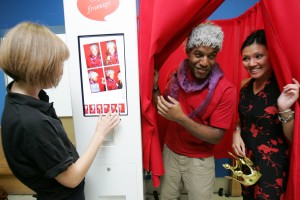
Our urban portraiture photo booth gave visitors a chance to pose with some excellent props.

© Richard Eaton

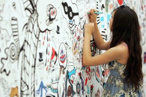
Supernatural characters in a giant wall mural by Zombie Collective, with visitors contributing their own Underworldly character designs.

Congrats to the Tate Collective team, another stomper of a Loud Tate! Join Tate Collective online to share your artwork with other young people around the world, and be first to know about the next Tate Collective events.

Read More Comments Off Share on Facebook + Twitter

Tate Collective: Keeping Tate LOUD

Loud Tate is there to disrupt the silence.

Galleries have become quiet temples of contemplation, isolating the individual within the thoughts and expression of an artist. However, this can isolate an individual away from a work, especially a younger generation who missed out on or forgot (because of exams) the Magic, the Humour, the Fun, the Vulgairty and the Noisiness of Art.

Tate Collective will not allow Tate to become another library… it just hasn’t got enough books for that.

Once a year Loud Tate disrupts the authority of a librarian, by smuggling in the following: Urban photography, take-away Poetry, photo-booths, Screen Printing, Zombies, something bigger than an Ipod and much, much more.

The reason for this is simple. We are that generation who feel we are being intimidated by the silence and sterility of a white-cubed gallery that suppresses the life of Art.

Let us not forget this a gallery and from it we chose a theme relating to a current exhibition: The Underworld, inspired by John Martin’s grand, biblical paintings.

John Martin, The Great Day of His Wrath (1851-3)

John Martin is a British Artist whose spectacular paintings stretch the boundaries of imagination and perspective. With his intense focus on architectural composition and the otherworldly chaos in Paradise Lost, he creates something predating any Hollywood blockbuster like Avatar. This has spurred an idea of an urban underground littered Platonian shadow puppetry, coincidental truths found in a glimpse of camera’s flash and spelt out in takeaway poems that look at what’s below the surface.

This cunning sellotaping of ideas will be brought into full view by the Urban photography Workshop, Raw Tours and a Q&A session (where I will be).

The Urban photography workshops will hold a treasure of wonderful props and two very talented photographers aiming to show you some of the secrets of a camera’s soul with an urban accent.

The Raw Tours… well, they are tours with hi-tops. They are unconventional, interactive and of course loud, because Art exists through opinions and dialogue… and Tate is not a library!

Now for the Q&A. There will be two and it’s not a press conference and Jeremy Paxman is banned. This is an opportunity to get a candid and informal response from established film-makers from your question and opinions.

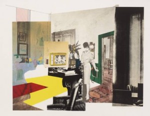
Richard Hamilton, Interior (1964-5)

I have been part of Tate’s peer lead group scheme since 2007. I believe the way to experience art is in a cocktail of experience. Workshops laced with facts stirred up with discussions is the best way to get into a gallery, because it becomes personal. My personal  favourite artist because of this is the late Richard Hamilton. The first Pop Artist whose blend of commercialism, materialism, sex, objects and disciplines produce dark but vibrant works that to this day critique our society.

So come down, make a noise so we can chase away these librarians.

Ian Hamilton Finley, Drum (1991)

Loud Tate: Underworld is a FREE event of live music, art and performance on 1 October 2011, curated by the young people of Tate Collective.

Read More Comments Off Share on Facebook + Twitter

The Reconstruction of Pompeii and Herculaneum

John Martin’s Destruction of Pompeii and Herculaneum is a dramatic work, showing the great volcano, Vesuvius, erupting over the ancient cities of Pompeii and Herculaneum. The painting was completed in around 1821 when people were very interested in big landscapes showing the destructive forces of nature.

Given its subject, perhaps it was fate when, on January 7 1928, the Thames burst its banks, flooding the basement at Tate Britain where the picture was being stored and completely submerging it. At the time, it was considered a lost cause. However, recent interest in Martin’s work and plans for a new exhibition led us to examine its remains, and we began a major restoration project in 2010.

The Destruction of Pompeii and Herculaneum, before any reconstruction.

Many flakes of paint had detached from the surface and were lost. Parts of the canvas on which the picture was painted had become weakened and torn apart, leaving a big gap right where the heart of the volcano should be.

The painting looks very dark in this image because it is covered with layers of dirt and yellowed varnish which had to be carefully removed. It had also been saturated with river water causing lots of paint to become detached and flake off. All the loose paint that had stayed in place has been stuck back down and all the little losses have been inpainted.

Retouching the work.

The section depicting the volcano and the cities had been completely destroyed, obliterating much of the compositional depth and leaving the scene difficult for viewers to understand.

The damaged edges also distracted from the original painting, as revealed by digitally tracking viewers’ eye movements to see where their attention was drawn.

Inserting a piece of canvas to complete the image.

We carefully reinstated the missing area of the canvas and repainted, drawing on photographs, a smaller painted replica of the composition by Martin and an outline etching of the original work. The new areas of painting are deliberately executed in a less detailed fashion, so as to ensure the viewer’s attention is drawn to Martin’s original work without compromising the power of the scene as a whole. In addition if you look closely and spend time with the painting you can see differences between the texture and appearance of the original paint and reconstructed areas.

Proudly in place in the gallery!

Our frames conservation department also made this beautiful new frame for the work. We wanted something that looked appropriate to the period, based on three similar frames made for other Martins in the collection in the 1990’s. After a lot of deliberation we chose a largely black frame since there are reports of Martins other painting, Belshazzars Feast, being displayed in an ebonised frame around the time that this painting was executed.

I feel the final effect successfully re-instates the drama and impact of Martins original work, something I think he would have wanted.  I very much look forward to hearing what you think of it when you visit the show!

John Martin: APOCALYPSE, Tate Britain, opens on 21 September 2011 and runs until 15 January 2012. Book tickets online or become a Tate Member or Tate Patron and visit for free.

Read More 1 Comment Share on Facebook + Twitter

BP Saturdays: Loud Tate – Underworld

Saturday, 1 October 2011
Tate Britain, 12:00 – 17:00

Tate Collective present a day of the dark, the sublime and the underground.

Inspired by the work of John Martin, experience haunting sounds set against a visual backdrop of deep, fiery, romantic landscapes.

Experience Tate Britain with rebellious, revolutionary and curious creative workshops, talks and tours.

Come and get creative

FREE, NO NEED TO BOOK

Read More Comments Off Share on Facebook + Twitter

Watercolour at Camp Bestival: Your Comment Winners!

Well festival season is over and our heads have stopped spinning (just about), so now it’s time to announce the winners of the Watercolour comment competition that we ran at Camp Bestival.

Visitors to our tent were invited to write their thoughts on the 12 Watercolour works which we had on show in our tent, and assistant curator Anna Austen and I have selected our favourites, who will each win Watercolour tickets and a catalogue.

Here are the five winners’ comments. Do you agree with them? We’ll be contacting the winners this week, congratulations to all!

“Neal Tait’s Country Booby was most interesting to me. The majority of the image is taken up by this ugly tangle of a person who’s ripping up a tree. I think it represents our increasingly materialistic society in the western world and the effects it is having on our earth.”
-    Emily, 19

“Leaves, lakes, bombs, Blake,
Watercolour thick and thin
Buttock, balls, abstract halls
Tate has this all within.”
-    Judy

“Juxtaposition of immediate danger, suspended in the second before disaster, and nature’s devastatingly innocent curiosity. A haunting warning.”
-    Imogen, 16 (on Summer in the Crimea)

“I wanted to reach out and touch John Ruskin’s Withered Oak Leaf. ‘Tis the friendliest looking leaf I have ever seen.”
-    Romilly, 16

“Watercolour is not the right word to describe this group of artworks – it is not amazing enough a description – it leaves out the ‘how’. How can water and colour create such a variety of textures, detail, light and finished beauty.”
-    Pauline

Read More Comments Off Share on Facebook + Twitter