‘Found’ words: Printed packaging, labels and layers
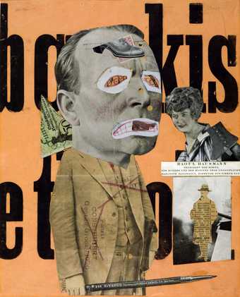
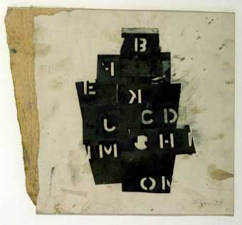
Ever since the cubists first collaged real newspapers and bottle labels into their still-life paintings in around 1912, artists have been making use of ‘found’ printed letters and words to add visual interest or texture to their work.
Kurt Schwitters added bus tickets, sweet wrappers, stamps and other scraps of throwaway printed papers to create delicate detail in his beautiful textured collages. Pop artists made use of the high-impact visual qualities of advertising and slick product packaging. Eduardo Paolozzi used these ‘found’ printed papers directly in his collages, while Andy Warhol lifted product brand names and advertising slogans for his prints.
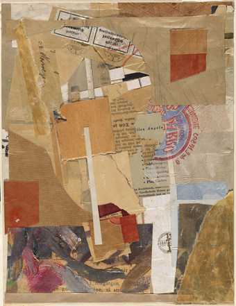
Kurt Schwitters
Opened by Customs (1937–8)
Tate
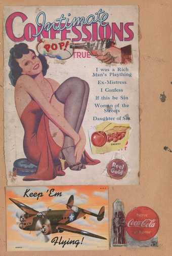
Sir Eduardo Paolozzi
I was a Rich Man’s Plaything (1947)
Tate
In the spirit of pop art artist Michel Majerus features logos and mass produced products in paintings such as Fries 2001. But he adopts this imagery to celebrate youthful subcultures that use images of consumerism as badges of identity, rather than subverting consumer culture, as the pop artists did.
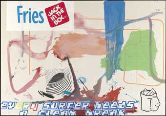
Michel Majerus
Fries (2001)
Tate
© The estate of Michel Majerus, courtesy neugerriemschneider, Berlin
Like the pop artists, Mimmo Rotella also used advertising posters to comment on the post-war consumer boom – but rather than embracing their slick in-your-face graphics, the words become almost intelligible in his fragmented compositions. Inspired by the rich distressed textures of layered posters he saw around him on hoardings in Rome he began to rip these down and use them directly – often rearranging the pieces and stripping away further layers. Gwyther Irwin similarly made use of advertising posters, scavenged from London’s East End, for Letter Rain 1959. Individual words and letters are clearly legible in the upper half of the work. Further down, the deluge of letters subsides into a haze of pale fragments through which faint traces of letters are just visible.
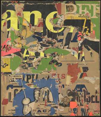
Mimmo Rotella
With a Smile (1962)
Tate
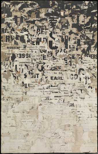
Gwyther Irwin
Letter Rain (1959)
Tate
Words and shapes
Concrete poetry arranges words and letters in a visual way; the work is as much about its layout as about the meaning of the words. For his Poster Poem (Le Circus) 1964, Ian Hamilton Finlay uses a mix of coloured fonts and quirky arrangement of text to suggest the fun and dynamic activity of a circus. Ajar 1967 is a concrete poem constructed of one word, repeated in a bent list which illustrates the meaning of the word through its shape. The poem is like a sculpture made of words.
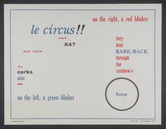
Ian Hamilton Finlay
Poster Poem (Le Circus) (1964)
Tate
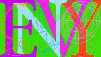
Sir Michael Craig-Martin
Envy (2008)
Tate
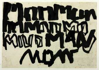
Robyn Denny
Manman (1957)
Tate
The shapes of the layered brightly coloured letters used in Michael Craig-Martin’s text pieces also have a sculptural aspect. The artist sees himself a constructor – a ‘putter-togetherer’ of things: ‘I think of my paintings as flat sculptures’. He creates his images digitally, scanning and assembling them on a computer. In his Seven Deadly Sins print series, the overlapping brightly coloured letters mingle with a mesh of simple outline drawings of ordinary objects.
Robyn Denny’s Manman 1957 uses the word ‘man’ – scrawled several times across the page graffiti-style – instead of a depiction of a person. The work was created in response to his art college teacher suggesting that he make figurative work. To Denny the word ‘man’ was the simplest way of creating a figure painting! By painting words in a gestural, eye-catching way his aim was to ‘lure the eye [of the viewer] out of the everyday world and into the world of the painting’.
Words that tell stories
Letters and words aren’t only used pictorially art – for the shape, texture and detail they can add to an artwork. Artists also use words linguistically – in a way that we might associate more with literature – to create narratives.
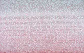
Fiona Banner
Break Point (1998)
Tate
Fiona Banner’s ‘wordscapes’, are large text works that recount the plots of feature films and other events. Break Point 1998 is a large painting comprising sixty-six rows of red text written horizontally on a white background, which collectively describe a car chase from the film Point Break (dir. Kathryn Bigelow, 1991). Banner explores the limits of verbal communication in her work: rather than watching an exciting fast-paced action scene viewers have to read the narrative in a deliberate and painstaking manner. As Banner commented: ‘when it’s translated into words … [the scene] becomes this kind of shaggy-dog story … the opposite of keen imperative momentum’.
Tom Phillips also used a ‘found’ narrative as the starting point for many of his prints. He worked directly onto the pages of printed books, isolating phrases or parts of words and then combining these with paint and collage elements to form a new verbal and visual narrative.
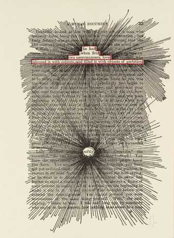
Tom Phillips
[no title: p. 33] (1970)
Tate
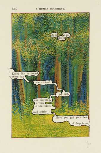
Tom Phillips
[no title: p. 264] (1970)
Tate
Ian Breakwell and Sophie Calle use text, often alongside photography, to tell narratives about the observed lives of others. Tracey Moffat also uses text alongside photographs for her Scarred for Life series. Her works which mimic photo spreads from the American magazine Life, draw on memories from her childhood. The terse captions hint at traumatic stories behind the images. Moffatt has commented: ‘A person can make a passing comment to you when you are young and this can change you forever. You can be “scarred for life”’.
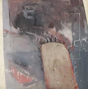
David Hockney
The Third Love Painting (1960)
Tate
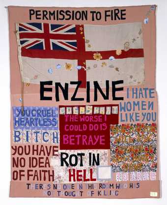
In works by artists David Hockney, Grayson Perry and Tracey Emin words mingle in with images. Scrawled in an expressive style they reveal personal thoughts, feelings and diary-like narratives.
Words and ideas
Conceptual artists often use text to explore ideas. With conceptual art what the art object looks like is less important than the ideas surrounding it, so conceptual artists use the best way of putting across their idea – which often involves using words to describe it!
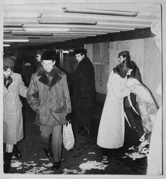
Ewa Partum
Active Poetry (1971)
Tate
Artist Ewa Partum combines performance art with poetry. Since the early 1970s she has been creating poems by scattering cut-out letters in a variety of landscapes and locations, using their random distribution to create poetry.
Artists Ed Ruscha and Bruce Nauman use words in their art to explore language and how it is used. The words in Nauman’s VIOLINS SILENCE VIOLENCE 1981-2 illuminate in a cycle. The triangular arrangement of the words and the way in which they overlap prevents a conventional left-to-right reading, while their sequential illumination makes us aware of the words’ shapes as well as their meanings. Violin suggests a musical sound but this is squelched by violence and obliterated by the following silence. In this way the merging of these words creates a sort of visual sound poem that coveys extremes of music and silence, creativity and violence.
Ed Ruscha often combines familiar phrases with unlikely and apparently unrelated images. These make us question what we are looking at and what we are being told. For Pay Nothing Until April 2003, he has used a mountain landscape and an advertising slogan painted in a clean modern font. Ruscha lives in Los Angeles and the city and its film industry is important in his work. The mountains he uses in his works have the spectacular and slightly unreal look of a film backdrop. By mixing awe-inspiring natural imagery with banal, consumerist text without any clear style, Ruscha’s painting reflects the city in which he lives, a place he once referred to as ‘the ultimate cardboard cut-out town’.
A call to action: posters, flyers and signs
The Guerrilla Girls are an anonymous group of feminist artists. They use words and figures to highlight sexism and racism in the art world. They fly-post posters and send letters to art institutions to raise awareness of this discrimination. They use facts, humour and simple language to put across their call to action in the most immediate way.
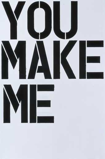
Conceptual artist Jenny Holzer also uses posters and signs to put across her message. She has also been known to use billboards, T-shirts, hats, stickers and park-benches in her art, too! Her first public works, Truisms 1977–9 were anonymous flyers pasted on buildings, walls and fences in and around New York. Commercially printed in bold italics, one-line statements such as ‘Abuse of power comes as no surprise’ were aimed at provoking public debate. These works explore socio-political issues. Holzer uses language and the mechanics of late twentieth century communications as an assault on established ideas about where and why art is shown and who it’s for.
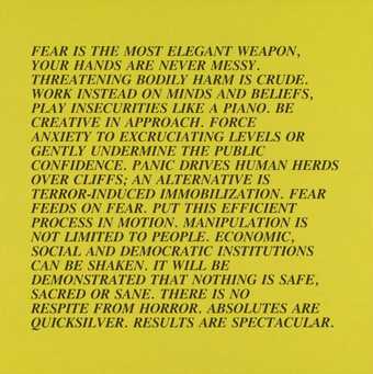
Jenny Holzer
[no title] (1979–82)
Tate
© Jenny Holzer, member/Artists Rights Society (ARS), New York
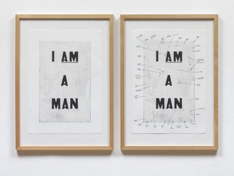
Glenn Ligon
Condition Report (2000)
Lent by the American Fund for the Tate Gallery 2007
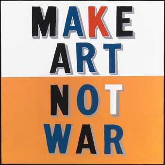
Bob and Roberta Smith’s text paintings have the air of revolutionary statements, riffing on life, politics and art. His texts, (Bob and Roberta Smith is an alias…his real name is Patrick Brill), are often painted onto scraps of discarded wood using ordinary household paint. The works often feature a generous amount of subversive humour. Smith has stated that his simple DIY approach – which anyone can do – and use of recycled materials, encourages ‘the idea that the world can be organised differently. People can construct their own realities and worlds rather than living in MTV or BBC world’.
Have a go
We’ve pulled together some ideas to help you get started using letters and words in art.
- Artists (such as Michel Majerus and pop artists) often used the words they saw around them in popular culture as the inspiration for their work. Collect brand names, slogans or ‘found’ printed words and texts (such as flyers, fast-food leaflets etc.). Use these – or bits of these to reflect popular and consumer culture today. You could use these in an abstract way, ripped up to create visual texture or directly to put across your message or to make point.
- Concrete poetry and neon texts play with the shape and look of words as well as their meaning. Try arranging words in ways that reflect their meaning. Think about font, colour, and scale of the words. Or try layering words to create rich layers of shape and meaning.
- Do you have powerful personal memories that are important to you today? Are there thoughts and feelings that you want to get out there? Could these be a starting point for an artwork? Add snippets of narrative to add power, emphasis, and meaning to visual images
- Try working directly with ‘found’ texts. Cut them up and rearrange them to make new meanings, or draw and paint directly onto pages of written or typed narrative text.
- Caption or present text alongside photographs, sketches or videos to make people think about what they are seeing in a different way.
- Are there any issues you feel strongly about? Think about ways you can use art and words to raise awareness and change peoples’ minds. Think about the way products are marketed and borrow some of these techniques to market your message. Get inspiration from posters, flyers and signs.

