Andrew Grassie
Tate New Hang 8 (2005)
Tate
Andrew Grassie
Tate New Hang 6 (2005)
Tate
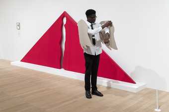
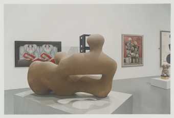
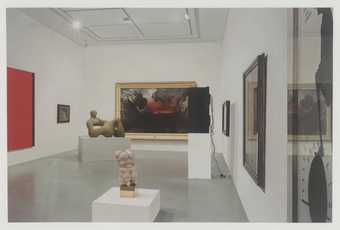
This image of an art gallery may look like a photograph – but it is actually a painting. This type or painting is sometimes called photorealism – because it looks as real as a photograph. By scrutinising and meticulously painting the details, including shadows, reflections and even the rough marks on the stone of the sculpture in the foreground: Grassie presents us with an image that looks like a camera must have captured it. The way the gallery is framed within the picture – so that some artworks are cut off at the edges of the paper, also make the painting look like a photograph.
Details in nature
James Ward
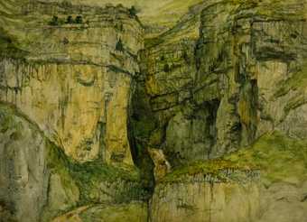
First Compositional Study for ‘Gordale Scar’ (1811)
Tate
James Ward
Sketch for ‘Gordale Scar’ (c.1811)
Tate
James Ward
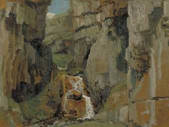
Sketch for ‘Gordale Scar’ (1811)
Tate
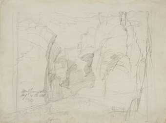
Artist James Ward looked closely at details – and nature was his inspiration. In these drawings and sketches he uses dramatic lines and sensitive marks to capture the jagged details of rocks and textures of the undergrowth. You get the feeling that he didn't take his eyes off the scene, losing himself in the details and following the shapes he saw with his pencil, feeling his way around the forms.
Vija Celmins
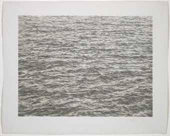
Ocean (1975)
Tate
Vija Celmins also focuses on the natural environment in her meticulously detailed drawings. The subjects she chooses are so vast – skies, galaxies, desserts, the sea – you would think they would be impossible to capture. But by taking a section and focusing on the mesmerising repetitive details of waves, stars, stones, clouds, we get a sense of their hugeness. They seem to stretch on forever beyond the edges of the paper.
Details around us
Paul Noble
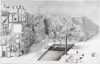
Lidonob (2000)
Tate
Paul Noble also creates dizzyingly intricate drawings of vast places. His drawing Lidonob is one of a series of artworks in which he depicts the buildings, locations and stories that make up an imaginary city called Nobson Newtown. It shows the swimming pool which is surrounded by a zigzagging wall of geometric protrusions resembling rock formations. The pool’s diving platform spells out the title of the work. The huge drawing (it's more than four metres across!) is crammed with minute detail, reflecting the detailed fictional narrative that Paul Noble has created about his imagined city. The urban vision he presents is a melancholic one. It is full of nightmares, excesses and weirdness. The artist has said: ‘The truth is that wherever man goes, destruction and sadness aren’t too far behind’.
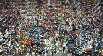
Andreas Gursky's large colour photograph depicts the trading floor of the Board of Trade in Chicago. Seen from above, the floor is a dense hive of activity. The intense details become almost a blur, suggesting the extreme busy-ness and hectic nature of the scene. To create the image Gursky took several pictures of the trading floor and scanned them into a computer where he merged and manipulated them. He uses digital technology to heighten images so they reflect his impression or memory of a scene. In this way the photographs become more than a document – they also carry the whole experience of being somewhere and seeing something.
Details in making
Peter Davies
Small Touching Squares Painting (1998)
Tate
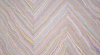
Details don’t have to come from things we see around us in the real (or imagined) world. They can be abstract marks or patterns. This painting looks at first like a sea of blurred, wavy coloured lines. But in fact the canvases have been painstakingly covered in line after line of tiny, hand-drawn squares which touch at their corners. Each square is filled with colour. Peter Davies is interested in the optical effects of colour and ordered pattern. His works look a little like the optical art of the 1970s, but also reminds us of the mesmerising effects of computer-generated designs.
Raqib Shaw
Jane (2006)
Tate
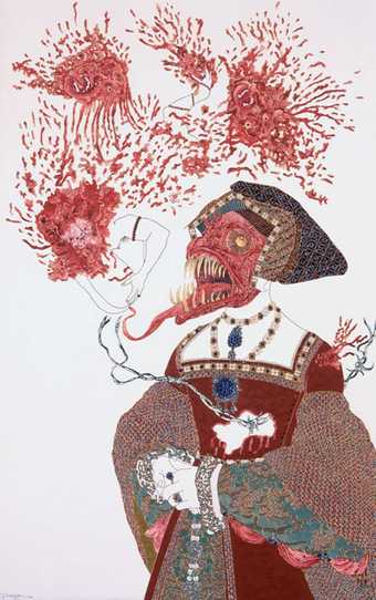
Raqib Shaw creates detailed patterns, and uses glitter and plastic beads alongside paint and pencil marks, adding to the painting's rich intricacy. He also uses some rather unusual techniques to create the jewel-like details – such as using the quill (or spike) of a porcupine to dot the surface with tiny pools of enamel paint. The inspiration for Shaw’s intricate patterns comes from a range of sources including Japanese wedding kimonos, Kashmiri shawls, medieval heraldry, Persian miniatures, carpets and jewellery. Beneath the beautiful, exquisitely detailed glittering surfaces and textures of the paintings however, lie darker themes and meanings. He uses a range of factual and fiction sources to create disturbing fantasy worlds.
Bernard Cohen
Matter of Identity III - The Trace (1977–9)
Tate
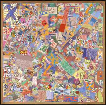
A mass of tiny details seem to be scattered and repeated across the surface of this painting. We can make out certain shapes – an aeroplane, a paw mark, a paddle, an explosion and a window – many of which look as if they have been doodled onto 'post-it' notes. These motifs have a personal significance to Cohen, who describes the painting as 'covered with stories'.
Fiona Banner
Break Point (1998)
Tate
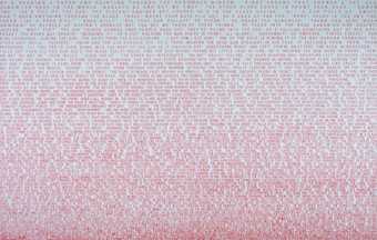
At first glance this looks like an abstract painting. But if you look more closely you will see that what look like tiny marks are in fact words. Fiona Banner explores detail in two ways. Not only does the text create the visual look of an intricately detailed artwork, but the work is also ABOUT details. To make the work Banner describes the scene from an action movie Point Break 1991. She uses detail to change the nature of the scene and how it comes across to the audience. By describing the scene in detail the pace of the action is slowed down as viewers are forced to read the narrative.
Tom Phillips
[no title: p. 11] (1970)
Tate
Tom Phillips
[no title: p. 228] (1970)
Tate
Tom Phillips
[no title: p. 300] (1970)
Tate
Tom Phillips
[no title: p. 343] (1970)
Tate
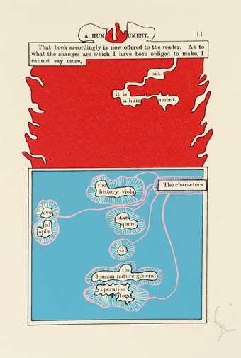
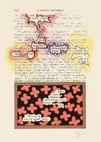
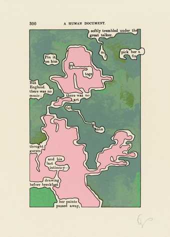
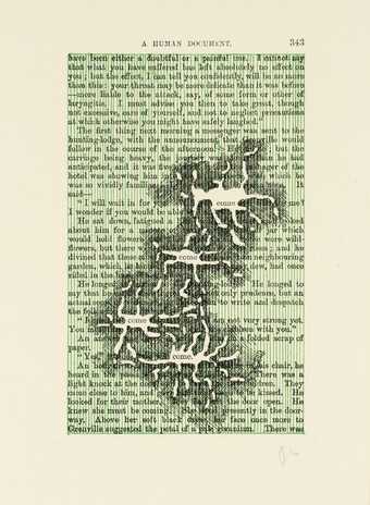
Tom Phillips creates new meanings from details in his Humument series of prints. By covering up most of the words on pages of a book we focus in on the words that are left – which say something very different from what was originally on the page! By getting rid of things to create new details, Phillips shows us that details can be about what you leave out as well as what you focus on.
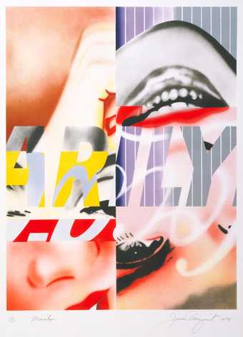
James Rosenquist
Marilyn (1974)
Tate
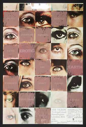
Joe Tilson
E - Erotic - Earth - Eyes (1969–70)
Tate
In these works, James Rosenquist and Joe Tilson have also removed sections of an image to highlight details. Pop artists were inspired by popular culture. Themes such as celebrity, pop music, fashion and shopping found its way into their work. They also often used details from imagery found in printed objects – such as advertisements or magazines. Joe Tilson has used images of womens madeup eyes from glossy magazines. Rosenquist uses details from photographs of film star Marilyn Monroe. In both works, features like the mouth, eyes, nose and hand are fragmented and placed alongside fragments of printed text. What effect does this have?
Have a go
Here are some ideas to get you started exploring different kinds of details in your art:
- Use photographs to capture details of things you see around you and use these to inspire abstract patterns and surfaces.
- Try photographing or drawing ordinary places or things and cropping the images to create details. How does this affect what you see?
- Explore other photorealist artists. Try painting a photograph. Look closely and work out ways of imitating the minutest details you can see, using paint.
- Draw a landscape or cityscape scene. Look closely at the shapes and details and experiment with lines and marks to suggest the forms and textures. Try drawing without looking at your paper. Look closely and follow the intricate lines of forms and shapes with your pencil.
- Collect samples or images of fabrics and make sketches of the patterns. Think how you could use these in your artwork to create a sense of detail. Patterns could be used in clothing in portraits (like Raqib Shaw has done), or you could use them to create dream-like fantasy landscapes.

