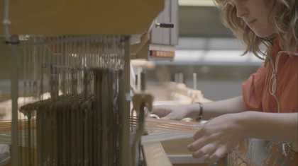
Paul Smith in his studio. Photography by Campbell Addy
Sir Paul Smith is a fashion designer known for his fresh take on traditional British clothing. Suits with a hot pink lining, vibrant irregular stripes and patterns sourced from seed packets are a few well loved examples.
The first thing you notice about Smith is his childlike fascination with the world. As we arrive, he dives into a tour of his studio. The room is full of objects, the majority of which are gifts from fans. Some, to be expected; books, prints, clothing samples, cycling gear (he is a well known cycling fanatic). Some, less so; a tic-tac clock, a nativity scene made from nuts, a dancing hoola girl. Each item has a story and he remembers each one.
There is also a large number of artworks - photographs, prints, drawings and paintings. They cover the walls or lie propped up on the floor.
What I like is that you can observe an artists' creative spirit through their work. And this way of thinking or doing can influence your own work.
We asked Paul to sum up five artworks in five words that connect to his life.
1. The Unexpected
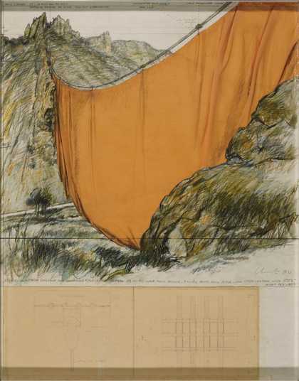
Christo (Christo Javacheff)
Valley Curtain (Project for Colorado) Rifle, Grand Hogback (1971)
Tate
I've always enjoyed the fact that Christo’s work is just what you're not supposed to do. It's illogical, it's odd - like putting a curtain across a valley. What I enjoy doing with my work is playing with irreverence, things that you shouldn't do. Lateral thinking, he is the king of that.
Christo Vladimirov Javacheff, and his wife Jeanne-Claude, are known for their epic pieces of land art. They are masters of the grand gesture, wild, unthinkable acts. These include surrounding islands with pink sheeting and wrapping a cliff face. The scale of the work is both nonsensical and totally romantic. It shows us familiar landscapes in a new light. Smith's approach to design is similar, on a smaller scale. The unexpected details in his designs make you see familiar items again for the first time.

Items in Paul Smith's studio
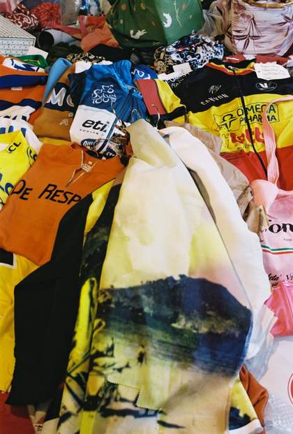
Cycling clothing and printed fabrics in Paul Smith's studio

Toy train from Paul Smith's studio
2. People
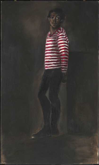
Lynette Yiadom-Boakye
10pm Saturday (2012)
Tate
You'll see that so much of what I do is to do with the items in this room. The colours of all the books together become a stripe. Or some unlikely objects placed together make me think of unusual fabric pairings like velvet next to canvas.
For a man whose life is dedicated to designing clothes, it feels apt that the narratives of his fans should surround him while he works. It’s this passion for human observation which he shares with one of the scholars of the Paul Smith Scholarship, Lynette Yiadom-Boakye.
With Lynette, what's so interesting, is she doesn't actually work from life. She just works from her very vivid but quite accurate imagination. Her figures look very spontaneous. Even though she may take hours painting them, it feels very loose and reflects her ability to observe very quickly.
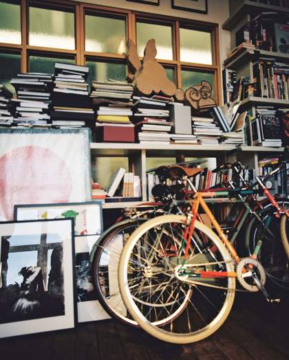
Books, prints and bicycles in the studio
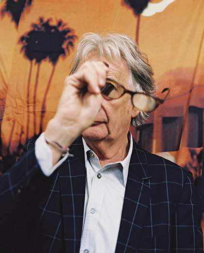
Portrait of Paul Smith
3. Colour
The snail is exactly the same size my first shop. Twelve feet by twelve feet. That's quite amusing.
Now that he has two hundred stores around the world, it’s hard to imagine him in that tiny shop. This success was definitely in part down to his use of colour. Rich colour combinations which never fail to bring joy.
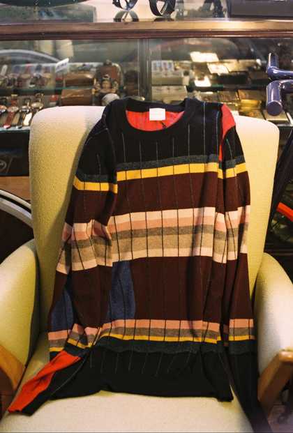
Paul Smith jumper, inspired by Anni Albers
Matisse is somebody who has always proved to me that you can play with colour. If you look at the pale blue and white of The Snail, it's very fresh, very light and clean. If you look at the orange and the red together, it's very vibrant and electric.
There’s a celebratory feel to this artwork. Perhaps because the way in which it came about was very challenging. Matisse was too ill to paint during the final years of his life, so developed a new method of mark making. The Snail is made by painting large sheets with colour and then cutting them in his bed.
Matisse said:
It allows me to draw in the colour. Instead of drawing the outline and putting the colour inside it - I draw straight into the colour.
4. Photography
I think looking through a viewfinder really helped me look and see, rather than just look. A friend of mine recently said to me, 'You walk down the road seeing fifty things. I just see three.'
Smith’s father was a photographer. As a result he learnt a lot about the medium long before he was old enough to own a camera. He later applied this knowledge to his own design practices- becoming one of the first in fashion to use photographic prints on clothing.
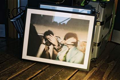
Print of Swingeing London 67 (f) by Richard Hamilton
I was in Florence in the '80s, and there was a van with a picture of the Duomo on the van. I thought 'That's so interesting seeing the Duomo on a vehicle'. So I said to myself 'Well then, why can't I put photographs on to clothes'.
Since the fifties many artists had begun using images from the media in their work. Richard Hamilton’s painting of a paparazzi’s photograph, complete with the blur of the flash, is an iconic example of this.
It was people like Rauschenberg and Hamilton, who played with collage and photography, and Warhol of course with his screen prints, that were all part of the influence.
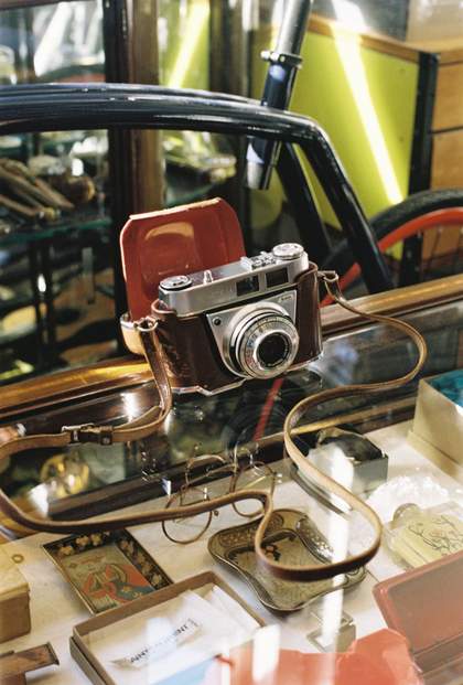
Paul Smith's first camera

Faded projector slide
5. Textiles
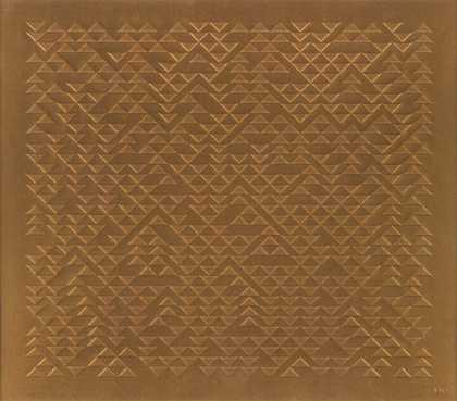
Anni Albers
TR III (1969–70)
Tate
© 2026 The Josef and Anni Albers Foundation/Artists Rights Society (ARS), New York/DACS, London
Anni Albers's work is fantastic for people like myself to observe and enjoy. The way she thinks is the way we think in this building; mixing things, a very textured yarn with a very smooth yarn. Rough and smooth. Scratchy and not scratchy.
Smith repeatedly returns to this theme of contrast, delighting in unexpected pairings. Albers's offbeat style is what makes her work so everlasting. Her use of colour, fabrics and yarns are examples of the lasting value of good design. For Smith this comes in to play in his own work too.
I've been in business for almost fifty years, and one of our biggest achievements I suppose is continuity. I've seen brands come and go. Musicians, restaurants, airlines, et cetera. Having longevity is, in my opinion, a lovely achievement and is partly down to timeless design.
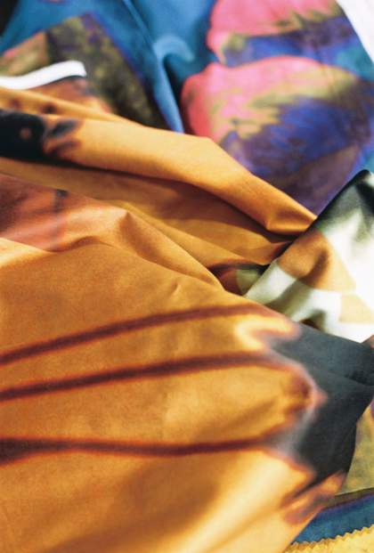
Paul Smith samples of photographic print on silk
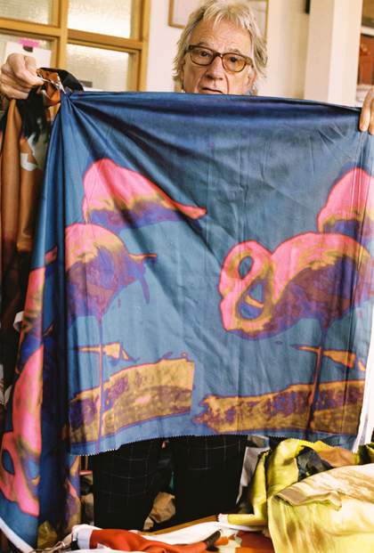
Paul Smith holding one of his designs
All photography © Campbell Addy
Discover more about Anni Albers in our exhibition of her work, on at Tate Modern until 27 Jan 2019.

