On early influences
When I was a student after the war, I spent a lot of time as a model-maker, creating models of exhibitions and models within exhibitions. I even made a model of a large, oversized piece of soap! As a result of this, installations themselves have always been on my mind as part of the process of art creativity.
I was brought to this by working at the Reimann Studios in London, a slightly commercialised version of the Bauhaus that moved from Germany in the early 1930s. The Studios were based on the idea that you had high-quality practitioners in a practical environment; there was a display studio, a fashion studio and a photography studio. The commercial studios were kept separate. I learned how to do a lot of things, such as cut lettering for exhibition stands, but the main quality of the place was that I met people who were exceptionally talented in their field. For example, I was given great encouragement for a while by a stage designer called ‘Professor’ Haas-Heye. On one occasion, he gave me a shilling and said go and see the Picasso show at the Barrington Gallery, behind the RA – the Guernica exhibition, a life-time experience. It was wonderful to work in the company of distinguished professionals, who were happy to associate with a 15-year-old kid filling in time waiting to go the Royal Academy Schools when he was 16.
On Growth and form 1951
This exhibition was the result of a fellow Slade student, Nigel Henderson, introducing me to D’Arcy Wentworth Thompson’s (1860–1948) On Growth and form 1917, a study of morphology in nature. It opened my eyes to the idea that the world is as it is because it must follow certain mathematical principles. He describes phenomena, like the spirals on a cauliflower, so that you see it has to be this way, because time and the activity of growth are related. It is a beautiful notion; it hangs in the mind as an explanation of life itself. Organisms start as a single cell, and then this cell splits into two, then two into four and then 8 and 16 and 32 and so on, till it has achieved the number of desired cells as a group. Then it rotates and assumes another form when a concavity appears, in much the way as a thumb pushed into a ball of clay makes a pot. The ball becomes a cylindrical tube. Then excrescences emerge from the sides of this tube and you end up with a creature with a mouth, an anus and four legs, or two legs and two arms. That this procedure should create something as complex as a human being is magical. That it should produce this extraordinary object at the end is one of the mysteries of existence. Thompson describes it in that way. The fact that I didn’t learn about these things at school meant that when books were brought to my attention, I’d get as much out of them as I could. I didn’t need another individual to disclose the magic. The printed word was enough.
On Man, machine and motion 1955
The Natural History Museum was a place I visited often with Henderson and Eduardo Paolozzi. I also visited the Victoria & Albert Museum and would look at Graeco-Roman tapestries. I first learned about etching from the V&A and spent days looking at Rembrandts in the Print Room. I knew the Science Museum well too. These three museums all have their areas of interest: art, natural structures, science, engineering. Spending time as a child in the Science Museum is probably what made me interested in machines. You pressed a button at the side of a vitrine containing a model of a steam engine and pistons started pumping; then you went to the next and turned a handle and something else happened. I think that the need to cope with technology provokes great art. A great artist has a vision and finds the technical means to create it. If the means don’t exist he’ll invent them, as a chemist or an engineer might, but the vision comes first, not the technological background.
So I began to accumulate images of extensions of the human body that man has made over many generations to adapt himself to other environments – a kind of man-made evolution – and then decided that it might make an exhibition. It wasn’t that I felt such ideas needed to be presented to the public, but simply that I thought it would make a show that would have a visual interest, and it would enable me to exploit my skills as a designer of structures to present that information.
On An exhibit 1957
In the early 1950s, I associated with many architects. I wasn’t interested in architecture as a practice but in ideas about moving within a space. I thought about what was novel in this experience of ‘exhibition’ and decided that it is a form that requires the movement of the spectator in a space. There are other ways to absorb information: watching a projected image in a cinema, reading a book; but an exhibition presents information in such a way that you are required to move to it rather than have it directed at you. I started to understand that there are certain things you can do in a space that are hard to visualise at the level of ‘plan’ and ‘elevation’. Plan and elevation were the tools that architects used to understand space and fields of vision. Before the computer, architects had to work only in plan. Space was seen two-dimensionally on a plane, and in elevation as walls. This restriction to rectilinear planes, and what could go on them, distracted from the possibility of understanding space as a whole. I speculated about Gaud and thought he couldn’t have produced what he had unless he moved around in the space and made decisions on site. I think even the most glorious architectural experience you can have, like visiting the Parthenon, is the result of somebody moving around that space. It’s built empirically, not conceived on paper.
An exhibit came about because a colleague, Victor Pasmore, told me that he liked the Man, machine and motion show but didn’t care for the pictures. He’d have preferred the show without a subject. That set me thinking. I devised a system whereby you could hang uniformly sized pieces of Plexiglas anywhere in a given space. The possibility of hanging panels vertically, horizontally or at right angles to each other was almost infinite. An exhibit had no subject, no theme other than itself; it was self-referential. Once the first mark is made by putting a plane in that space, that could lead to another consequence of putting the second plane in and so on. It would all have to develop organically.
On This is tomorrow 1956
This exhibition came about at a time when the Independent Group was on the verge of extinction. It started in 1953, but had already become a platform to present ideas to the public rather than an introverted group of people. Theo Crosby, editor of Architectural Design magazine, was involved in a congress in Paris around 1954, where the idea was presented that architects, painters and sculptors should get together. He organised a meeting and told us, ‘We must form groups, so go away and talk amongst yourselves, and decide who you want to work with.’
John McHale (1922–1978) and myself knew we’d like to work together, and then it was a question of finding an architect. I knew John Voelcker slightly and liked him very much, so we asked if he’d join us. Unfortunately, not long after that evening, after we’d had time for just a few discussions, John McHale went off to America and stayed until a few weeks before the exhibition was to open. We could only correspond by letter, and their tone became increasingly acrimonious. Finally, we were no longer friends. But I think that happened with a number of the groups. The ideas were certainly mutual; we were agreed that the show should represent the things that we’d talked about in the Independent Group, like Pop Art, pop music, cinema and all the other things you see in a list when Pop Art is mentioned. John McHale was very interested in optical matters, Gestalt psychology and all the rest. I took a few ideas from John and incorporated them into the exhibition. John Voelcker designed the structure.
The idea was that there were certain things that were new in our visual environment, such as cinema, the jukebox, Marilyn Monroe and comics. All these images from popular culture contrasted with the way we saw things that could be informed by straight-forward optical experience. The visual illusions were taken from books. They weren’t decoration, they were just enlargements of images, and you felt them on that scale. So these things were put together and presented in as exciting a way as possible. The jukebox ran continuously, and people could make a choice without putting money in; but this resulted in such constant use that you never got what you wanted, because your choice would play an hour later. There were all these games with sound, optical illusion and imagery. One chamber in the fun house was even a kind of space capsule. There were portholes from science fiction which showed aliens looking through the windows.
On exhibitions at the ICA
The main reason for the ICA’s success at this time, in its small Dover Street premises, was that it was small enough to be like an intimate club. Four people influenced its creation: the historians Roland Penrose and Herbert Read and the sponsors Peter Watson and Peter Gregory, proprietor of Lund Humphries, the biggest and best British print firm of the period. Penrose and Read were the dominant ideas men; the other two provided finance. When, at the end of the year, the overdraft was assessed, they would split it up between them.
I met many artists and intellectuals there. I first met architectural historian Reyner Banham (1922–1988) at ‘Growth and form. There was also a bunch of people who were students or graduates of the Architectural Association. Banham was writing for Architectural Review and had studied under Pevsner. The contacts being made were free and fluid.
Prior to that, around 1949–50, I was introduced to the founder of La Hune, the Paris bookshop, who organised a James Joyce exhibition for the ICA, borrowing showcases and improvising places to hang pictures. I was brought in to help with that and designed the poster, which was my first exercise in typography. I continued to install ICA exhibitions and adopted the Buckminster Fuller practice of ‘less is more’.
All the shows I installed there were variants on the first, including a show of Henry Moore drawings with display panels hung diagonally along the gallery. Those panels lasted a couple of years, and saw perhaps ten exhibitions. Having learned so much from hanging other people’s work I still like to install my own shows, because I feel I know my paintings better than anyone else. My favourite tool is a metal tape measure; a few centimetres makes such a difference. I call it my rhythm stick.
The artist’s biography
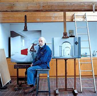
Born in London in 1922, Richard Hamilton took art classes when he was 12 and left school at 14 to work for an engineering firm. At 15 he moved to a commercial design studio, before becoming a student at the Royal Academy Schools. During its wartime closure Hamilton worked as a draughtsman. He returned to the RA after WWII, but was expelled for ‘not profiting from the instruction’.
In 1948, he resumed his studies at the lade and began illustrating James Joyce’s Ulysses, a project which continued into he 1990s. His Ulysses series was shown at the British Museum last year. In 1951 he conceived his Growth and form exhibition (the ICA’s contribution to the Festival of Britain). He taught at the Central School of Arts and Crafts in 1952, where he worked with Eduardo Paolozzi and William Turnbull. With Paolozzi and other artists, architects and writers he joined the ‘Independent Group’ based at the ICA. In 1953, he took a lecturing post at the University of Durham and created several shows which went on to the ICA.
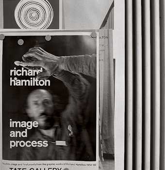
The Independent Group’s exhibition at the Whitechapel Gallery in London, This is Tomorrow, featured his collage, Just what is it that makes today’s homes so different, so appealing? From 1957 to 1961 he lectured in Interior Design at the Royal College of Art. Intrigued by the work of Marcel Duchamp, he published a typographical version of Duchamp’s Green Box in 1960. In 1966, he organized a Duchamp retrospective at Tate, for which he painstakingly replicated Duchamp’s fragile work The Large Glass.
During the 1970s, many institutions held etrospectives of his work, including Tate and the Guggenheim, New York. In 1982, his writings were published, including the 1957 letter in which he outlines his criteria for a work of Pop Art.
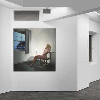
Hamilton’s work crosses many fields, from painting to typography. Most recently, he has exhibited in London at the Tate Triennial and at the Gagosian Gallery. His retrospective is at MACBA in Barcelona until 1 July, curated by the Director of Tate Modern, Vicente Todoli.
This article was originally published in Tate Magazine issue 4.


