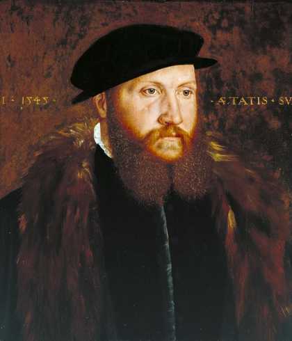
Fig.1
John Bettes active c.1531–1570
An Unknown Man in a Black Cap 1545
Oil paint on panel
470 x 410 mm
N01496
This painting is in oil paint on a wooden panel measuring 482 x 410 mm (fig.1). The panel support is composed of three boards of oak, placed vertically and held together at butt joints with glue, positioned with internal dowels (fig.2). Dendrochronological examination of the wood gave the year 1533 as the earliest possible felling date of the boards, although from 1539 onwards is more likely. As in most panels from this period the oak was from the Baltic area1 . The central board is 245 mm across and contains the full width of the head. Now reduced to strips about 70 mm wide, the two lateral pieces would originally have been almost as wide as the central board. Taking the truncated inscriptions on the front as a guide, the original support was probably a standard three-quarter length portrait size, that is about 690 mm wide and between 800 mm and 1000 mm high, similar to the Portrait of Sir William Cavendish c.1545 (The Trustees of the Chatsworth Settlement), which has been confidently attributed to Bettes on stylistic and technical grounds.2
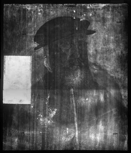
Fig.2
X-radiograph of An Unknown Man in a Black Cap
The white gesso ground is composed of natural chalk and gypsum, mixed up together and bound with animal glue size.3 It was applied evenly all over the front of the panel and has a smooth surface with just a trace of diagonal marking left by the blade used to smooth the surface (fig.3). Once dry it was covered over with a coat of bright, salmon pink paint, composed of vermilion, red lead, white lead, ivory black and azurite, mixed up and leanly bound in linseed oil. This pink priming is also found on the Cavendish portrait cited above and in the Portrait of Sir William Butts c.1745 in the Museum of Fine Arts, Boston, again attributed to Bettes on stylistic grounds.4 In relation to Bettes’s known association with Holbein, it is probably significant that very similar, salmon pink primings are present in some of Holbein’s portraits from the late 1530s, for exampleEdward, Prince of Wales 1538 (National Gallery of Art, Washington, D.C.) and, with a water based medium, in Holbein’s portrait drawings of the same period, for example, Mary, Lady Monteagle c.1538−40 (Royal Collection, London).
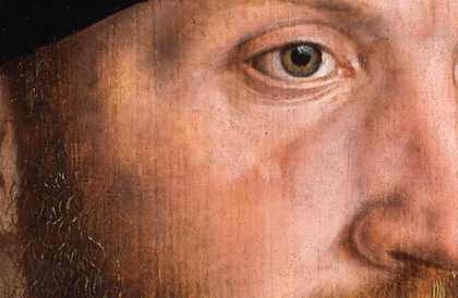
Fig.3
Detail of face in slightly raking light from the right, showing the vertical grain of the wood, and in the temple the faint diagonal marks left by the scraper used to smooth the ground
Infra-red imaging (fig.4) reveals a sensitive freehand drawing in a crumbly material with a fine hard point.5 Surely drawn from life, the features were created with multiple lines until the desired shape and character were defined. A thicker drawing tool was probably used to sketch in the bulk of the torso. The drawing is visible with the unaided eye now that the overlying paint has become more translucent with time, but it was probably always possible for the viewer’s eye to register the effect of the underdrawing, if not to discern its details. Its fine sketchy lines, perceptible as pearly grey tones at the side of the painted contours, give a sense of animation to the head in a very subtle exploitation of the ‘turbid medium effect’. This is an optical phenomenon whereby dark marks lying beneath a layer of light coloured, semi-opaque paint will appear as cool, pearly tones of the overlying colour.
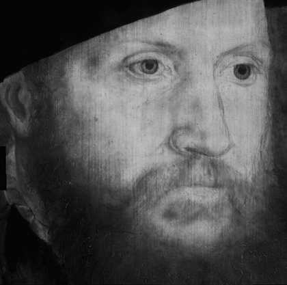
Fig.4
Infra-red detail of face, showing the freehand underdrawing
All the colours in the painting were made from pigments bound in pure linseed oil.
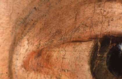
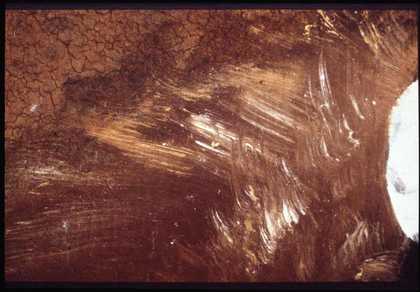
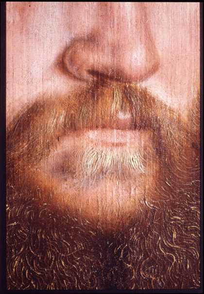
The light flesh tones of the face are mixtures of lead white, vermilion and black. For the dark shadows the artist added red lake, azurite and yellow ochre to that mixture. The pink priming was left visible as a mid-tone in parts of the temple and the beard. An interesting feature that is found also in the Chatsworth and Boston portraits is the use of a flesh tone – white lead mixed with vermilion – for the recessive curve of the eyeballs (fig.5). For the black hat and jerkin, Bettes chose mixtures of ivory black and white lead. These opaque tones were applied thinly, wet-in-wet, with featureless brushwork that serves to highlight the expressive use of paint in the fur collar (fig.6). The artist clearly took delight in varying his surface, culminating in his treatment of the wiry beard, where he chose pigments − mainly lead tin yellow – and a thick binding medium that would retain the crisp, curvilinear brushstrokes applied to the plain brown underpainting (fig.7).
The procedure for producing the background was complex, involving three distinct phases of painting. The backgrounds of the Chatsworth and Boston paintings are slightly more complex, with four consecutive layers. In this painting the artist first laid a thin, slightly streaky layer of opaque, bluish grey paint over the pink priming in the background areas to act as a preparatory layer for the final, bright blue colour. When this was dry he applied two coats of the glassy blue pigment, smalt, in linseed oil. It is evident from cross-sections that the lower layer of smalt was dry when the second was applied (figs.8 and 9).
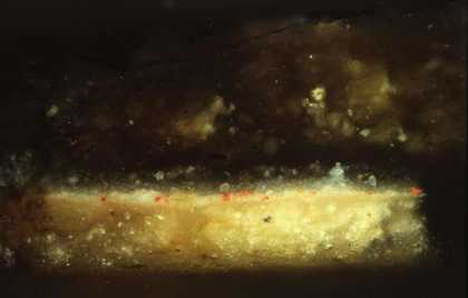
Fig.8
Cross-section through the background, showing from the bottom upwards: white ground; salmon pink priming; pale bluish grey underpaint; one layer of discoloured smalt (the second coat is not present in this sample)
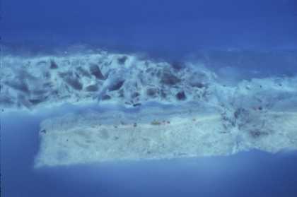
Fig.9
The same cross-section in ultraviolet light, which shows the particles of smalt more clearly
An interesting and apparently very unusual feature is that the gold-leaf letters of the inscription, recording the sitter’s age and the date of the painting, were applied on top of the first layer of blue, and then were covered over with the second coat. The same is true of the lower (and older) of the two signatures now on the back (figs.10 and 11). Smalt is effectively ground-up blue glass and therefore semi-translucent, and this would have rendered all the lettering a glittery blue. It must have been eye-catching but time has robbed us of the whole effect, smalt being an unstable colour in oil medium. The browns, yellows and sludge-greens of the background represent varying degrees of degradation of this pigment, and the puzzle of the two inscriptions can be solved by studying the sequence of deterioration.
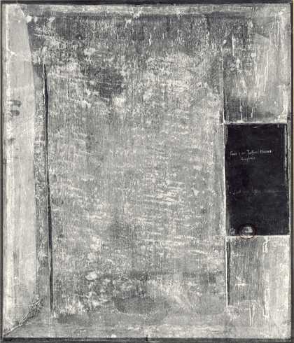
Fig.10
The back of the painting with the original signature and inscription attached to it
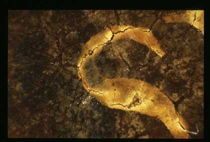
Fig.11
Detail of the ‘s’ in the original signature, showing the layer of smalt on top of it
The action of light is one of several agents in the complex process involved in the discolouration of smalt. As time passes the blue paint turns dark brownish green and then alters through brown to yellow; at this point there is hardly any colour left in the smalt and the yellow is actually the colour of the dried oil which binds together the transparent particles. Once the smalt on this painting had become dark green it would have obscured the inscriptions and signature – hence the duplication of them all, which was carried out with gold leaf applied on top of an opaque, orange mordant. It is ironic that with further degradation of the smalt, the original inscriptions would have started to reappear; even now the original gold letters are covered by a layer of smalt, so transparent it is hardly visible. At some point after the original inscriptions reappeared, someone removed the duplicate words on the front of the painting, only to find that they had literally left their shadow in the underlying smalt; the pigment is darker here, having been protected from light by the gold letters. Like the signature they had been done in gold leaf on an orange mordant, traces of which are present within the dark shadows.
By the mid-seventeenth century the instability of smalt was well known, although it continued to be used as a cheap alternative to the fabulously expensive ultramarine, whose intense blue it resembles when first applied.6 In this part of the sixteenth century, however, it is unlikely that many artists knew of the problem. Two instances provide strong indication that Bettes and also Holbein were unaware of its instability. Bettes used the costly, greenish blue pigment, azurite, for the background of his Portrait of Sir William Cavendish, but went on to glaze it with smalt.7 It is unlikely that a trained artist would knowingly cover an expensive pigment with one that was very likely to degrade. The second example is Holbein’s use of smalt in the background of his Edward Prince of Wales. This painting was almost certainly the one presented to Henry VIII at New Year 1539, either as a royal commission or as a gift from Holbein himself.8 If a gift, it is unlikely that the artist would have used a pigment known to be unstable to create a blue background that could pass as ultramarine. If a commission, would Henry have chosen an inexpensive, unstable blue for the portrait of his heir? To these artists smalt must have seemed a godsend: the rich blue of ultramarine at a fraction of the cost. We are the losers for their innocence, for apart from its superb draughtsmanship and masterly brushwork, An Unknown Man in a Black Cap must have been a quite splendid compilation of rich colours and sumptuous textures when presented to its owner.
The painting was cleaned and restored at Tate in 1977. The varnish is a modern synthetic resin.
May 2015

