Simplify – Skylar Haskard
I first met John Baldessari as a student at UCLA, where I would enjoy his occasional studio visits and critique classes. He would instruct the class in conversations on form and rarely, sometimes frustratingly so, on content. From that class I remember one confession, “I am a raging formalist!”, or something along those lines. After graduating, I would remind myself of another of his phrases: “Talent is overrated.” Among my multitude of odd jobs was one that involved tending JB’s garden. Employed for my green thumb, I was soon to realise that he didn’t rule out the notion that all artists should have one. I pruned, raked and dug in this garden almost pointlessly, as it was soon to be levelled to make way for another of his West Side studios. I enjoyed crossing paths with JB, and particularly the strength of his after-six martinis!
Recently, he invited me to collaborate with him on a reinvention of an Allan Kaprow piece, Apple Shrine (1960), for the Kaprow retrospective ‘Art as Life’ at the Museum of Contemporary Art, Los Angeles. The collaboration was by no means of equal involvement – JB would later say that the piece was 95 per cent mine and five per cent his. This means five per cent Baldessari, twenty per cent Kaprow and 70 per cent Haskard. A confusing first-time museum appearance, but still an excuse to meet with JB at regular intervals, in which he would filter my complicated, ambitious ideas with his light-hearted, almost
effortless wit. I was amazed by his humorous suggestions, which at times appeared simplistic and obvious, but by the time of the exhibition were complex and hysterical. Apple Shrine was re-invented as a chaotic labyrinth similar to Kaprow’s first Judson Church version in 1960. JB’s inclusion was a list of apples.
To note a personal favourite work of mine in JB’s prolific oeuvre: WRONG. A man standing in front of a palm tree (the artist himself ) with the word “WRONG” in bold capitals painted below. Or the video in which he is singing some of Sol LeWitt’s instructions. These works to me explain a lot about his sense of humour and also the best kind of Conceptualism particular to California. Humorous Conceptualism. I am very grateful for having met JB, and have found all our interactions fruitful and his
generosity infectious.
Simplify – Frederic TutenRed Sunday
We were spending a Sunday afternoon on a bench facing the East River. Two old friends having a talk without destination. A trawler passed, black bridge and red hull, heavy in the water, plodding. Lassitude itself. “Like the ship in Antonioni’s Red Desert,” I said. “Do you know that film?”
“Sure. The film whose emptiness is its supposed content. And whose star, Monica Vitti, with her perpetual flatness of gaze and expression is meant to embody the despair and chagrin with the modern industrial world.”
“I was thinking of Antonioni’s use of red, when I asked you that. The red of the ship in an unseen canal sliding across a barren field and a bleak sky. The startling and unexpected stretching strip of red intruding on the action, on the characters.”
“Or his use of green, in Blow-Up, where he painted the already green grass of a public park even greener. A green so prominent as to project itself as a character and not merely be a scene or setting or backdrop for the action.”
“Not exactly that,” I said, “and not exactly as you seem to suggest the use of colour as mood or an emblem of psychological state, as in van Gogh’s Night Café, where the greens and chrome yellows derange and banish joy from life and reflect the tormented lives of the café’s besotted habitués.”
“Or,” he said, “the troubled life of the painting’s author, in which colour is autobiography.”
“Oh! Yes. Colour as metaphor; colour as the voice of feeling.”
“But does that suggest that there is a universal equation for colours and the sensations they produce?” he asked. A peacock passed by, giving us his flat eye. Then a silhouette of a man holding a pistol in his outstretched arm, then a woman in a hat without flowers.
“Well,” I said, “I was speaking only of the way that van Gogh made us see what he saw in those yellows and greens he used.”
“Sometimes,” my friend said, “I’m tired of colour. Too much of it everywhere to leave an impression of any duration or value.”
“A promiscuity of colour, you might say.”
“We were raised,” he said, “when black-and-white films were the norm, and I still favour them, as I do art that uses colour with reserve. I like the way also, in certain art, colour obliterates the narrative, where there is one or where there is one implied by the juxtaposition of images, such as movie stills and photographs, so that the arrangement teases one to suppose a story or a part of one. I like the obscuring of a coherent reading of the images by the placement of little, full moons of just a few colours – a green, a pink, a yellow – over the faces of the people in the photos. This obliteration further frustrates the viewer’s ability to make the picture’s narrative coherent, and leaves him stretching for meaning and order, leaving him in a kind of sweet limbo of uncertainty, the region where all interesting art resides.”
“I see. The use of moons or squares of colour which at once obliterate key information in the picture and create in us a desire, hunger for colour,” I said, as the red line of the ship’s hull filled the borders of the horizon, leaving above it only the blue of what was once the sky.
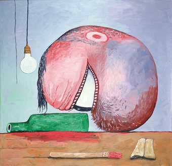
Philip Guston
Bottle and Head 1975
Oil on canvas
166.5 x 174 cm
Courtesy Timothy Taylor Gallery © The Estate of Philip Guston
Simplify – Meg Cranston
I first met John in 1984 when I was a student at CalArts. I related to his very direct way of dealing with art. At that time, the fashion was to talk about work in the most elliptical way possible. Density was a virtue equated with profundity and moral correctness. John’s approach moved in the opposite direction. His goal was always clarity, or, as he would say, to get the water to run clear.
What I learned from studying with John and through our long friendship is that most art, especially most great art, isn’t particularly difficult to understand. The meanings in the works of the artists John admires, Matisse, Cézanne, Giotto, Morandi, or his great favourite Philip Guston, are pretty obvious. In Guston’s case, it isn’t hard to understand what the artist is getting at when he has a giant eyeball staring down at an empty liquor bottle. The hard part is achieving that clarity. For John, art is the process of making complex things understandable – making them perfectly obvious. It’s a hard job for the artist, but with luck, a fairly easy and pleasurable experience for the audience.
Recently, John told me there are three tenets of his philosophy. They are: simplify, simplify and simplify. You can see that philosophy at play in his work and in his famous love of dumb jokes. He loves jokes because they make the ordinary absurd and the absurd seem ordinary, which of course it is. The fun comes from recognising and understanding what would otherwise seem preposterous. If no one gets the joke, if no one laughs, the joke is a bomb. I think John would agree there is a lesson in that for art.

