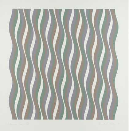
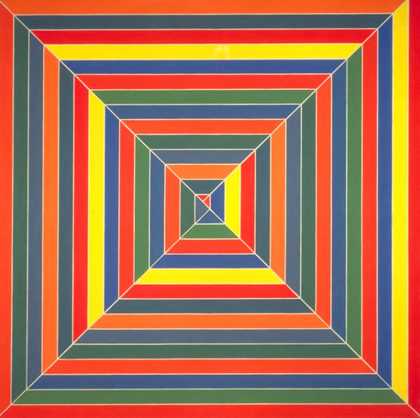
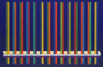
- Artist
- Bridget Riley born 1931
- Medium
- Acrylic paint on canvas
- Dimensions
- Support: 2413 × 2159 mm
- Collection
- Tate
- Acquisition
- Purchased 1974
- Reference
- T01868
Catalogue entry
T01868 CANTUS FIRMUS 1972–3
Inscribed ‘Riley 73’ on stretcher
Cryla on Canvas, 95×85 (240.3×216)
Purchased from the artist through the Rowan Gallery (Grant-in-Aid) 1974
Exh: La Peinture Anglaise Aujourdhui, Musée d'Art Moderne de la Ville de Paris, Paris, February–March 1973 (55); Bridget Riley, Arts Council touring exhibition, April 1973–January 1974 (64)
Lit: Bryan Robertson, ‘Bridget Riley: Colour as Image’, Art in America, LXIII, March–April 1975, pp.69–71; ‘Bridget Riley in conversation with Robert Kudielka’, Catalogue introduction to Bridget Riley, Arts Council touring exhibition, April 1973–January 1974
Since 1969 an important aspect of Bridget Riley's work has been its concern with the interplay between light and colour. Commenting on her use of stripes in this regard the artist told Robert Kudielka (op.cit) that she chose them because they are ‘unassertive forms’, unlike the shapes she was using previously (and which, in addition, often had distracting symbolic associations). ‘Form and colour seem to be fundamentally incompatible; they destroy each other... Colour energies need a virtually neutral vehicle if they are to develop uninhibited. The repeated stripe seems to meet these conditions’.
After 1969, the artist extended her original colour range of ‘pure’ red, green and blue on white into ‘mixed’ or indefinite scales of orange, green and violet or pink, lime-green and turquoise. She chose these latter colours because their capacity to ‘spread’ into the adjacent white bands was greatest. ‘Cantus Firmus’, in which sets of narrow pink, turquoise and lime green stripes alternate at carefully modulated intervals with bands of white, grey and black, introduced a new dimension of complexity. The spread of colour into the white areas is countered by the action both of the black bands, which intensify the colours next to them, and by the greys which get progressively darker towards the centre of the canvas. The effect is rhythmic and episodic, unlike the earlier ‘Early Morning’ (1967–8) (T.1032) where the very narrow parallel stripes produce a shimmering overall ‘curtain’ of colour in front of the canvas.
Published in:
The Tate Gallery 1974-6: Illustrated Catalogue of Acquisitions, London 1978
Explore
- abstraction(8,615)
-
- non-representational(6,161)
- formal qualities(12,454)