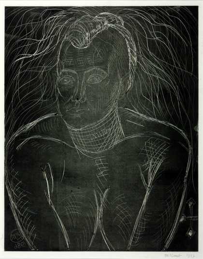
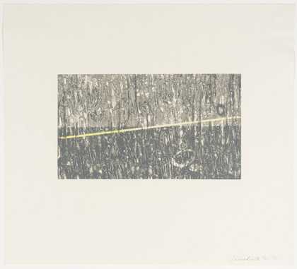
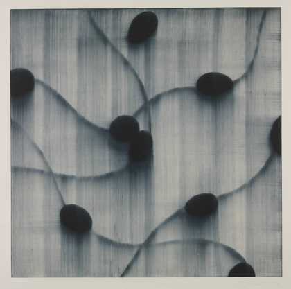
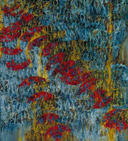
Prints and Drawings Room
View by appointment- Artist
- Thérèse Oulton born 1953
- Medium
- Monotype, oil paint and sand on paper
- Dimensions
- Image: 439 × 383 mm
- Collection
- Tate
- Acquisition
- Presented by Garner H. Tullis and Pamela Auchincloss 1988
- Reference
- P11197
Catalogue entry
P11197 Untitled 1987
Monotype 439 × 383 (17 1/4 × 15) on heavy handmade paper 755 × 565 (29 3/4 × 22 1/4); printed by Garner Tullis at Garner Tullis Workshop, Santa Barbara
Inscribed ‘Thérèse Oulton’ below image b.r.
Presented by Garner H. Tullis and Pamela Auchincloss 1988
Lit: Phyllis Plous, ‘Monotype Today’, in Collaborations in Monotype, exh. cat., University Art Museum, Santa Barbara 1988, pp.16, 21, 42; David Cohen, ‘Thérèse Oulton's Printmaking’, Print Quarterly, vol.6, no.4, Dec. 1989, pp.421–39
This monotype depicts a circle whose circumference touches the sides and top edge of the rectangular plate mark. The circle is divided diagonally. Its upper part is largely russet in colour, with patches of purple and black, and has a scrubbed, harshly worked texture. The lower part has a ribbed pattern in which discrete areas of russet and purple, overlaid with black and grey marks, alternate with patches of light blue, inflected with green and purple. Below and to the right of the circle is an area of muted green. Roughly finished brushstrokes trail into the unworked area of the image at the bottom left.
P11197 is one of a number of monotypes, all of which are untitled, made by Oulton at the Garner Tullis Workshop in Santa Barbara, California, in early February 1987 (see also entry on P11198). During her fortnight there, she produced four or five prints the size of P11197 each day. This rate of production was slightly slower than the studio average: as Oulton used copper plates, which are left clean after every printing, she had to begin each work from scratch. (During her second visit to the workshop, in February 1989, she used wooden boards instead of copper plates. These retained ghost images which provided a basis for the next print.) In conversation with the compiler at the Tate Gallery on 24 February 1994, Oulton recalled that she had not felt entirely comfortable at the print studio, working at this pace and on this relatively small scale: ‘It was my first time there, so I was kind of intimidated by the vastness of the workshop which is like an aircraft hanger ... And there was me working on small plates, whereas there was a slight, kind of implied aesthetic of producing big things.’
Oulton brought to the workshop her own Windsor and Newton oil paints, and, as is her standard practice, mixed her palette at the beginning of each day. Standoil was added to the paints to protect the paper, as, in the case of P11197, was some sand, giving areas of the print a gritty texture. She applied paint with brushes, wiping parts of the plate with etcher's scrim to create the scrubbed appearance of the upper section of the disc. P11197 was printed onto remarkably thick, hand-made paper, produced especially for the Garner Tullis Workshop. In conversation Oulton described this particularly heavy type of paper, with its marked surface texture, as ‘unsympathetic’, and added that she was perturbed by the contrast between the textured border area and the flattened paint surface and paper in the image area, a result of both the thickness of the paper and the amount of pressure applied by the printing press. She said, ‘Generally, I am not very at home, even with my oil paintings, with confrontational ways of making things’.
Monotype printing allows a direct and spontaneous way of working and is seen by some artists as a means of quickening or ‘freeing up’ their painting technique. However, Oulton, who works relatively slowly in making her oil paintings, was not particularly interested in this aspect of monotypes; she wanted, instead, to explore the other possibilities of this medium, which was entirely new to her. In relation to her later monoprints, Oulton has written of the ‘material considerations’ that are peculiar to monotypes - ‘nuances of paper, press pressure, transparencies or otherwise of paint, surfaces used to [print]’-, explaining how her approach to printmaking is shaped by the specificities of the medium (publicity text for Thérèse Oulton - New Monoprints, Marlborough Graphics Ltd, Feb.–March 1994). In conversation with the compiler, however, Oulton said she felt that, in the early monotypes, her experience of being a watercolourist and an etcher had been brought very much to the fore. In P11197, for example, she had used etcher's scrim, as mentioned above, to wipe away areas of paint, and had incorporated areas of white paper in the manner of a watercolourist. David Cohen (1989, p.426) commented that this use of white paper in the early monotypes was a ‘pictorial breathing space, rare in Oulton's paintings’.
In both imagery and style P11197 is closely related to earlier paintings. In conversation Oulton said the print was linked directly to
a series of oil paintings called ‘Dissonance Quartet’ which I showed in Vienna while I was living in Vienna. The reference was to Mozart's ‘Dissonance Quartet’. It was the idea that the ‘Dissonance Quartet’ does not end on a tonic resolution; and it was the idea of taking something of wholeness, like harmony or the circle, and then emptying that of its usual connotations. At the time, my particular concern was to take given meanings and see if they were still workable, or whether the weight of meaning was too great to use any more.
Oulton lived in Vienna for about a year, and exhibited the four paintings that make up the ‘Dissonance Quartet’, all executed in 1985, at the Galerie Krinzinger in 1986 (repr. Thérèse Oulton, exh. cat., Vienna 1986, pl.II–V in col.). During her stay she saw a great deal of art of the Counter-Reformation, and was concerned to use the illusory tactile qualities and the affective qualities of compositional devices particularly associated with such art. In conversation she recalled the importance to her, as she worked on the ‘Dissonance Quartet’, of the way in which Rubens had painted armour-plating, and the ‘uneasy, psychological juxtaposition’ of metal and flesh found in his pictures:
In the series things were turned inside out, and body metaphors, I think, began to creep in ... I began to like where the armour-plating became the flesh, so it was kind of turned inside out. There was often a kind of ribbing that could have been something protective. And the surface is bowed out like a Counter-Reformation Mannerist type of painting.
In the first and third of the series a gravity-defying circle fills the top two-thirds of the canvas, its circumference touching the top and the sides. The disc-shape appears to bow outwards, although this sensation is countered, particularly in the third work, by seemingly flatter, vertical rows of repeated patterning. In this last work, the patterning, which is russet-coloured, partially covers the disc, which, painted in metallic greys flecked with white, appears to reflect or deflect light off its varied surface.
In the following year Oulton went to the Garner Tullis Workshop with a body of ideas that was related to her work shown recently in Vienna. Owing to the nature of monotypes she was unable to use the tactile vocabulary of her oil paintings, and relied more on certain images and compositional devices. In conversation with the compiler she said that, when making P11197, she had wanted to suggest the potential ambiguity of a circle that appeared to push outwards towards the viewer and that, at the same time, might be hollow. To create its perfect shape the artist used a compass, scratching a faint trace into the copper with the compass needle in the manner of drypoint. Oulton said she did not reject an interpretation of this shape as the moon or earth. For her such a reading was linked to the ‘the original associations of wholeness’ that had inspired the ‘Dissonance Quartet’ series, although it was the idea of ‘fracture’, not wholeness, that had inspired her work on this theme.
The artist has approved this entry.
Published in:
Tate Gallery: Illustrated Catalogue of Acquisitions 1986-88, London 1996
Explore
- abstraction(8,615)
-
- non-representational(6,161)
-
- irregular forms(2,007)
- formal qualities(12,454)
-
- texture(466)