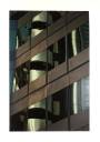
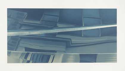
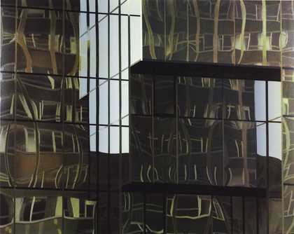
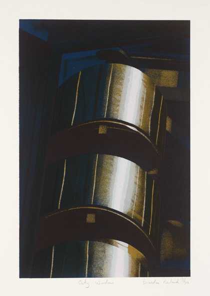
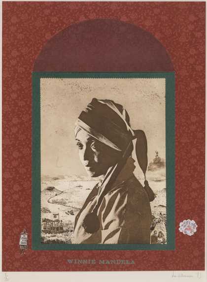
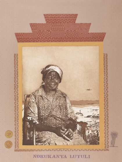
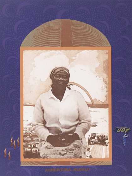
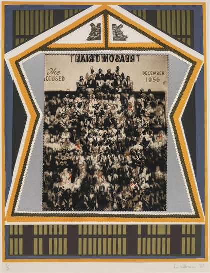
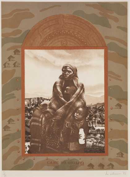
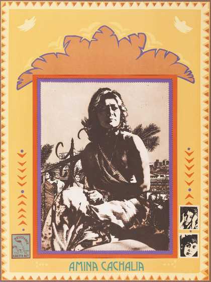
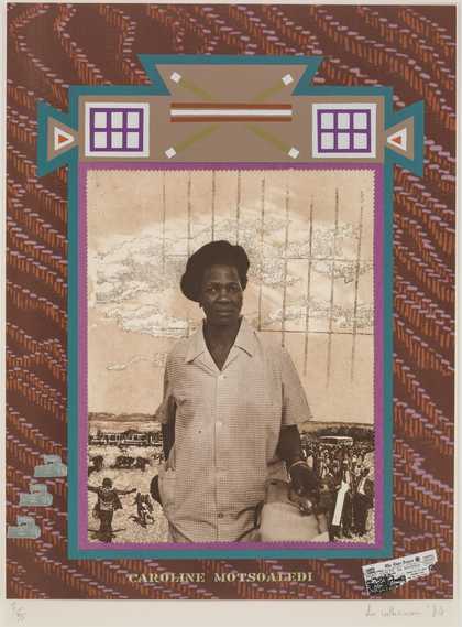
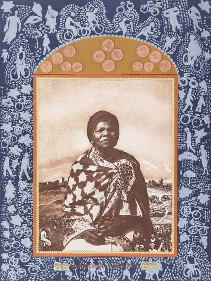
Prints and Drawings Room
View by appointment- Artist
- Brendan Neiland born 1941
- Medium
- Screenprint on paper
- Dimensions
- Image: 763 × 509 mm
- Collection
- Tate
- Acquisition
- Presented by the artist 1987
- Reference
- P02946
Catalogue entry
P02946 Lloyd's 1986
Screenprint 763 × 509 (30 × 20) on Arches paper 972 × 711 (38 1/4 × 28); watermark ‘ARCHES France’; printed by Brad Faine at Coriander Studio and published by Coriander Studio and the artist; artist's proof aside from the edition of 100
Inscribed ‘Brendan Neiland’ b.r., ‘Lloyd's’ below image bottom centre and ‘AP II/X’ below image b.l.
Presented by the artist 1987
Lit: Sarah Hyde, ‘Lloyds 1986: Designed by Brendan Neiland (b.1941) British’, The Whitworth Art Gallery: The First Hundred Years, 1988, p.134, repr. opp. (col.), another impression. Also repr: Triangle, (Lloyd's staff newspaper), no.67, April 1987, p.5 (col., another impression)
This screenprint depicts Lloyd's of London's headquarters in Leadenhall Street, EC3, reflected in the glass facade of a nearby building. The Lloyd's building was designed by the architects Richard Rogers and Partners and completed in 1986. The building in which Lloyd's is reflected is situated at 34–6 Lime Street and was designed by the architect Richard Sheppard of Robson & Partners and completed in December 1973.
In reply to a questionnaire received by the compiler on 5 January 1993, the artist described his fascination with the building:
I found it quite stunning, almost a piece of sculpture. Very strong in its environment. I was able to use contrasts. The curved reflective white highlights contrasting with the flat grid. One is able to suggest the whole through parts. So much of the city is observed through reflection. In a sense, it is far more real than the buildings themselves, particularly with the glass, aluminium, steel and marble surfaces. It helps to give the feeling of movement & activity & life of the city. It gives me the opportunity to structure my paintings using the grids of buildings within which to develop the ripples and highlights of the reflections. The flat grid holding areas against which the highlighted tubes could be held and developed, not allowing the rhythms and reflections to totally dominate and control. A play between the structured and the free more abstracted marks.
The artist first discovered the Lloyd's building while wandering around the City of London with his daughter on a quiet Sunday morning. As the artist has noted, ‘we were both staggered by a series of ripplying, weaving and tubular reflections. Such a contrast to the ordered structure of so many buildings. How well they looked in the severer containing structures. They had to form the basis of a series of paintings and the print Lloyd's’ (quoted in Hyde 1988). Notable examples in the series of paintings include: ‘Lloyd's Insurance Building’, 1986 (acrylic on canvas, Brendan Neiland: Facades, exh. cat., Fischer Fine Art 1987, no.26); ‘Lloyd's (The Tubes)’, 1987 (acrylic on paper, ibid., no.20, repr. p.11 in col.); ‘Lloyd's (The Stairwell)’, 1987 (acrylic on paper, repr. ibid., on front cover in col.); ‘Tubular City’, 1987 (acrylic on canvas, repr. ibid., p.7 in col.), and ‘London City: Tubes’, 1989 (acrylic on canvas). Neiland made one other print of the Lloyd's building. This was a small screenprint entitled ‘City Window’, 1988, also printed by Brad Faine. The works influenced each other in that ‘each painting and print seemed to help in the understanding of what I wanted with the imagery’. ‘Lloyd's Insurance Building’, 1986, depicts the same reflected view of the Lloyd's building as that shown in P02946.
Between 1986 and 1989 Neiland took approximately sixty to seventy photographs of the Lloyd's building from different angles. He considers these photographs both as aide-mémoires and as a type of sketchbook. Although Neiland lives and works in London, he began working on the drawings and stencils for P02946 at his studio in Courçon, Charente Maritime, near La Rochelle, France in August 1986. The screenprint was printed at Coriander Studio, London, and the edition was signed on 24 November 1986. In 1987 Neiland donated to the Tate Gallery Archive (TGA 879) the following material related to the making of P 02946: eleven hand-cut stencils, the basic grid seritrace, sixteen hand-sprayed positive seritraces, two colour charts, six photographs of the Lloyd's building, together with a proof of the final print annotated with the artist's comments for the printer, Brad Faine. These items formed the basis of an archive display entitled Lloyds 1986: A Print in the Making (Tate Gallery, April–June 1988). For this display the artist gave an account of his working practice, with special reference to P02946:
I make the drawings which can be cut out to provide a stencil through which I can spray. The first two drawings provide the skeleton structure and are the starting point of the print. These will be transferred to all the other sheets of paper. As each new sheet of drawing is developed and completed, this, too, is transferred to the other sheets. For this print grey acrylic paint was used for this purpose. I can then work within the areas created by the previous drawings, developing the imagery. I will do as many drawings as are needed. I can't say there's going to be ten, fifteen, eight, to get all the forms, the structure, even the most subtle nuances. There comes a point when there's no more drawing, no more stencils, needed. If there are, they can be done in the process of working on the hand-sprayed positives. This method is used because I am spraying and I need a hard edge. I need the ability to work against an edge and also, if it's a large enough area, to work quite freely within it. If you're spraying you have to mask areas of the print off. You mask around the area you want to spray, so while you're working on the print, you're quite isolated from the rest of it. With these stencils you can actually lift them up, look underneath, remove them and put them back on. The method arose partly because in working on a print I find it awfully important to be able to go back and forth to the seritrace and not just spray one area at one time only. By having the stencils, I can actually work on the imagery and the colour and the tone for as long as need be. This is why I work with paper and paper stencils rather than with masking tape or masking fluid.
When I have completed most of the stencils, I am ready to work on the clear seritrace sheets. I spray through the stencil on to the seritrace using ‘Stabilene’, a red masking fluid. This sprays well, is water-based and opaque to ultra-violet light. Each hand-sprayed positive forms the basis of a screen used for printing. I have by now a concept of the colour required for each positive and have decided on the number of positives that I should work on to reach the first proof. In the studio as each positive is completed, it is pinned to the wall, and I can relate to them as I work on the fresh one and, if necessary, work back on the previous ones. A rough idea of the colours to be used emerges from the stencil stage but when working on the hand-sprayed positives greater definition is necessary. Once the first two colours have been determined it becomes less difficult to visualize the colours of the later positives.
I have worked with the printer, Brad Faine of Coriander Studio, for fourteen years. We start by discussing the imagery, the sort of colour range, possibly the number of colours, and then I'll go away and I won't see him again until I actually have the hand-sprayed positives to give him. The hand-sprayed positive provides a resist to ultra-violet light so that a pre-sensitized silk-screen film can be made into a photo-stencil. This is applied to the screen which is then processed to provide a single colour printer.
In my studio I will have already decided on the order and what colour each sprayed sheet will be. I give the printer a colour chart which indicates the colour I visualize at this first proof stage for each positive and the order in which to print them. I decided with this print to work from a dark base. I thought it would give body and strength to the print which I wanted. The printer has got to know the order in which I've considered doing them. If he did them in another order there'd be totally different results. I know the original colour range I've been thinking of will be primitive. I can't make final decisions until actually proofing the print together with the printer.
The hand-sprayed positives and colour information were left with Brad. He then carried on on his own and made a very rough proof of the print. Within a fortnight he rang up saying, ‘Hey Bren, really great, something for you to look at’. Having reached that first proof stage, I sat down for an hour or two, looking at the print and writing on it what I wanted increased, decreased, what wasn't happening that I hoped would and what was happening that was unforeseen.
I was very pleased with this print at this stage but I did realise there was further work to do to get the balance and the emphasis through the colour working as I wanted. From then on, I worked in conjunction with the printer in his studio, not my own. He had all the equipment needed for further work. At this point, the print depended very much on the working relationship between myself and the printer with his technical expertise. Together we discussed the print and decided to add three more colours to enrichen it. Brad suggested a glaze to add even more richness over the dark colours. Then we went through the print again and the Studio editioned it. The whole of the process, from my background work and the drawings to the first proof, probably took about a month.
Sarah Hyde (1988) has noted that:
The final image is reminiscent of the way in which the world appears through the lens of a camera. Often in the past Neiland has studied the way in which a shiny, glass-fronted office building seems almost to dematerialize as the lens of a camera (or for that matter our eyes) focuses on a passing cloud reflected in its surface. In the ‘Lloyds’ print, however, one surface remains firm, its linear structure undistorted, whilst one of the building's most striking aspects, the shining staircase, seems to float and bend, distorted like a mirage before us.
When asked if P02946 was influenced by works by other artists Neiland replied, ‘I have a great admiration and love of Fernand Léger's work and have often related back to his imagery’.
This entry has been approved by the artist.
Published in:
Tate Gallery: Illustrated Catalogue of Acquisitions 1986-88, London 1996
Explore
- architecture(30,960)
-
- periods and styles(5,198)
-
- post-modern(1)
- public and municipal(2,385)
-
- offices(36)
- UK countries and regions(24,355)
-
- England(19,202)