Damien Hirst
Pharmacy (1992)
Tate
Introduction
Damien Hirst has said ‘art’s about life, and it can’t really be anything else’. In a series of memorable works, often involving provocative materials such as flies, dead animals and formaldehyde, Hirst has made uncompromising statements about the transience of life.
In this room installation, he recreates the clinical atmosphere of a pharmacy. Hirst views medicine as a powerful belief system: we are seduced by drugs, believing they will cure all ills and preserve life, though rarely questioning their side-effects.
Growing up in Leeds, he remembers going into a chemist’s with his mother and wondering why she could put her faith in drugs, yet had no faith in art. Hirst explains:
I like the way art works, the way it brightens people’s lives up…but I was having difficulty convincing the people around me that it was worth believing in. And then I noticed that they were believing in medicine in exactly the same way that I wanted them to believe in art.
The pharmacy, with its cool white shelves of classified bottles and boxes, seems to be a model of minimalist order, banishing fears of death and decay. However, the bowls of honeycomb placed on stools, and the insect-o-cutor hanging from the ceiling are a reminder of mortality. The honey potentially attracts flies, only to lure them on to a quick and brutal death. In a similar way, medicine promises much but can only stave off the inevitable end. As Hirst puts it:
We all die, so this kind of big happy, smiling, minimal, colourful, confident facade that medicine and drug companies put up is not flawless – your body lets you down, but people want to believe in some kind of immortality.

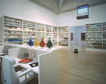
Damien Hirst, Installation of Pharmacy at Tate Modern, 2012, Photo: Andrew Dunkley, Tate Photography
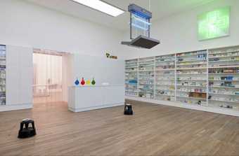
Damien Hirst, Installation of Pharmacy at Tate Modern, 2012, Photo: Andrew Dunkley, Tate Photography
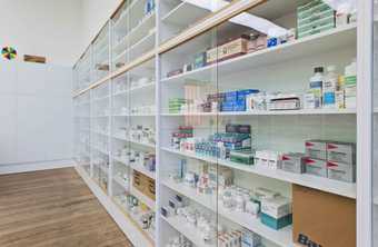
Damien Hirst, Installation of Pharmacy at Tate Modern, 2012, Photo: Andrew Dunkley, Tate Photography
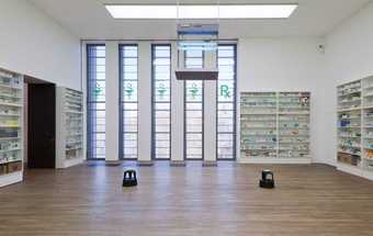
Damien Hirst, Installation of Pharmacy at Tate Modern, 2012, Photo: Andrew Dunkley, Tate Photography
Look around
The artist has chosen to make specific associations with parts of the installation. Pick one of the objects below to learn more about their meanings.
Bottles
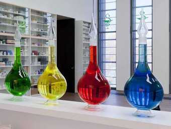
The four bottles containing water and food colouring are traditional pharmacist’s symbols, representing the four elements, Earth, Air, Fire and Water.
Their symbolic value, which enabled people to recognise the pharmacy before the days of mass literacy, can be compared to that of the striped pole outside a barber’s shop.
By placing these old-fashioned bottles in a contemporary pharmacy setting, Hirst seems to be reminding us of the passing of time. As he explains, despite its clean, minimalist lines and modern medicines, this pharmacy will soon date: ‘In a hundred-years-time this will look like an old apothecary. A museum of something that’s around today’.
Cabinets
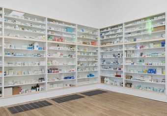
I know the medicine cabinets work, but in many ways. I like all the readings, if you see them as power structures, a society, or as metaphor for the human body or even as a comment on capitalism or consumerism…or pro-medicine or anti-medicine – they are about all these things, even if you just think it’s weird to see them in a gallery.
Someone was looking at the medicine cabinets, somebody who had worked as a nurse in a doctor’s surgery somewhere, and she stood looking at it, puzzling over it for ages… She said, ‘I can’t work out the arrangement.’ What she meant was, she’d worked with a lot of doctors who have their own personality. Basically, you can tell what kind of a doctor they are by the way they organise their drugs – what drugs they have closest to hand; where they shelve barbiturates and the other drugs you use with barbiturates, etc. But I was unaware of what the drugs do. I just put like with like. So I quite liked the idea that to a hell of a lot of people they looked so confident, but then to somebody who knows what’s going on, you know, it’s a mess.
Damien Hirst
The cabinets are simple white shelves, arranged with empty bottles and packages of prescription drugs. The bottles and boxes on the shelves form blocks of colour (red, blue, orange, yellow, white) and although the artist has said that he doesn’t mind if the exact order is changed he thinks it is important to keep the colour balance.
Desk
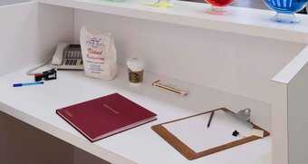
As the work is intended to convey the sense of being in a real pharmacy, it is important for the visitor to enter the installation at the desk, which gives the illusion of stumbling into a pharmacy from behind the scenes.
Insect-o-cutor
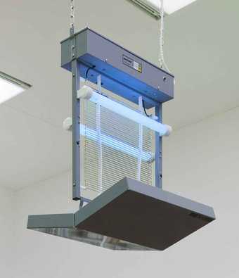
Hirst believes that the most important aspect of the insect-o-cutor is that it ‘symbolises some kind of god, something that kills without mercy, without emotion, without choice’. There are unlikely to be many flies in the gallery, but, according to Hirst, ‘visitors to the gallery act as flies, people as flies, like an overview of life without emotion, that is as far as the metaphor should go’.
Medicine

Hirst has related the cabinets to people, comparing the drugs inside them to internal organs, and commenting on the way many drugs relate to a particular part of the body. In some previous installations of Pharmacy, the cabinets were arranged to place drugs for head ailments at the top, down to those for the feet at the bottom.
People have confidence in medicine. I noticed they were looking at shiny colours and bright shapes and nice white coats and cleanliness and they were going right – this is going to be my saviour, except they weren’t reading the side-effects. There seems to be a lot of trickery going on. I think art is a hell of a lot better for you than medicine, in the long run. You don’t get a long list of side-effects – or maybe you do
Stools
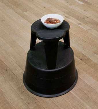
Four porcelain bowls containing honeycomb are placed on footstools. The honey can attract flies, which would then be zapped by the insect-o-cutor. When Pharmacy was first shown in New York, Hirst cut holes in the gallery windows to allow flies into the space.
Honey was traditionally believed to have medicinal purposes. According to Hirst, the honeycombs reflect the natural, non-human world which is set against the man-made world represented by drugs and packaging.
In conversation
In an interview with Gordon Burn in London, on 3 October 2001, Damien Hirst discussed some of the themes and ideas behind Pharmacy.
Discussion

Damien Hirst, Installation of Pharmacy at Tate Modern, 2012, Photo: Andrew Dunkley, Tate Photography
The personal
- What is your first reaction to Pharmacy?
- Is it a room in which you would feel happy to be left alone?
- What parts of the installation seem to you to be most important?
- How do you feel about calling this installation an art work?
The subject
Damien Hirst has chosen an old fashioned pharmacy as the subject for this installation.
Nowadays we would visit a chemist if we need to have a prescription dispensed or obtain medicines or tablets.
Modern medicine has been a recurring theme in Hirst’s work, and it is art which, for him becomes the great healer, a replacement for God, a mind alterer, a potential placebo, a hopeful panacea.
- Explore other artworks by the artist in Tate’s collection. Can you find any other works where Hirst uses medicine as a subject?
- Read Damien Hirst’s interview where he talks about his choice of a pharmacy and pharmaceuticals as a subject for art
The context
Pharmacy is an installation which displays great theatricality. We know that Hirst is interested in the effects of medicine and in this work he manages to create a ‘stage’ with a backdrop of bottles, boxes and other related instruments. We as viewers become the ‘visitors’, the ‘actors’ who participate in his play.
- Explore how the installation has appeared in different gallery spaces
- What are the differences between the installations?
- How do these changes affect how a visitor might experience the work?
The object
Pharmacy with its clean, cool, floor-to-ceiling cabinet walls presents a realistic imitation of a chemist’s dispensary. At the same time however, the streamlined graphics of drug packaging and the ordered and formal presentation of the work suggests the language of art movements such as minimalism. The objects that make up Pharmacy – the glass display cases, the medicines, the desk, the telephone – are straight forward enough on one level, but the suggested themes and visual references make it a complex and mysterious artwork.
- Do you think Pharmacy is a realistic imitation of a chemist’s dispensary or an artist’s fantasy?
Theme of Mortality
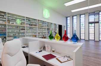
Damien Hirst, Installation of Pharmacy at Tate Modern, 2012, Photo: Andrew Dunkley, Tate Photography
Mortality is one of the main themes of Pharmacy, and a subject Damien Hirst returns to repeatedly in his work. Use quotations by the artist from his interview with Gordon Burn, as a starting point for discussion and activities
Quote 1:
The names of the drugs in the cabinets conjures up a vision of human misery and dread – with all the drugs there comes a reference to a particular sickness along with a list of side-effects. One drug, on the packet, for example carried a big warning – it said blurred vision, change in color vision – these were all the side-effects you could have, so it said like a warning – you think the drugs are perfect and they're used to heal you and do everything they say – I've got a headache so I'll take this.
- What do you think about this idea?
- Do you think we are led to believe medicines are perfect and will heal everything?
- Do you think we only see the good things in medicines and ignore the bad things, the side-effects?
- Use the internet to see if you can find an example of a drug company that has been forced to withdraw a drug from the market. Write a case study which researches this example
- You could stage a debate about the pros and cons of pharmaceuticals
Quote 2:
Yeah well, we all die, so this kind of big happy, smiling, minimal, colourful, confident facade that medicine and drug companies put up is not flawless – your body lets you down but people want to believe in some kind of immortality.
- Have a look at some of the packaging which you can see on the various medicines and tablets. How does this kind of packaging differ from say, soft drinks or washing powder?
- Damien Hirst calls it minimal and believes it is supposed to inspire confidence in the consumer. Do you agree?
- What do you think of when you look at the packaging of these medicines? Is anything else packaged in this way?
- Look at Damien Hirst's series of prints The Last Supper. What is odd about this packaging? What does food packaging usually look like?
- In his discussion about Pharmacy, Damien Hirst speaks about mortality and the way in which some of us use medicines to stay young and to achieve immortality. Do you believe that we are so afraid of our own mortality that we will do anything, believe anything, take anything to prevent death?
- As a result of this discussion, you could design a packet for a particular medicine. Damien Hirst believes the minimalist packaging is part of the illusion of the medicine. Design some packaging that undermines that illusion. What would it have? Images? Bold colours? Flashy designs?
Quote 3:
People have confidence in [medicine]. Because I had a confidence in art that comes from God knows where – I was thinking I like this and I like the way it works, I like the way it brightens people's lives up, the way that people believe in it, but I was having difficulty in convincing the people around me that it was worth believing in. And then I noticed that they were believing in medicine in exactly the same way that I wanted them to believe in art and they weren't doing it.
- Can art heal? What do you think? Have you ever listened to a song, or read a book, or seen a painting that made you feel better about yourself or the world?
- What is the purpose of art?
- Should it inspire you to think differently?
- Should art try to talk about everyday things and ideas?
- Is it good to question everyday things in the world?
- Should art make us think about things we don't want to face?
- Art often asks questions. Are there any questions or issues you would like to address through art? What form would your artwork take – a sculpture, painting, installation, photograph? Why have you chosen that form?

